[This blog post is an excerpt from a commentary published at TSI about 1.5 weeks ago]
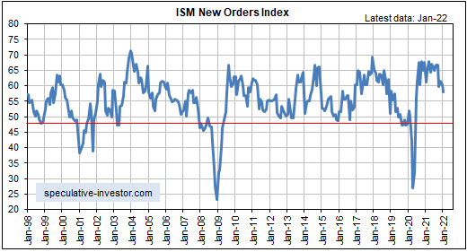
The latest leading economic data indicate that the US expansion is intact. This is the case even though the following monthly chart reveals that in January-2022 the ISM Manufacturing New Orders Index (NOI), one of our favourite leading economic indicators, dropped to its lowest level since June-2020. The reason is that it’s normal for the rate of improvement — which is what the NOI is measuring — to decline while the economy remains in the expansion phase. That being said, there are signs that the pace of economic activity will slow markedly during the first half of this year.
Note that the NOI would have to drop below 55 to stop being a positive influence on the US stock market and below 48 to warn of a recession. We won’t be surprised if it drops below 55 within the next two months, but a decline to below 48 is probably at least 2-3 quarters away.
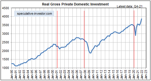
Regarding the pace of US economic growth, in our previous four “US Recession/Expansion Watch” monthly discussions we wrote that we expected US economic activity to re-accelerate during the final months of 2021 and the early part of 2022 due to inventory building and millions of people returning to the workforce. That happened (for exactly the reasons expected*) and was confirmed by the preliminary estimate of annualised GDP growth coming in at 6.9% for Q4-2021. It was also confirmed by Real Gross Private Domestic Investment (RGPDI), a quarterly statistic that acts as a leading indicator of recession starts and a coincident indicator of recession ends. As illustrated below, RGPDI rose sharply to a new all-time high in the fourth quarter of last year.
Note that the vertical red lines on the following chart mark official recession start dates.
However, the financial markets don’t care what happened months ago; they care what’s going to happen over the months/quarters ahead and there is evidence that the GDP growth rates reported for the first two quarters of this year will be MUCH lower than the rate reported for the final quarter of last year. In fact, due to “inflation” remaining near its cycle peak while the pace of economic activity slows, the “real” GDP growth rate during the first quarter of this year could be close to zero.
The preponderance of evidence from leading economic indicators and confidence indicators points to the H1-2022 economic slowdown occurring within the context of an economic boom, although a pronounced slowdown within a boom and the early part of a boom-to-bust transition can be indistinguishable.
Money-supply trends warn that a boom-to-bust transition could begin as soon as the first half of this year, but the start of a boom-to-bust transition usually precedes the start of an official recession by at least a few quarters and leading economic indicators are a long way from issuing recession warnings. Therefore, the next US recession probably won’t begin any earlier than Q4-2022.
*We noted at the time they were announced that the initial BLS estimates for jobs growth in November and December of last year had massively understated the strength of the US labour market. The latest monthly employment report, which was issued on Friday 4th February, contained revisions to previous months that corrected the errors. The corrections resulted in a combined increase of 709K to the November-December jobs growth total. As a consequence, the employment data now show that the US economy added 1.83M jobs in Q4-2021 and 2.3M jobs over the past four months.