Print This Post Print This Post

Changing with the times

May 24, 2021

[This blog post is an excerpt from a TSI commentary that was published last week]

Senior policymakers at the Fed assert that the “inflation” surge of the past several months will prove to be transitory, and it isn’t hard to find market analysts and economists who agree with this assessment. A point we want to make today is that anyone who has been financially positioned for the deflation or “disinflation” that supposedly will follow the period of “transitory inflation” has missed a great opportunity encompassing an inflationary burst of historic magnitude.

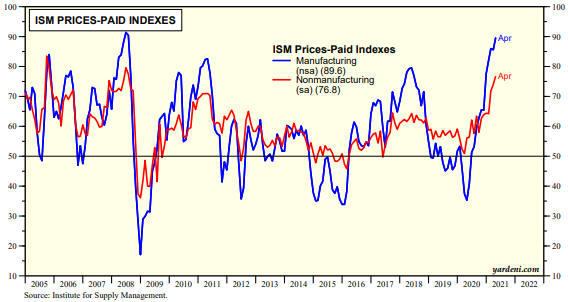
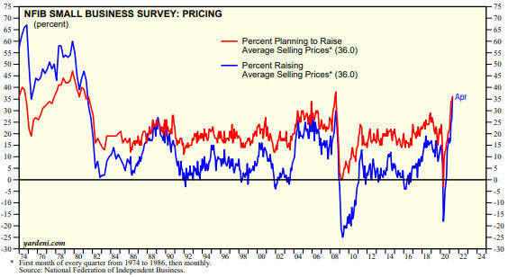
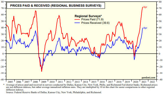
In the above sentence we didn’t use the word “historic” lightly. As evidence we present three charts from Yardeni.com.

The first chart shows that the ISM Prices-Paid Indices for both Manufacturing and Services are at 10-year highs and are close to multi-decade highs.

The next chart shows that the percent of small businesses that are raising their average selling prices is the highest since 1981. In other words, this indicator of price increases is at a 40-year high!

The final chart shows the average of prices paid and the average of prices received as determined by the Fed’s regional business surveys. Both Prices Paid and Prices Received are at multi-decade highs, but notice that the Prices Paid line has risen to a much greater extent than the Prices Received line. This means that profit margins are being compressed by the inflation.

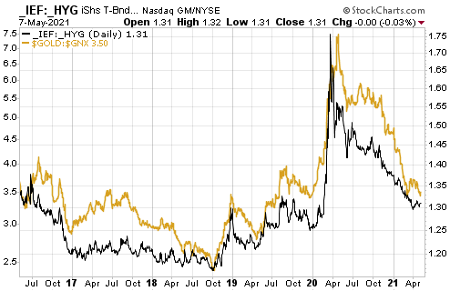
It’s perfectly fine to have an opinion about what will happen in the future, but it’s important to position your portfolio in a way that will enable you to profit from the overarching trends currently in progress. Since the second half of March last year and especially since early November of last year the three inter-related trends that have dominated the financial markets are rising inflation expectations, rising economic confidence and US$ weakness. The combination of these trends is very bullish for commodity prices, both in fiat currency terms and in gold terms.

There are warning signs that the above-mentioned trends are in their final phases, but they haven’t ended yet. Therefore, at the moment it’s reasonable to be positioned based on the assumption that what worked over the past six months will continue to work, albeit with a ‘nod’ to the likelihood that some of the dominant trends could be near their ends. From our perspective, that ‘nod’ has involved building up exposure to gold. However, when the evidence of a general trend shift becomes clearer it will be important to change with the times and not doggedly stick with the positioning that was aligned with previous conditions. In other words, don’t make the mistake that was made over the past 7-14 months by the perennial US$ and T-Bond bulls.

Print This Post Print This Post

The Boom Continues

May 11, 2021

[This blog post is an excerpt from a TSI commentary published on 9th May 2021]

The major trends in monetary inflation result in a boom-bust cycle. In particular, a rising trend in the money-supply growth rate leads to increased consumption and investment spending, ushering-in the boom phase of the cycle. A subsequent decline in the rate of money-supply growth reveals the investing errors of the boom and leads to a liquidation process, which is the bust phase of the cycle. In other words, monetary inflation causes the boom and the boom causes the bust.

Once a boom is set in motion by creating lots of money out of nothing, a painful bust that eliminates all or most the boom’s apparent gains is inevitable. The only question is the timing. Even if the central bank tries to keep the boom going forever by maintaining a rapid pace of money-supply growth, all it will do is set the scene for the eventual bust to involve hyperinflation and a total economic breakdown.

Unfortunately, the timing question can’t be answered well in advance of the start of the boom-to-bust transition. However, there are indicators that usually generate warning signals early enough to be useful. Two such signals are credit spreads and the gold/commodity ratio.

When a boom is in progress, credit spreads are relatively narrow or in a narrowing trend and gold is relatively cheap or in a cheapening trend. As evidenced by the following chart, that’s exactly what has been happening over the past 13 months and especially over the past 6 months (the black line on the chart is a credit-spread indicator and the yellow line on the chart is the gold/commodity ratio). Furthermore, although gold has done well in US$ terms since late-March and ended last week at a 2-month high, relative to commodities (as represented by the GSCI Spot Commodity Index – GNX) it tested its 12-month low last week. With credit spreads near their narrowest levels in more than 12 months, this makes sense. It means that the US boom is intact.

When the boom is close to its end the gold/commodity ratio should start trending upward and credit spreads should start widening.

Print This Post Print This Post

The ‘V’ Recovery

May 5, 2021

In an article at the TSI Blog in May of last year we explained why the US economic rebound from the H1-2020 plunge into recession probably would look like a ‘V’. Our conclusion at that time was: “There will be a ‘V’ shaped recovery, but due to the destruction of real wealth stemming from the lockdowns the rising part of the V is bound to be much shorter than the declining part of the V. This will lead to a general realisation that life for the majority of people will be far more difficult in the future than it was over the preceding few years.” This assessment was close to the mark, but not totally correct.

During the few months after we posted the above-linked article at the TSI Blog our views regarding the likely strength and longevity of the economic rebound — as outlined in TSI commentaries — shifted. Specifically, in commentaries published at TSI between June and November of last year we began to anticipate a longer rebound with an acceleration of economic activity during the first half of 2021. This was due to a) the central bank’s promise to maintain accommodative monetary conditions for years despite the emerging evidence of an “inflation” problem, b) the eagerness of the US federal government to continue showering the populace with money, c) the expected natural release of pent-up demand as COVID-related restrictions were removed and d) the likelihood of the US government approving a multi-trillion-dollar infrastructure spending program regardless of the November-2020 election outcome. Due to this combination of factors, a full ‘V’ recovery has occurred when measured in GDP terms. This is illustrated by the following chart.

GDP_050521

The GDP rebound does not reflect sustainable progress. Due to the way that GDP is calculated, a dollar of counterproductive spending is the same as a dollar of productive spending. For example, if the government pays people to dig holes in the middle of nowhere and then fill them in, the payments will add to GDP even though the process wastes resources and adds nothing to the economy-wide pool of wealth. Over the past 12 months there has been a lot of counterproductive spending.

The popular economic indicator called “GDP” actually reflects money-supply growth more than it reflects economic progress. By simultaneously giving the money supply a hefty boost and pretending that the purchasing power of money is essentially unchanged, the impression can be created that the economy is moving ahead in leaps and bounds while the total amount of real wealth actually shrinks.

When speculating and investing, however, it’s important to take advantage of the artificial boom and not fritter away your personal wealth betting against the monetary tide. Such bets will become appropriate at some point (as determined by various leading indicators), but they haven’t been appropriate over the past six months and they are not appropriate today.

Print This Post Print This Post