Print This Post Print This Post

Energy Transition Realities

June 24, 2022

[This blog post is an excerpt from a recent commentary published at TSI]

This is a follow-up to our 25th April piece titled “Inconvenient Facts” in which we summarised some of the issues that are ignored or brushed over by many proponents of a fast transition to a world dominated by renewable energy sources. The follow-up was prompted by a recent RealVision.com interview of Wil VanLoh, the CEO of Quantum Energy Partners, by Kyle Bass. The charts displayed below were taken from this interview.

To summarise the summary included in our earlier piece, it takes a lot of energy and minerals to build renewable energy systems and it takes years for a renewable energy system to ‘pay back’ the energy that was used to build it. Consequently, achieving the energy transition goals set by many governments will require increasing production of fossil fuels for at least the next ten years, which, in turn, will require substantially increased investment in fossil fuel production and distribution (pipelines, terminals, storage facilities and ships). In addition, achieving today’s energy transition goals will necessitate substantially increased production of certain minerals, meaning that it will require more mining.

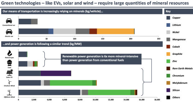
With regard to the need for more mining to bring about the Sustainable Energy Transition (SET), the top section of the following chart compares the quantities of minerals required to build a conventional car with the quantities required to build an electric car. The bottom section of the same chart does a similar comparison of fossil-fuel (natural gas and coal) power generation and renewable (solar, on-shore wind and off-shore wind) power generation.

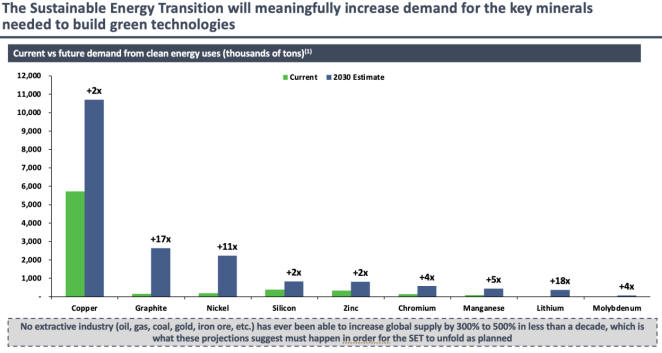
The next chart illustrates the increase in the production of several minerals that will have to happen by 2030 to achieve the current energy transition goals. Of particular interest to us, it shows that over the next eight years copper and zinc production will have to double, manganese production will have to increase by 5-times, nickel production will have to increase by 11-times and lithium production will have to increase by 18-times.

On a related matter, mining is an energy-intensive process. Moreover, the bulk of the increased mining required to meet the current SET goals will occur in places where the only economically-viable sources of energy will be fossil-fuelled power stations or local diesel-fuelled generation. This means that the increase in mining required for the energy transition will, itself, require increased production of coal, natural gas and diesel.

Soaring prices of oil, natural gas, coal and oil-based products (gasoline and diesel) have focused the attention of senior Western politicians on the urgent need for more oil and natural gas production. However, today’s supply shortages are due to a decade of under-investment in hydrocarbon production, which, in turn, is a) the result of political and social pressure NOT to invest in such production, b) a problem that even in a best-case scenario will take many years to resolve, and c) a problem that will be exacerbated by chastising oil companies and threatening government intervention to cap prices.

If it were possible to do so, ‘greedy’ oil and oil-refining companies would be very happy to flip a switch and increase production to take advantage of current high prices. The reality is that it isn’t possible and that increasing production to a meaningful extent will require large, long-term investments. But why should these companies take the risks associated with major investments to boost long-term supply when they continue to be pressured by both governments and their own shareholders to prioritise reduced carbon emissions above all other considerations and when there is enormous uncertainty regarding future government energy policy?

Print This Post Print This Post

The Fed has been ‘quantitatively tightening’ for more than 6 months

June 15, 2022

[This blog post is a excerpt from a recent TSI commentary]

In terms of effect on the money supply, reverse repurchase agreements (reverse repos) are the opposite of quantitative easing (QE). Whereas every dollar of QE adds one dollar to the money supply plus one dollar to bank reserves at the Fed (bank reserves are not counted in the money supply), every dollar of reverse repos subtracts one dollar from the money supply plus one dollar from bank reserves at the Fed. Consequently, although reverse repos are not done with the primary aim of tightening monetary conditions, they effectively are a form of quantitative tightening (QT).

Unlike QE, reverse repos are temporary. To be more specific, the money removed from the banking system via a reverse repo will be returned within 24 hours unless a new reverse repo is created to replace the expiring one. However, the following chart shows that since April of last year the Fed has not only been rolling over or replacing expired reverse repos, but also has been adding to the outstanding pile by creating new reverse repos. As a result, the outstanding pile of reverse repos now amounts to $2.16 trillion. This means that the Fed’s reverse repo program has removed $2.16 trillion from the US economy since the beginning of April-2021.

From April-2021 until March-2022 the Fed was adding money to the economy via QE and simultaneously removing money from the economy via reverse repos. The amount of money being added via QE was greater than or equal to the amount being subtracted via reverse repos until early-December of last year, at which time the Fed became a net subtractor from the US money supply and US bank reserves.

One implication is that even though the Fed officially won’t start QT until this month, for all intents and purposes QT has been happening for about six months. Another implication is that the Fed now has more than two trillion dollars that it could inject into the economy simply by allowing existing reverse repos to expire. This could enable the Fed to boost the money supply over the months ahead while pretending to do QT.

Print This Post Print This Post

The Investment Seesaw

June 11, 2022

[This blog post is an excerpt from a TSI commentary published on 5th June 2022]

A point we’ve made many times in the past* is that gold and the world’s most important equity index (the S&P500 Index – SPX) are at opposite ends of a virtual investment seesaw. Due to their respective natures, if one is in a long-term bull market then the other must be in a long-term bear market. In multi-year periods when they are both trending upward in dollar terms it means that the dollar is in a powerful bear market, not that gold and the SPX are simultaneously in bull markets (the one that is actually in a bull market will be determined by the performance of the gold/SPX ratio). Recently, our ‘investment seesaw’ concept was part of the inspiration for the Synchronous Equity and Gold Price Model (SEGPM) created by Dietmar Knoll. This model is a quantitative relationship between the SPX, the US$ gold price and the US money supply (the model uses the M2 monetary aggregate), and is explained on pages 251-266 of Incrementum’s latest “In Gold We Trust” report.

Before delving into how the SEGPM works, it’s worth pointing out that there have been previous attempts to link changes in the stock market and the gold price to changes in the money supply. These attempts failed. With regard to the stock market they failed because a strong positive correlation between the senior equity index and the money supply only exists during equity bull markets, that is, the money supply in isolation fails to account for the major swings in the stock market. For example, during the 9-year period from March-2000 to March-2009 there was huge growth in the US money supply, but the SPX was 50% lower at the end than it was at the start of this period.

With regard to the gold market the aforementioned attempts failed first and foremost because the underlying premise is wrong, in that there is no good reason for the gold price to track the US money supply. Also, we know from the historical record that valuations for gold that are based solely on the US money supply can deviate hugely from the real world for DECADES at a time, which means that they have no practical value.

The sorts of models mentioned above have never worked over complete cycles because they consider the SPX and the money supply or gold and the money supply, as opposed to an SPX-gold combination (both ends of the ‘investment seesaw’) and the money supply.

The SEGPM is based on the idea that there are periods when an increase in the money supply will boost the SPX more than it will boost the gold price and other periods when an increase in the money supply will boost the gold price more than it will boost the SPX, with the general level of trust/confidence** in money, the financial system and government determining whether the SPX or gold is the primary beneficiary of monetary inflation. During long periods when trust/confidence is high or trending upward, increases in the money supply will tend to do a lot for the SPX and very little for gold. The opposite is the case during long periods when trust/confidence is low or falling.

Dietmar Knoll found that adding the SPX to 1.5-times the US$ gold price (and applying a scaling factor) resulted in a number that has done a good job of tracking the M2 money supply over many decades. The correlation is illustrated by charts included in the above-linked Incrementum report, but we have created our own charts using True Money Supply (TMS) instead of M2. Our charts are displayed below.

Each of the following two monthly charts compares the US TMS with the sum of the S&P500 Index and 1.5-times the US$ gold price. The only difference between these charts is the scaling of the Y-axis. The first chart uses a linear scale and the second chart uses a log scale.

The log-scaled chart displayed above indicates that since 1959 there have been only three multi-year periods during which the SEGPM deviated by a substantial amount from the money supply. The first was during 1969-1971 due to the extreme under-valuation of gold (the gold price was fixed at the time and unable to respond to the monetary inflation and declining confidence of the time). The second was during 1979-1980 due to a gold market bubble. The third was during the second half of the 1990s due to a stock market bubble.

Interestingly, both charts indicate that the current SPX+gold level is low relative to the money supply. If we are right to think that an economic bust (a 1-3 year period of declining confidence) has begun, then this suggests that there is a lot of scope for the gold price to increase over the next couple of years even if the pace of money-supply growth is slow. To be more specific, it suggests the potential for the US$ gold price to double over the next two years with TMS growth of only 5% per year.

*For example, in the May-2017 blog post linked HERE

**The general level of trust/confidence is quantified by our Gold True Fundamentals Model (GTFM)

Print This Post Print This Post