Print This Post Print This Post

Replaying the 1970s?

June 30, 2023

[This blog post is a modified excerpt from a newsletter published at www.speculative-investor.com about two weeks ago]

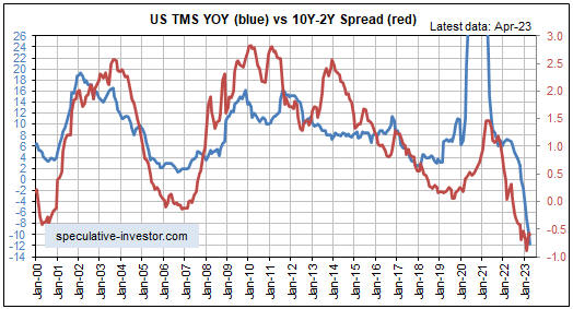
The world is not going through a replay of the 1970s, as there are some critical differences between the current situation and the situation back then. For example, a critical difference is that private and government debt levels were much lower during the 1970s than they are today. However, this decade’s macroeconomic path probably will have a lot more in common with the 1970s than with any subsequent decade. One similarity is that just like the 1970s, the current decade probably will have multiple large waves of inflation. Another similarity and the one we will address now is the performance of the US yield curve.

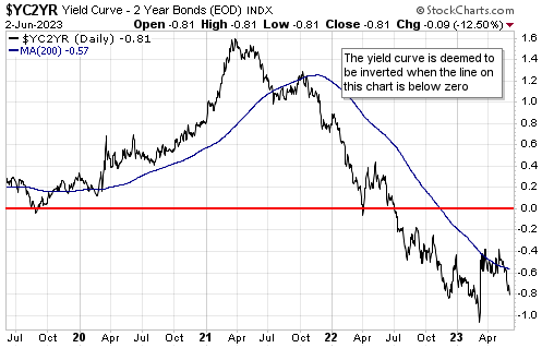
Here is a monthly chart of the US 10-year T-Note yield minus the 3-month T-Bill yield (the 10year-3month spread), a proxy for the US yield curve. Clearly, nothing like the current situation has occurred over the past forty years. Just as clearly, the current yield-curve situation is not unprecedented or even extreme compared to what happened during 1973-1981.

Note that the shaded areas on the chart show when the US economy was deemed by the National Bureau of Economic Research (NBER) to be in recession.

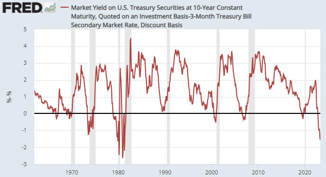
During the period from June-1973 to August-1981, the yield curve was inverted for a cumulative total of 40 months (about 40% of the time). This means that during the aforementioned roughly 8-year period, yield curve inversion was almost the norm. Furthermore, there were times during this period when the inversion was more extreme than it is today.

Of potential relevance to the present, the 1973-1974 recession began 6 months after the yield curve became inverted and 3 months after the inversion extreme, that is, 3 months after the start of a steepening trend, while the 1981-1982 recession began 8 months after the yield curve became inverted and 7 months after the inversion extreme. The ‘odd man out’ was the 1980 recession, which began 13 months after the yield curve became inverted and 2 months BEFORE the inversion extreme. In other words, even during the major inflation swings of the 1970s and early-1980s, the yield curve tended to reverse from flattening/inverting to steepening prior to the start of an official recession.

Also of relevance is that during the 1970s gold generally did well when the yield curve (the 10year-3month spread) was inverted. For instance, the entire major rally from around $200 in late-1978 to the blow-off top above $800 in January-1980 occurred while the yield curve was inverted. In addition, the entire large decline in the gold price during 1975-1976 occurred while the yield curve was in positive territory.

The situation today is that the US yield curve (the 10year-3month spread) became inverted in October of last year. This means that about 8 months have gone by since the inversion. As mentioned above, the longest time from inversion to recession start during 1973-1981 was 13 months. Also, at this time there is no evidence that an inversion extreme is in place.

One conclusion is that based on what happened during the 1970s, we probably will have to get used to the yield curve being inverted. Another conclusion is that today’s inversion-recession path would remain within the bounds of what transpired during 1973-1981 if a recession were to begin by November of this year.

Print This Post Print This Post

The US stock market in ‘real’ terms

June 13, 2023

[This blog post is an excerpt from a commentary published last week at www.speculative-investor.com]

In a world where the official currencies make poor measuring sticks due to their relentless and variable depreciation, looking at the relative performances of different investments is the best way to determine which ones are in bull markets. Furthermore, because they are effectively at opposite ends of an investment seesaw, with one doing best when confidence in money, central banking and government is rising and the other doing best when confidence in money, central banking and government is falling, this is a concept that works especially well for gold bullion and the S&P500 Index (SPX).

There will be times when both gold and the SPX are rising in US$ terms, but it should be possible to tell the one that is in a genuine bull market because it will be the one that is relatively strong. More specifically, if the SPX/gold ratio is in a multi-year upward trend then the SPX is in a bull market and gold is not, whereas if the SPX/gold ratio is in a multi-year downward trend then gold is in a bull market and the SPX is not. There naturally will be periods of a year or longer when it will be impossible to determine whether a multi-year trend has reversed or is consolidating (we are now in the midst of such a period), but there is a moving-average crossover that can be used to confirm a reversal in timely fashion.

For at least a decade, we have been monitoring the SPX/gold ratio (or the gold/SPX ratio) relative to its 200-week MA to ascertain whether gold or the SPX is in a long-term bull market*. The idea is that when the SPX/gold ratio is above its 200-week moving average, it means that the SPX is in a bull market and gold is not. And when the ratio is below this moving average, it means that gold is in a bull market and the SPX is not.

The following weekly chart shows that since 1980 the SPX/gold ratio relative to its 200-week MA (the blue line) has generated only two false signals. Both of these false signals occurred as a result of stock market crashes — the October-1987 crash and the March-2020 crash. The chart also shows that since peaking in late-2021, the SPX/gold ratio has dropped back to its 200-week MA but is yet to make a sustained break to the downside.

The next weekly chart zooms in on the SPX/gold ratio’s more recent performance. This chart makes it clear that over the past 12 months the ratio has been oscillating around its bull-bear demarcation level.

It’s likely that an SPX bear market, and therefore a gold bull market, began in late-2021, but there remains some doubt. The remaining doubt would be eliminated by the SPX/gold ratio breaking below its March-2023 low.

Further to comments we made in the latest Weekly Update, the only plausible alternative to the bear-market-rebound scenario for the US stock market is that a bear market has not yet started. This is clearer when looking at the SPX in gold terms than when looking at the SPX in nominal dollar terms. What we mean is that the moderate pullback in the SPX/gold ratio to its 200-week MA clearly was not a complete bear market; it was either the start of a bear market or it was a bull-market correction.

Our view is that a multi-year equity bear market is in progress. However, if the SPX/gold ratio fails to break below its March-2023 low within the next few months and instead makes its way upward, then what transpired during 2022 was an intermediate-term stock market correction within a bull market.

*A January-2019 blog post discussing the concept can be found HERE.

Print This Post Print This Post

US Recession Watch

June 5, 2023

[This blog post is an excerpt from a recent commentary published at speculative-investor.com]

Leading indicators of the US economy continue to signal imminent recession, but coincident indicators are mixed and some lagging indicators, most notably employment, are still showing strength. Therefore, it isn’t clear whether or not a recession has commenced. Also, high-profile parts of the stock market are muddying the water by trading as if a “soft landing” (no recession, but a large-enough inflation decline to cause the Fed to reverse course) were the most likely economic outcome over the next several months.

Turning to our favourite two leading indicators, first up we have a chart showing that the ISM Manufacturing New Orders Index (NOI) made its cycle low to date in January-2023 and returned to its cycle low in May-2023. As noted in previous TSI commentaries, at no time since 1970 has the ISM Manufacturing NOI been as low as it is today without the US economy being either in recession or about to enter recession.

Next up is the yield curve, which remains inverted to an extreme. The extreme inversion tells us that monetary conditions have become tight enough to virtually guarantee an official recession, but the signal that a recession is imminent is a reversal of the yield curve from flattening/inverting to steepening.

A yield curve reversal from flattening/inverting to steepening has not happened, yet. It’s possible that the rebound in the 10-year T-Note yield minus the 2-year T-Note yield (the 10y-2y spread) from its March-2023 low is the start of a reversal, but the 10-year T-Note yield minus the 3-month T-Note yield (the 10y-3m spread), an equally important measure of the yield curve, just hit a new inversion extreme for the cycle. Daily charts of these interest rate spreads are displayed below.

As explained in the past, the yield curve is driven by the monetary inflation rate and tends to lag the monetary inflation rate at major turning points. Of particular relevance at this time, a reversal in the yield curve from flattening/inverting to steepening usually follows a major upward reversal in the monetary inflation rate. This relationship is illustrated by the monthly chart displayed below. The red line on this chart is the 10y-2y spread and the blue line is the growth rate of US True Money Supply (TMS).

Clearly, the monetary inflation rate has not yet reversed upward. This indicates that the monetary conditions for a yield curve reversal are not yet in place.

Note that for the monetary inflation rate to begin trending upward in the near future, a large amount of money probably will have to exit the Fed’s Reverse Repo facility. This could happen in response to the flood of new debt that will be issued by the Treasury within the next couple of months.

In conclusion, it’s possible that a US economic recession has begun, but it’s now more likely that a recession won’t begin until the third quarter of this year.

Print This Post Print This Post