Print This Post Print This Post

Have the Chinese pegged the gold price?

July 30, 2018

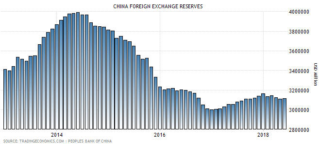
Governments and central banks lost interest in the gold price decades ago, but stories about how governments are supposedly controlling the gold price never lose their appeal. One of the latest stories is that since the inclusion of the Yuan in the IMF’s SDR (Standard Drawing Rights) basket in October-2016, the Chinese government has pegged the SDR-denominated gold price to 900 +/- a few percent. According to The Macro Tourist’s 25th July blog post, this story has been told by Jim Rickards. The Macro Tourist suggests a different story*, which involves the Chinese government (or someone else) having pegged the Yuan-denominated gold price. Both stories are based on gold’s narrow trading range relative to the currency in question over the past two years.

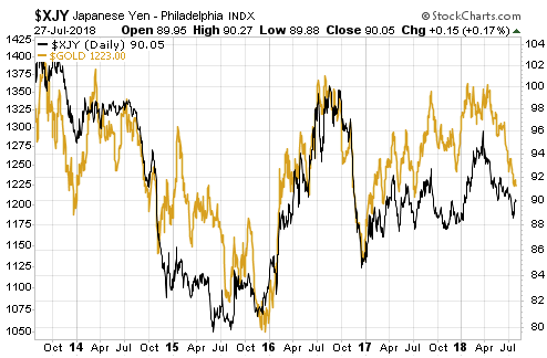
If we are going to play this game then I can tell an even better story. My story is that the Japanese government took control of the gold market in early-2014 and has since been keeping the Yen-denominated gold price at 137,000 +/- 5%. They lost control in early-2015 and again in early-2018, but in both cases they quickly brought the market back into line.

Here’s the chart that ‘proves’ my version of events:

gold_Yen_300718

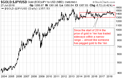
The narrow sideways range of the Yen gold price over the past 4.5 years is due to the Yen being the major currency to which gold has been most strongly correlated. Here’s a chart that illustrates the strong positive correlation between Yen/US$ and gold/US$:

goldvsYen_300718

My story about the Japanese government pegging the gold price makes as much sense as the stories about the Chinese government pegging the gold price. That is, my story makes no sense.

It will be possible to find price data to substantiate almost any manipulation story. Also, with sufficient imagination there is no limit to the manipulation stories that can be concocted to explain any price action. For example, you can always look at a period of range-trading in the gold market and conclude that a government (the same organisation that makes a mess of everything else it tries to do) is adeptly managing the price. Alternatively, you can look for a more plausible explanation or perhaps just acknowledge that not all price action has a single, simple explanation.

Like all financial markets the gold market is, of course, manipulated, but even if there were a desire to do so (there isn’t) it would not be possible under today’s monetary system for any government to directly control the gold price over a period of years or alter major trends in the gold price.

*In general the Macro Tourist blog provides level-headed commentary on the financial markets and doesn’t plunge into the murky world of gold-manipulation story-telling. Even in this case I think the main point of the post is to show that gold is stretched to the downside and may be good for a short-term trade, but some people will take the post as more evidence that the gold market is dominated by nefarious forces.

Print This Post Print This Post

The “Productivity of Debt” Myth

July 23, 2018

Page 4 in Hoisington Investment Management’s latest Quarterly Review and Outlook contains a discussion about the falling productivity of debt problem. According to Hoisington and many other analysts, the problem is encapsulated by the falling trend in the amount of GDP generated by each additional dollar of debt, or, looking from a different angle, by the rising trend in the amount of additional debt required to generate an additional unit of GDP. However, there are some serious flaws in the “Productivity of Debt” concept.

There are three big problems with the whole “it takes X$ of debt to generate Y$ of GDP” concept, the first being that GDP is not a good indicator of the economy’s size or progress.

For one thing, GDP is a measure of spending, not a measure of wealth creation. It’s possible, for example, for GDP to grow rapidly during a period when wealth is being destroyed on a grand scale. This could happen during war-time and it could also happen as the result of massive government spending on make-work projects. It’s also possible for GDP to grow slowly at a time when the rate of economic progress is high. This can happen because GDP is dominated by consumption. It omits all business-to-business expenditure and misses a lot of value-adding investment.

For another thing, GDP is strongly influenced by changes in the money supply. Of particular concern, even though an increase in the money supply cannot possibly cause a sustainable increase in economy-wide wealth, it will usually boost GDP.

Therefore, comparing anything with GDP is problematic.

The second flaw in the “it takes X$ of debt to generate Y$ of GDP” concept is that it involves comparing a flow (annual GDP) to a stock (the cumulative total of debt). There are times when it can make sense to compare a stock to a flow, but care must be taken when doing so. I’ll use a hypothetical example to show one of the pitfalls.

Assume that over the course of a year an economy goes from a GDP of $10T and a total debt of $50T to a GDP of $10.4T and a total debt of $52T. This could prompt the claim that it took $2T of additional debt to boost GDP by $0.4T, or that $5 of additional debt was needed for every $1 of additional GDP. However, it could also be said that a 4% increase in debt was associated with a 4% increase in GDP. The second way of expressing the same change seems far less worrisome.

In any case, the above two flaws in the typical productivity-of-debt analysis pale in comparison with the third flaw, which is that the entire concept of debt productivity is meaningless. The fact is that debt doesn’t cause economic growth and ‘excessive debt’ (whatever that is) doesn’t inhibit economic growth.

An economy can grow with or without an increase in debt, because per-capita economic growth is caused by savings and capital investment. An increase in debt can accelerate the pace of real growth by acting as a means by which savings are channeled to where they can be invested to the best effect, but the transfer of savings can also occur via the exchange of money for equity. For example, most exploration-stage mining companies and most technology start-ups are equity-financed not debt-financed. There is, of course, debt that is used to finance consumption rather than investment, but that type of debt can’t grow the economy over the long term because it necessarily involves a present-future trade-off — more spending in the present leads to less spending in the future.

The central problem is unsound money, not excessive debt. More specifically, the problem is that when banks make loans they create money out of nothing. It’s this creation of money out of nothing and the subsequent exchange of nothing for something, not the build-up of debt, that leads to reduced productivity. If all debt involved the lending/borrowing of real savings then no amount of debt could ever make the overall economy less efficient. Of course, if all debt involved the lending/borrowing of real savings then the total amount of debt would be a small fraction of what it is today.

Print This Post Print This Post

No currency manipulation by China’s government, yet

July 18, 2018

[This is a brief excerpt from a commentary posted at TSI last week]

In the 2nd July Weekly Update we discussed the risk posed by the recent weakening of China’s currency (the Yuan), and commented: “We won’t know for sure until China’s central bank publishes its international currency reserve figure for June, but the recent weakening of the Yuan does not appear to be the result of a deliberate move by China’s government.” We now know for sure — the Yuan’s pronounced weakness during the month of June was NOT the result of government manipulation. In fact, it can be more aptly described as the result of an absence of manipulation.

We know that this is so because of what happened to China’s currency reserves in June. As indicated by the final column on the following chart, almost nothing happened (there was no significant change). This means that China’s government made no attempt to either strengthen or weaken its currency last month.

To further explain, for China’s government to engineer weakness in the Yuan’s foreign exchange value it must add to its international currency reserves by exchanging its own currency (that it creates ‘out of thin air’) for foreign currency. By the same token, for China’s government to increase the Yuan’s relative value it must use its international currency reserves to purchase Yuan. Consequently, periods when China’s currency reserve is increasing are periods when China’s government is attempting to weaken the Yuan and periods when China’s currency reserve is decreasing are periods when China’s government is attempting to strengthen the Yuan.

The above chart therefore tells us that China’s government was trying to weaken the Yuan up to mid-2014 and strengthen the Yuan from mid-2014 until the end of 2016. The chart also seems to indicate that there was a tentative attempt to weaken the Yuan during 2017, but 2017′s gradual increase in China’s foreign currency stash was most likely driven by changing market valuation. We are referring to the fact that because reserves are reported in US dollars and held as debt securities, the reported value of the reserves can be altered by a change in exchange rates or bond prices. In particular, the reported reserve figure will have an upward bias during periods when the US$ is weak relative to other major currencies, as it was throughout 2017.

The bottom line is that China’s government has not yet weaponised the Yuan’s FX value in its economic war with the US government, but it is also not standing in the way when the Yuan weakens in response to market forces.

Print This Post Print This Post

The current message from the most useful sentiment indicator

July 10, 2018

As I’ve noted in the past, the Commitments of Traders (COT) information is nothing other than a sentiment indicator. Moreover, for some markets, including gold, silver, copper, the major currencies and Treasury bonds, the COT reports are by far the best indicators of sentiment. This is because they reflect how the broad category known as speculators is betting. Sentiment surveys, on the other hand, focus on a relatively small sample and are, by definition, based on what people say rather than what they are doing. That’s why for some markets, including the ones mentioned above, I put far more emphasis on the COT data than on sentiment surveys.

In this post I’ll summarise the COT situations for five markets with the help of charts from “Gold Charts ‘R’ Us“. I’ll be focusing on the net positioning of speculators in the futures markets, although useful information can also be gleaned from gross positioning and open interest.

Note that what I refer to as the total speculative net position takes into account the net positions of large speculators (non-commercials) and small traders (the ‘non-reportables’) and is the inverse of the commercial net position. The blue bars in the middle sections of the charts that follow indicate the commercial net position, so the inverse of each of these bars is considered to be the total speculative net position.

I’ll start with gold.

Gold’s COT situation was almost unchanged over the latest week. Ignoring everything except sentiment (as indicated by the COT data), gold is in a similar position now to where it was in early-July and early-December of last year. This suggests the potential for a 2-month rally to the $1350-$1400 range, but not much more than that.

goldCOT_100718

Silver’s COT situation has been a source of controversy over the past four months. Some analysts argued that it was extremely bullish, whereas I argued (for example: HERE) that at no point over this period was the COT situation conducive to a significant silver rally. I’m therefore not surprised that there hasn’t been a significant silver rally.

Four weeks ago silver’s COT situation became slightly bearish, but it has since improved and I now view it as neither a tail-wind nor a head-wind for the silver price. However, silver will rally if gold rallies. It’s that simple.

silverCOT_100718

Four weeks ago the speculative net-long position in Comex copper futures became extreme. This didn’t guarantee that a large price decline was in store, but it pointed to substantial downside risk in the price.

Copper’s COT situation is now similar to what it was near short-term price bottoms in July and December of last year, so there’s a decent chance of a multi-week price rebound.

copperCOT_100718

Of the major currencies, the Swiss franc (SF) has the most bullish COT situation. The COT information certainly doesn’t preclude one more decline in the SF to a new low for the year, but it suggests that the SF will trade significantly higher within the next three months.

SFCOT_100718

I expect that long-dated US Treasury securities will trade at much lower prices (much higher yields) within the next 2 years, but during April-May of this year I began to anticipate a multi-month price rebound (yield pullback) in this market. This was mainly due to sentiment as indicated by the COT situation. Of particular relevance, the total speculative net-short position in 10-year T-Note futures had risen to an all-time high.

Despite a price rebound from the May low, the speculative net-short position in 10-year T-Note futures remains near the all-time high reached in late-May. Therefore, it’s a good bet that the T-Note/T-Bond price rebound is not close to being complete.

TNoteCOT_100718

Print This Post Print This Post

Gold’s true fundamentals turn bullish

July 5, 2018

I update gold’s true fundamentals* every week in commentaries and charts at the TSI web site, but my most recent blog post on the topic was on 30th April. At that time the fundamental backdrop was gold-bearish, but there has since been a change.

My Gold True Fundamentals Model (GTFM) turned bearish in mid-January 2018 and was still bearish at the end of the week before last (22nd June). There were fluctuations along the way, but at no time between mid-January and late-June was the fundamental backdrop supportive of the gold price. However, at the end of last week (29th June) the GTFM turned bullish. The deciding factor was a small, but significant, widening of credit spreads.

Here is a chart comparing the GTFM (in blue) with the US$ gold price (in red).

The upshot is that for the first time in more than 5 months the gold market has a ‘fundamental’ tail-wind, which is a prerequisite for a substantial rally. For reasons that I’ve mentioned in TSI commentaries I’m expecting a tradable 2-month rally from a July low rather than a substantial rally, but my expectations will change if the evidence changes.

*Note that I use the word “true” to distinguish the actual fundamental drivers of the gold price from the drivers that are regularly cited by gold-market analysts and commentators. According to many pontificators on the gold market, gold’s fundamentals include the volume of metal flowing into the inventories of gold ETFs, China’s gold imports, the volume of gold being transferred out of the Shanghai Futures Exchange inventory, the amount of “registered” gold at the COMEX, India’s monsoon and wedding seasons, jewellery demand, the amount of gold being bought/sold by various central banks, changes in mine production and scrap supply, and wild guesses regarding JP Morgan’s exposure to gold. These aren’t true fundamental price drivers. At best, they are distractions.

Print This Post Print This Post