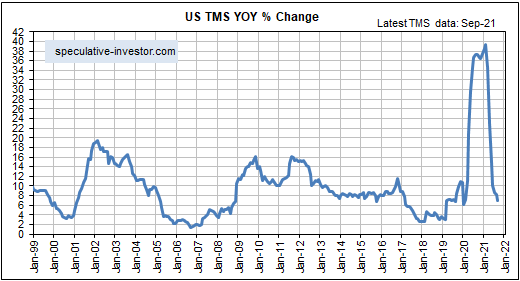
[This blog post is a slightly modified excerpt from a TSI commentary published last week]
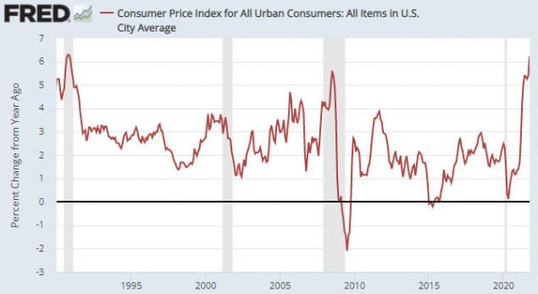
The US government just reported a 6.2% year-over-year increase in the CPI (refer to the following chart). This was the largest increase since 1990 and the second-largest increase since 1982. Furthermore, nobody in their right mind believes that the CPI overstates the pace of US$ depreciation. How can this be happening in parallel with a yield of about 1.5% on the US 10-year T-Note and a yield of about 1.9% on the US 30-year T-Bond?
There’s a two-part answer to the above question, the first part of which is that the bond market expects the CPI to average only 2.7% over the next ten years. We know this is the case because 2.7% is the annual CPI increase factored into the current price of the 10-year TIPS. In other words, the bond market is anticipating a substantial pullback in the “inflation” rate from its current level. However, even a 2.7% rate of increase in the CPI is inconsistent with a current 10-year T-Note yield of around 1.5%. Based on today’s inflation expectations, the 10-year T-Note currently should be yielding at least 3.5%.
The other part of the answer is that the financial markets expect the Fed to do whatever it takes to cap the yields on US government bonds at well below the rates that would be consistent with the official “inflation” rate.
Given its unlimited ability to purchase assets with money that it creates out of nothing, the Fed is capable of keeping government bond yields pegged at unrealistically low levels for a long time. However, doing so would have very bearish implications for the US$ and very bullish implications for most US$-denominated prices. In particular, Fed policy that involved capping US government bond yields at low levels in the face of obvious evidence of high “inflation” would be extremely bullish for the US$ gold price.
Official Fed policy that involves capping bond yields at low levels in the face of persistently high “inflation” is not likely to be introduced over the next six months, but I suspect that it will become a major driver of market prices during 2023-2024.