Print This Post Print This Post

Motive, means and opportunity, but no crime

October 23, 2017

When a prosecutor is trying to establish guilt in a murder trial in most cases he will try to show that the accused had the motive, the means and the opportunity. However, prior to analysing motive, means and opportunity (MMO) there must first be evidence that an actual murder occurred. One of the most basic mistakes made by those who tout gold-price suppression stories is that they focus on the MMO without first establishing that a crime has taken place. The crime in this case would be causing the gold price to behave consistently in a way that was contrary to the underlying fundamentals.

Before getting to the absence of evidence that a crime has occurred let’s first deal with the MMO-focused argument, because even this argument has many holes in it. There is no question that the banking cartel that encompasses central banks and commercial banks has the opportunity to manipulate prices, given that it is a big player in the financial markets. However, it is not clear that “the cartel” has the means to manipulate the gold price beyond minor fluctuations over very short time periods.

One popular story is that the price is suppressed over the long-term via the “naked” short selling of gold futures, but you don’t need to go to the lengths to which the Monetary Metals team recently went to see that this story is fictitious. The bogus nature of the story can be seen by looking at the Commitments of Traders (COT) data. For example, if price declines were driven by the naked short selling of futures then the open interest (OI) in the futures market should rise as the price trends downward (as new short positions are added), but more often than not the opposite is the case. For another example, the COT data show that the “Commercial” traders, the supposed architects of the price suppression, are typically net buyers during price declines.

Another popular story is that the price is suppressed by creating paper supply in the London market. This story is based on the fact that there are a lot more claims to physical gold traded via the London Bullion Market Association (LBMA) than there is physical gold in LBMA vaults. This story is more difficult to refute, not because it is more likely to be true but because there is less transparency with LBMA gold trading than there is with Comex gold trading. However, for the sake of argument let’s make a huge leap of faith and assume that the LBMA provides the means to suppress the gold price beyond the very short-term.

We now turn to motive. The idea is that gold is a barometer of the monetary system’s health, with a rising gold price being indicative of failing health, and that the banking cartel wants us to believe that the monetary system is healthy even when it’s not. As part of the cartel’s efforts to create a false impression of monetary-system health, the gold price is prevented from rising to the great heights that would be reached if the market were left alone.

This line of thinking is on the right track, in that the gold price does reflect financial-system and economic confidence. The problem is that these days it is a very low-profile barometer — so low-profile that even when the gold price rocketed up to near $2000/oz in 2011 it generally wasn’t viewed as a sign that the US$-based monetary system was in danger of falling apart.

The reality is that the senior members of the banking cartel couldn’t care less whether gold was priced at $1100/oz, $1300/oz, $1500/oz or some other number. It’s likely that they care deeply about the currency, bond and stock markets, but rarely give the gold price more than a passing glance. However, for the sake of argument let’s again make a leap of faith and assume that the banking cartel has a strong motive to suppress the gold price.

In other words, despite the weakness of the supporting arguments let’s assume that the banking cartel has the motive, means and opportunity to suppress the gold price. This gets us back to the point made at the start, which is that establishing the MMO would be meaningless without evidence that the gold price has performed significantly worse than it should have performed.

Of course, to know how the gold price should have performed you must have some way of quantifying the fundamental backdrop and how it relates to gold. A rational analyst cannot do what most manipulation-centric commentators appear to do, which is blindly assume that the fundamental backdrop is always bullish for gold.

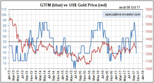
I developed a model that quantifies the extent that the fundamental backdrop is bullish for gold. The model was described in a June blog post and is based on the concept that gold’s value moves in the opposite direction to confidence in the financial system and/or the economy. The following chart compares the output of this model with the US$ gold price since the beginning of 2015.

Given that in addition to being affected by changes in the fundamental backdrop the gold price is also affected in the short-term by sentiment shifts, technical trading and knee-jerk reactions to random news events, the positive correlation evident on the following chart is as strong as reasonably could be expected. Furthermore, a positive correlation between the true fundamentals and the gold price is clearly evident back to 2002, which due to data limitations is as far back as I’ve been able to calculate the model.

In other words, the US$ gold price has done what it should have done over the years considering the shifts in the fundamental backdrop. This suggests that the effects of downward and upward manipulation (price manipulation happens in both directions) have been short-lived. It also suggests that there has been no EFFECTIVE price-suppression scheme.

I’ll end with an analogy. Bill Jones is accused of murdering Fred Smith and the prosecutor does a wonderful job of showing that Bill had the motive, means and opportunity to kill Fred. The problem is that Fred Smith is walking around, perfectly healthy.

Print This Post Print This Post

Gold, the stock market and the yield curve

October 16, 2017

The yield curve is a remarkably useful leading indicator of major economic and financial-market events. For example, its long-term trend can be relied on to shift from flattening to steepening ahead of economic recessions and equity bear markets. Also, usually it will remain in a flattening trend while a monetary-inflation-fueled boom is in progress. That’s why I consider the yield curve’s trend to be one of the true fundamental drivers of both the stock market and the gold market. Not surprisingly, when the yield curve’s trend is bullish for the stock market it is bearish for the gold market, and vice versa.

A major steepening of the yield curve will have one of two causes. If the steepening is primarily the result of rising long-term interest rates then the root cause will be rising inflation expectations, whereas if the steepening is primarily the result of falling short-term interest rates then the root cause will be increasing risk aversion linked to declining confidence in the economy and/or financial system. The latter invariably begins to occur during the transition from boom to bust.

A major flattening of the yield curve will have the opposite causes, meaning that it could be the result of either falling inflation expectations or a general increase in economic confidence and the willingness to take risk.

On a related matter, the conventional wisdom is that a steepening yield curve is bullish for the banking system because it results in the expansion of banks’ profit margins. While superficially correct, this ‘wisdom’ ignores the reality that one of the two main reasons for a major steepening of the yield curve is widespread, life-threatening problems within the banking system. For example, the following chart shows that over the past three decades the US yield curve experienced three major steepening trends: the late-1980s to early-1990s, the early-2000s and 2007-2011. All three of these trends were associated with economic recessions, while the first and third got underway when balance-sheet problems started to appear within the banking system and accelerated when it became apparent that most of the large banks were effectively bankrupt.

Here’s an analogy that hopefully helps explain the relationship (under the current monetary system) between major yield-curve trends and the economic/financial backdrop: Saying that a steepening of the yield curve is bullish because it eventually leads to a stronger economy and generally-higher bank profitability is like saying that bear markets are bullish because they eventually lead to bull markets; and saying that a flattening of the yield curve is bearish because it eventually — after many years — is followed by a period of severe economic weakness is like saying that bull markets are bearish because they always precede bear markets.

yieldcurve_161017

Both rising inflation expectations and increasing risk aversion tend to boost the general desire to own gold, whereas gold ownership becomes less desirable when inflation expectations are falling or economic/financial-system confidence is on the rise. Consequently, a steepening yield curve is bullish for gold and a flattening yield curve is bearish for gold.

The US yield curve’s trend has not yet reversed from flattening to steepening, meaning that its present situation is bullish for the stock market and bearish for the gold market. However, the yield curve is just one of seven fundamentals that factor into my gold model and one of five fundamentals that factor into my stock market model.

Print This Post Print This Post

Updating gold’s true fundamentals

October 11, 2017

Last week I posted a short piece titled “A silver price-suppression theory gets debunked“, the main purpose of which was to direct readers to a Keith Weiner article disproving that the silver price had been dominated by the “naked” short-selling of futures. My brief post rattled the cage of GATA’s Chris Powell, who made an attempt at a rebuttal early this week and in doing so proved that 1) he doesn’t understand what arbitrage is and how it affects prices, and 2) he doesn’t understand what fundamental and technical analysis are (he seems to believe that any analysis that uses charts to display data is the ‘technical’ variety).

My approach to the gold market involves fundamentals, sentiment and technicals in that order, except when sentiment is extreme in which case it takes priority. To give non-TSI subscribers an idea of what I do, here’s a brief excerpt from the TSI commentary that was published on 8th October:

Last week, two of the seven components of our Gold True Fundamentals Model (GTFM) flipped from bullish to bearish. We are referring to the bond/dollar ratio, which broke below its moving demarcation level, and the real interest rate (the 10-year TIPS yield), which broke above its moving demarcation level. As a result, five of the seven components are now bearish and the GTFM is well into bearish territory. Here’s the updated chart:

The gold market responds more immediately, directly and accurately to changes in the fundamental backdrop than any other major financial market. This means that there is often an easy-to-identify fundamental reason for any sizable multi-week move in the gold price, but it also means that changes in the fundamental backdrop often say more about the past than the future. For example, the fact that the fundamental backdrop was gold-bearish at the end of last week doesn’t imply that there will be additional short-term weakness in the gold price. Instead, it explains the weakness that has already happened.

That being said, an understanding of the true fundamental drivers of the gold price can be used to assess the future prospects for the gold price. For example, five of the seven components of the GTFM are either directly or indirectly influenced by the bond market, with T-Bond strength generally acting to shift these components in the gold-bullish direction and T-Bond weakness generally acting to shift these components in the gold-bearish direction. Therefore, a strong expectation regarding the future direction of the T-Bond price can feed into an assessment of gold’s risk/reward.

For example, it was partly the expectation of T-Bond weakness, potentially exacerbated by the Fed taking its first genuine step along the monetary tightening path, that three weeks ago caused us to become sufficiently concerned about gold’s short-term risk/reward to suggest buying some put-option insurance. This was despite the GTFM being well into gold-bullish territory at the time.

It is now the expectation of a T-Bond rebound that causes us to view gold’s short-term risk/reward as being skewed towards reward, despite the GTFM being well into gold-bearish territory.

Print This Post Print This Post

Blatant statistical bias: Gun ownership vs. gun deaths

October 9, 2017

This post has nothing to do with the US Second Amendment or my opinion on whether gun ownership should be legal. It’s about the presentation of gun-related death statistics in a way that supports a political position rather than provides relevant information.

The following chart from a recent post at ritholtz.com compares the number of gun-related deaths to the number of guns per 100 people across many countries. It naturally shows that the country with by far the highest rate of gun ownership (the US) has by far the highest rate of gun-related deaths.

The above chart would be presented for only one reason: to persuade people that the US needs stricter gun control. However, the chart does not make the case for stricter gun control in even a small way. This is because the charted comparison is meaningless.

Obviously, the greater the availability of guns the higher the proportion of gun-related deaths. A country with zero guns will have zero gun-related deaths and a country in which everyone owns a gun will have a significant number of gun-related deaths. This is not evidence that the first country is safer than the second country.

Also, not all gun-related deaths are equal. There is, for example, a huge difference between someone using a gun to take his own life and someone using a gun to take someone else’s life. Lumping all gun-related deaths together is therefore disingenuous. It is part of a deliberate effort to mislead.

The relevant comparison isn’t the gun ownership rate and the gun-related death rate, it’s the gun ownership rate and the total homicide rate or the violent crime rate. Evidence that a higher rate of gun ownership led to a higher rate of homicide and/or a higher rate of violent crime would not prove that stricter gun control was desirable, but at least it would be relevant to the debate.

The following charts from a 2014 article at crimeresearch.org contain relevant information. These charts compare homicide rates and gun ownership rates across countries. They show that the US has a much higher gun ownership rate than average and a slightly higher homicide rate than comparable countries. The slightly higher homicide rate could be due to the higher rate of gun ownership, but it could also be due to other factors.

Screen Shot 2014-03-31 at Monday, March 31, 3.17 AM

OECD and Small Arms Survey

As mentioned at the start, this post has nothing to do with my opinion on whether the US should have stricter gun control laws. It’s about how statistics are abused to influence opinions and promote agendas.

Print This Post Print This Post

A silver price-suppression theory gets debunked

October 6, 2017

Embracing the belief that a bank or a cartel of banks has suppressed the prices of gold and silver for decades via the short-selling of futures contracts is like adopting a child. It’s a lifetime commitment through thick and thin, meaning that once this belief takes hold there is no amount of evidence or logic that can dislodge it.

Entering a debate with someone who is incapable of being swayed by evidence that invalidates their position is a waste of time and energy, so these days I devote no TSI commentary space and minimal blog space to debunking the manipulation-centric gold and silver articles that regularly appear. However, Keith Weiner has taken on the challenge in a recent post.

Keith’s article is brilliant. In essence, it proves that the silver market has NOT been dominated by the “naked” short-selling of futures. His arguments might not be as interesting as many of the manipulation stories, but they have the advantage of being based on facts and logic.

Don’t get me wrong; for as long as I can remember it has been apparent to me that gold, silver and all the other important financial markets are manipulated. However, it is also apparent to me that the price manipulation happens in both directions and never overrides the fundamentals for long. Of course, to see that this is the case you first have to know what the true fundamentals are.

Print This Post Print This Post

The Laffer Curve is misleading and dangerous

October 3, 2017

The logic underlying the Laffer Curve is that the greater the tax on production, the lesser the amount of production. As a broad-brushed economics principle this is reasonable, but the Laffer Curve itself is bogus. Unfortunately, this bogus curve is being used to justify bad government policy.

Before I get into why it is bogus and how it is being used to justify bad policy, here is a representation of the Laffer Curve from an Investopedia article:

Laffer Curve

And here is how the Laffer Curve is described in the above-linked article:

The Laffer Curve suggests that, as taxes increase from low levels, tax revenue collected by the government also increases. It also shows that tax rates increasing after a certain point (T*) would cause people not to work as hard or not at all, thereby reducing tax revenue. Eventually, if tax rates reached 100%, shown as the far right on his curve, all people would choose not to work because everything they earned would go to the government. Governments would like to be at point T*, because it is the point at which the government collects maximum amount of tax revenue while people continue to work hard.

One of the problems with the Laffer Curve is that the relationship between tax rates and tax revenue cannot be expressed as a simple curve. In fact, it can’t be expressed by any curve. This is because tax revenue is affected by a myriad of variables, not just the average tax rate. However, there are much bigger problems.

A second problem is that the Laffer Curve puts the focus on maximising government revenue when the focus of economists should be on maximising living standards. A related problem is that by putting the focus on tax rates the Laffer Curve takes the focus away from what really matters, which is the total amount spent by the government. All else remaining the same, higher government spending combined with a lower average tax rate is worse for the economy than lower government spending combined with a higher average tax rate. The reason is that if the government is running a deficit, then reducing the tax rate and simultaneously increasing government spending will quicken the pace at which private-sector savings are siphoned to the government. This happens because a government deficit can only be funded by private-sector savings.

Another problem is that there is often a big difference between the official tax rate and the effective tax rate. For example, the US corporate tax rate is presently 35%, but the average rate of corporate tax actually paid in the US is only 22%. For the purpose of this discussion let’s assume, however, that a change in the tax rate would initially lead to a proportional change in the amount of tax being paid. That is, let’s assume for the sake of argument that a 5% reduction in the US corporate tax rate would initially lead to an average reduction of 5% in the corporate tax burden. Having made this assumption we get to an additional problem.

The additional problem is that the Laffer Curve implies a potential outcome that is, as far as I can tell, impossible. If the Laffer Curve is right, then the government taking less money from the private sector potentially would result in both the government and the private sector ending up with more money. Unless I am missing something this could only be possible if the money supply were to increase, meaning that at its core the Laffer Curve relies on a form of monetary illusion.

The biggest problem of all, though, is that the Laffer Curve is downright dangerous to the extent that it seemingly removes the need to implement cuts in government spending to fund cuts in taxes. Thanks to the support provided by this bogus curve, unscrupulous and/or ignorant politicians can promote tax-cutting plans that have no offsetting spending cuts based on the idea that lower tax rates will eventually bring about a counter-balancing increase in tax revenue. The potential result is a tax-cutting plan that quickens the pace at which private-sector savings are siphoned to the government, that is, a tax-cutting plan that leads to slower economic progress.

Print This Post Print This Post