Print This Post Print This Post

Why it’s different this time

May 29, 2018

[The following is an excerpt from a commentary posted at TSI last week.]

One of the financial world’s most dangerous expressions is “this time is different”, because the expression is often used during investment bubbles as part of a rationalisation for extremely high market valuations. Such rationalisations involve citing a special set of present-day conditions that supposedly transforms a very high valuation by historical standards into a reasonable one. However, sometimes it actually is different in the sense that all long-term trends eventually end. Sometimes, what initially looks like another in a long line of price moves that run counter to an old secular trend turns out to be the start of a new secular trend in the opposite direction. We continue to believe that the current upward move in interest rates is different, in that it is part of a new secular advance as opposed to a reaction within an on-going secular decline. Here are two of the reasons:

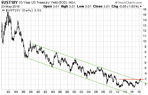
The first and lesser important of the reasons is the price action, one aspect of which is the performance of the US 10-year T-Note yield. With reference to the following chart, note that:

a) The 2016 low for the 10-year yield was almost the same as the 2012 low, creating what appears to be a long-term double bottom or base.

b) The 10-year yield has broken above the top of a well-defined 30-year channel.

c) By moving decisively above 3.0% last week the 10-year yield did something it had not done since the start of its secular decline in the early-1980s: make a higher-high on a long-term basis.

The more important of the reasons to think that the secular interest-rate trend has changed is the evidence that the bond market’s performance from early-2014 to mid-2016 constituted a major blow-off. The blow-off and the resulting valuation extreme are not apparent in the US bond market, but they are very obvious in the euro-zone bond market.

In the euro-zone, most government debt securities with durations of 2 years or less rose in price to the point where they had negative yields to maturity, and some long-term bonds also ended up with negative yields. For example, the following chart shows that the yield on Germany’s 10-year government bond fell from around 2% in early-2014 to negative 0.25% in mid-2016.

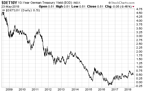
Although yields have trended upward in the euro-zone since Q3-2016, German government debt securities with durations of 5 years or less still trade with negative yields to maturity. Even more remarkable considering that Italy’s new government is contemplating a partial debt default and a large increase in the budget deficit, Italy’s 2-year government bond yield moved out of negative territory only two weeks ago and is about 220 basis points below the equivalent US yield. To be more specific, you can buy a US 2-year Treasury note today and get paid about 2.5% per year or you can buy an Italian government 2-year note today and get paid about 0.3% per year.

Why would anyone lend money to the Italian government for 2 years at close to 0% today when there is a non-trivial chance of default during this period? Why would anyone have lent money to the Italian government or even to the more financially-sound European governments over the past three years at rates that guaranteed a nominal loss if the debt was held to maturity?

There are two reasons, the first being the weakness of the euro-zone banking system. The thinking is that you lock in a small loss by purchasing government bonds with negative yields to maturity, but in doing so you avoid the risk of a large or even total loss due to bank failure (assuming the alternative is to lend the money to a private bank). The main reason, however, is the ECB’s massive bond-buying program. This program was widely anticipated during 2014 and came into effect in early-2015.

With the ECB regularly hoovering-up large quantities of bonds almost regardless of price, speculators could pay ridiculously-high prices for bonds and be safe in the knowledge that they could offload their inventory to the ECB at an even higher price.

Negative interest rates and negative yields-to-maturity could not occur in a free market. It took the most aggressive central-bank interest-rate manipulation in history to bring about the situation that occurred in Europe over the past few years.

We don’t think it’s possible for the ECB to go further without completely destroying the euro-zone’s financial markets. Also, if it isn’t obvious already it should become obvious within the next couple of years that the aggressive bond-buying programs conducted by the ECB, the Fed and other central banks did not work the way they were advertised. Therefore, even if it were technically possible for the major central banks to go further down the interest-rate suppression path, they won’t be permitted to do so.

That’s why it’s a very good bet that the secular downward trend in interest rates is over.

Print This Post Print This Post

Incomplete silver COT analysis, revisited

May 21, 2018

In a blog post a week ago I discussed why silver’s Commitments of Traders (COT) situation was nowhere near as bullish as it had been portrayed in numerous articles over the preceding two months. This prompted some criticism that involves a misunderstanding of how I use the COT data. Before I address the criticism, a brief recap is in order.

As stated in last week’s post, the enthusiastically-bullish interpretation of silver’s COT situation fixated on the positioning of large speculators (“NonCommercials”) in Comex silver futures. It was based on the fact that over the past two months the large specs had reduced their collective net-long silver exposure to its lowest level in a very long time, indicating that these traders had become more pessimistic about silver’s prospects than they had been in a very long time. This was clearly a bullish development given the contrary nature of speculative sentiment.

I then explained that two components of silver’s overall COT situation cast doubt on the validity of the bullish interpretation.

The first was that near important bottoms in the silver price the open interest (OI) in silver futures tends to be low, but in early-April of this year the OI hit an all-time high.

The second was that whereas the positioning of large specs in silver futures pointed to depressed sentiment, the positioning of small speculators (“NonReportables”) pointed to extreme optimism. This was evidenced by the fact that over the past two months these traders (the proverbial ‘dumb money’) had, as a group, accumulated their greatest net-long exposure in 9 years. It would be very unusual for a big rally to begin at the time when the ‘dumb money’ was positioned for a big rally.

The latest COT report showed minimal change in the positioning of the small specs. As illustrated by the following chart from goldchartsrus.com, their collective net-long exposure is down from its late-March peak but remains near the top of its 3-year range (and its 10-year range).

The main criticism of last week’s blog post was that the size of the total “NonCommercial” (large-spec) position is about 10-times the size of the total “NonReportable” (small-spec) position and therefore that what the “NonCommercials” are doing is an order of magnitude more important than what the “NonReportables” are doing.

My response is: not if the COT information is being used as a sentiment indicator, which is the only way I use it.

The reason it is useful to know the sentiment of the small traders in any financial market is NOT that these traders are the movers and shakers in the market. They obviously aren’t. If they were they wouldn’t be “small” traders and wouldn’t be classed as “NonReportables” in the COT reports. It is useful to know the sentiment of these minor players because as a group they tend to be wrong when they become extremely bullish or extremely bearish. They are the ‘dumb money’. As I wrote last week and repeated above, it would be very unusual for a big rally to begin at the time when the ‘dumb money’ was positioned for a big rally.

Not surprisingly, then, there was no big rally (or any rally worth trading) in the silver market over the past two months.

Print This Post Print This Post

Incomplete silver COT analysis

May 14, 2018

During March and April a number of articles appeared at precious-metals-focused web sites describing the silver market’s Commitments of Traders (COT) situation as extremely bullish. However, this unequivocally bullish interpretation overlooked aspects of the COT data that were bearish for silver. Taking all aspects of the data into consideration, my interpretation at the time (as presented in TSI commentaries) was that silver’s COT situation was neutral and that the setup for a large rally was not yet in place.

The enthusiastically-bullish interpretation of silver’s COT situation fixated on the positioning of large speculators in Comex silver futures. As illustrated by the following chart, over the past two months the large specs (called “NonCommercials” on the chart) first went ‘flat’ and then went net-short. This suggested that large specs had become more pessimistic about silver’s prospects than they had been in a very long time, which was clearly a bullish development given the contrary nature of speculative sentiment.

silverCOT_largespec_140518
Chart source: http://www.goldchartsrus.com/

However, two components of silver’s overall COT situation cast doubt on the validity of the bullish interpretation.

The first is that near important bottoms in the silver price the open interest (OI) in silver futures tends to be low, but in early-April of this year the OI hit an all-time high.

The second and more significant is that whereas the positioning of large specs in silver futures pointed to depressed sentiment, the positioning of small specs (the proverbial dumb money) pointed to extreme optimism. This is evidenced by the following chart, which shows that over the past two months the small specs (called “NonReportable” on the chart) reached their greatest net-long exposure in 9 years. It would be very unusual for a big rally to begin at the time when the ‘dumb money’ was positioned for a big rally.

silverCOT_smallspec_140518
Chart source: http://www.goldchartsrus.com/

The upshot is that silver’s COT situation was not price-supportive at any stage over the past two months. This is mainly because the bullish implications of the unusually-low net-long exposure of large specs was counteracted by the bearish implications of the unusually-high net-long exposure of small specs.

Print This Post Print This Post

US Recession Watch

May 7, 2018

[The following is an excerpt from a commentary posted at TSI last week]

The US economic expansion that began in mid-2009 has been much weaker than average, but, as indicated by the chart displayed below, it is also much longer than average. In fact, it is simultaneously the weakest and the second-longest expansion on record. Due to the advanced age of the expansion and the signs of weakness that have appeared over the past three months in economic statistics and the stock market, recession warnings are becoming more common. However, when we take an impartial look at the most reliable leading indicators of recession we arrive at the conclusion that these warnings are premature.


Chart source: http://realinvestmentadvice.com/bull-markets-actually-do-die-of-old-age/

The three leading indicators of US recession that we care about are the ISM New Orders Index (NOI), Real Gross Private Domestic Investment (RGPDI) and the yield curve. Not one of these indicators is close to giving a recession warning, which is why we say that the increasingly-common warnings of recession are premature.

The NOI, for instance, has declined each month since making a 13-year high in December-2017, but it remains far above the level that it would have to drop below (the red line on the following chart) to warn of a recession.

Also, there are not even tentative signs of major trend reversals in either RGPDI or the yield curve. That’s because last month the US yield curve became its flattest in more than 10 years (a recession is signaled by a major shift from flattening to steepening) and because the data published at the end of last week revealed that RGPDI hit a new all-time high in Q1-2018. RGPDI’s trend generally reverses downward at least two quarters prior to the start of a recession.

Note that the vertical red lines on the following chart mark the starting points of the last two recessions.

Based on the latest data, we roughly estimate the recession start-time probabilities as follows:
- Q2-2018: 0%
- Q3-2018: 10%
- Q4-2018: 30%
- Some time in 2019: >80%

The main reason for our high 2019 recession probability estimate is the decline in the G2 (US plus euro-zone) monetary inflation rate illustrated by the following chart. The inflation rate bounced in March, but it’s likely that the preceding decline was large enough to bring the artificial boom to an end.

Print This Post Print This Post