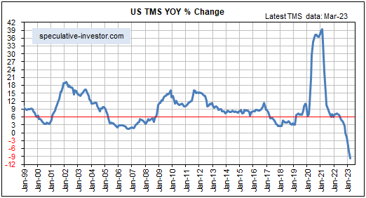
[This blog post is an excerpt from a recent commentary at https://speculative-investor.com/]
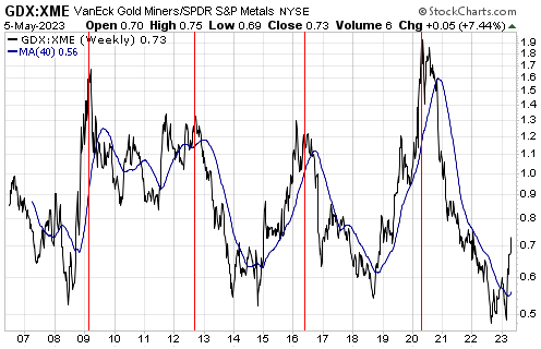
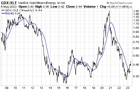
Short-term moves can create opportunities to scale in or scale out, but the big picture always should be kept in mind. For the gold mining sector, this means keeping in mind the high probability that a cyclical bull market is underway. This cyclical trend should result in large additional gains by gold mining stocks in nominal terms and relative to most other stocks. With regard to relative performance, the following two weekly charts give some idea as to the amount by which gold mining stocks could outperform other commodity-related stocks over the next 6-12 months.
The first chart shows that gold mining stocks (represented by GDX) doubled-bottomed relative to general mining stocks (represented by XME) between August of last year and February of this year. Significant gains in the GDX/XME ratio have occurred already, but based on the historical record the ratio could double from here prior to making its next major peak. As mentioned in previous TSI commentaries, the cyclicality of this ratio points to the gold sector’s next major relative-strength peak occurring between late-2023 and mid-2024.
The second chart shows that the gold sector reversed upward relative to the oil sector (represented by XLE) during the final quarter of last year. This chart suggests that the new trend involving strength in gold stocks relative to oil stocks is still in its infancy.
In case what we’ve written above and in many previous commentaries is not clear, the focus of most investing/speculating should be on gold and the related assets (silver and the gold/silver mining stocks). This has been the case for the past six months, it is the case now and it likely will be the case for the next six months.
For equity traders, this means that the gold mining sector should be prioritised when planning portfolio additions. However, it doesn’t mean that everything else should be ignored and that your entire portfolio should consist of gold/silver stocks. With regard to “everything else”, we note that the fundamentals for the oil tanker sector remain very bullish, the cannabis sector is starting to shows signs of life, it is important to have exposure to energy (oil, coal, uranium and natural gas) and it would make sense to have some exposure to commodities such as lithium and the REEs.