
[This blog post is an excerpt from a recent commentary at www.speculative-investor.com]
While it is true that prices are still rising at above-average rates in some parts of the US economy, this should be expected. The reality is that in some parts of the economy it takes longer than in others for demand and/or supply to respond to changing monetary conditions. That central bankers choose to focus on these slower-to-respond sectors is a problem we’ve addressed many times in the past. Our purpose today is to highlight some of the signs that monetary tightness is taking a substantial toll.
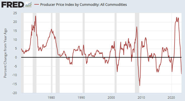
Commodity prices tend to lead producer prices for finished goods and producer prices for finished goods tend to lead consumer prices on both the way up and the way down. Therefore, the cyclical “inflation” up-swings and down-swings should become evident in commodity prices first and consumer prices last. In this respect the Producer Price Index (PPI) charts displayed below and the CPI chart included in last week’s Interim Update show that the current situation is not out of the ordinary, despite the extraordinary monetary machinations of the past few years.
The following monthly chart shows that over the past 12 months the year-over-year percentage change in the PPI for commodities has collapsed from near a 50-year high to near a 50-year low. We are now seeing a level of ‘commodity price deflation’ that since 1970 was only exceeded near the end of the Global Financial Crisis of 2007-2009.
The next chart shows the year-over-year percentage change in the PPI for Finished Goods Final Demand. Here we also see a collapse over the past 12 months from high ‘price inflation’ to ‘price deflation’.
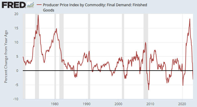
It’s likely that the year-over-year rate of change in producer prices has just bottomed, because an intermediate-term downward trend in the oil price kicked off in June of last year. Just to be clear, we doubt that prices have bottomed, but over the months ahead they probably will decline at a slower year-over-year pace. However, the declines in producer prices that have happened to date suggest that the growth rate of the headline US CPI, which was 3.0% last month, will drop to 1% or lower within the next few months.
As an aside, there is nothing inherently wrong with falling prices, as lower prices for both producers and consumers is a consequence of economic growth. The problem at the moment is that prices are being driven all over the place by central bankers.
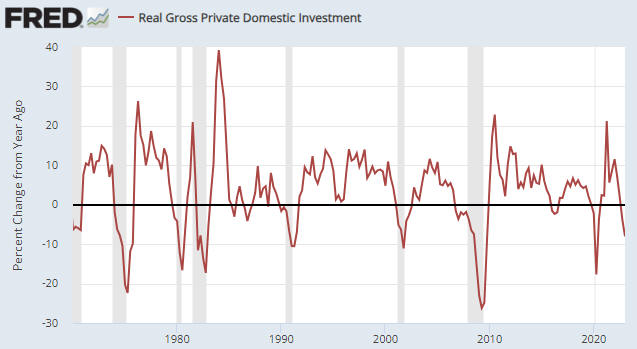
Historic ‘deflation’ in producer prices is one sign that monetary tightness is taking a substantial toll. While this price deflation could be viewed as a positive by those who are not within the ranks of the directly-affected producers, other signs are definitively negative. For example, the following chart shows that the year-over-year percentage change in Real Gross Private Domestic Investment (RGPDI) has plunged to a level that since 1970 has always been associated with an economy in recession.
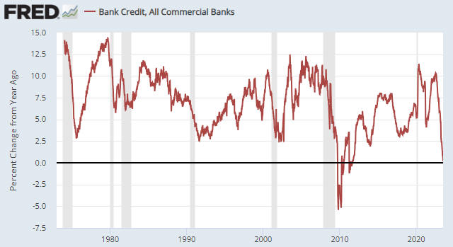
For another example, the year-over-year rate of commercial bank credit expansion has dropped to zero. As illustrated by the following chart, this is very unusual. The chart shows that in data going back to 1974, the annual rate of commercial bank credit growth never got below 2.5% except during the 2-year aftermath of the Global Financial Crisis.
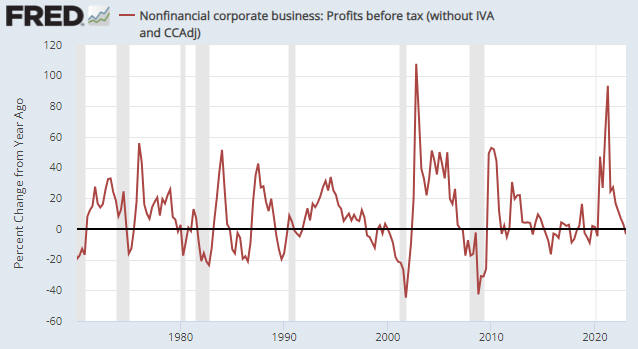
For a third example, the next chart shows that the annual rate of change of US corporate profits has crashed from a stimulus-induced high during the first half of 2021 to below zero. Moreover, the line on this chart probably will be much further below zero after the latest quarterly earnings are reported over the next several weeks.
The above charts point to economic contraction, but the performances over the past four months of high-profile stock indices such as the S&P500 and NASDAQ100 dominate the attentions of many observers of the financial world and at present these indices are painting a different picture. They are suggesting that monetary conditions are not genuinely tight and that the economy is in good shape. How is this possible?
Part of the reason it is possible is that ‘liquidity’ has been injected into the financial markets despite the shrinkage in the economy-wide money supply. We note, in particular, that $514B has exited the Fed’s Reverse Repo (RRP) Facility over the past six weeks, including about $300B over just the past two weeks. Another part of the reason is that the stock market keeps attempting to discount an about-face by the Fed. A third reason is simply that the senior stock averages are not representative of what has happened to the average stock. Related to this third reason is that there are money flows into index-tracking funds every month that boost the relative valuations of the stocks with the largest market capitalisations.
We end by cautioning that just because something hasn’t happened yet, doesn’t mean it isn’t going to happen. It’s likely that eventually the monetary tightening will reduce the prices of almost everything.