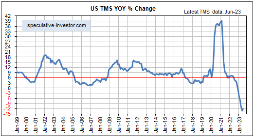
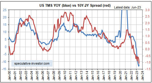
[This blog post is an excerpt from a recent commentary at speculative-investor.com]
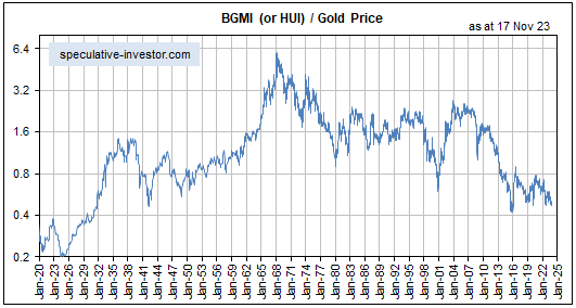
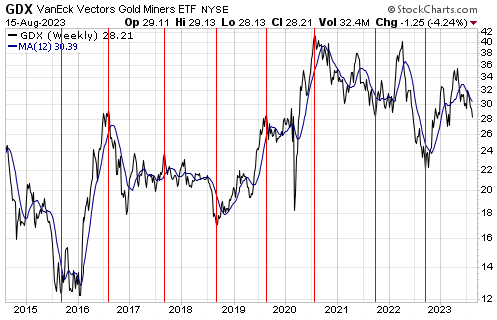
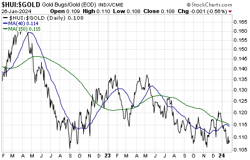
The HUI peaked at over 600 way back in 2011 with the gold price about $100 lower than it is today. However, this provides no information whatsoever regarding the HUI’s current value or upside potential. The reason is that the average cost of mining gold is much higher now than it was in 2011. Due to the ever-increasing cost of mining gold, over time it takes a progressively higher gold price to justify the same level for the HUI. Putting it another way, due to the increasing costs of mining gold and building new gold mines, the price of the average gold mining share is in a long-term downward trend relative to the price of gold. An implication is that the HUI isn’t necessarily cheap today just because it happens to be more than 60% below its 2011 level.
Over periods of two years or less, however, the ratio of a gold mining index such as the HUI to the price of gold bullion can be indicative of whether gold stocks are cheap or expensive. This is because the average cost of mining gold usually doesn’t change by a lot over periods of less than two years.
The following daily chart of the HUI/gold ratio suggests that at the moment they are cheap. In particular, the chart shows that at the end of last week the HUI/gold ratio was near the bottom of its 2-year range — very close to where it bottomed in September-2022 and October-November-2023.
This doesn’t mean that a substantial rally is about to begin. On the contrary, in the absence of a major geopolitical scare we doubt that there will be anything more than a countertrend rebound over the next few weeks. This is because the risk-on trend is still very much intact in the stock market, the gold/oil ratio has begun to trend downward due to temporary strength in the oil market and a downward correction in the bond market has not yet run its course. What it means is that in the short-term there is not much additional scope for gold mining stocks to weaken relative gold.
By the way, we did not expect that the HUI/gold ratio would re-visit its 2022-2023 lows at this time. Our expectation was for a normal correction from the late-December high, which would have taken the HUI/gold ratio no lower than its 40-day MA (the blue line on the chart) before the short-term upward trend resumed.
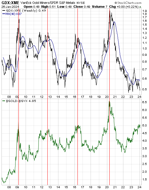
Gold mining stocks also look cheap at the moment relative to general mining stocks. This is evidenced by the following chart, which shows that the GDX/XME ratio has almost dropped back to its lows of 2022 and 2023 even though gold has been trending upward relative to the Industrial Metals Index (GYX) since the first half of 2022. The comparison of the GDX/XME ratio and the gold/GYX ratio suggests that gold stocks have some catching up to do.
A cycle peak for the GDX/XME ratio is ‘due’ this year, so the catching-up should begin soon. We suspect that gold mining stocks will reach their next cycle peaks relative to general mining stocks in the same way that a character in an Ernest Hemmingway novel described how he went bankrupt: “Gradually and then suddenly.”
So, a reasonable argument can be made that gold mining stocks, as a group, are cheap right now. At least, on an intermediate-term basis they are cheap relative to gold bullion and general mining stocks. This provides no information about likely performance over the next few weeks but creates a good set-up for large gains to be made within the next six months.