It may be ‘one and done’ for the Fed

January 31, 2022

[This blog post is an excerpt from a commentary published at TSI last week]

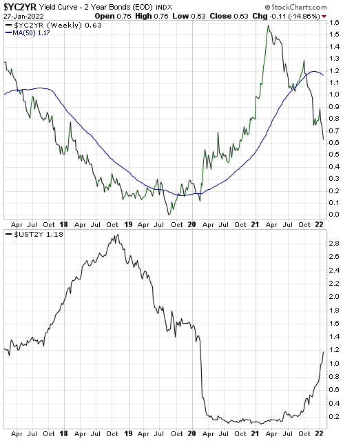
After the FOMC meeting on Wednesday 26th January, the Fed — via a post-meeting statement and a press conference — made it clear that it plans to end its bond monetisation (QE) program in early-March and hinted strongly that it will make its first rate hike of the cycle in mid-March (the time of the next FOMC meeting). The Fed also discussed its intention to significantly reduce its balance sheet.

What the Fed expects to do and what it ends up doing are often very different. Currently the Fed expects to hike its official interest rate targets in March-2022 as part of a rate-hiking campaign that will entail four rate hikes this year and more rate hikes next year. However, we suspect that the March-2022 hike will turn out to be this year’s only hike, because by May-June it will be clear to the backward-looking Fed that both “inflation” pressure and US economic growth peaked in 2021.

Moreover, we are confident that the Fed will never significantly reduce its balance sheet. It may well start to reduce its balance sheet over the remainder of this year by not replacing maturing debt securities, but it will react to the next serious economic decline the way it has reacted in the past. As a result, its balance sheet probably will be much larger in 18 months’ time than it is today.

The insurmountable problem faced by the Fed is that once an investment bubble of sufficient magnitude to affect a large part of the economy has been inflated, there is no way to let the air out of the bubble without wreaking economic havoc. To postpone the politically unacceptable economic havoc that would result from genuine deflation, every downturn must be met by progressively larger floods of new money. The endgame is hyperinflation and/or a reset involving the establishment of a new monetary system.

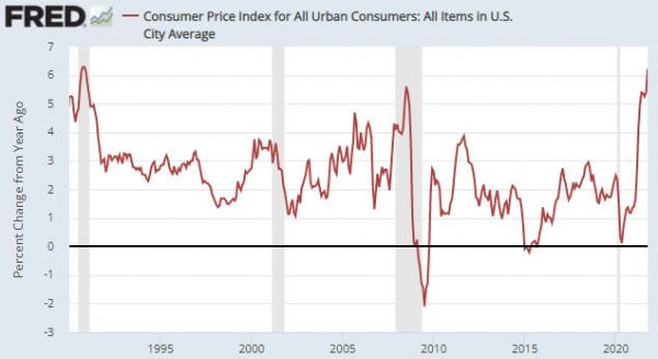
We think that the endgame is still many years away. In the meantime, be prepared for more waves of monetary inflation leading to increasingly obvious price inflation, interrupted by the occasional deflation scare.

Print This Post Print This Post

Understanding the yield curve

January 28, 2022

The yield curve is said to be steepening when the gap between long-term interest and short-term interest rates is increasing, but the meaning of the steepening is different depending on whether it is being driven by rising long-term interest rates or falling short-term interest rates. Also, the yield curve is said to be flattening when the gap between long-term interest and short-term interest rates is decreasing, but the meaning of the flattening is different depending on whether it is being driven by falling long-term interest rates or rising short-term interest rates. The two possible yield curve trends (steepening or flattening) and the two main ways that each of these trends can come about results in four different yield curve scenarios as outlined below.

1) A steepening curve driven by rising long-term interest rates (that is, a steepening of the curve along with flat or rising short-term interest rates).

This is indicative of rising inflation expectations. It tends to be bullish for commodities, cyclical sectors of the stock market and relatively high-risk equities and credit. It is bearish for long-dated treasuries.

2) A steepening curve driven by falling short-term interest rates.

This is indicative of declining liquidity and a general shift away from risk. It is bullish for all treasury securities (especially short-dated treasuries) and gold. It is bearish for almost all equities and especially bearish for cyclical and relatively high-risk equities. It is also bearish for commodities and high-yield credit.

3) A flattening curve along with rising short-term interest rates.

This is indicative of an increasing urgency to borrow short to lend/invest long and a general shift towards risk. It tends to be bullish for most equities and high-yield credit. It is bearish for gold and short-dated treasury securities.

4) A flattening curve driven by falling long-term interest rates (that is, a flattening of the curve along with flat or falling short-term interest rates).

This is indicative of declining inflation expectations and increasing aversion to risk. It tends to be bullish for gold, long-dated treasuries and relatively low-risk equities. It tends to be bearish for cyclical stocks and high-yield credit.

In general, scenarios 1 and 3 arise during economic booms, scenario 2 is a characteristic of an economic bust and scenario 4 occurs during a boom-to-bust transition.

The top section of the following chart shows that the 10yr-2yr yield spread, which is one of the most popular measures of the US yield curve, has been declining (indicating a flattening yield curve) since March of 2021. The bottom section of the same chart shows that the yield-curve flattening has occurred in parallel with a rising 2-year yield, meaning that for the past several months we have had yield curve scenario 3. This is evidence that the boom continues. However, a shift to yield curve scenario 4 (indicating a boom to bust transition) could happen soon.

yieldcurve_blog_280122

Print This Post Print This Post

The inflation peak is in the rear-view mirror

January 18, 2022

[This blog post is a brief excerpt from a TSI commentary published last week]

It was reported on Wednesday 12th January that the year-over-year growth rate of the US CPI hit a new post-1982 high of 7% in December-2021. However, garnering less attention was the fact that the month-over-month CPI growth rate peaked in June-2021, made a slightly lower high in October-2021 and in December-2021 was not far from its low of the past 12 months. The first of the following charts shows the month-over-month change in the US CPI. Of greater importance for financial market participants, the second of the following charts shows that inflation expectations (the rate of CPI growth factored into the Treasury Inflation Protected Securities market) is well down from its November-2021 peak and actually fell on Wednesday 12th January in the wake of the horrific headline CPI news.

We were very bullish on “inflation” back in April of 2020 when deflation fear was rampant; not because we were being contrary for the sake of being contrary but because central bank and government actions pretty much guaranteed that the CPI would be much higher within 12 months. Now, with inflation fear rampant, we expect to see increasingly obvious signs over the quarters ahead that the inflation threat has abated, not because we are being contrary for the sake of being contrary but because the monetary and fiscal situations stopped being pro-inflation many months ago.

It’s likely that the next round of accelerating inflation will emerge during 2023-2024.

Print This Post Print This Post

Oil fundamentals are still bullish, but…

January 10, 2022

[This blog post is a modified excerpt, including updated charts, from a TSI commentary published about three weeks ago]

The oil futures market remains in strong backwardation. The fact that the oil futures curve still has a steep downward slope (meaning: nearer contracts are priced well above later contracts) indicates that the physical supply situation is still ‘tight’. Moreover, oil supply probably will remain somewhat tight for at least the next two months due to the natural gas shortage in Europe and the resultant need to find a substitute fuel for electricity generation. This suggests that the oil price bottomed on a multi-month basis when it dropped to the low-US$60s in early-December. At the same time, macroeconomic considerations and intermarket relationships suggest that the October-2021 high near US$85 was the intermediate-term variety (a high that holds for at least 6 months).

With regard to the macroeconomic backdrop, as recently as two months ago inflation expectations were trending higher and the yield curve had not confirmed a shift from steepening to flattening. However, we now have evidence that inflation expectations peaked in November-2021 and confirmation of a trend reversal in the yield curve. Both of these changes remove macroeconomic supports for commodities, including oil.

Also, signs of declining growth expectations have begun to appear. It’s early days, but we view the recent performance of the XLY/XLP ratio as a ‘shot across the bow’.

By way of explanation, here’s what we wrote about the XLY/XLP ratio on 27th October:

The performance of the Consumer Discretionary ETF (XLY) relative to the performance of the Consumer Staples ETF (XLP) is a good indicator of whether stock market participants, as a group, are favouring growth or safety. Specifically, when the XLY/XLP ratio is trending upward it indicates that the market is tilting towards growth and when the XLY/XLP ratio is trending downward it indicates that the market is tilting towards safety. Consequently, when this ratio signals a trend reversal by breaking above a prior high or below a prior low, it is useful information.

Until late-November the XLY/XLP ratio was in a clear upward trend, indicating that the financial world was tilting towards growth. It hasn’t yet confirmed a downward trend reversal, but it has fallen far enough to negate the October upside breakout.

XLY_XLP_100122

With regard to intermarket relationships, the divergence between the oil price and the Canadian dollar (C$) sticks out. The following chart shows that the divergence was made substantially smaller by the late-November Omicron mini panic that caused the oil price to plunge from the mid-$70s to the low-$60s, but it hasn’t been eliminated. We note, in particular, that during December the oil price reversed upward from above its August low whereas the C$ made a new low for the year.

oil_C$_100122

The combination of the various influences suggests that the oil price will spend the next two months trading between the mid-$60s and the low-$80s. What happens after that will be determined by macroeconomic and supply developments that aren’t yet knowable.

Print This Post Print This Post

Inflation Expectations and the Metals

December 20, 2021

[This blog post is an excerpt from a commentary published at TSI last week]

Popular measures of inflation such as the CPI and the PPI are backward looking, but the financial markets are always trying to look forward. To be more specific, current prices in the financial markets are determined by what’s expected to happen in the future as opposed to what happened in the past. An implication is that prices in the financial markets are influenced to a far greater degree by changes in the expected future CPI (inflation expectations) than changes in the reported CPI.

The expected CPI is indicated by the TIPS (Treasury Inflation Protected Securities) market. For example, the following chart shows the expected CPI factored into the price of the 5-year TIPS. According to this measure, the market’s inflation expectations peaked in mid-November and made a 2-month low during the first half of this week.

Contrary to the opinions of many commentators on the financial markets, gold tends to underperform the industrial metals when inflation expectations are rising and outperform the industrial metals when inflation expectations are falling. Therefore, if inflation expectations have peaked then the Industrial Metals Index (GYX) should have peaked relative to gold.

The following chart comparison of the GYX/gold ratio and the Inflation Expectations ETF (RINF) shows that GYX peaked relative to gold in mid-October, meaning that the downward reversal in the GYX/gold ratio led the downward reversal in the expected CPI by about one month.

The sustainability of the recent downward reversal in inflation expectations is yet to be determined, but our guess is that it has marked the start of a trend that will continue for 6-12 months or longer. An implication is that it is time to start favouring gold over industrial metals.

Print This Post Print This Post

The status of gold’s “true fundamentals”

December 7, 2021

According to my Gold True Fundamentals Model (GTFM), the gold market’s fundamentals were bullish or trending positively from early-November of 2019 through to late-September of 2020 and were bearish or trending negatively from early-October of 2020 through to late-October of this year. As illustrated by the blue line on the following weekly chart, they turned upward in early-November and are now in bullish territory, albeit only slightly. Does the recent upturn constitute a major shift or a countertrend move within an overall environment that remains bearish for gold?

Before attempting to answer the above question, it is worth reiterating that I use the term “true fundamentals” to distinguish the fundamentals that actually matter from the largely irrelevant issues that many gold-market analysts and commentators focus on.

According to many pontificators on the gold market, gold’s fundamentals include the volume of metal flowing into the inventories of gold ETFs, China’s gold imports, the amount of “registered” gold at the Comex, India’s monsoon and wedding seasons, jewellery demand, the amount of gold being bought/sold by various central banks, changes in mine production and scrap supply, changes in the money supply and the CPI, and wild guesses regarding the activities of bullion banks. These things are distractions at best. For example, a gold investor/trader could have ignored everything that has been written over the past 20 years about the amount of gold in Comex warehouses and been none the worse for it.

On an intermediate-term (3-18 month) basis, there is a strong tendency for the US$ gold price to trend in the opposite direction to confidence in the US financial system and economy. That’s why most of the seven inputs to my GTFM are measures of confidence. Two examples are credit spreads and the relative strength of the banking sector. The model is useful, in that over the past two decades all intermediate-term upward trends in the gold price occurred while the GTFM was bullish most of the time and all intermediate-term downward trends in the gold price occurred while the GTFM was bearish most of the time.

However, upward corrections can occur in the face of bearish fundamentals and downward corrections can occur in the face of bullish fundamentals. For example, there was a substantial downward correction in the gold market in March of 2020 in the face of bullish fundamentals. Such corrections often are signalled by sentiment indicators.

Getting back to the question posed in this post’s opening paragraph, I suspect that we are dealing with a countertrend bullish move within an overall environment that remains bearish for gold. The reason is that although a couple of small cracks have appeared in the superficially-positive economic picture over the past few weeks, the preponderance of evidence still indicates that the US economic boom (monetary-inflation-fuelled increase in economic activity) is intact.

Major gold rallies occur during the economic bust and boom-to-bust transition phases of the long-term cycle. By the same token, gold tends to fare poorly, especially relative to the broad stock market and industrial commodities, during the boom phases of the long-term cycle. While the boom remains intact, the best that can be reasonably expected from gold is a multi-month rebound within a trading range or a long-term downward trend.

Print This Post Print This Post

Boom-Bust Cycle Update

November 23, 2021

In a 9th November blog post I wrote that the US TMS (True Money Supply) growth rate had fallen far enough to suggest that the next trend reversal in credit spreads from narrowing to widening would mark the start of a boom-to-bust transition rather than just an interruption to the boom. What’s the current situation?

Before answering the above question it’s worth reiterating that a trend reversal in credit spreads (from narrowing to widening) isn’t the only early warning that a boom-to-bust transition has begun for the US economy. As mentioned in previous blog posts (for example, HERE), another necessary signal is pronounced weakness in the Industrial Metals Index (GYX) relative to the gold price. In other words, prior to the end of a boom* there will be upward trend reversals in credit spread indicators such as the US High Yield Index Option-Adjusted Spread (HYIOAS) and a downward trend reversal in the GYX/gold ratio. As an aside, the most recent bust began in early-October of 2018 and ended in early-June of 2020.

The following daily chart shows the HYIOAS.

In early-July of this year the HYIOAS was at its lowest level in more than 10 years and not far from an all-time low. It spiked upward around the middle of July and then returned to near its low, where it remains (it ended last week at around 3.2%).

Note that a credit-spread reversal would be signalled by the HYIOAS making a higher short-term high AND moving back above 4%. The first of these criteria (the initial warning) would be triggered by a move above 3.5%.

HYIOAS_231121

The next chart shows the GYX/gold ratio. To generate a boom-to-bust warning the line on this chart would have to make a sustained break below its 200-day moving average.

GYX_gold_231121

Neither of the indicators that in the past have always warned prior to the start of a boom-to-bust transition for the US economy has triggered, although it would not take much additional weakness in GYX relative to gold for the GYX/gold ratio to generate a warning signal. This implies that the US economic boom that began during the second quarter of 2020 is intact. Furthermore, as things currently stand it looks like the start of a boom-to-bust transition is still at least a few months away.

*An economic boom is a period of generally rapid economic activity fuelled by monetary inflation. It does not necessarily involve sustainable economic progress. In fact, most of the apparent gains achieved during the boom tend to be relinquished during the subsequent bust.

Print This Post Print This Post

Reconciling high “inflation” and low bond yields

November 16, 2021

[This blog post is a slightly modified excerpt from a TSI commentary published last week]

The US government just reported a 6.2% year-over-year increase in the CPI (refer to the following chart). This was the largest increase since 1990 and the second-largest increase since 1982. Furthermore, nobody in their right mind believes that the CPI overstates the pace of US$ depreciation. How can this be happening in parallel with a yield of about 1.5% on the US 10-year T-Note and a yield of about 1.9% on the US 30-year T-Bond?

There’s a two-part answer to the above question, the first part of which is that the bond market expects the CPI to average only 2.7% over the next ten years. We know this is the case because 2.7% is the annual CPI increase factored into the current price of the 10-year TIPS. In other words, the bond market is anticipating a substantial pullback in the “inflation” rate from its current level. However, even a 2.7% rate of increase in the CPI is inconsistent with a current 10-year T-Note yield of around 1.5%. Based on today’s inflation expectations, the 10-year T-Note currently should be yielding at least 3.5%.

The other part of the answer is that the financial markets expect the Fed to do whatever it takes to cap the yields on US government bonds at well below the rates that would be consistent with the official “inflation” rate.

Given its unlimited ability to purchase assets with money that it creates out of nothing, the Fed is capable of keeping government bond yields pegged at unrealistically low levels for a long time. However, doing so would have very bearish implications for the US$ and very bullish implications for most US$-denominated prices. In particular, Fed policy that involved capping US government bond yields at low levels in the face of obvious evidence of high “inflation” would be extremely bullish for the US$ gold price.

Official Fed policy that involves capping bond yields at low levels in the face of persistently high “inflation” is not likely to be introduced over the next six months, but I suspect that it will become a major driver of market prices during 2023-2024.

Print This Post Print This Post

Setting the stage for the 2022 bust

November 9, 2021

[This blog post is an excerpt from a commentary posted at speculative-investor.com about two weeks ago]

The US financial system currently has an abundance of ‘liquidity’. We know that this is the case because US credit spreads are close to multi-decade lows. The probability of a liquidity crisis or crunch with credit spreads near their narrowest levels in decades is not just low, it is zero. However, the money-supply growth trend warns that a boom-to-bust transition could begin as soon as the first half of 2022, potentially setting the stage for a major financial-market event/crisis during the second half of 2022.

The US money-supply growth trend is illustrated by the following chart. The chart shows that the year-over-year rate of growth in US True Money Supply (TMS) peaked at almost 40% early this year and has since collapsed to around 7%.

We thought that the TMS growth rate would level out during September, but instead it extended its steep decline. The reason is that the Fed, via its Reverse Repo (RRP) program, removed $330B from the financial system over the course of the month. To put it another way, for every dollar the Fed added via its QE program during September it removed almost three dollars via its Reverse Repo program.

If not for the Fed’s additions to its RRP program in September, the TMS growth rate would have ended the month at 8.7% (slightly above the end-August level) instead of 7.0%. Furthermore, if not for all the money removed by the Fed via RRP’s since the program was initiated in March of this year, the TMS growth rate would now be 14.5% as opposed to 7.0%.

As an aside, the Fed hasn’t removed a lot of money ($1.43 trillion at the time of writing) from the US financial system over the past seven months in an effort to tighten monetary conditions; it has done so to address a problem that can be aptly described as a surplus of dollars. There has been a huge quantity of dollars ‘sloshing around’ the financial system looking for a zero-risk, temporary home with a small positive yield. The Fed’s RRP program has provided such a home.

All of the money removed by the Fed via RRP’s will be returned to the US financial system at some point (probably next year). However, the US TMS growth rate has fallen far enough to suggest that the next trend reversal in credit spreads from narrowing to widening will mark the start of a boom-to-bust transition rather than just an interruption to the boom.

By the same token, until the credit-spreads trend reversal happens it will be reasonable to assume that the boom is intact and that there won’t be anything more bearish than moderate corrections in the senior equity and commodity indices.

Print This Post Print This Post

Looking at oil from different perspectives

October 25, 2021

[This blog post is a modified excerpt from a commentary published at TSI about two weeks ago. We've updated the charts and prices to reflect the current market situation.]

Today we’ll take a brief look at oil through three different lenses: The long-term price-action lens, the physical supply-demand lens and the macro-economic lens.

The following chart shows the significance of the US$76-$77 price level above which oil has moved over the past few weeks. This price level acted as support during large downward corrections in 2011-2012 and capped the 2016-2018 rally.

The move above major resistance is not a short-term buy signal, because the market is ‘overbought’ (which, by the way, doesn’t guarantee that the price will fall, but does mean that the risk of new buying is relatively high). However, it is a reward for those who added to their oil exposure when the commodity and the related equities were ‘oversold’ at various times over the past three months and is consistent with our view that the cyclical advance will extend into 2022.

oil_251021

With regard to likely future performance, of far greater importance than the break above long-term resistance is that the physical supply situation remains unusually ‘tight’. We know this is the case because strong backwardation (meaning: nearer-dated contracts are priced well above later-dated contracts) prevails in the oil futures market. This is evidenced by the downward slope on the following chart. Strong backwardation can only arise and be sustained in the oil market during a period when the demand for oil is high relative to the currently available supply.

The most recent data on the following chart is for the situation at 14th October 2021, but the futures curve continues to have a steep downward slope. For example, at the time of writing oil for delivery in December of this year is priced at $84.55, whereas oil for delivery in December-2022 is priced at $72.58 and oil for delivery in December-2023 is priced at only $66.56.

Note that the prices of oil futures are NOT forecasts of where the spot price will be in the future. Instead, the futures price relative to the spot price reflects the cost of storage. Since the cost of storage is always above zero, the futures price will always be higher than the spot price unless there is a current shortage of the physical commodity.

oilfuturescurve_251021
Chart source: https://www.erce.energy/graph/wti-futures-curve/

Our last chart shows that the oil price and the Inflation Expectations ETF (RINF) usually trend in the same direction. This positive correlation is part and parcel of a broader positive correlation between commodity prices (as represented by indices such as GNX) and inflation expectations.

Both oil and inflation expectations have resumed their cyclical upswings following corrections during the second and third quarters of this year.

oil_RINF_251021

At the moment, the price action, the supply-demand fundamentals and the macro-economic backdrop (as reflected by inflation expectations) are saying the same thing. They are all saying that we should expect the oil price to continue its upward trend.

Print This Post Print This Post