Revisiting the most important gold fundamental

June 23, 2021

There are seven inputs to my Gold True Fundamentals Model (GTFM), one of which is an indicator of US credit spreads (a credit spread is the difference between the yield on a relatively high-risk bond and the yield on a relatively low-risk bond of the same duration). In a blog post on 12th April I wrote that if I had to pick just one fundamental to focus on at the moment, it would be credit spreads.

The average credit spread is the most reliable indicator of economic confidence. When economic confidence is high or in a rising trend, credit spreads will be narrow or in a narrowing trend. And when economic confidence is low or in a declining trend, credit spreads will be wide or in a widening trend. It therefore isn’t surprising that over the past 25 years there was a pronounced rise in US credit spreads prior to the start of every period of substantial weakness in the US economy and every substantial gold rally. This is as it should be.

Credit spreads being narrow or in a narrowing trend is a characteristic of an economic boom caused by creating lots of money out of nothing. In fact, the main reason for the popularity of inflation policy (pumping up the money supply) is that the policy initially leads to rising economic confidence as evidenced by narrowing credit spreads. It is only much later that the negative effects of the policy bubble to the surface, but by then enough time will have passed that the link between cause and effect will be obscured and the negative effects can be blamed on exogenous events as opposed to bad policy.

In my 12th April post I included a chart that showed a proxy for the average US credit spread. The chart’s message at the time was that credit spreads had been in a strong narrowing trend (reflecting rising economic confidence) for about 12 months and had become almost as low/narrow as they ever get. This implied that anyone who over the preceding several months had been betting on a large stock market decline or a large rally in the gold price had been betting against both logic and history. I pointed out that economic confidence was probably about as high as it would get, but that it could stay at a high level for more than a year.

An update of the same chart is displayed below. It shows that nothing has changed, in that over the ensuing period credit spreads essentially drifted sideways near their multi-decade lows. This means that the economic boom remains in full swing.

CreditSpread_230621

During an economic boom it isn’t a good idea to trade gold from the long side, except for the occasional multi-month trade after the gold market becomes ‘oversold’ in sentiment and momentum terms. However, if the economic boom is accompanied by rising inflation expectations and interest rates, as is the case with the boom that kicked off last year, it usually will pay to be long industrial commodities in general and energy in particular.

Print This Post Print This Post

When will the next US recession begin?

June 7, 2021

[This blog post is an excerpt from a TSI commentary published last week]

Our view for the past 11-12 months has been that last year’s US recession ended in June plus/minus one month, making it the shortest recession in US history. The latest leading economic data indicate that the recovery is intact and that the strong GDP growth reported for the first quarter of this year will continue.

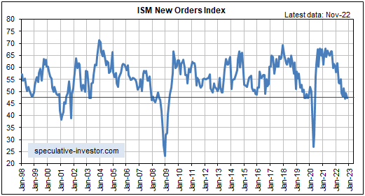
Of particular relevance, the following monthly chart shows that the ISM New Orders Index (NOI), one of our favourite leading economic indicators, remains near the top of its 20-year range. The ISM NOI leads Industrial Production by 3-6 months.

The performances of leading and coincident economic indicators show that the US economy remains in the boom phase of the boom-bust cycle, meaning that the economic landscape remains bullish for industrial commodities relative to gold. Therefore, the small amount of relative strength demonstrated by gold over the past two months is probably part of a countertrend move that will run its course within the next three months.

A year ago our view was that there would be a strong rebound in economic activity fueled by monetary stimulus, fiscal stimulus and the release of pent-up demand after COVID-related restrictions were removed, but that the rebound would be short-lived. Specifically, we were looking for the US economy to recover rapidly during the second half of 2020, level off during the first half of 2021 and return to recession territory by the first half of 2022. This view was revised in response to leading indicators and by October of last year we were expecting the period of strong growth to extend through the first half of 2021.

Based again on leading indicators, we now expect the period of above-average GDP growth to continue throughout 2021, albeit with a slower growth rate during the second half than during the first half. Furthermore, the probability of the US economy re-entering recession territory as soon as the first half of 2022 is now extremely low. To get a recession within the next 12 months there will have to be another shock of similar magnitude to the virus-related lockdowns of 2020.

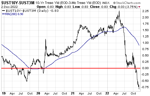
As far as what happens beyond the first half of next year, it’s largely pointless trying to look that far ahead. One thing we can say is that the current position of the yield curve suggests that the next US recession will not begin earlier than 2023. To further explain this comment we will make use of the following chart of the US 10yr-2yr yield spread, a good proxy for the US yield curve.

A major yield-curve trend reversal from flattening (indicated by a falling line on the chart) to steepening (indicated by a rising line on the chart) generally occurs during the 6-month period prior to the start of a recession. After that, what tends to happen is:

a) The yield curve steepens throughout the recession and for 1-2 years after the recession is over.

b) The yield curve peaks and a long (3-year +) period of curve flattening gets underway.

c) The curve eventually gets as flat as it is going to get and reverses direction, warning that a recession will begin within the ensuing 6 months.

Currently, there is a lot of scope for curve steepening prior to peak ‘steepness’. To be more specific, right now the 10-year T-Note yield is about 1.5% above the 2-year T-Note yield, but previous periods of curve steepening didn’t end until the 10-year T-Note yield was at least 2.5% above the 2-year T-Note yield. Moreover, history tells us that there will be a multi-year period of curve flattening between the peak in yield-curve steepness and the start of a recession.

We expect that the current economic cycle will be compressed, but it still could take years for the yield curve to return to the position where it is warning of recession.

Due to unprecedented manipulation of interest rates it could be different this time, meaning that the end of the current boom could coincide with a yield curve that contrasts with the typical pre-recession picture. However, regardless of what happens to the yield curve near the end of the current boom there will be timely warnings of a boom-to-bust transition in the real-time data, including an upward reversal in credit spreads. At the moment, such warnings are conspicuous by their absence.

Print This Post Print This Post

Changing with the times

May 24, 2021

[This blog post is an excerpt from a TSI commentary that was published last week]

Senior policymakers at the Fed assert that the “inflation” surge of the past several months will prove to be transitory, and it isn’t hard to find market analysts and economists who agree with this assessment. A point we want to make today is that anyone who has been financially positioned for the deflation or “disinflation” that supposedly will follow the period of “transitory inflation” has missed a great opportunity encompassing an inflationary burst of historic magnitude.

In the above sentence we didn’t use the word “historic” lightly. As evidence we present three charts from Yardeni.com.

The first chart shows that the ISM Prices-Paid Indices for both Manufacturing and Services are at 10-year highs and are close to multi-decade highs.

The next chart shows that the percent of small businesses that are raising their average selling prices is the highest since 1981. In other words, this indicator of price increases is at a 40-year high!

The final chart shows the average of prices paid and the average of prices received as determined by the Fed’s regional business surveys. Both Prices Paid and Prices Received are at multi-decade highs, but notice that the Prices Paid line has risen to a much greater extent than the Prices Received line. This means that profit margins are being compressed by the inflation.

It’s perfectly fine to have an opinion about what will happen in the future, but it’s important to position your portfolio in a way that will enable you to profit from the overarching trends currently in progress. Since the second half of March last year and especially since early November of last year the three inter-related trends that have dominated the financial markets are rising inflation expectations, rising economic confidence and US$ weakness. The combination of these trends is very bullish for commodity prices, both in fiat currency terms and in gold terms.

There are warning signs that the above-mentioned trends are in their final phases, but they haven’t ended yet. Therefore, at the moment it’s reasonable to be positioned based on the assumption that what worked over the past six months will continue to work, albeit with a ‘nod’ to the likelihood that some of the dominant trends could be near their ends. From our perspective, that ‘nod’ has involved building up exposure to gold. However, when the evidence of a general trend shift becomes clearer it will be important to change with the times and not doggedly stick with the positioning that was aligned with previous conditions. In other words, don’t make the mistake that was made over the past 7-14 months by the perennial US$ and T-Bond bulls.

Print This Post Print This Post

The Boom Continues

May 11, 2021

[This blog post is an excerpt from a TSI commentary published on 9th May 2021]

The major trends in monetary inflation result in a boom-bust cycle. In particular, a rising trend in the money-supply growth rate leads to increased consumption and investment spending, ushering-in the boom phase of the cycle. A subsequent decline in the rate of money-supply growth reveals the investing errors of the boom and leads to a liquidation process, which is the bust phase of the cycle. In other words, monetary inflation causes the boom and the boom causes the bust.

Once a boom is set in motion by creating lots of money out of nothing, a painful bust that eliminates all or most the boom’s apparent gains is inevitable. The only question is the timing. Even if the central bank tries to keep the boom going forever by maintaining a rapid pace of money-supply growth, all it will do is set the scene for the eventual bust to involve hyperinflation and a total economic breakdown.

Unfortunately, the timing question can’t be answered well in advance of the start of the boom-to-bust transition. However, there are indicators that usually generate warning signals early enough to be useful. Two such signals are credit spreads and the gold/commodity ratio.

When a boom is in progress, credit spreads are relatively narrow or in a narrowing trend and gold is relatively cheap or in a cheapening trend. As evidenced by the following chart, that’s exactly what has been happening over the past 13 months and especially over the past 6 months (the black line on the chart is a credit-spread indicator and the yellow line on the chart is the gold/commodity ratio). Furthermore, although gold has done well in US$ terms since late-March and ended last week at a 2-month high, relative to commodities (as represented by the GSCI Spot Commodity Index – GNX) it tested its 12-month low last week. With credit spreads near their narrowest levels in more than 12 months, this makes sense. It means that the US boom is intact.

When the boom is close to its end the gold/commodity ratio should start trending upward and credit spreads should start widening.

Print This Post Print This Post

The ‘V’ Recovery

May 5, 2021

In an article at the TSI Blog in May of last year we explained why the US economic rebound from the H1-2020 plunge into recession probably would look like a ‘V’. Our conclusion at that time was: “There will be a ‘V’ shaped recovery, but due to the destruction of real wealth stemming from the lockdowns the rising part of the V is bound to be much shorter than the declining part of the V. This will lead to a general realisation that life for the majority of people will be far more difficult in the future than it was over the preceding few years.” This assessment was close to the mark, but not totally correct.

During the few months after we posted the above-linked article at the TSI Blog our views regarding the likely strength and longevity of the economic rebound — as outlined in TSI commentaries — shifted. Specifically, in commentaries published at TSI between June and November of last year we began to anticipate a longer rebound with an acceleration of economic activity during the first half of 2021. This was due to a) the central bank’s promise to maintain accommodative monetary conditions for years despite the emerging evidence of an “inflation” problem, b) the eagerness of the US federal government to continue showering the populace with money, c) the expected natural release of pent-up demand as COVID-related restrictions were removed and d) the likelihood of the US government approving a multi-trillion-dollar infrastructure spending program regardless of the November-2020 election outcome. Due to this combination of factors, a full ‘V’ recovery has occurred when measured in GDP terms. This is illustrated by the following chart.

GDP_050521

The GDP rebound does not reflect sustainable progress. Due to the way that GDP is calculated, a dollar of counterproductive spending is the same as a dollar of productive spending. For example, if the government pays people to dig holes in the middle of nowhere and then fill them in, the payments will add to GDP even though the process wastes resources and adds nothing to the economy-wide pool of wealth. Over the past 12 months there has been a lot of counterproductive spending.

The popular economic indicator called “GDP” actually reflects money-supply growth more than it reflects economic progress. By simultaneously giving the money supply a hefty boost and pretending that the purchasing power of money is essentially unchanged, the impression can be created that the economy is moving ahead in leaps and bounds while the total amount of real wealth actually shrinks.

When speculating and investing, however, it’s important to take advantage of the artificial boom and not fritter away your personal wealth betting against the monetary tide. Such bets will become appropriate at some point (as determined by various leading indicators), but they haven’t been appropriate over the past six months and they are not appropriate today.

Print This Post Print This Post

Will tax increases derail the US equity bull market?

April 27, 2021

[This blog post is an excerpt from a report published at the TSI website on 25th April]

The US stock market was reminded last Thursday that the Biden Administration plans to increase taxes to cover part of the cost of its spending proposals. This caused a pullback in the S&P500 Index (SPX) that lasted only a few hours. The next day the tax risk was forgotten and a marginal new all-time high was recorded. Does this mean that the stock market is immune to higher taxes?

Before we answer the above question it’s worth pointing out that there always will be a substantial economic cost to a substantial increase in government spending, regardless of the method used to pay for the spending. Of the three possible payment methods an increase in taxes is probably the most honest, because it’s the method that makes the cost of the spending most obvious to everyone.

Another method of paying for an increase in government spending involves adding to the government debt pile via the sale of bonds to the private sector. As discussed in a TSI blog post last week, the main cost associated with this method is the transfer of private-sector investment to government spending.

In essence, when taxes are hiked to pay for increased government spending then the cost to the economy is a reduction in private-sector income, whereas when debt is used to pay for increased government spending then the cost to the economy is a reduction in private-sector investment. Both methods will hinder economic progress.

The third method is to use “inflation”, a.k.a. “financial repression”, to pay for the spending. This is what happens when the central bank monetises the bulk of the debt issued by the government to finance an increase in its spending. In effect, the real value of the debt is lessened over time by depreciating the money in which the debt is denominated. This causes a reduction in average living standards due to an increase in the cost of living relative to wages. It also magnifies economic inequality because it hurts the asset-poor to a far greater extent than it hurts the asset-rich. In fact, the asset-rich often profit from the debt monetisation process.

Returning to the question we posed in the opening paragraph, higher taxes or the risk of higher taxes could be the ‘excuse’ for the intermediate-term stock market correction we think will happen during the second half of this year. However, we doubt that tax increases will reverse the market’s long-term trend. The reason is that the long-term upward trend in nominal equity prices is driven by the Fed’s idiotic belief that currency depreciation is helpful and the relentless flow of money into “passive” investment vehicles.

The most likely cause of a long-term trend reversal in the stock market is the general belief taking hold that inflation is “public enemy number one”. Until that happens, every substantial decline in the US stock market will be met with a flood of new money courtesy of the Fed.

Print This Post Print This Post

The true cost of government debt

April 19, 2021

Current government debt loads will never be paid off. Instead, new debt will replace expiring old debt. Also, new debt will be issued to pay the interest on existing debt and to finance increased government spending, thus ensuring that the total debt pile continues to grow. At a superficial level it therefore seems as if government debt is neither a cost that will be borne by the current generation of taxpayers nor a cost that will be borne by future generations. After all, how could a debt that no one will ever have to repay be a genuine financial burden?

The mistake that most people make is to assume that the main cost of government debt is associated with the obligation to repay. This assumption leads to the conclusion that if for all practical purposes there never will be a requirement to pay off or even to pay down the debt, then the debt effectively is costless and there really is such a thing as a free lunch. However, the assumption is wrong.

If government debt is purchased by the private sector, then the main cost is actually immediate and is due to the transfer of private-sector investment to government spending. For example, money that would have been invested in building businesses that add to the wealth of the economy is diverted to government programs. In general, politically-motivated spending does not add to the economy-wide pool of wealth. In fact, it often does the opposite.

To put it more succinctly, adding to the government’s debt converts one form of spending, the bulk of which would have been productive in a relatively free economy, to a different form of spending, the bulk of which will be unproductive.

But what if government debt were purchased by the central bank using money created out of nothing? According to MMT, such debt would be costless as long as there was sufficient slack in the economy (as determined by “inflation” statistics).

In this case the cost of the debt is not immediate. In fact, when an increase in government spending is financed via the creation of new money the short- and intermediate-term effects usually will be positive, with the costs only becoming apparent years later in the form of busted bubbles, major recessions and slower long-term economic progress. The most important costs of such policy stem from the falsification of prices caused by the injection of the new money. Many of the investments that are made in response to these misleading price signals turn out to be of the “mal” variety and end up being liquidated.

Summing up, the main cost of government debt has very little to do with the future repayment obligation it implies. If the debt is purchased by the private sector using existing money then the most important cost is an immediate reduction in productive investment, whereas if the debt is financed via monetary inflation then the most important cost will be a long-term reduction in economic progress due to the mal-investment incentivised by the new money.

Print This Post Print This Post

The most important gold fundamental right now

April 12, 2021

[This blog post is an excerpt from a TSI commentary published within the past fortnight]

There are seven inputs to our Gold True Fundamentals Model (GTFM), one of which is an indicator of US credit spreads (a credit spread is the difference between the yield on a relatively high-risk bond and the yield on a relatively low-risk bond of the same duration). If we had to pick just one fundamental to focus on at the moment, it would be credit spreads.

The average credit spread is not the only indicator of economic confidence, but it is the most reliable. When economic confidence is high or in a rising trend, credit spreads will be narrow or in a narrowing trend. And when economic confidence is low or in a declining trend, credit spreads will be wide or in a widening trend. As a consequence, over the past 25 years there was a pronounced rise in US credit spreads prior to the start of 1) every period of substantial weakness in the US economy, 2) every substantial stock market decline, and 3) every substantial gold rally.

The following chart shows a proxy for the average US credit spread. Notice that credit spreads have been in a strong narrowing trend (reflecting rising economic confidence) over the past 12 months and are now almost as low/narrow as they ever get. This implies that economic confidence won’t get much higher than it is right now. It also implies that anyone who over the past several months has been betting on a large stock market decline or a large rally in the gold price has been betting against both logic and history.

As mentioned above, economic confidence is probably about as high as it is going to get. This implies that the next big move will be a decline, but be aware that confidence sometimes will stay at a high level for more than a year. For example, the above chart shows that credit spreads languished at a very low level (meaning: confidence hovered at a very high level) from February-2017 to September-2018.

We doubt that confidence will hover at a high level for a lengthy period this time around. Instead, we expect that there will be an economic confidence reversal within the next few months. However, there is no need to forecast the reversal, because credit spreads should provide us with a timely warning.

Print This Post Print This Post

Relentless price-insensitive buying

April 5, 2021

[Below is an excerpt from a TSI commentary. It was published about six weeks ago but remains applicable.]

We have focused on the monetary tsunami set in motion by central banks, but there is another force contributing to the record-high valuations in the US stock market. That force is the shift towards passive and ETF-focused investing that began more than two decades ago and has come to dominate flows within the stock market.

So-called “passive” strategies use rules-based investing, often to track an index by holding all of its constituent components or a representative sample of those components. There is no discretion on the part of the asset manager. For example, money going into an S&P500 index fund will be allocated to all of the stocks in the S&P500 according to their weight in the index, meaning that the stocks with the highest market capitalisations will receive the lion’s share of the money flowing into such a fund.

Due to passive investing, the more expensive a stock becomes the more investment it will attract and the more expensive it will become. For example, in the S&P500 Index the current weighting of Apple is 500-times greater than that of Xerox, so when money flows into an S&P500 index fund the proportion that gets allocated to the purchase of Apple shares will be automatically 500-times greater than the proportion that gets allocated to the purchase of Xerox shares. Therefore, rather than a relatively high valuation stemming from past outperformance being an impediment to future relative strength, it will tend to create additional relative strength.

This wouldn’t be a major issue if passive investing constituted a small part of the market, but the strategy has grown to be by far the most important source of demand for stocks in the US. This means that the largest net buyer of US equities each month is price insensitive (value blind).

Summing up the above, every month a large amount of money flows into funds that allocate with no consideration of value.

Furthermore, many “active” fund managers now trade ETFs rather than individual stocks and many of these ETF’s are rules-based. For example, rather than go to the trouble of selecting/monitoring the stocks of individual oil companies, these days an active manager who is bullish on oil is likely to buy shares of the Energy Select Sector ETF (XLE). This ETF tracks a market-cap-weighted index of US energy companies in the S&P 500, so the more expensive an oil company becomes the greater will be its weighting in XLE and the larger the amount of money that will be allocated to it whenever the demand for the ETF pushes the ETF’s price above its net asset value.

The increasing popularity of ETFs among “active” managers tends to cause the stocks that have the largest weightings in ETFs to become relatively strong, regardless of whether the strength is warranted based on the performances of the underlying businesses. That is, the increasing use of ETFs by active managers exacerbates the effect on market-wide valuation of the increasing popularity of passive investing.

A consequence is that the market no longer mean-reverts the way it used to. In theory, it could keep getting more expensive ad infinitum.

In practice, it won’t get more expensive ad infinitum because at some point something will happen (for example, a major inflation scare that causes the Fed to slam its foot on the monetary brake) that causes the direction of the passive flows to reverse. This is part of the explanation for why the March-2020 decline was exceptional. In March-2020, the decision to shut down large parts of the economy in reaction to a virus caused the massive price-insensitive buyer to become a net seller for a short period. The result for the S&P500 Index was the quickest-ever 35% decline from an all-time high.

In conclusion, be wary of confident claims to the effect that today’s record-high valuations imply that a major top is close in terms of time or price. The reality is that valuations could go much higher. Also be wary of bullish complacency, because at some point the flows will reverse. The risk that flows will reverse with little warning is why we are about 35% in cash despite our expectation that the equity bull market will continue for at least a few more months.

Print This Post Print This Post

When will rising interest rates become a major problem for the stock market?

March 22, 2021

[This blog post is an excerpt from a recent TSI commentary]

The title of this discussion is a trick question. The reason is that while rising interest rates put downward pressure on some stock market sectors during some periods, it is not clear that rising interest rates bring about major, broad-based stock market declines. After all, the secular equity bull market that began in the early-to-mid 1940s and ended in the mid-to-late 1960s unfolded in parallel with a rising interest-rate trend.

The conventional wisdom that rising interest rates eventually become a major problem for the stock market exists for two inter-related reasons. First, there is a strong tendency for major equity market declines to be preceded by a sustained and substantial tightening of monetary conditions. Second, it is common for a substantial tightening of monetary conditions to be accompanied by rising interest rates.

However, a sustained and substantial tightening of monetary conditions would bring about major weakness in the stock market even if interest rates were low or falling. This, in essence, is what happened during 2007-2008. The corollary is that a rising interest-rate trend would never become a major problem for the overall stock market as long as monetary conditions remained sufficiently accommodative.

The point is that when assessing the prospects of the stock market we should be more concerned about monetary conditions than interest rates, because it isn’t a given that rising interest rates indicate tightening monetary conditions or that falling interest rates indicate loosening monetary conditions. How, then, do we know the extent to which monetary conditions are tight or loose?

One of the most important indicators, albeit not the only useful indicator, is the growth rate of the money supply itself.

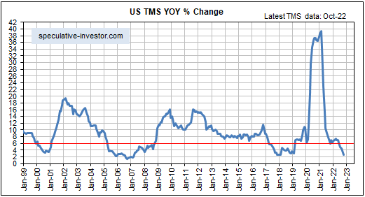
Good economic theory informs us that rapidly inflating the money supply leads to a period of unsustainable economic vigour called a boom, and that the boom begins to unravel after the monetary inflation rate slows. Over the past 25 years, booms have begun to unravel within 12 months of the year-over-year growth rate of G2 (US plus eurozone) money supply dropping below 6%.

The following chart shows the year-over-year growth rate of G2 True Money Supply (TMS), with a horizontal red line drawn to mark the 6% growth level mentioned above and vertical red lines drawn to mark the official starting times of US recessions. In the typical sequence, there is a decline in the G2 monetary inflation rate below 6%, followed within 12 months by the start of an economic bust (the unravelling of the monetary-inflation-fuelled boom), followed within 12 months by an official recession.

The time from a decline in the G2 monetary inflation rate to below 6% to the start of a recession can be two years or even longer, but the broad stock market tends to struggle from the time that the boom begins to unravel. This typically occurs within 12 months of the monetary inflation rate dropping below 6%, regardless of what’s happening with interest rates.

Now, it’s likely that the unravelling of the current boom will begin with the monetary inflation rate at a higher level than in the past. However, with the G2 TMS growth rate well into all-time high territory and still trending upward it is too soon (to put it mildly) to start preparing for an equity bear market.

Print This Post Print This Post