[This blog post is an excerpt, with a couple of minor tweaks, from a commentary published at www.speculative-investor.com last week]
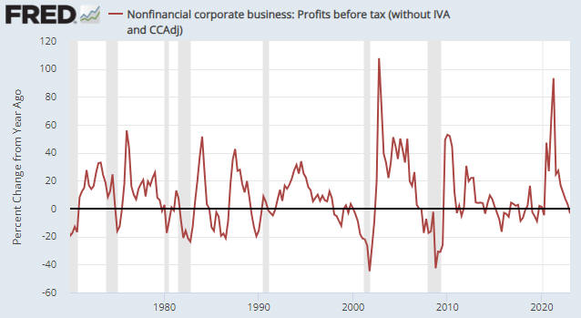
With regard to US economic indicators, very little has happened over the past three months. Coincident data have become weaker but not dramatically so, while there have been no significant changes in the most important leading indicators of recession. The overarching message from the data is that the US economy is not far from recession, although it is clear that the tipping point has not yet been reached. However, there has been a pronounced change in sentiment, with the view that a recession will be avoided (the soft-landing or no-landing expectation) becoming dominant.
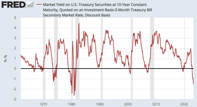
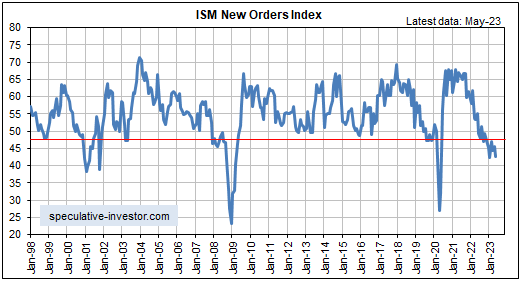
Turning to the data, as usual we’ll note the current positions of the ISM Manufacturing New Orders Index (NOI) and the yield curve, two of our favourite leading recession indicators.
The following monthly chart shows that the NOI remains at a level (below 48) that in the past usually pointed to the US economy being either in recession or about to enter recession.
Note, as well, that while the NOI generated a couple of false recession warnings in the past, the only period since 1970 during which the NOI spent several months below 48 with no recession was in 1995. It’s very unlikely that we are dealing with a 1995 scenario, though, because at that time public and private debt levels were relatively low and the Fed stopped tightening well before the yield curve became inverted.

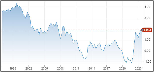
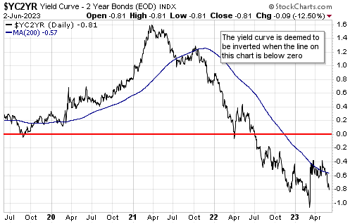
Speaking of the yield curve, the following chart shows that the 10year-3month yield spread remains inverted to an extreme (the yield curve is inverted when the line on this chart is below zero). This tells us that monetary conditions have become tight enough to virtually guarantee an official recession. However, the signal that a recession is imminent is a reversal of the yield curve from flattening/inverting to steepening, which is yet to happen.
Note that the mild steepening that occurred over the past two months appears to have been driven by concerns about the speed at which the US government will be going into debt. We don’t view this as the sort of steepening that warns of imminent recession.
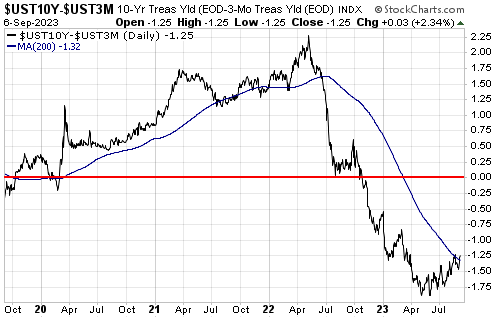
It is very unusual for the NOI to spend so much time in recession territory (11 months and counting at this stage) without conclusive evidence of recession appearing in the coincident economic data, but the time from yield curve inversion to the present is still well within the historical range. We are referring to the fact that since the late-1960s, the time from the 10y-3m yield spread becoming inverted to the start of an official recession typically has been 8-12 months, with a minimum of 5 months and a maximum of 17 months. The 10y-3m yield spread became inverted in October of last year, so the typical historical lead-time points to June-October of this year and the maximum historical lead-time points to March of next year for the start of a recession.
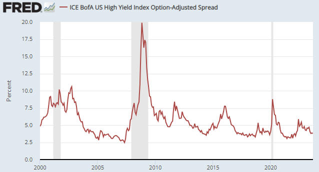
One of the most useful economic indicators is the average credit spread as represented by the High Yield Index Option Adjusted Spread (HYIOAS). The HYIOAS is a coincident indicator of the US economy and a leading indicator of recession, in that by the time the US economy has become weak enough to enter recession territory there usually will have been a significant widening of credit spreads as evidenced by a rapid rise in the HYIOAS. Referring to the following chart, for example, notice the upward moves in the HYIOAS during the months leading up to the 2001 and 2007-2009 recessions.
The sort of up-move in the HYIOAS that would be consistent with the lead-up to a recession occurred during March-June of last year, but the economy then rebounded and since June of last year the HYIOAS has been trending downward. This downward trend in the HYIOAS is indicative of an upward trend in economic confidence.
The HYIOAS currently is near a 16-month low, which is NOT consistent with an imminent recession start. If a recession is going to begin within the next few months, a sizable up-move in the HYIOAS should begin soon.
In conclusion, although most data are consistent with the US economy being on the verge of recession, the low level of the HYIOAS and the lack of a yield curve reversal imply that the recession start is still at least three months away.