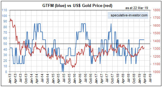
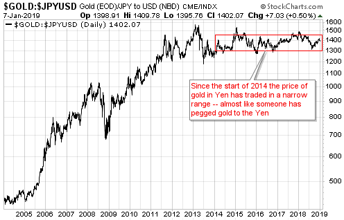
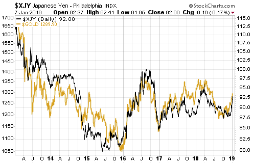
[This blog post is an excerpt from a recent TSI commentary]
Keynesian economic theory is useless if the aim is to understand how the world of human production and consumption works, but it is useful when attempting to figure out the policies that will be implemented in the future. The reason is that government and central bank policy-making is dominated by Keynesian ideas.
One of the most prominent Keynesian ideas is that changes in aggregate demand drive the economy. This leads to the belief that the government can keep the economy on a steady growth path by boosting its deficit-spending (thus adding to aggregate demand) during periods when economic activity is too slow and running surpluses (thus subtracting from aggregate demand) during periods when economic activity is too fast.
To further explain using an analogy, in the Keynesian world the economy is akin to a bathtub filled with an amorphous liquid called “aggregate demand”. When the liquid level gets too low it’s the job of the government and the central bank to top it up, and when the liquid level gets too high it’s the job of the government and the central bank to drain it off. Keynesian economics therefore has been called “bathtub economics”. The real-world economy is nothing like a bathtub, but that doesn’t seem to matter.
In any case, the point we now want to make is that in the US the traditional Keynesian guidelines are no longer being followed. Gone are the days of ramping-up government deficit-spending in response to economic weakness and running surpluses or at least reducing deficits when the economy is strong. These days the US federal government applies non-stop Keynesian-style stimulus and regularly exhorts the central bank to do the same. So, debt-financed tax cuts were implemented in 2017 when the economy seemed to be performing well, and now, with the unemployment rate at a generational low, the stock market near an all-time high and GDP growth chugging along at around 3%/year, the US government is planning a US$2 trillion infrastructure spending spree and the executive branch of the government is demanding that the Fed cut interest rates from levels that are already very low by historical standards.
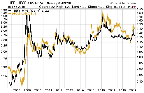
In other words, although the ‘Keynesian bathtub’ appears to be almost over-flowing, the US government is pushing for more demand-boosting actions. The strategy is now full-on ‘stimulus’ all the time. That’s part of why it doesn’t make sense to be anything other than long-term bullish on “inflation” and long-term bearish on Treasury bonds.
 Print This Post