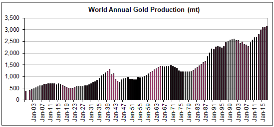
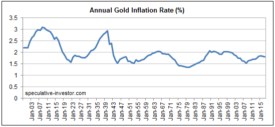
Print This Post Print This Post

Can silver rally without gold?

June 29, 2018

[This blog post is an excerpt from a recent TSI commentary]

The article titled “Silver’s Critical Role In Electrification May Fuel Its Rise” contains some interesting comments about the silver market, but with one minor exception the information presented in this article has no bearing on silver’s risk/reward as a speculation or investment. The minor exception is the high (by historical standards) gold/silver ratio, which suggests that the silver price is likely to rise relative to the gold price over the next few years. However, none of the information about silver ‘fundamentals’ presented in the article is relevant to the silver price.

It isn’t relevant for the same reasons that most of the information presented by the ‘experts’ about gold fundamentals is also not relevant: It treats the annual output of the mining sector as if it were the total supply (annual mine production is a small fraction of the total supply) and it confuses flows from one part of the market to another with changes in total demand (every ‘flow’ involves an increase in demand on the part of the buyer and an exactly offsetting decrease in demand on the part of the seller). Furthermore, it isn’t relevant for another reason that can be illuminated by asking the question: within the past 80 years, when was there a major silver rally in the absence of a gold rally?

The answer is that over the past 80 years there hasn’t been a single major silver rally in the absence of a gold rally. The best rally in silver without a concurrent rally in gold was the 6-month price spike that began in Q3-1997. This rally resulted from an attempt to manipulate the price upward on the back of Warren Buffett’s silver accumulation; it did not result from any of the ‘fundamental’ drivers cited by commentators trying to make the case that silver can rally strongly without gold.

The historical record persuasively argues that large silver rallies don’t happen in the absence of large gold rallies. This tells us that either economic/financial-system confidence drives the silver market in the same way that it drives the gold market or that the big trends in silver simply follow the big trends in gold.

The bottom line is that there does not appear to be a good reason to expect the silver price to move substantially higher independently of the gold price.

Print This Post Print This Post

Why the yield curve changes direction ahead of a recession

June 18, 2018

[This post is an excerpt from a TSI commentary]

Conventional wisdom is that an inversion of the yield curve (short-term interest rates moving above long-term interest rates) signals that a recession is coming, but this is only true to the extent that a recession is always coming. A reversal in the yield curve from flattening to steepening is a far more useful signal.

What a yield curve inversion actually means is that the interest-rate situation has become extreme, but there is no telling how extreme it will become before the eventual breaking point is reached. Furthermore, although there was a yield-curve inversion prior to at least the past seven US recessions, Japan’s most recent recessions were not preceded by inverted yield curves and there is no guarantee that short-term interest rates will rise by enough relative to long-term interest rates to cause the yield curve to become inverted prior to the next US recession. In fact, a good argument can be made that due to the extraordinary monetary policy of the past several years the start of the next US recession will NOT be preceded by a yield curve inversion.

Previous US yield curve inversions have happened up to 18 months prior to the start of a recession, and as mentioned above it’s possible that there will be no yield curve inversion before the next recession. Therefore, we wouldn’t want to be depending on a yield curve inversion for a timely warning about the next recession or financial crisis. However, the yield curve can provide us with a much better, albeit still imperfect, recession/crisis warning in the form of a confirmed trend reversal from flattening to steepening. This was discussed in numerous TSI commentaries over the years and was also covered in a blog post last December.

There are two reasons that a reversal in the yield curve from flattening to steepening is a more useful recession/crisis warning signal. First, it is timelier. Second, it should work regardless of whether or not the yield curve becomes inverted.

Now, from a practical speculation standpoint it is not essential to understand WHY the yield curve reverses from flattening to steepening ahead of major economic problems bubbling to the surface. It is enough to know that it does. However, if you understand why the curve has reversed direction ahead of previous recessions you will understand why it either should or might not reverse direction in a timely manner in the future. After all, if extraordinary monetary policy could prevent the yield curve from becoming inverted ahead of the next recession then perhaps it also could prevent the yield curve from reversing course the way it has in the past.

With regard to understanding the why, the first point to grasp is that the boom phase of the cycle is characterised by borrowing short-term to lend/invest long-term. This puts upward pressure on short-term interest rates relative to long-term interest rates, meaning that it causes the yield curve to flatten. Also, when the boom is mature and is approaching its end there will be a scramble for additional short-term financing to a) complete projects that were started when monetary conditions were easier and b) address cash shortages that have arisen due to completed projects not delivering the predicted cash flows. This puts further upward pressure on short-term rates relative to long-term rates, and could, although won’t necessarily, cause the yield curve to become inverted.

Next, as the boom nears its end the quantity of loan defaults will begin to rise and the opportunities to profit from short-term leverage will become scarcer. Everything will still seem fine to casual observers, central bankers, the average economist and the vast majority of commentators on the financial markets, but it will now be apparent to a critical mass of astute operators (investors, speculators and financiers) that many of the investments that were incentivised by years of easy money were ill-conceived. These operators will begin shifting towards ‘liquidity’ and away from risk.

The aforementioned increasing desire for the combination of safety and liquidity leads to greater demand for cash and gold. But more importantly as far as this discussion is concerned, it boosts the demand for short-term Treasury debt relative to long-term Treasury debt (thus putting downward pressure on short-term interest rates relative to long-term interest rates). The reason is that the shorter the term of the Treasury debt, the lower the risk of an adverse price movement. For example, if you lend $10B to the US government via the purchase of 3-month T-Bills then in three months’ time you will have something worth $10B, but if you lend $10B to the US government via the purchase of 10-year T-Notes then in three months’ time you could have something that is worth significantly more or less than $10B.

As an aside, what an investor focused on boosting liquidity really wants is cash, but if he has billions of dollars then cash is not a viable option. This is because the cash would have to be deposited in a bank, which means that the investor would be lending the money to a bank and taking the risk of a massive loss due to bank failure. Lending to the US government is a much safer choice.

In summary, it’s mainly the desire for greater liquidity and safety that begins to emerge at the tail-end of a boom that causes the yield curve to stop flattening and start steepening. As demonstrated by the events of the past few years the central bank has substantial power to postpone the end of a boom, but eventually a breaking point will be reached and when it is the yield curve’s trend will change from flattening to steepening.

Print This Post Print This Post

What is fiat currency?

June 11, 2018

The term “fiat” is often associated with irredeemable-paper or electronic currency, but existing only in paper or electronic form is not the defining characteristic of fiat currency. In fact, paper or electronic currency is not necessarily “fiat” and hard commodity currency can be “fiat”.

Regardless of the form it takes, fiat currency is simply currency by government decree. If the government dictates that a certain ‘thing’ is money and must be accepted in payment for goods, services and debts, then that ‘thing’ is a fiat currency.

Obviously, all of today’s national currencies are fiat currencies. Not so obviously, gold was a fiat currency during the Gold Standard era. It could be claimed — without any argument from me — that during the Gold Standard era gold would have been the most widely used currency without the government making it so, but this is beside the point. In the situation where the government has commanded that gold is money, gold is a fiat currency.

Also not so obviously considering what has been written on the topic in other places, Bitcoin is not a fiat currency. If anything it is the opposite of a fiat currency, because it was created by the private sector and is not supported in any way by the government. This doesn’t mean that Bitcoin is a good currency, as there is a lot more to being a good currency than being outside the direct control of government.

Summing up, people should be careful when applying the word “fiat” to currency/money. The word is routinely used to mean irredeemable or non-physical, but that’s not what it actually means.

Print This Post Print This Post

The useless and dangerous “money velocity” concept

June 5, 2018

In a blog post about three years ago I explained that in the real world there is money supply and there is money demand; there is no such thing as money velocity. “Money velocity” only exists in academia and is not a useful economics concept. In this post I’ll try to make the additional point that in addition to being useless, it can be dangerous.

Before getting to why the money velocity concept can be dangerous, it’s worth quickly reviewing why it is useless. In this vein, here are the main points from the blog post linked above:

1) The price (purchasing power) of money is determined in the same way as the price of anything else: by the interplay of supply and demand. The difference is that money is on one side of almost every transaction, so at any given time there will be millions of different prices for money. This is why it makes no sense to come up with a single number (e.g. the CPI) to represent the purchasing power of money.

2) Money velocity, or “V”, comes from the Equation of Exchange. This equation is often expressed as M*V = P*Q, or, in more simple terms, as M*V = nominal GDP, where “M” is the money supply. In essence, “V” is a fudge factor that is whatever it needs to be to make one side of the ultra-simplistic and largely meaningless Equation of Exchange equal to the other side.

3) The Equation of Exchange can be written: V = GDP/M. Consequently, whenever you see a chart of “money velocity” what you are really seeing is a chart showing nominal GDP divided by some measure of money supply. During a long period of relatively fast monetary inflation the line on such a chart naturally will have a downward slope.

4) Over the past two decades the pace of US money-supply growth has been relatively fast. Hence the downward trend in the GDP/M ratio (a.k.a. money velocity) over this period. Refer to the following chart for details.

5) During the 2-decade period of declining “V” there were multiple economic booms and busts, not one of which was predicted by or reliably indicated by “V”.

velocity_040618

That’s why “money velocity” is useless in describing/analysing how the world works. Unfortunately, there are many influential economists who believe that the simplistic Equation of Exchange can be put to good use when figuring out what’s happening in the world of human action and what should be done about it. These economists, some of whom are in senior positions at central banks, view “money velocity” not only as a valid real-world concept, but also as an important causal factor in the economy.

If you believe that changes in “V” cause changes in economic growth, with a higher “V” bringing about faster growth, then during periods of economic weakness you will be in favour of policies that are specifically designed to boost “V”. In particular, you will be in favour of policies that result in or promote faster spending for the sake of spending.

Of course, if the supply of money is constant then the calculated value of “V” will be high during periods of strong growth and low during periods of weak or no growth. However, the cause is the growth and the change in “V” is a calculated effect of the growth.

Thinking that growth can be boosted via policies designed to increase “V” is similar to the mistake made by Herbert Hoover during the first few years of the Great Depression. He knew that prices tended to rise during economic booms and fall during economic depressions, so he concluded that a depression could be avoided if prices were prevented from falling. That is, he confused cause and effect. This led to efforts to prop-up prices, especially the price of labour. Not surprisingly, these efforts were counter-productive.

Summing up, the belief that “money velocity” is a useful real-world concept is not only wrong, but also dangerous if it is held by people with the power to influence central-bank or government policy.

Print This Post Print This Post

Why it’s different this time

May 29, 2018

[The following is an excerpt from a commentary posted at TSI last week.]

One of the financial world’s most dangerous expressions is “this time is different”, because the expression is often used during investment bubbles as part of a rationalisation for extremely high market valuations. Such rationalisations involve citing a special set of present-day conditions that supposedly transforms a very high valuation by historical standards into a reasonable one. However, sometimes it actually is different in the sense that all long-term trends eventually end. Sometimes, what initially looks like another in a long line of price moves that run counter to an old secular trend turns out to be the start of a new secular trend in the opposite direction. We continue to believe that the current upward move in interest rates is different, in that it is part of a new secular advance as opposed to a reaction within an on-going secular decline. Here are two of the reasons:

The first and lesser important of the reasons is the price action, one aspect of which is the performance of the US 10-year T-Note yield. With reference to the following chart, note that:

a) The 2016 low for the 10-year yield was almost the same as the 2012 low, creating what appears to be a long-term double bottom or base.

b) The 10-year yield has broken above the top of a well-defined 30-year channel.

c) By moving decisively above 3.0% last week the 10-year yield did something it had not done since the start of its secular decline in the early-1980s: make a higher-high on a long-term basis.

The more important of the reasons to think that the secular interest-rate trend has changed is the evidence that the bond market’s performance from early-2014 to mid-2016 constituted a major blow-off. The blow-off and the resulting valuation extreme are not apparent in the US bond market, but they are very obvious in the euro-zone bond market.

In the euro-zone, most government debt securities with durations of 2 years or less rose in price to the point where they had negative yields to maturity, and some long-term bonds also ended up with negative yields. For example, the following chart shows that the yield on Germany’s 10-year government bond fell from around 2% in early-2014 to negative 0.25% in mid-2016.

Although yields have trended upward in the euro-zone since Q3-2016, German government debt securities with durations of 5 years or less still trade with negative yields to maturity. Even more remarkable considering that Italy’s new government is contemplating a partial debt default and a large increase in the budget deficit, Italy’s 2-year government bond yield moved out of negative territory only two weeks ago and is about 220 basis points below the equivalent US yield. To be more specific, you can buy a US 2-year Treasury note today and get paid about 2.5% per year or you can buy an Italian government 2-year note today and get paid about 0.3% per year.

Why would anyone lend money to the Italian government for 2 years at close to 0% today when there is a non-trivial chance of default during this period? Why would anyone have lent money to the Italian government or even to the more financially-sound European governments over the past three years at rates that guaranteed a nominal loss if the debt was held to maturity?

There are two reasons, the first being the weakness of the euro-zone banking system. The thinking is that you lock in a small loss by purchasing government bonds with negative yields to maturity, but in doing so you avoid the risk of a large or even total loss due to bank failure (assuming the alternative is to lend the money to a private bank). The main reason, however, is the ECB’s massive bond-buying program. This program was widely anticipated during 2014 and came into effect in early-2015.

With the ECB regularly hoovering-up large quantities of bonds almost regardless of price, speculators could pay ridiculously-high prices for bonds and be safe in the knowledge that they could offload their inventory to the ECB at an even higher price.

Negative interest rates and negative yields-to-maturity could not occur in a free market. It took the most aggressive central-bank interest-rate manipulation in history to bring about the situation that occurred in Europe over the past few years.

We don’t think it’s possible for the ECB to go further without completely destroying the euro-zone’s financial markets. Also, if it isn’t obvious already it should become obvious within the next couple of years that the aggressive bond-buying programs conducted by the ECB, the Fed and other central banks did not work the way they were advertised. Therefore, even if it were technically possible for the major central banks to go further down the interest-rate suppression path, they won’t be permitted to do so.

That’s why it’s a very good bet that the secular downward trend in interest rates is over.

Print This Post Print This Post

Incomplete silver COT analysis, revisited

May 21, 2018

In a blog post a week ago I discussed why silver’s Commitments of Traders (COT) situation was nowhere near as bullish as it had been portrayed in numerous articles over the preceding two months. This prompted some criticism that involves a misunderstanding of how I use the COT data. Before I address the criticism, a brief recap is in order.

As stated in last week’s post, the enthusiastically-bullish interpretation of silver’s COT situation fixated on the positioning of large speculators (“NonCommercials”) in Comex silver futures. It was based on the fact that over the past two months the large specs had reduced their collective net-long silver exposure to its lowest level in a very long time, indicating that these traders had become more pessimistic about silver’s prospects than they had been in a very long time. This was clearly a bullish development given the contrary nature of speculative sentiment.

I then explained that two components of silver’s overall COT situation cast doubt on the validity of the bullish interpretation.

The first was that near important bottoms in the silver price the open interest (OI) in silver futures tends to be low, but in early-April of this year the OI hit an all-time high.

The second was that whereas the positioning of large specs in silver futures pointed to depressed sentiment, the positioning of small speculators (“NonReportables”) pointed to extreme optimism. This was evidenced by the fact that over the past two months these traders (the proverbial ‘dumb money’) had, as a group, accumulated their greatest net-long exposure in 9 years. It would be very unusual for a big rally to begin at the time when the ‘dumb money’ was positioned for a big rally.

The latest COT report showed minimal change in the positioning of the small specs. As illustrated by the following chart from goldchartsrus.com, their collective net-long exposure is down from its late-March peak but remains near the top of its 3-year range (and its 10-year range).

The main criticism of last week’s blog post was that the size of the total “NonCommercial” (large-spec) position is about 10-times the size of the total “NonReportable” (small-spec) position and therefore that what the “NonCommercials” are doing is an order of magnitude more important than what the “NonReportables” are doing.

My response is: not if the COT information is being used as a sentiment indicator, which is the only way I use it.

The reason it is useful to know the sentiment of the small traders in any financial market is NOT that these traders are the movers and shakers in the market. They obviously aren’t. If they were they wouldn’t be “small” traders and wouldn’t be classed as “NonReportables” in the COT reports. It is useful to know the sentiment of these minor players because as a group they tend to be wrong when they become extremely bullish or extremely bearish. They are the ‘dumb money’. As I wrote last week and repeated above, it would be very unusual for a big rally to begin at the time when the ‘dumb money’ was positioned for a big rally.

Not surprisingly, then, there was no big rally (or any rally worth trading) in the silver market over the past two months.

Print This Post Print This Post

Incomplete silver COT analysis

May 14, 2018

During March and April a number of articles appeared at precious-metals-focused web sites describing the silver market’s Commitments of Traders (COT) situation as extremely bullish. However, this unequivocally bullish interpretation overlooked aspects of the COT data that were bearish for silver. Taking all aspects of the data into consideration, my interpretation at the time (as presented in TSI commentaries) was that silver’s COT situation was neutral and that the setup for a large rally was not yet in place.

The enthusiastically-bullish interpretation of silver’s COT situation fixated on the positioning of large speculators in Comex silver futures. As illustrated by the following chart, over the past two months the large specs (called “NonCommercials” on the chart) first went ‘flat’ and then went net-short. This suggested that large specs had become more pessimistic about silver’s prospects than they had been in a very long time, which was clearly a bullish development given the contrary nature of speculative sentiment.

silverCOT_largespec_140518
Chart source: http://www.goldchartsrus.com/

However, two components of silver’s overall COT situation cast doubt on the validity of the bullish interpretation.

The first is that near important bottoms in the silver price the open interest (OI) in silver futures tends to be low, but in early-April of this year the OI hit an all-time high.

The second and more significant is that whereas the positioning of large specs in silver futures pointed to depressed sentiment, the positioning of small specs (the proverbial dumb money) pointed to extreme optimism. This is evidenced by the following chart, which shows that over the past two months the small specs (called “NonReportable” on the chart) reached their greatest net-long exposure in 9 years. It would be very unusual for a big rally to begin at the time when the ‘dumb money’ was positioned for a big rally.

silverCOT_smallspec_140518
Chart source: http://www.goldchartsrus.com/

The upshot is that silver’s COT situation was not price-supportive at any stage over the past two months. This is mainly because the bullish implications of the unusually-low net-long exposure of large specs was counteracted by the bearish implications of the unusually-high net-long exposure of small specs.

Print This Post Print This Post

US Recession Watch

May 7, 2018

[The following is an excerpt from a commentary posted at TSI last week]

The US economic expansion that began in mid-2009 has been much weaker than average, but, as indicated by the chart displayed below, it is also much longer than average. In fact, it is simultaneously the weakest and the second-longest expansion on record. Due to the advanced age of the expansion and the signs of weakness that have appeared over the past three months in economic statistics and the stock market, recession warnings are becoming more common. However, when we take an impartial look at the most reliable leading indicators of recession we arrive at the conclusion that these warnings are premature.


Chart source: http://realinvestmentadvice.com/bull-markets-actually-do-die-of-old-age/

The three leading indicators of US recession that we care about are the ISM New Orders Index (NOI), Real Gross Private Domestic Investment (RGPDI) and the yield curve. Not one of these indicators is close to giving a recession warning, which is why we say that the increasingly-common warnings of recession are premature.

The NOI, for instance, has declined each month since making a 13-year high in December-2017, but it remains far above the level that it would have to drop below (the red line on the following chart) to warn of a recession.

Also, there are not even tentative signs of major trend reversals in either RGPDI or the yield curve. That’s because last month the US yield curve became its flattest in more than 10 years (a recession is signaled by a major shift from flattening to steepening) and because the data published at the end of last week revealed that RGPDI hit a new all-time high in Q1-2018. RGPDI’s trend generally reverses downward at least two quarters prior to the start of a recession.

Note that the vertical red lines on the following chart mark the starting points of the last two recessions.

Based on the latest data, we roughly estimate the recession start-time probabilities as follows:
- Q2-2018: 0%
- Q3-2018: 10%
- Q4-2018: 30%
- Some time in 2019: >80%

The main reason for our high 2019 recession probability estimate is the decline in the G2 (US plus euro-zone) monetary inflation rate illustrated by the following chart. The inflation rate bounced in March, but it’s likely that the preceding decline was large enough to bring the artificial boom to an end.

Print This Post Print This Post

An update on gold’s true fundamentals

April 30, 2018

I update gold’s true fundamentals* every week in commentaries and charts at the TSI web site, but my most recent blog post on the topic was on 20th March. At that time the fundamental backdrop was gold-bearish. What’s the current situation?

The fundamental backdrop (from gold’s perspective) is little changed since 20th March. In fact, it has not changed much since early this year. My Gold True Fundamentals Model (GTFM), a weekly chart of which is displayed below, turned bearish during the first half of January and was still bearish at the end of last week. There have been fluctuations along the way, but at no time over the past 3.5 months has the fundamental backdrop been supportive of the gold price.

GTFM_270418

It’s possible for a tradable rally in the US$ gold price to get underway at a time when the fundamental backdrop is not gold-bullish, but for this to happen the sentiment situation as indicated by the Commitments of Traders data would have to be very supportive or the US$ would have to be very weak. Currently, the fundamental backdrop is bearish, the sentiment situation is neutral and the Dollar Index has just broken out to the upside. Therefore, as things stand today there is no good reason to expect that a substantial gold rally will get underway in the near future.

Based on how I expect the fundamentals to shift over the weeks ahead my guess is that a substantial gold rally will begin from a May-June low. However, there is more to be lost than gained by ‘jumping the gun’ and buying a short-term trading position now in anticipation of such a rally.

*Note that I use the word “true” to distinguish the actual fundamental drivers of the gold price from the drivers that are regularly cited by gold-market analysts and commentators. According to many pontificators on the gold market, gold’s fundamentals include the volume of metal flowing into the inventories of gold ETFs, China’s gold imports, the volume of gold being transferred out of the Shanghai Futures Exchange inventory, the amount of “registered” gold at the COMEX, India’s monsoon and wedding seasons, jewellery demand, the amount of gold being bought/sold by various central banks, changes in mine production and scrap supply, and wild guesses regarding JP Morgan’s exposure to gold. These aren’t true fundamental price drivers. At best, they are distractions.

Print This Post Print This Post

Which political team do you support?

April 24, 2018

Most people support a political party in the same way they support a sports team. The support is through thick and thin, regardless of the policies that are being proposed/enacted. And criticism of their team is not tolerated, because, well, it’s their team. People love to be part of a team.

One consequence of the team-spirit aspect of politics is that the average person doesn’t decide the appropriateness and efficacy of a policy by objective analysis, but rather by who is proposing/implementing the policy. If the policy is put forward by Party A then the supporters of Party A will claim it is a good idea and the supporters of Party B will be critical, whereas if the identical policy is put forward by Party B then the Party B supporters will be in favour of it and the Party A supporters will be critical. In some cases a policy put forward by a particular party will be so obviously bad that the more rational supporters of that party will be unable to come out openly in favour of it, in which case they usually will remain silent. They are like the one-eyed sports fans who shout abuse when the referee makes a bad decision in the opposing team’s favour but turn a blind eye when the referee makes a bad decision in their team’s favour.

Another consequence of the tendency towards blind support of a political team and the associated unwillingness to objectively analyse the merits of policies is that people tend to embrace a set of beliefs covering many different socioeconomic issues, even if the beliefs are not consistent. This is because the set of beliefs is associated with their team and advocated by the leaders of their team. A knock-on effect is that if you know where someone stands on one hot-button issue, examples of which are climate change, gun control, immigration and abortion, in most cases you will know where they stand on all hot-button issues. That’s even though it doesn’t logically follow that a particular belief on, for example, gun control should be linked to a particular belief on, for example, climate change or abortion.

One of the most curious aspects of the strong identification with a particular political team and the animosity that members of one team often feel for members of the opposing team is that in practice the teams are very similar. At each election a sizable proportion of the population will vote for what they believe is a change of direction, but regardless of the outcome of the election nothing will really change. The leaders of the different teams will spew forth different rhetoric and there will be some differences in the policy details, but regardless of the election result there will be no meaningful change in the overall governmental approach. The main reason is that in a typical modern-day two (or more) party democracy, each of the major parties will be in favour of a powerful, intrusive government. In effect, when people vote to remove the team that’s currently in power they are voting for a change in the facade, not a change in the structure.

It would be great if the average person, instead of labeling himself/herself as a member of a particular political team (Republican, Democrat, Conservative, Liberal, Labour, etc.) and blindly supporting that team’s policies, either impartially assessed each policy proposal and railed against bad policy regardless of its origin or simply admitted to not being well-enough informed to have an opinion. Unfortunately, that’s never going to happen.

Print This Post Print This Post

A dramatic upward reversal in US monetary inflation

April 21, 2018

[Here is an excerpt from a commentary posted at TSI about a week ago]

In February of this year the year-over-year rate of growth in the US True Money Supply, a.k.a. the US monetary inflation rate, was only 2.4%. This was its lowest level since March of 2007 and not far from a multi-decade low. In March of this year, however, the monetary inflation rate almost doubled — to around 4.6%. Refer to the following chart for more detail. What caused the reversal and what effect will it have on the economy and the financial markets?

The Fed has been slowly removing money from the economy via its QT program, so March’s money-supply surge wasn’t caused by the central bank. The main cause also wasn’t the commercial banking industry, because although there has been an up-tick in the rate of bank credit expansion over the past month it is nowhere near enough to explain the increase in TMS.

We can’t be certain, but by a process of elimination we conclude that the sharp upward reversal in the US monetary inflation rate was due to money coming into the US from overseas. If so, the most likely driver would be the repatriation of corporate profits due to the tax changes approved near the end of last year.

In other words, it’s likely that March’s TMS surge was due more to the way that the banking system accounts for existing US dollars than an increase in the total supply of US dollars.

If the monetary inflation reversal has more to do with a change in the way existing US dollars are accounted for than a sudden large increase in the pace of new dollar creation, then the effects on the economy and the financial markets will be minimal. In any case, after the monetary inflation rate has moved high enough for long enough to set in motion an artificial boom, a drop to a relatively low inflation level will inevitably lead to a bust (an economic recession and a large decline in the stock market, often accompanied by a banking crisis). For example, the pronounced rebound in the TMS growth rate from Q4-2006 to Q3-2007 did not stop the recession, the equity bear market and the banking crisis of 2007-2009.

This means that as a result of the 2017 decline in the monetary inflation rate to near a 20-year low, the die has been cast.

The big unknown right now is the timing of the bust that will occur in response to last year’s precipitous decline in the monetary inflation rate. Will it get underway during the second half of this year or will it wait until next year?

Print This Post Print This Post

Bull market correction or bear market?

April 17, 2018

In previous blog posts (e.g. HERE) I explained the limitations of sentiment as a market timing tool. Since the public is invariably wrong at price extremes, it certainly can be helpful to track the public’s sentiment and use it as a contrary indicator. However, whereas price extremes always coincide with sentiment extremes, sentiment extremes often don’t coincide with price extremes. This is especially the case during long-term bull markets, when sentiment is capable of staying very optimistic for years. It’s therefore best to think of a sentiment extreme as a necessary, but not a sufficient, condition for a price extreme.

With regard to US stock market sentiment there was an optimistic extreme in January of this year. This is evidenced by the TSI Index of Bullish Sentiment (TIBS) hitting a 20-year high at that time. Refer to the following weekly chart for details. Note that TIBS is a weighted average of four sentiment surveys (Investors Intelligence, Market Vane, Consensus-inc and American Association of Individual Investors), the 5-day moving average of the equity put/call ratio and the 5-day moving average of the VIX.

What is the probability that January’s optimistic extreme coincided with the top of the equity bull market?

TIBS_180418

The answer is: quite low. While sentiment was consistent with a major top and valuations, on average, were definitely high enough to usher in a major top, an end to the long-term upward trend was not signaled by several important indicators. For example, there would normally be a pronounced widening of credit spreads at or before a bull market top, but credit spreads remain near their narrowest levels of the past 10 years. For another example, there is likely to be a reversal in the yield curve from flattening to steepening at or prior to a bull market top, but at the end of last week the US yield curve was at its ‘flattest’ in more than 10 years. For a third example, there has been more strength in market internals over the past two months than there normally would be if we were dealing with the early stage of a bear market.

So, despite the rampant optimism evident in January-2018, the decline that followed the January peak probably will turn out to be a bull-market correction.

Print This Post Print This Post

The short that keeps on giving?

April 10, 2018

Among the list of stock selection and trading ideas maintained at the TSI web site there was, until the week before last, a Tesla (TSLA) put option position. The position was exited — and a large profit recorded — after the stock’s recent plunge from well above $300 to the $250s. However, this stock could present multiple opportunities over the coming 12 months to profit on the dark (bearish) side as it makes its way along the path to zero. TSLA could become the short that keeps on giving.

In fact, the fast rebound from the 2nd April low in the mid-$240s to the 9th April high of $309.50 may have already created the next such opportunity. The reason is that the rebound appears to have ended near the top of the former major support at $300-$310, the implication being that the stock has completed a successful test of its breakdown.

TSLA_090418

The company is clearly in trouble. It is hemorrhaging cash and running out of money, it is suffering production problems, it has possibly engaged in fraudulent accounting and is under investigation, and it will soon be faced with much greater competition from companies that are far more adept at vehicle manufacturing. And yet, it still sports an extremely high market valuation.

TSLA bears will have to remain on guard, though, because Elon “the carnival barker” Musk is still capable of whipping up enthusiasm.

Print This Post Print This Post

Trade as a zero sum game

April 9, 2018

[This blog post is an excerpt from a TSI commentary published on 27th March 2018]

The policies of the Trump Administration are being influenced by the view that international trade is a zero sum game, where whoever receives the most money is the winner at the expense of whoever receives the most goods. Under this line of thinking, which sometimes goes under the name “mercantilism”, policies are beneficial if they increase the amount of money coming into the country relative to the amount of money going out of the country. As discussed below, it’s the wrong way to look at the world.

Another way of framing the mercantilist position is that the winner is the one who ends up with the larger amount of the medium of exchange and the loser is the one who ends up with the larger amount of real wealth. For reasons we’ll get into in a moment there are actually no winners and losers, but if it were true that one side was getting the better deal then surely it would be the one that ended up with the most real wealth; especially these days, when the medium of exchange is created out of nothing by the banking system.

Also, it’s important to understand that countries don’t trade with each other. For example, the US doesn’t trade with China. What we mean is that a country is not an economic entity that buys and sells. Instead, individuals in one country trade with individuals in another country and in each transaction both sides believe that they are benefiting (otherwise the transaction wouldn’t happen). While it is technically possible to lump together all the transactions undertaken by the individuals in one region and arrive at the conclusion that ‘we’ have a trade deficit or ‘we’ have a trade surplus, in the real world there is no ‘we’ when it comes to trade.

Unfortunately, however, governments pay attention to the meaningless lumping-together of millions of individual transactions, and if the result happens to be what is commonly called a deficit then the government will often conclude that it should place obstacles in the way of many transactions. You may think that you are benefiting from a deal with a foreign seller, but according to the government you are creating a problem for the collective ‘we’ and must be hindered or stopped.

The Trump Administration is in the spotlight at the moment for having undertaken three sets of protectionist measures over just the past two months. There were the tariffs on imported washing machines and solar panels announced in January, the tariffs on imported steel and aluminium announced at the beginning of March and the as-yet-unspecified tariffs on $60B of Chinese imports announced last week. However, the US government does not have a monopoly on counter-productive mercantilism. Far from it! The same sort of ‘reasoning’ that has informed the trade-related missteps of the US government over the past two months is informing the actions of most governments around the world.

For example, other governments are threatening to impose their own tariffs in response to the US tariffs, which is something they would not do unless they wrongly believed that such restrictions could benefit their own economies. For another example, the large quantity of US$-denominated reserves collectively held by central banks around the world has almost nothing to do with the US$ being the official reserve currency and almost everything to do with exchange-rate management designed, using terribly flawed logic, to gain an international trade advantage. Refer to the May-2015 post at the TSI Blog for more colour on this issue.

There is nothing that any one government can do directly to change the wrongheaded protectionist ways of other governments. The best that any single government can do is to not become part of the problem. The ideal situation is that no side erects barriers to international trade, but the second-best situation for any one country is that its own government opts not to erect barriers. Just because some other government decides to impose economic sanctions on its own citizens doesn’t mean that your government is justified in doing the same.

Print This Post Print This Post

Money Matters

March 30, 2018

[This blog post is an excerpt from a recent TSI commentary]

The year-over-year rate of growth in the US True Money Supply (TMS) was around 11.5% in October of 2016 (the month before the US Presidential election) and is now only 2.4%, which is near a 20-year low. Refer to the following monthly chart for details. In terms of effects on the financial markets and the economy, up until recently the US monetary inflation slowdown was largely offset by continuing rapid monetary inflation elsewhere, most notably in Europe. However, the tightening of US monetary conditions has started to have noticeable effects and these effects should become more pronounced as the year progresses.

The tightening of monetary conditions eventually will expose the mal-investments of the last several years, which, in turn, will result in a severe recession, but the most obvious effect to date is the increase in interest rates across the entire curve. The upward acceleration in interest rates over the past six months has more than one driver, but it probably wouldn’t have happened if money had remained as plentiful as it was two years ago.

It would be a mistake to think that the tightening has been engineered by the Fed. The reality is that the Fed has done very little to date.

The Fed has made several 0.25% increases in its targeted interest rates, but the main effect of these rate hikes is to increase the amount of money the Fed pays to the commercial banks in the form of interest on reserves (IOR). It doesn’t matter how you spin it, injecting more money into banks ain’t monetary tightening!

The Fed’s actual efforts on the monetary loosening/tightening front over the past 5 years are encapsulated by the following weekly chart of Reserve Bank Credit (RBC). This chart shows that there was a rapid rise in RBC during 2013-2014 that ended with the completion of QE in October-2014. For the next three years RBC essentially flat-lined, which is what should be expected given that the Fed was neither quantitatively easing nor quantitatively tightening during this period. In October-2017 the Fed introduced its Quantitative Tightening (QT) program. To date, this program has resulted in only a small reduction in RBC, but the plan is for the pace of the QT to ramp up.

Strangely, the most senior members of the Fed appear to believe that their baby-step rate hikes constitute genuine tightening and that the contraction of the central bank’s balance sheet is neither here nor there. The reality is the opposite.

So, the Fed is not responsible for the large decline in the US monetary inflation rate and the resultant tightening of monetary conditions that has occurred to date.

The responsibility for the tightening actually lies with the commercial banks. As illustrated by the next chart, the year-over-year rate of growth in commercial bank credit was slightly above 8% at around the time of the Presidential election in late-2016 and is now about 3%.

We won’t be surprised if a steepening yield curve prompts commercial banks to collectively increase their pace of credit creation over the next two quarters, but with the Fed set to quicken the pace of its QT the US monetary inflation rate probably will remain low by the standards of the past two decades. At the same time, the ECB will be taking actions that reduce the monetary inflation rate in the euro-zone. This could lead to stock and bond market volatility during the second half of this year that dwarfs what we’ve witnessed over the past two months.

Print This Post Print This Post

Another look at gold’s true fundamentals

March 20, 2018

The major long-term driver of the gold price is confidence in the official money and in the institutions (governments, central banks and private banks) that create/promote/sponsor the official money. As far as long-term investors are concerned the gold story is therefore a simple one: gold will be in a bull market when confidence in the financial establishment (money, banks and government) is in a bear market and gold will be in a bear market when confidence in the financial establishment is in a bull market.

In real time it often doesn’t seem that simple, though, because on a weekly, monthly or even yearly basis a lot can happen to throw an investor off the scent. However, the risk of being thrown off the scent can be reduced by having an objective way of measuring the ebbs and flows in the confidence that drives, among other things, the performance of the gold market. That’s why I developed the Gold True Fundamentals Model (GTFM). The GTFM is determined mainly by confidence indicators such as credit spreads, the yield curve, the relative strength of the banking sector and inflation expectations, although it also takes into account the US dollar’s exchange rate and the general commodity-price trend.

An alternative to objective measurement is to rely on gut feel, but gut feel is notoriously unreliable in such matters because it is, by definition, influenced by personal biases. For example, it will be influenced by “projection bias”. This is the assumption that if you perceive things in a certain way, then most other people will perceive them in the same way. Projection bias plays a big part in a lot of gold market analysis. The market analyst will observe central bank or government actions that from his/her perspective are blatantly counter-productive, and go on to assume, often wrongly, that most market participants will view the actions in the same way.

Another alternative is to assume that gold’s fundamentals are always bullish and therefore that any large or lengthy price decline must be the result of a grand price-suppression scheme. Given its absurdity it’s amazing how popular this line of thinking has become in the gold market. Then again, it’s a line of thinking that has been aggressively promoted over the past two decades and has a certain emotional appeal.

Due to the effects of market sentiment the gold price occasionally will diverge from its ‘true fundamentals’ (as indicated by the GTFM) for up to a few months, but ALL substantial upward and downward trends in the gold price over the past 15 years have been consistent with the fundamental backdrop.

Does this invalidate the idea that manipulation happens in the gold market?

Of course not. Every experienced and knowledgeable trader/investor knows that all financial markets have always been subject to manipulation and always will be subject to manipulation. It does, however, invalidate the idea that there has been a successful long-term gold-price-suppression program.

The current situation (as at the end of last week) is that gold’s true fundamentals, as indicated by the GTFM, have been bearish for the past 10 weeks. Also, the true fundamentals have spent more time in bearish territory than bullish territory since the second half of last September. Refer to the following chart comparison of the GTFM and the US$ gold price for details.

GTFM_200318

Now, considering the fundamental backdrop it seems that the gold price has held up remarkably well over the past several months, but that conclusion only emerges if your sole measuring stick is the US$. When performance relative to the other senior currency (the euro) and the world’s most important equity index (the S&P500) are taken into account it becomes clear that the gold market has been weak. Here are the relevant charts.

gold_euro_200318

gold_SPX_200318

The fundamental backdrop is continually shifting and potentially could turn gold-bullish within the next few weeks. It just isn’t bullish right now. Also, there could be a strong rally in the US$ gold price in the face of neutral-bearish fundamentals. If so, we would be dealing with a US$ bear market as opposed to a gold bull market.

In a gold bull market the ‘value’ of an ounce of gold rises relative to the major equity indices and both senior currencies. For this to happen the true fundamentals would have to be decisively bullish most of the time.

Print This Post Print This Post

The rising interest-rate trend

March 5, 2018

The rising interest-rate trend in the US isn’t new and isn’t related to the Fed’s so-called “policy normalisation” program. However, it has only just started to matter.

That the rising interest-rate trend isn’t new and isn’t related to the Fed’s rate-hiking efforts is clearly illustrated by the following chart. This chart shows that the US 2-year T-Note yield began trending upward in 2011 — more than 6 years ago and more than 4 years prior to the Fed’s first rate hike.

UST2Y_050318

As we go further out in duration we find later beginnings to the rising-yield trend. This is evidenced by the following three charts, the first of which shows that the 5-year yield bottomed in mid-2012, the second of which shows that the 10-year yield double-bottomed in mid-2012 and mid-2016, and the third of which shows that the 30-year yield continued to make lower lows until mid-2016. But even in the case of the 30-year yield the rising trend is now more than 18 months old.

UST5Y_050318

UST10Y_050318

UST30Y_050318

Given that US interest rates have been rising for more than 6 years at the short end and more than 18 months at the long end, why has the trend suddenly begun to draw a lot of attention in the mainstream press?

The answer is: because rising yields on credit instruments have begun to put downward pressure on equity prices. The stock market is capable of ignoring rising interest rates for long periods, as has been demonstrated by the market action of the past few years. However, if a rising interest-rate trend persists for long enough it transforms, as far as the stock market is concerned, from an irrelevance to the most important thing.

The way that interest rates gradually turned upward over several years despite the relentless downward pressure applied by the central bank suggests that we are dealing with the end of a very long-term decline. In other words, there’s a good chance that we are now in the early stages of a 1-2 decade (or longer) rising interest-rate trend. But how could that be, when debt levels are very high and the economy-wide savings rate is very low?

Under the current monetary regime, major upward trends in interest rates are not driven by the desire to consume more in the present (the desire to save less) or by rapidly-increasing demand for borrowed money to invest in productive enterprises. That, in essence, is a big part of the problem — interest-rate trends do not reflect what they should reflect. Instead, major upward trends in interest rates are driven primarily by rising inflation expectations, or, to put it more aptly, by declining confidence in money.

Of particular relevance, under the current monetary regime it is not only possible for a large, general increase in the desire to save to be accompanied by rising interest rates, it is highly probable that when a large rise in interest rates happens it will be accompanied by a general desire to save more. It’s just that the desire for greater savings won’t manifest itself as a greater desire to hold cash. It will, instead, manifest itself as a desire to hold more of something with near-cash-like liquidity that is not subject to arbitrary devaluation by central banks and governments. Gold is the most obvious example.

Print This Post Print This Post

The warning shots of 2007

February 26, 2018

[This post is a slightly-modified excerpt from a recent TSI commentary]

For a market analyst there is an irresistible temptation to seek out one or more historical parallels to the current situation. The idea is that clues about what’s going to happen in the future can be found by looking at what happened following similar price action in the past. Sometimes this method works, sometimes it doesn’t.

Assuming that the decline from the January-2018 peak is a short-term correction that will run its course before the end March (my assumption since the correction’s beginning in late-January), the recent price action probably is akin to what happened in February-March of 2007. In late-February of 2007 the SPX had been grinding its way upward in relentless fashion for many months. The VIX was near an all-time low and there was no sign in the price action that anything untoward was about to happen, even though some cracks had begun to appear in the mortgage-financing and real-estate bubbles. Then, out of the blue, there was a 5% plunge in the SPX. On the following daily chart this plunge is labeled “Warning shot 1″.

After the February-March ‘hiccup’ the SPX resumed its bull market. Both the stock market and the economy were believed to be in good shape, with the problems that had emerged in the realm of sub-prime mortgage lending generally considered to be contained to that relatively-unimportant part of the economy. No less of an authority than Ben Bernanke assured us that these problems were, indeed, contained.

The upward trend continued until mid-July, at which point another ‘out of the blue’ plunge began. This time the decline lasted 5 weeks and wiped 11% off the SPX. On the following daily chart it is labeled “Warning shot 2″.

The July-August decline was taken more seriously by almost everyone, including the Fed’s senior management. It was taken seriously enough, in fact, to prompt a reversal in the Fed’s monetary policy. The Fed entered rate-cutting mode.

During the weeks following the August-2007 low there was still widespread optimism. The overall economy was supposedly still strong, the Fed was being supportive and, as everyone knows, you should never fight the Fed.

The SPX went on to make a marginal new high in October-2007 and then commenced a bear market that over the ensuing 17 months would result in a loss of almost 60%.

The SPX was more stretched to the upside in January of 2018 than it was in February of 2007 and the more recent plunge was twice as big, but we could be dealing with Warning Shot 1. Also, this time around there may not be a second warning shot.

Print This Post Print This Post

Gold Leads Silver

February 20, 2018

It is widely believed that silver leads gold during bull markets for these metals. I wonder how this belief first arose and persists to this day given that it is contrary to the historical record.

It is partially true that silver outperforms gold during precious-metals bull markets. In particular, it’s true that silver tends to achieve a greater percentage gain than gold from bull-market start to bull-market end. It’s also the case that silver tends to do better during the final year of a cyclical bull market and during the late stages of the intermediate-term rallies that happen within cyclical bull markets. However, the early stages of gold-silver bull markets are characterised by relative strength in gold.

Gold’s leadership in the early stages of bull markets is evidenced by the following long-term chart of the gold/silver ratio. The boxes labeled A, B and C on this chart indicate the first two years of the cyclical precious-metals bull markets of 1971-1974, 1976-1980 and 2001-2011, respectively. Clearly, gold handily outperformed silver during the first two years of each of the last three cyclical precious-metals bull markets that occurred within secular bull markets.

gold_silver_200218

Now, in the same way that all poodles are dogs but not all dogs are poodles, the fact that gold tends to strengthen relative to silver in the early years of a precious-metals bull market doesn’t mean that substantial strength in gold relative to silver is indicative of a precious-metals bull market in its early years. For example, there was relentless strength in gold relative to silver from mid-1983 until early-1991 that took the gold/silver ratio as high as 100, but there was no precious-metals bull market during this period.

Between mid-1983 and early-1991 there was, however, a multi-year period when gold, silver, most other metals and mining stocks offered very profitable trading opportunities on the long side. I’m referring to 1985-1987. We are probably in a similar period today, with the next buying opportunity likely to arrive before the end of this quarter.

Print This Post Print This Post

For gold and bitcoin, the cost of mining follows the price

February 14, 2018

The amount of gold mined in a year is only about 1.5% of the total existing stock of gold, which is why changes in gold production have almost no effect on the gold price. It is also why changes in the cost of mining gold do not affect the gold price. In fact, cause and effect works the other way around — the change in the market price of gold determines, with a lag, the average cost of mining gold. To put it another way, the cost of mining gold follows the price of gold.

What happens is that as the gold price rises, mineral deposits or parts of deposits that were previously uneconomic become economic and start being mined. The mining of this lower-grade/higher-cost gold pushes up the average cost of production. And as the gold price falls, lower-grade/higher-cost gold is left in the ground and the average cost of production moves downward. Of course, there are substantial time-lags involved, because it takes years to bring a new mine into production and because mine plans won’t be changed in response to a price trend until the trend has been in progress for long enough to appear sustainable.

Adding to the tendency for the mining cost to follow the price is that after the price has been trending upward for a long period there will be less focus on cost control and more focus on growth, with the opposite being the case after the price has been trending downward for a long period.

Perhaps not surprisingly given that the Bitcoin system was designed to mimic gold in some respects, the relationship between the bitcoin mining cost and the bitcoin price is the same as the relationship between the cost of mining gold and the gold price. That is, the average cost of mining a bitcoin moves up and down with the price. That’s why, several years ago, it was profitable to mine bitcoins when the price was less than $1 and why the average cost of mining a bitcoin has since risen to around US$5,000.

One difference between gold and bitcoin is that the bitcoin mining industry can respond very quickly to changes in price. Whereas it probably will take at least a strong 3-year trend in the gold price to bring about a substantial change in the average cost of mining an ounce of gold, it takes almost no time to put a new bitcoin mining rig into operation and even less time to turn it off.

The way the Bitcoin distributed ledger system is designed, the computational gymnastics that have to be performed to add new blocks to the ‘chain’ and create new bitcoins scale up and down based on the total amount of computing power dedicated to the task. And the amount of computing power dedicated to the task will be dictated by the price. That is, the lower the price the smaller will be the total amount of resource (computing power and electricity) channeled into obtaining the reward of a new bitcoin, thus reducing the difficulty of performing the computations that verify transactions and the associated mining cost.

Therefore, if the price of a bitcoin falls from its current level of around $8,500 to only $100, mining bitcoins will remain a profitable business. It’s just that the quantity of resources being consumed/wasted by the mining process will be a small fraction of what it is today. Alternatively, if the price of a bitcoin skyrockets to $100,000 then the cost of mining bitcoin will also skyrocket, meaning that the quantity of resources being consumed by a process that adds nothing to the general standard of living will be vastly greater than it is today.

Returning to gold, a popular argument is that gold is an inefficient form of money due to the high cost of adding a new ounce to the existing stockpile. However, the relatively high cost of mining an ounce of gold is incurred regardless of whether or not gold is money; it is incurred because humans want to own gold and value it highly.

To further explain, well before gold was used as money, people liked to have it in their possession because of its physical characteristics: its look, feel, weight, malleability and extraordinary resistance to deterioration. In fact, it was the widespread desire to own gold that led to gold becoming money. And now that gold is no longer money (due to government command, not market preference), billions of people still desire it enough to cause the price and the mining cost to be relatively high. Allowing gold to be money again would therefore impose no additional cost.

Bitcoin is obviously different, in that its high price and associated high production cost are due solely to the possibility that it will, at some future time, be widely used as a medium of exchange. I think that the probability of this possibility is close to zero and therefore that the price of a bitcoin will eventually drop to near zero, but at the same time I think that the blockchain idea is brilliant.

Print This Post Print This Post