Sidebar left

US recession to start before year-end

October 11, 2023

[This blog post is an excerpt from a commentary published at https://speculative-investor.com/ last week]

There is currently a major divergence within the US economy. Over the past 12 months industrial production has been flat and the ISM Manufacturing Report has been warning of imminent recession, but according to GDP calculations and forecasts the economy has grown and will continue to grow at a healthy pace (US GDP grew at a 2.1% annualised pace in Q2-2023 and is projected to have grown at a faster pace in Q3-2023). Furthermore, despite the warnings from reliable leading indicators, the dominant view now is that there will be a “soft landing” (a slowdown, but no recession). Before discussing what’s behind this divergence we’ll review the current messages from some of our favourite leading recession indicators.

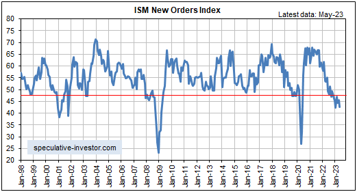
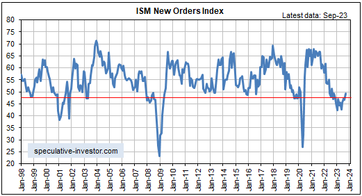
First, the ISM Manufacturing New Orders Index (NOI) bounced during September-2023, but its overarching message continues to be that a recession will begin within the next few months. It would have to rise to 55 to cancel the recession warning.

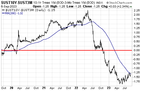
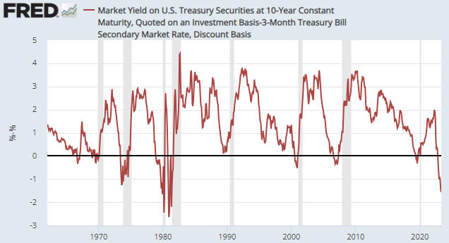
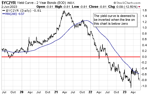
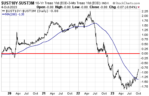
Second, the following chart of the 10year-3month yield spread shows that although the US yield curve remains inverted to an extreme (the yield curve is inverted when the line on this chart is below zero), there has been a reversal from flattening/inverting to steepening. The reversal from flattening/inverting to steepening is a recession warning signal, meaning that the yield curve is now sending the same signal as the NOI.

Muddying the waters is the fact that the yield curve’s reversal has been driven by a rising long-term yield, whereas the reversal to steepening that precedes a recession usually is driven by a falling short-term yield. However, we will take the signal at face value as it is not unprecedented for the initial steepening to be caused by the long-term yield rising faster than the short-term yield.

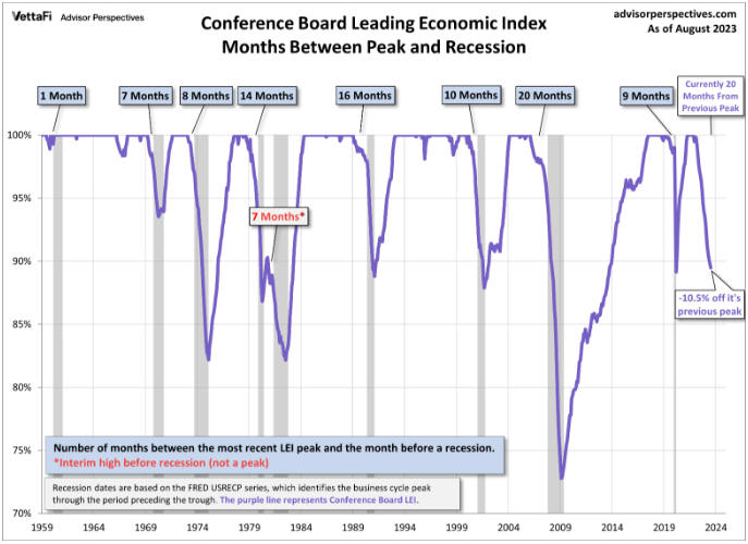
Third, here is a chart of the Conference Board’s Leading Economic Index (LEI). This chart shows that the LEI has fallen by 10.5% from its peak and that 20 months have gone by since the peak.

In the more than 60 years covered by this chart, the LEI has never suffered a peak-to-trough decline of 10.5% without the economy having entered recession and the LEI has never declined for longer than 20 months from its peak without the economy having entered recession. Assuming that the economy is not in recession today (a reasonable assumption given the coincident data), this implies that with respect to the LEI’s messaging the economy is now in uncharted territory.

The US economy is not in recession today, but taken together the above leading indicators suggest a high probability of a recession getting underway before year-end. This doesn’t mean that recessionary conditions will become obvious to most analysts and economists before year-end, though, because recession start/finish dates are determined well after the fact and because in real time the economy can appear to be doing OK during the first few months of a recession.

Returning to the question we asked in the opening paragraph, the robust economic activity still evident in some statistics, chief among them being the GDP numbers, is most likely the result of rapid government spending. This is causing the parts of the economy that are impacted the most by government spending, such as anything linked to the military or the ridiculously-named “Inflation Reduction Act”, to be strong while other parts of the economy are weak.

As an aside, due to the way GDP is calculated it can be boosted by wealth-destroying activities. For a hypothetical example, if the US government were to pay a million people $1000 each to dig a hole and then another $1000 to fill it in, 2 billion dollars would be added to US GDP. For an actual example, the on-going destruction of Ukraine is adding to US GDP because it is increasing US production of military equipment and all of the parts/materials that go into the equipment.

If the current cycle ends up being unprecedented in terms of the time from leading indicator warnings of recession to the actual start of a recession, we think that it will be due to the federal government doing aggregate-demand-boosting spending much sooner than usual during the cycle. This could delay the start of a recession to beyond the historical range, but only by creating the conditions for a government debt spiral.

Print This Post Print This Post

Timing the coming US recession

September 12, 2023

[This blog post is an excerpt, with a couple of minor tweaks, from a commentary published at www.speculative-investor.com last week]

With regard to US economic indicators, very little has happened over the past three months. Coincident data have become weaker but not dramatically so, while there have been no significant changes in the most important leading indicators of recession. The overarching message from the data is that the US economy is not far from recession, although it is clear that the tipping point has not yet been reached. However, there has been a pronounced change in sentiment, with the view that a recession will be avoided (the soft-landing or no-landing expectation) becoming dominant.

Turning to the data, as usual we’ll note the current positions of the ISM Manufacturing New Orders Index (NOI) and the yield curve, two of our favourite leading recession indicators.

The following monthly chart shows that the NOI remains at a level (below 48) that in the past usually pointed to the US economy being either in recession or about to enter recession.

Note, as well, that while the NOI generated a couple of false recession warnings in the past, the only period since 1970 during which the NOI spent several months below 48 with no recession was in 1995. It’s very unlikely that we are dealing with a 1995 scenario, though, because at that time public and private debt levels were relatively low and the Fed stopped tightening well before the yield curve became inverted.

Speaking of the yield curve, the following chart shows that the 10year-3month yield spread remains inverted to an extreme (the yield curve is inverted when the line on this chart is below zero). This tells us that monetary conditions have become tight enough to virtually guarantee an official recession. However, the signal that a recession is imminent is a reversal of the yield curve from flattening/inverting to steepening, which is yet to happen.

Note that the mild steepening that occurred over the past two months appears to have been driven by concerns about the speed at which the US government will be going into debt. We don’t view this as the sort of steepening that warns of imminent recession.

It is very unusual for the NOI to spend so much time in recession territory (11 months and counting at this stage) without conclusive evidence of recession appearing in the coincident economic data, but the time from yield curve inversion to the present is still well within the historical range. We are referring to the fact that since the late-1960s, the time from the 10y-3m yield spread becoming inverted to the start of an official recession typically has been 8-12 months, with a minimum of 5 months and a maximum of 17 months. The 10y-3m yield spread became inverted in October of last year, so the typical historical lead-time points to June-October of this year and the maximum historical lead-time points to March of next year for the start of a recession.

One of the most useful economic indicators is the average credit spread as represented by the High Yield Index Option Adjusted Spread (HYIOAS). The HYIOAS is a coincident indicator of the US economy and a leading indicator of recession, in that by the time the US economy has become weak enough to enter recession territory there usually will have been a significant widening of credit spreads as evidenced by a rapid rise in the HYIOAS. Referring to the following chart, for example, notice the upward moves in the HYIOAS during the months leading up to the 2001 and 2007-2009 recessions.

The sort of up-move in the HYIOAS that would be consistent with the lead-up to a recession occurred during March-June of last year, but the economy then rebounded and since June of last year the HYIOAS has been trending downward. This downward trend in the HYIOAS is indicative of an upward trend in economic confidence.

The HYIOAS currently is near a 16-month low, which is NOT consistent with an imminent recession start. If a recession is going to begin within the next few months, a sizable up-move in the HYIOAS should begin soon.

In conclusion, although most data are consistent with the US economy being on the verge of recession, the low level of the HYIOAS and the lack of a yield curve reversal imply that the recession start is still at least three months away.

Print This Post Print This Post

Gold and ‘real’ US interest rates

August 31, 2023

[This blog post is an excerpt from a commentary published at speculative-investor.com on 27th August 2023]

We’ve noted in previous commentaries how well the US$ gold price has held up given the rise in real US interest rates as indicated by the 10-year Treasury Inflation Protected Securities (TIPS) yield. We are referring to the fact that the 10-year TIPS yield, a long-term chart of which is displayed below, made a 14-year high of 2.00% early last week before pulling back a little, whereas the US$ gold price has retraced less than half of its up-move from its Q4-2022 low. We often say that everything is linked, and in this case the likely linkage (the explanation for gold’s resilience) is the nature of the recent T-Bond sell-off.


Chart Source: https://www.cnbc.com/quotes/US10YTIP

As discussed in last week’s Interim Update, meaningful declines in the T-Bond price over the past few decades generally have been driven by rising inflation expectations and/or the Fed’s rate-hiking. They generally have NOT been driven by accelerating supply growth or concerns about the same. The main reason is that in the past the T-Bond supply tended to ramp up in parallel with economic and financial market conditions that prompted a substantial increase in the desire to hold T-Bonds, so much so that the increase in demand for the perceived safety provided by Treasury debt trumped the increase in the supply of this debt.

The recent past has been different, in that the decline in the T-Bond price over the past four months and especially over the past month was not driven by changing expectations regarding inflation or the Fed’s monetary tightening. We know that this is the case because the “inflation” rates factored into the TIPS market (what we sometimes refer to as the “expected CPI”) have been stable, as were the prices of the most relevant Fed Funds Futures contracts prior to the past few days. Instead, the main driver was concerns about the pace at which the supply of government debt will grow over the coming year due to current spending plans, rapidly rising interest expense, and a likely large increase in government deficit-spending after the economy slides into recession. This difference matters to the gold market.

The recent increase in the ‘real’ yield on Treasury bonds has not been as bearish for gold as it normally would be, because the concerns about the US fiscal situation that have been driving the T-Bond price downward and the real T-Bond yield upward also have been boosting the investment demand for gold. We suspect that this is not so much due to the rapid increase in the government’s indebtedness in and of itself, but due to the eventual economic and monetary consequences of the burgeoning government debt.

The eventual economic consequences include slower growth as more resources get used and allocated by the government. A likely monetary consequence is that regardless of what senior members of the Fed currently say and think (they naturally will insist that the Fed is independent), there’s a high probability that the Fed eventually will be called upon to help finance the government.

Print This Post Print This Post

The gold sector is approaching a cycle low

August 15, 2023

It is worth paying close attention when a market trends into a period during which a turning point is likely based on historical cyclicality. The gold mining sector has just entered such a period.

We are referring to the strong tendency of the gold mining sector, as represented by the Gold Miners ETF (GDX), to make its high or its low for the year during August-September. Specifically, this period contained the low for the year in 2015, the high for the year in 2016 and 2017, the low for the year in 2018, the high for the year in 2019 and 2020, and the low for the year in 2021 and 2022. In other words, the August-September period ushered in the annual high or the annual low in each of the past eight years.

The vertical red lines on the following weekly GDX chart mark the aforementioned August-September turning points.

GDX_cycle_150823

We have been following the gold mining sector’s August-September cycle at speculative-investor.com for several years now. At the start of a year there will be no way of knowing whether that year’s August-September period will contain an important high or low, but there usually will be clues by June. By mid-June of this year it was apparent that if the August-September cycle was still in effect then it would mark an important low, that is, a turn from down to up. Subsequent price action has continued to point to an August-September low.

The 12-month cycle low could be set at any time over the next few weeks, but to create maximum potential for the ensuing rally it ideally will be set after the March-2023 low has been tested or breached.

Print This Post Print This Post

An end to the US monetary inflation decline?

August 2, 2023

[This blog post is an excerpt from a commentary published at speculative-investor.com last week]

The year-over-year rate of growth in US True Money Supply (TMS) ticked upward in June, that is, the US money supply contracted at a slightly slower pace during the latest month for which there are monetary data. Although the uptick is barely noticeable on the following chart, it is probably significant. It is the first increase in the monetary inflation rate since March-2022 and probably marks an end to the decline.

Below is our chart comparing the US monetary inflation rate (the blue line) with the 10y-2y yield spread (the red line), a proxy for the US yield curve. The monetary inflation rate drives the yield curve, so if the monetary inflation rate has begun to trend upward then the yield curve should commence a steepening trend within the next couple of months.

Both the monetary inflation rate and the yield curve may have reached their negative extremes, but unless one of two things happens the US will experience monetary deflation and the yield curve will remain inverted until at least the end of this year. This is because even if the Fed has made its final rate hike, it plans to continue its Quantitative Tightening (QT) for many months to come.

Continuing the QT program at the current rate would remove about $380B from the money supply over the remainder of this year. Although this could be offset by commercial bank lending (commercial banks create new money when they make loans), trends in the commercial banking industry currently are heading in the opposite direction, that is, banks are becoming less willing to expand credit.

One of the two things that could shift the monetary trend from deflation to inflation over the next several months is the large-scale exodus of money from the Fed’s Reverse Repo (RRP) facility. There is still about $1.7 trillion ‘sequestered’ in this facility, which means that there is the potential for up to $1.7T to be released from RRPs to the economy’s money supply.

The other development that could return the US money supply to inflation mode is a crisis that not only stops the Fed’s QT, but also precipitates a new bout of QE.

Our expectation is that there will not be a genuine crisis between now and the end of this year, but that there will be sufficient weakness in the stock market to prompt the Fed to end QT and that at least $1T will come out of the RRP facility to take advantage of the higher rates being offered by Treasury bills. This combination probably would turn the US monetary inflation rate positive by year-end and set in motion a steepening trend in the US yield curve.

Print This Post Print This Post

The toll of monetary tightening

July 21, 2023

[This blog post is an excerpt from a recent commentary at www.speculative-investor.com]

While it is true that prices are still rising at above-average rates in some parts of the US economy, this should be expected. The reality is that in some parts of the economy it takes longer than in others for demand and/or supply to respond to changing monetary conditions. That central bankers choose to focus on these slower-to-respond sectors is a problem we’ve addressed many times in the past. Our purpose today is to highlight some of the signs that monetary tightness is taking a substantial toll.

Commodity prices tend to lead producer prices for finished goods and producer prices for finished goods tend to lead consumer prices on both the way up and the way down. Therefore, the cyclical “inflation” up-swings and down-swings should become evident in commodity prices first and consumer prices last. In this respect the Producer Price Index (PPI) charts displayed below and the CPI chart included in last week’s Interim Update show that the current situation is not out of the ordinary, despite the extraordinary monetary machinations of the past few years.

The following monthly chart shows that over the past 12 months the year-over-year percentage change in the PPI for commodities has collapsed from near a 50-year high to near a 50-year low. We are now seeing a level of ‘commodity price deflation’ that since 1970 was only exceeded near the end of the Global Financial Crisis of 2007-2009.

The next chart shows the year-over-year percentage change in the PPI for Finished Goods Final Demand. Here we also see a collapse over the past 12 months from high ‘price inflation’ to ‘price deflation’.

It’s likely that the year-over-year rate of change in producer prices has just bottomed, because an intermediate-term downward trend in the oil price kicked off in June of last year. Just to be clear, we doubt that prices have bottomed, but over the months ahead they probably will decline at a slower year-over-year pace. However, the declines in producer prices that have happened to date suggest that the growth rate of the headline US CPI, which was 3.0% last month, will drop to 1% or lower within the next few months.

As an aside, there is nothing inherently wrong with falling prices, as lower prices for both producers and consumers is a consequence of economic growth. The problem at the moment is that prices are being driven all over the place by central bankers.

Historic ‘deflation’ in producer prices is one sign that monetary tightness is taking a substantial toll. While this price deflation could be viewed as a positive by those who are not within the ranks of the directly-affected producers, other signs are definitively negative. For example, the following chart shows that the year-over-year percentage change in Real Gross Private Domestic Investment (RGPDI) has plunged to a level that since 1970 has always been associated with an economy in recession.

For another example, the year-over-year rate of commercial bank credit expansion has dropped to zero. As illustrated by the following chart, this is very unusual. The chart shows that in data going back to 1974, the annual rate of commercial bank credit growth never got below 2.5% except during the 2-year aftermath of the Global Financial Crisis.

For a third example, the next chart shows that the annual rate of change of US corporate profits has crashed from a stimulus-induced high during the first half of 2021 to below zero. Moreover, the line on this chart probably will be much further below zero after the latest quarterly earnings are reported over the next several weeks.

The above charts point to economic contraction, but the performances over the past four months of high-profile stock indices such as the S&P500 and NASDAQ100 dominate the attentions of many observers of the financial world and at present these indices are painting a different picture. They are suggesting that monetary conditions are not genuinely tight and that the economy is in good shape. How is this possible?

Part of the reason it is possible is that ‘liquidity’ has been injected into the financial markets despite the shrinkage in the economy-wide money supply. We note, in particular, that $514B has exited the Fed’s Reverse Repo (RRP) Facility over the past six weeks, including about $300B over just the past two weeks. Another part of the reason is that the stock market keeps attempting to discount an about-face by the Fed. A third reason is simply that the senior stock averages are not representative of what has happened to the average stock. Related to this third reason is that there are money flows into index-tracking funds every month that boost the relative valuations of the stocks with the largest market capitalisations.

We end by cautioning that just because something hasn’t happened yet, doesn’t mean it isn’t going to happen. It’s likely that eventually the monetary tightening will reduce the prices of almost everything.

Print This Post Print This Post

Replaying the 1970s?

June 30, 2023

[This blog post is a modified excerpt from a newsletter published at www.speculative-investor.com about two weeks ago]

The world is not going through a replay of the 1970s, as there are some critical differences between the current situation and the situation back then. For example, a critical difference is that private and government debt levels were much lower during the 1970s than they are today. However, this decade’s macroeconomic path probably will have a lot more in common with the 1970s than with any subsequent decade. One similarity is that just like the 1970s, the current decade probably will have multiple large waves of inflation. Another similarity and the one we will address now is the performance of the US yield curve.

Here is a monthly chart of the US 10-year T-Note yield minus the 3-month T-Bill yield (the 10year-3month spread), a proxy for the US yield curve. Clearly, nothing like the current situation has occurred over the past forty years. Just as clearly, the current yield-curve situation is not unprecedented or even extreme compared to what happened during 1973-1981.

Note that the shaded areas on the chart show when the US economy was deemed by the National Bureau of Economic Research (NBER) to be in recession.

During the period from June-1973 to August-1981, the yield curve was inverted for a cumulative total of 40 months (about 40% of the time). This means that during the aforementioned roughly 8-year period, yield curve inversion was almost the norm. Furthermore, there were times during this period when the inversion was more extreme than it is today.

Of potential relevance to the present, the 1973-1974 recession began 6 months after the yield curve became inverted and 3 months after the inversion extreme, that is, 3 months after the start of a steepening trend, while the 1981-1982 recession began 8 months after the yield curve became inverted and 7 months after the inversion extreme. The ‘odd man out’ was the 1980 recession, which began 13 months after the yield curve became inverted and 2 months BEFORE the inversion extreme. In other words, even during the major inflation swings of the 1970s and early-1980s, the yield curve tended to reverse from flattening/inverting to steepening prior to the start of an official recession.

Also of relevance is that during the 1970s gold generally did well when the yield curve (the 10year-3month spread) was inverted. For instance, the entire major rally from around $200 in late-1978 to the blow-off top above $800 in January-1980 occurred while the yield curve was inverted. In addition, the entire large decline in the gold price during 1975-1976 occurred while the yield curve was in positive territory.

The situation today is that the US yield curve (the 10year-3month spread) became inverted in October of last year. This means that about 8 months have gone by since the inversion. As mentioned above, the longest time from inversion to recession start during 1973-1981 was 13 months. Also, at this time there is no evidence that an inversion extreme is in place.

One conclusion is that based on what happened during the 1970s, we probably will have to get used to the yield curve being inverted. Another conclusion is that today’s inversion-recession path would remain within the bounds of what transpired during 1973-1981 if a recession were to begin by November of this year.

Print This Post Print This Post

The US stock market in ‘real’ terms

June 13, 2023

[This blog post is an excerpt from a commentary published last week at www.speculative-investor.com]

In a world where the official currencies make poor measuring sticks due to their relentless and variable depreciation, looking at the relative performances of different investments is the best way to determine which ones are in bull markets. Furthermore, because they are effectively at opposite ends of an investment seesaw, with one doing best when confidence in money, central banking and government is rising and the other doing best when confidence in money, central banking and government is falling, this is a concept that works especially well for gold bullion and the S&P500 Index (SPX).

There will be times when both gold and the SPX are rising in US$ terms, but it should be possible to tell the one that is in a genuine bull market because it will be the one that is relatively strong. More specifically, if the SPX/gold ratio is in a multi-year upward trend then the SPX is in a bull market and gold is not, whereas if the SPX/gold ratio is in a multi-year downward trend then gold is in a bull market and the SPX is not. There naturally will be periods of a year or longer when it will be impossible to determine whether a multi-year trend has reversed or is consolidating (we are now in the midst of such a period), but there is a moving-average crossover that can be used to confirm a reversal in timely fashion.

For at least a decade, we have been monitoring the SPX/gold ratio (or the gold/SPX ratio) relative to its 200-week MA to ascertain whether gold or the SPX is in a long-term bull market*. The idea is that when the SPX/gold ratio is above its 200-week moving average, it means that the SPX is in a bull market and gold is not. And when the ratio is below this moving average, it means that gold is in a bull market and the SPX is not.

The following weekly chart shows that since 1980 the SPX/gold ratio relative to its 200-week MA (the blue line) has generated only two false signals. Both of these false signals occurred as a result of stock market crashes — the October-1987 crash and the March-2020 crash. The chart also shows that since peaking in late-2021, the SPX/gold ratio has dropped back to its 200-week MA but is yet to make a sustained break to the downside.

The next weekly chart zooms in on the SPX/gold ratio’s more recent performance. This chart makes it clear that over the past 12 months the ratio has been oscillating around its bull-bear demarcation level.

It’s likely that an SPX bear market, and therefore a gold bull market, began in late-2021, but there remains some doubt. The remaining doubt would be eliminated by the SPX/gold ratio breaking below its March-2023 low.

Further to comments we made in the latest Weekly Update, the only plausible alternative to the bear-market-rebound scenario for the US stock market is that a bear market has not yet started. This is clearer when looking at the SPX in gold terms than when looking at the SPX in nominal dollar terms. What we mean is that the moderate pullback in the SPX/gold ratio to its 200-week MA clearly was not a complete bear market; it was either the start of a bear market or it was a bull-market correction.

Our view is that a multi-year equity bear market is in progress. However, if the SPX/gold ratio fails to break below its March-2023 low within the next few months and instead makes its way upward, then what transpired during 2022 was an intermediate-term stock market correction within a bull market.

*A January-2019 blog post discussing the concept can be found HERE.

Print This Post Print This Post

US Recession Watch

June 5, 2023

[This blog post is an excerpt from a recent commentary published at speculative-investor.com]

Leading indicators of the US economy continue to signal imminent recession, but coincident indicators are mixed and some lagging indicators, most notably employment, are still showing strength. Therefore, it isn’t clear whether or not a recession has commenced. Also, high-profile parts of the stock market are muddying the water by trading as if a “soft landing” (no recession, but a large-enough inflation decline to cause the Fed to reverse course) were the most likely economic outcome over the next several months.

Turning to our favourite two leading indicators, first up we have a chart showing that the ISM Manufacturing New Orders Index (NOI) made its cycle low to date in January-2023 and returned to its cycle low in May-2023. As noted in previous TSI commentaries, at no time since 1970 has the ISM Manufacturing NOI been as low as it is today without the US economy being either in recession or about to enter recession.

Next up is the yield curve, which remains inverted to an extreme. The extreme inversion tells us that monetary conditions have become tight enough to virtually guarantee an official recession, but the signal that a recession is imminent is a reversal of the yield curve from flattening/inverting to steepening.

A yield curve reversal from flattening/inverting to steepening has not happened, yet. It’s possible that the rebound in the 10-year T-Note yield minus the 2-year T-Note yield (the 10y-2y spread) from its March-2023 low is the start of a reversal, but the 10-year T-Note yield minus the 3-month T-Note yield (the 10y-3m spread), an equally important measure of the yield curve, just hit a new inversion extreme for the cycle. Daily charts of these interest rate spreads are displayed below.

As explained in the past, the yield curve is driven by the monetary inflation rate and tends to lag the monetary inflation rate at major turning points. Of particular relevance at this time, a reversal in the yield curve from flattening/inverting to steepening usually follows a major upward reversal in the monetary inflation rate. This relationship is illustrated by the monthly chart displayed below. The red line on this chart is the 10y-2y spread and the blue line is the growth rate of US True Money Supply (TMS).

Clearly, the monetary inflation rate has not yet reversed upward. This indicates that the monetary conditions for a yield curve reversal are not yet in place.

Note that for the monetary inflation rate to begin trending upward in the near future, a large amount of money probably will have to exit the Fed’s Reverse Repo facility. This could happen in response to the flood of new debt that will be issued by the Treasury within the next couple of months.

In conclusion, it’s possible that a US economic recession has begun, but it’s now more likely that a recession won’t begin until the third quarter of this year.

Print This Post Print This Post

The stock market says one thing, the copper market says another

May 30, 2023

[This blog post is an excerpt for a commentary published last week at www.speculative-investor.com]

The following chart shows that over the past five years the US$ copper price (the brown line) and the S&P500 Index (the green line) generally trended in the same direction. Why, then, have they moved in opposite directions over the past two months?

The relationship between the copper price and the S&P500 Index (SPX) can be described as one of generally positive correlation with divergent movements at times. The copper price acts as an economic bellwether due to its extensive industrial usage, while the SPX represents general equity market sentiment. They are influenced by similar macroeconomic factors, but short-term performance differences occasionally arise due to shifts in commodity-specific factors, inflation expectations and risk preferences.

The performance difference since early-April, with the copper price moving downward to a new low for the year while the SPX moved upward to a new high for the year, is most likely due to shifting risk preferences within the stock market. To be more specific, the copper price has declined in sympathy with a global manufacturing recession (the US, European and Chinese manufacturing PMIs are all in recession territory) and the high probability of reduced metal demand over the months ahead as the on-going monetary tightening takes its inevitable economic toll, while the SPX has risen on the back of speculation that technology in general and AI in particular will generate good returns almost regardless of what happens to the economy.

One way or the other, it’s likely that the divergence will close within the next three months.

From our perspective, copper is performing exactly the way it should be performing considering the macroeconomic landscape. It is short-term oversold and could rebound at any time (a routine countertrend rebound would take the copper price back to the US$3.80s), but we suspect that it will trade at least 10% below its current price before completing its downward trend. Consequently, we expect that the divergence will close via weakness in the stock market rather than strength in the copper market.

Print This Post Print This Post

Debt Ceiling Scenarios

May 23, 2023

[This blog post is an excerpt from a recent commentary at https://speculative-investor.com/]

Last week there was a big drop in the US federal government’s account at the Fed (the Treasury General Account, or TGA for short). The latest figures show a TGA balance of only US$57B, which probably means that the government will run out of money within the next three weeks unless a deal is done to raise or suspend the Debt Ceiling. Given the lack of fear recently evident in the financial markets, with risk-off assets such as gold doing relatively poorly and signs of aggressive bullish speculation in parts of the stock market, it appears that most market participants expect a deal to be done very soon. While that’s definitely possible, it’s far from a foregone conclusion. Moreover, what comes after a Debt Ceiling deal will not favour the stock market.

What comes after a Debt Ceiling deal will be a flood of new government debt issuance to replenish the TGA and make the payments that were postponed during the preceding months. To be more specific, based on information provided by the Treasury there will be net new debt issuance of more than US$700B during the three months following a deal. This will drain liquidity from the financial markets unless it is accompanied by money leaving the Fed’s Reverse Repo (RRP) program. For instance, if the government were to increase its total debt by $750B after a deal and $500B of the new debt were purchased by MMFs using funds presently held in the RRP program, then the net liquidity drain would only amount to $250B.

Currently, therefore, there are two big unknowns. The first is the timing of a political deal to raise the Debt Ceiling and the second is the proportion of the ensuing flood of new debt that will be offset — in terms of effect on financial market liquidity — by money coming out of RRPs.

With regard to the timing question, there are two main scenarios.

The first is that a deal will be done within the next three weeks, thus avoiding a partial shutdown of the government. As mentioned above, this currently appears to be the general expectation. We suspect that if it comes to pass it will lead to short-lived (1 week maximum) moves to the upside in the stock market and downside in the gold and T-Bond markets, followed by reversals as other issues, including an imminent recession and the coming flood of new government debt, move to centre-stage.

The second scenario is that the political negotiations will drag on until a deal is forced upon the two negotiating parties by extreme weakness in the stock market. Under this scenario, a deal could be 2-3 months away. Even though the TGA balance probably will drop to almost zero within three weeks, this sort of delay in striking a deal is possible because of the corporate tax payments that are due on 15th June and the additional special measures that could become available to the Treasury at the end of June. In addition to substantial stock market weakness and a partial government shutdown, likely ramifications of this scenario include a large rise in the gold price.

What happens with the US government’s Debt Ceiling will have a big influence on the paths taken by the major financial markets over the next three months, but our short-term assessments of risk and reward do not hinge on when/how the Debt Ceiling issue is resolved. Regardless of whether we get the first scenario or the second scenario or something in between, the outlook for the next three months is bearish for the S&P500 Index, bullish for gold and bullish for the T-Bond.

Print This Post Print This Post

An important gold mining cycle

May 17, 2023

[This blog post is an excerpt from a recent commentary at https://speculative-investor.com/]

Short-term moves can create opportunities to scale in or scale out, but the big picture always should be kept in mind. For the gold mining sector, this means keeping in mind the high probability that a cyclical bull market is underway. This cyclical trend should result in large additional gains by gold mining stocks in nominal terms and relative to most other stocks. With regard to relative performance, the following two weekly charts give some idea as to the amount by which gold mining stocks could outperform other commodity-related stocks over the next 6-12 months.

The first chart shows that gold mining stocks (represented by GDX) doubled-bottomed relative to general mining stocks (represented by XME) between August of last year and February of this year. Significant gains in the GDX/XME ratio have occurred already, but based on the historical record the ratio could double from here prior to making its next major peak. As mentioned in previous TSI commentaries, the cyclicality of this ratio points to the gold sector’s next major relative-strength peak occurring between late-2023 and mid-2024.

The second chart shows that the gold sector reversed upward relative to the oil sector (represented by XLE) during the final quarter of last year. This chart suggests that the new trend involving strength in gold stocks relative to oil stocks is still in its infancy.

In case what we’ve written above and in many previous commentaries is not clear, the focus of most investing/speculating should be on gold and the related assets (silver and the gold/silver mining stocks). This has been the case for the past six months, it is the case now and it likely will be the case for the next six months.

For equity traders, this means that the gold mining sector should be prioritised when planning portfolio additions. However, it doesn’t mean that everything else should be ignored and that your entire portfolio should consist of gold/silver stocks. With regard to “everything else”, we note that the fundamentals for the oil tanker sector remain very bullish, the cannabis sector is starting to shows signs of life, it is important to have exposure to energy (oil, coal, uranium and natural gas) and it would make sense to have some exposure to commodities such as lithium and the REEs.

Print This Post Print This Post