[This blog post is an excerpt from a recent TSI commentary]
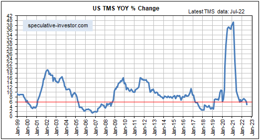
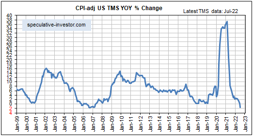
In most countries/regions around the world, monetary inflation rates peaked at extraordinary heights in early 2021 and have since crashed. Furthermore, the declines are set to continue over the next several months as central bankers attempt to make up for their mistake of being far too ‘easy’ during 2020-2021 by being far too ‘tight’ during 2022-2023, thus revealing a fondness for irony given that part of the official justification for central banks is to smooth-out the business cycle. Here are monthly money-supply charts showing where we are and where we’ve been.
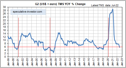
G2 True Money Supply (TMS), a concoction of ours that combines the money supplies of the US and the euro-zone, is the primary driver of the global boom-bust cycle. The following chart shows that in July-2022 the year-over-year G2 TMS growth rate dropped below the boom-bust threshold. With both the Fed and the ECB intent on contracting their balance sheets over the months ahead, it’s a virtual certainty that the line on this chart will continue to move downward. This will worsen the global recession that is already underway.
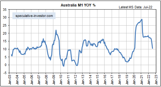
At a little over 10%, Australia’s monetary inflation rate remains high. However, it has come down a lot from its level of 18 months ago and looks set to drop to 5% or lower over the next several months as the Reserve Bank of Australia ‘tightens the screws’. This is bearish for Australia’s real estate market, where valuations generally remain extremely high.
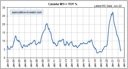
Over the past 18 months Canada’s monetary inflation rate has collapsed from an all-time high to near a multi-decade low. This has very bearish implications for Canada’s real estate market.
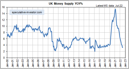
The UK’s monetary inflation rate also has collapsed from an all-time high to near a multi-decade low.
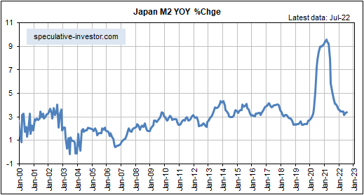
Japan has been a monetary inflation enigma for a long time, in that despite the appearance of aggressive Bank of Japan (BOJ) money pumping the year-over-year growth rate of Japan’s M2 money supply spent the bulk of the past 25 years in the 0%-4% range. In response to the COVID crisis the M2 growth rate surged to almost 10% in 2020-2021, but it has since fallen back to its low/narrow multi-decade range.
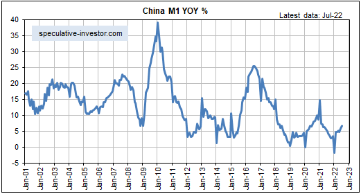
With regard to money-supply growth, China has been the ‘odd man out’ over the past three years. In China the monetary response to the COVID crisis was relatively minor and by January of this year the year-over-year growth rate of M1 money supply had dropped below zero. It has since rebounded to around 7%.
The following chart shows that China’s monetary inflation rate has been making lower highs and lower lows (trending downward, that is) since 2010. It probably isn’t a fluke that this downward trend coincides with Xi Jinping’s leadership, because Xi does not like financial speculation.
China’s relatively slow rate of monetary inflation over the past few years is a long-term plus for that country’s economy, but it is being counteracted by many negatives including the severe damage that has been wrought by the “Dynamic Zero COVID” policy.
Once central banks have created a bubble the best they can do is step aside and let the markets sort out the mess. Stepping aside would involve not creating any more money and not destroying any existing money. The worst they can do is take money out of the economy, because that causes additional price distortions and because simply ending the pumping-in of new money would be sufficient on its own to burst the bubble. Currently, central banks are doing the worst they can do in an effort to address price rises resulting from supply constraints, as if reducing the availability of money and credit will promote the investment needed to bring about additional supply. These actions will have dire consequences.