Sentiment Synopsis, Part 2

November 28, 2017

A blog post titled “Sentiment Synopsis” posted two weeks ago contained some explanatory remarks about the Commitments of Traders (COT) reports and briefly discussed the sentiment situations for gold, silver, the Canadian dollar and the Yen using the COT data as the indicators of market sentiment. In this post I’ll do the same for the euro, the Swiss franc and oil, again with the help of charts from Gold Charts ‘R’ Us.

As noted in the earlier post, what I refer to as the total speculative net position takes into account the net positions of large speculators (non-commercials) and small traders (the ‘non-reportables’) and is the inverse of the commercial net position. The blue bars in the middle sections of the charts that follow indicate the commercial net position, so the inverse of each of these bars is considered to be the total speculative net position.

Let’s begin with the euro.

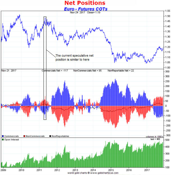
For the past few months the net speculative long position in euro futures has hovered near an all-time high. In fact, the only time that speculators in currency futures, as a group, have ever bet more heavily on a rise in the euro was in 2011 when the euro/US$ exchange rate was peaking in the high-1.40s. Consequently, it could be argued that sentiment is more conducive to euro weakness than euro strength in the short-term.

There is, however, a caveat, which is that if speculators were to become as bullish on the euro as they were bearish in Q2-2012 or Q1-2015 then the speculative net-long position in euro futures will become much larger than at any time in the past. The current COT situation should therefore be viewed as a short-term warning of euro weakness, but not a reason to place a substantial bearish bet.

euroCOT_281117

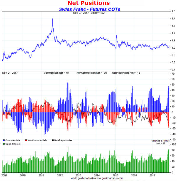
Turning to the following Swiss franc (SF) chart we see the opposite situation. Whereas the COT report indicates that speculators in the futures market are almost as bullish on the euro as they have ever been, it also indicates that the same speculators are almost as bearish on the SF as they have ever been. In particular, it was only for a brief period in 2012 that currency speculators, as a group, were more short (that is, more bearish) on the SF than they are right now. It looks very much like speculators in currency futures have been buying the euro and selling the SF as a pair trade, undoubtedly to take advantage of the downward trend in the SF/euro exchange rate that got underway in April.

I view the current COT situation as a reason to be short-to-intermediate-term bullish on the SF relative to both the US$ and the euro.

SFCOT_281117

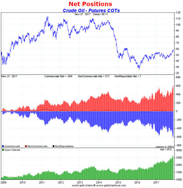
Last but not least, below is a chart showing the COT situation for US (West Texas Intermediate) crude oil futures. The chart tells us that the net speculative long position in oil futures made an all-time high two weeks ago and remains close to its high.

Based on considerations other than sentiment I expect the oil price to trade well into the $60s during the first half of next year, but oil’s COT situation is a short-term danger sign. In the absence of a steady stream of bullish news the oil price is likely to trade at least 10% below its current price within the next two months. I hasten to point out, however, that the risk/reward does not suggest that oil should be shorted.

oilCOT_281117

Gold’s 47-Year Bull Market

November 24, 2017

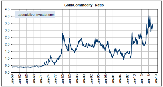
The following monthly chart shows that relative to a broad basket of commodities*, gold commenced a very long-term bull market (47 years and counting) in the early-1970s. It’s not a fluke that this bull market began at the same time as the final official US$-gold link was severed and the era of irredeemable free-floating fiat currency kicked off.

gold_commodity_241117

Anyone attempting to apply a traditional commodity-type analysis to the gold market would have trouble explaining the above chart. This is because throughout the ultra-long-term upward trend in the gold/commodity ratio the total supply of gold was orders of magnitude greater, relative to commercial demand, than the supply of any other commodity. Based on the sort of supply-demand analysis that routinely gets applied to other commodities, gold should have been the worst-performing commodity market.

The reason that a multi-generational upward trend in the gold/commodity ratio began in the early-1970s and is destined to continue is not that gold is money. The reality is that gold no longer satisfies a practical definition of money. The reason is the combination of the greater amount of mal-investment enabled by the post-1970 monetary system and the efforts by central bankers to dissuade people from saving in terms of the official money.

In brief, what happens is this: Central banks put downward pressure on interest rates (by creating new money) in an effort to promote economic growth, but the economy’s prospects cannot be improved by falsifying the most important price signals. Instead, the price distortions lead to clusters of ill-conceived investments, thus setting the stage for a recession or economic bust. Once it is widely realised that cash flows are going to be a lot less than previously expected there is a marked increase in the general desire to hold cash. At the same time, however, central banks say that if you hold cash then we will punish you. They don’t use those words, but it is made clear that they will do whatever it takes to prop-up prices and prevent the savers of money from earning a real return on their savings. This prompts people to look for highly liquid assets that can be held in lieu of the official money, which is where gold comes in.

This is why the gold/commodity ratio tends to trend downward when everything seems fine on the surface and rocket upward when it becomes apparent that numerous investing mistakes have been made and that the future will be nowhere near as copacetic as previously assumed.

It’s reasonable to expect that the multi-generational upward trend in the gold/commodity ratio that began in the early-1970s will continue for at least as long as the current monetary system remains in place. Why wouldn’t it?

*For the broad basket of commodity prices the chart uses the CRB Index up to 1992 and the GSCI Spot Commodity Index (GNX) thereafter.

TSI’s Principles of Technical Analysis

November 21, 2017

Although my primary focus is on the fundamentals, I do use Technical Analysis (TA). However, many of my TA-related beliefs deviate from the mainstream. Below is a collection of these beliefs presented in no particular order. The collection is not comprehensive, but it gives an overview of how I think historical price action can and can’t be used.

Note that there is significant repetition in the following list, in that a similar meaning is sometimes conveyed in separate points using different words. Also, I am not stating that my beliefs are the ‘be all and end all’ of TA and should be adopted by everyone. Far from it. What works for me may not work for you, and vice versa. Consequently, if you are able to make good use of a TA method that I believe to be useless then there is no reason why my opinion should prompt you to make a change.

Here we go:

1) Clues about future price action can sometimes be gleaned from price charts, but price charts tell you a lot about what has happened and very little about what is going to happen.

2) All of the useful information that can be gleaned from a chart is available without drawing a single line or calculating a single Fibonacci ratio. For example, you can tell whether a price has trended upward or downward just by ‘eyeballing’ the chart. You can also tell, just by looking at the chart, if a market is extended to the upside or the downside.

3) You can’t gain an advantage in the financial markets by doing something that could be done by the average nine-year-old, such as drawing lines to connect dots on a chart. Note: I regularly draw lines on the charts contained in TSI commentaries, but this is for illustrative purposes only. For example, for TSI presentation purposes I draw horizontal lines to highlight the previous peaks/troughs that could influence future trading and angled lines to illustrate that a market has been making lower highs or higher lows. I never draw lines on charts for my own trading/investing.

4) Channels are more useful (or less useless) than trend lines, because channel lines show that a market has been rising or falling at a consistent pace. As a consequence, a properly defined price channel can help a trader see when a significant change has occurred. A related consideration is that at least 5 points are needed to properly define a price channel — at least 3 points on one side and at least 2 points on the other side.

5) The more lines drawn on a chart, the less useful the chart becomes. The reason is that the lines obscure the small amount of useful information that can be gleaned from a chart.

6) The more obvious a chart pattern, the less chance it will be helpful in figuring out what the future holds in store or the appropriate action (buy, sell, or do nothing).

7) Markets invariably retrace, which means that they never move upward or downward in straight lines for long. However, markets are no more likely to retrace in accordance with “Fibonacci” numbers than with any other series of similarly spaced numbers.

8) Under normal market conditions, breakouts above resistance and below support are unreliable buy/sell signals. Manic markets like the one for NASDAQ stocks during 1998-2000 are exceptions. Under these abnormal market conditions, most upside breakouts are followed by large gains.

9) False (meaning: failed) upside breakouts are more reliably bearish than downside breakouts, and false downside breakouts are more reliably bullish than upside breakouts.

10) More often than not, a “death cross” (the 50-day moving average moving from above to below the 200-day moving average) will roughly coincide with either a short-term or an intermediate-term low. In other words, “death crosses” usually have bullish implications and are therefore misnamed. “Golden crosses” (the 50-day moving average moving from below to above the 200-day moving average) are neither bullish nor bearish.

11) The trend can’t possibly be your friend, because in real time you never know what the trend is. You only know for certain what it was. Another way of saying this is that the current trend is always a matter of opinion.

12) When figuring out where to buy and sell it can be useful to identify lateral support and resistance levels. For example, part of a money management strategy could involve buying pullbacks to support when there is good reason to believe, based on fundamental analysis, that a bull market is in progress. More generally, charts can help identify appropriate price levels to buy and sell for investments that have been selected using fundamental analysis.

13) Charts and momentum indicators can help determine the extent to which a market is ‘overbought’ or ‘oversold’, which, in turn, can help identify appropriate times to scale into and out of positions.

14) One way of determining the extent to which a market is ‘overbought’ or ‘oversold’ is to check the price relative to its 50-day and 200-day moving averages. For example, when a market price moves a large percentage above or below its 50-day moving average it usually means that the market is sufficiently extended in one direction to enable a significant move in the opposite direction (note that what constitutes a “large percentage” will be different for different markets). For another example, downward corrections in bull markets tend to end slightly below the 200-day moving average.

15) Acceleration usually happens near the end of a trend. This means that if you are long you should view upward acceleration as a warning signal of an impending top, not a reason to get more bullish.

16) Long sequences of up days create short-term selling opportunities and long sequences of up weeks create intermediate-term selling opportunities, especially if the percentage gain is large in the context of the market in question. It’s the same with long sequences of down days/weeks and buying opportunities. A “long” sequence is at least five in a row.

17) Charts showing price ratios can be informative, but traditional TA is even less valid with ratios than with nominal prices. In particular, support and resistance levels only have meaning with reference to the prices of things that people actively and directly trade in financial markets. On a related matter, applying TA to economic statistics or sentiment indicators is a total waste of time.

18) With a few exceptions, intra-day price reversals are unreliable indicators of the future. One exception is when the reversal happens immediately after a breach of an obvious support or resistance level.

19) History repeats, but in real time you can never be sure which history is repeating. Putting it another way, a market’s future price action almost certainly will be similar to the price action of that market or some other market at an earlier time, but while it is happening you can never be certain which historical price action is being replicated.

20) Elliott Wave analysis explains everything with the benefit of hindsight but provides its practitioners with very little in the way of foresight.

21) Price targets determined by measuring distances on charts are little better than random guesses. However, price targets determined in this way can be helpful in figuring out levels at which some buying (in the case of a downside target) or selling (in the case of an upside target) should be done, especially when the targets roughly coincide with a support or resistance level.

Sentiment Synopsis

November 14, 2017

The Commitments of Traders (COT) reports are nothing other than sentiment indicators, but as far as sentiment indicators go they are among the most useful. In fact, for some markets, including gold, silver, copper and the major currencies, the COT reports are by far the best indicators of sentiment. This is because they reflect how the broad category known as speculators is betting. Sentiment surveys, on the other hand, usually focus on a relatively small sample and are, by definition, based on what people say rather than on what they are doing with their money. That’s why for some markets, including the ones mentioned above, I put far more emphasis on the COT data than on sentiment surveys.

In this post I’m going to summarise the COT situations for four markets with the help of charts from an excellent resource called “Gold Charts ‘R’ Us“. I’ll be zooming in on the net positions of speculators in the futures markets, although useful information can also be gleaned from gross positions and the open interest.

Note that what I refer to as the total speculative net position takes into account the net positions of large speculators (non-commercials) and small traders (the ‘non-reportables’) and is the inverse of the commercial net position. The blue bars in the middle sections of the charts that follow indicate the commercial net position, so the inverse of each of these bars is considered to be the total speculative net position.

Let’s begin with the market that most professional traders and investors either love or hate: gold.

The following weekly chart shows that the total speculative net-long position in Comex gold futures hit an all-time high in July of 2016 (the chart only covers the past three years, but I can assure you that it was an all-time high). In July of last year the stage was therefore set for a sizable multi-month price decline, which unfolded in fits and starts over the reminder of the year. More recently, the relatively small size of the speculative net-long position in early-July of this year paved the way for a tradable rebound in the price, but by early-September the speculative net-long position had again risen to a relatively high level. Not as high as it was in July of 2016, but high enough that it was correct to view sentiment as a headwind.

There has been a roughly $100 pullback in the price from its early-September peak, but notice that there has been a relatively minor reduction in the total speculative net-long position. This suggests that speculators have been stubbornly optimistic in the face of a falling price, which is far from the ideal situation for anyone hoping for a gold rally. A good set-up for a rally would stem from the flushing-out of leveraged speculators.

The current COT situation doesn’t preclude a gold rally, but it suggests that a rally that began immediately would be limited in size to $50-$100 and limited in duration to 1-2 months.

goldCOT_131117

It’s a similar story with silver, in that the price decline of the past two months has been accompanied by almost no reduction in the total speculative net-long position in Comex silver futures. In other words, silver speculators are tenaciously clinging to their bullish positions in the face of price weakness. This suggests a short-term risk/reward that is neutral at best.

silverCOT_131117

In May of this year the total speculative net-short position in Canadian dollar (C$) futures hit an all-time high, meaning that the C$’s sentiment situation was more bullish than it had ever been. This paved the way for a strong multi-month rally, but by early-September the situation was almost the exact opposite. After having their largest net-short position on record in May, by late-September speculators had built-up their largest net-long position in four years. The scene was therefore set for C$ weakness.

The speculative net-long position in C$ futures has shrunk since its September peak but not by enough to suggest that the C$’s downward correction is complete.

C$COT_131117

For the Yen, the sentiment backdrop is almost as supportive as it gets. This is because the speculative net-short position in Yen futures is not far from an all-time high. There are reasons outside the sentiment sphere to suspect that the Yen won’t be able to manage anything more than a minor rebound over the coming 1-2 months, but due to the supportive sentiment situation the Yen’s short-term downside potential appears to be small.

YenCOT_131117

Needless to say (but I’ll say it anyway), sentiment is just one piece of a big puzzle.