Understanding the yield curve

January 28, 2022

The yield curve is said to be steepening when the gap between long-term interest and short-term interest rates is increasing, but the meaning of the steepening is different depending on whether it is being driven by rising long-term interest rates or falling short-term interest rates. Also, the yield curve is said to be flattening when the gap between long-term interest and short-term interest rates is decreasing, but the meaning of the flattening is different depending on whether it is being driven by falling long-term interest rates or rising short-term interest rates. The two possible yield curve trends (steepening or flattening) and the two main ways that each of these trends can come about results in four different yield curve scenarios as outlined below.

1) A steepening curve driven by rising long-term interest rates (that is, a steepening of the curve along with flat or rising short-term interest rates).

This is indicative of rising inflation expectations. It tends to be bullish for commodities, cyclical sectors of the stock market and relatively high-risk equities and credit. It is bearish for long-dated treasuries.

2) A steepening curve driven by falling short-term interest rates.

This is indicative of declining liquidity and a general shift away from risk. It is bullish for all treasury securities (especially short-dated treasuries) and gold. It is bearish for almost all equities and especially bearish for cyclical and relatively high-risk equities. It is also bearish for commodities and high-yield credit.

3) A flattening curve along with rising short-term interest rates.

This is indicative of an increasing urgency to borrow short to lend/invest long and a general shift towards risk. It tends to be bullish for most equities and high-yield credit. It is bearish for gold and short-dated treasury securities.

4) A flattening curve driven by falling long-term interest rates (that is, a flattening of the curve along with flat or falling short-term interest rates).

This is indicative of declining inflation expectations and increasing aversion to risk. It tends to be bullish for gold, long-dated treasuries and relatively low-risk equities. It tends to be bearish for cyclical stocks and high-yield credit.

In general, scenarios 1 and 3 arise during economic booms, scenario 2 is a characteristic of an economic bust and scenario 4 occurs during a boom-to-bust transition.

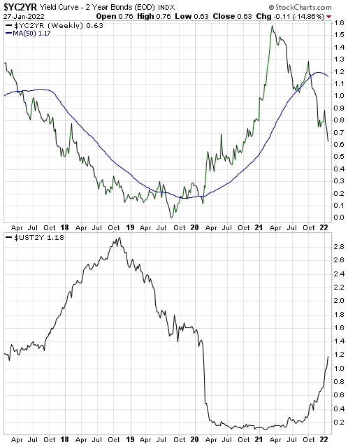
The top section of the following chart shows that the 10yr-2yr yield spread, which is one of the most popular measures of the US yield curve, has been declining (indicating a flattening yield curve) since March of 2021. The bottom section of the same chart shows that the yield-curve flattening has occurred in parallel with a rising 2-year yield, meaning that for the past several months we have had yield curve scenario 3. This is evidence that the boom continues. However, a shift to yield curve scenario 4 (indicating a boom to bust transition) could happen soon.

yieldcurve_blog_280122

The inflation peak is in the rear-view mirror

January 18, 2022

[This blog post is a brief excerpt from a TSI commentary published last week]

It was reported on Wednesday 12th January that the year-over-year growth rate of the US CPI hit a new post-1982 high of 7% in December-2021. However, garnering less attention was the fact that the month-over-month CPI growth rate peaked in June-2021, made a slightly lower high in October-2021 and in December-2021 was not far from its low of the past 12 months. The first of the following charts shows the month-over-month change in the US CPI. Of greater importance for financial market participants, the second of the following charts shows that inflation expectations (the rate of CPI growth factored into the Treasury Inflation Protected Securities market) is well down from its November-2021 peak and actually fell on Wednesday 12th January in the wake of the horrific headline CPI news.

We were very bullish on “inflation” back in April of 2020 when deflation fear was rampant; not because we were being contrary for the sake of being contrary but because central bank and government actions pretty much guaranteed that the CPI would be much higher within 12 months. Now, with inflation fear rampant, we expect to see increasingly obvious signs over the quarters ahead that the inflation threat has abated, not because we are being contrary for the sake of being contrary but because the monetary and fiscal situations stopped being pro-inflation many months ago.

It’s likely that the next round of accelerating inflation will emerge during 2023-2024.

Oil fundamentals are still bullish, but…

January 10, 2022

[This blog post is a modified excerpt, including updated charts, from a TSI commentary published about three weeks ago]

The oil futures market remains in strong backwardation. The fact that the oil futures curve still has a steep downward slope (meaning: nearer contracts are priced well above later contracts) indicates that the physical supply situation is still ‘tight’. Moreover, oil supply probably will remain somewhat tight for at least the next two months due to the natural gas shortage in Europe and the resultant need to find a substitute fuel for electricity generation. This suggests that the oil price bottomed on a multi-month basis when it dropped to the low-US$60s in early-December. At the same time, macroeconomic considerations and intermarket relationships suggest that the October-2021 high near US$85 was the intermediate-term variety (a high that holds for at least 6 months).

With regard to the macroeconomic backdrop, as recently as two months ago inflation expectations were trending higher and the yield curve had not confirmed a shift from steepening to flattening. However, we now have evidence that inflation expectations peaked in November-2021 and confirmation of a trend reversal in the yield curve. Both of these changes remove macroeconomic supports for commodities, including oil.

Also, signs of declining growth expectations have begun to appear. It’s early days, but we view the recent performance of the XLY/XLP ratio as a ‘shot across the bow’.

By way of explanation, here’s what we wrote about the XLY/XLP ratio on 27th October:

The performance of the Consumer Discretionary ETF (XLY) relative to the performance of the Consumer Staples ETF (XLP) is a good indicator of whether stock market participants, as a group, are favouring growth or safety. Specifically, when the XLY/XLP ratio is trending upward it indicates that the market is tilting towards growth and when the XLY/XLP ratio is trending downward it indicates that the market is tilting towards safety. Consequently, when this ratio signals a trend reversal by breaking above a prior high or below a prior low, it is useful information.

Until late-November the XLY/XLP ratio was in a clear upward trend, indicating that the financial world was tilting towards growth. It hasn’t yet confirmed a downward trend reversal, but it has fallen far enough to negate the October upside breakout.

XLY_XLP_100122

With regard to intermarket relationships, the divergence between the oil price and the Canadian dollar (C$) sticks out. The following chart shows that the divergence was made substantially smaller by the late-November Omicron mini panic that caused the oil price to plunge from the mid-$70s to the low-$60s, but it hasn’t been eliminated. We note, in particular, that during December the oil price reversed upward from above its August low whereas the C$ made a new low for the year.

oil_C$_100122

The combination of the various influences suggests that the oil price will spend the next two months trading between the mid-$60s and the low-$80s. What happens after that will be determined by macroeconomic and supply developments that aren’t yet knowable.

Inflation Expectations and the Metals

December 20, 2021

[This blog post is an excerpt from a commentary published at TSI last week]

Popular measures of inflation such as the CPI and the PPI are backward looking, but the financial markets are always trying to look forward. To be more specific, current prices in the financial markets are determined by what’s expected to happen in the future as opposed to what happened in the past. An implication is that prices in the financial markets are influenced to a far greater degree by changes in the expected future CPI (inflation expectations) than changes in the reported CPI.

The expected CPI is indicated by the TIPS (Treasury Inflation Protected Securities) market. For example, the following chart shows the expected CPI factored into the price of the 5-year TIPS. According to this measure, the market’s inflation expectations peaked in mid-November and made a 2-month low during the first half of this week.

Contrary to the opinions of many commentators on the financial markets, gold tends to underperform the industrial metals when inflation expectations are rising and outperform the industrial metals when inflation expectations are falling. Therefore, if inflation expectations have peaked then the Industrial Metals Index (GYX) should have peaked relative to gold.

The following chart comparison of the GYX/gold ratio and the Inflation Expectations ETF (RINF) shows that GYX peaked relative to gold in mid-October, meaning that the downward reversal in the GYX/gold ratio led the downward reversal in the expected CPI by about one month.

The sustainability of the recent downward reversal in inflation expectations is yet to be determined, but our guess is that it has marked the start of a trend that will continue for 6-12 months or longer. An implication is that it is time to start favouring gold over industrial metals.