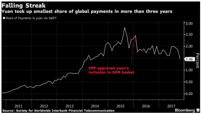
Print This Post Print This Post

Gold, the stock market and the yield curve

October 16, 2017

The yield curve is a remarkably useful leading indicator of major economic and financial-market events. For example, its long-term trend can be relied on to shift from flattening to steepening ahead of economic recessions and equity bear markets. Also, usually it will remain in a flattening trend while a monetary-inflation-fueled boom is in progress. That’s why I consider the yield curve’s trend to be one of the true fundamental drivers of both the stock market and the gold market. Not surprisingly, when the yield curve’s trend is bullish for the stock market it is bearish for the gold market, and vice versa.

A major steepening of the yield curve will have one of two causes. If the steepening is primarily the result of rising long-term interest rates then the root cause will be rising inflation expectations, whereas if the steepening is primarily the result of falling short-term interest rates then the root cause will be increasing risk aversion linked to declining confidence in the economy and/or financial system. The latter invariably begins to occur during the transition from boom to bust.

A major flattening of the yield curve will have the opposite causes, meaning that it could be the result of either falling inflation expectations or a general increase in economic confidence and the willingness to take risk.

On a related matter, the conventional wisdom is that a steepening yield curve is bullish for the banking system because it results in the expansion of banks’ profit margins. While superficially correct, this ‘wisdom’ ignores the reality that one of the two main reasons for a major steepening of the yield curve is widespread, life-threatening problems within the banking system. For example, the following chart shows that over the past three decades the US yield curve experienced three major steepening trends: the late-1980s to early-1990s, the early-2000s and 2007-2011. All three of these trends were associated with economic recessions, while the first and third got underway when balance-sheet problems started to appear within the banking system and accelerated when it became apparent that most of the large banks were effectively bankrupt.

Here’s an analogy that hopefully helps explain the relationship (under the current monetary system) between major yield-curve trends and the economic/financial backdrop: Saying that a steepening of the yield curve is bullish because it eventually leads to a stronger economy and generally-higher bank profitability is like saying that bear markets are bullish because they eventually lead to bull markets; and saying that a flattening of the yield curve is bearish because it eventually — after many years — is followed by a period of severe economic weakness is like saying that bull markets are bearish because they always precede bear markets.

yieldcurve_161017

Both rising inflation expectations and increasing risk aversion tend to boost the general desire to own gold, whereas gold ownership becomes less desirable when inflation expectations are falling or economic/financial-system confidence is on the rise. Consequently, a steepening yield curve is bullish for gold and a flattening yield curve is bearish for gold.

The US yield curve’s trend has not yet reversed from flattening to steepening, meaning that its present situation is bullish for the stock market and bearish for the gold market. However, the yield curve is just one of seven fundamentals that factor into my gold model and one of five fundamentals that factor into my stock market model.

Print This Post Print This Post

Updating gold’s true fundamentals

October 11, 2017

Last week I posted a short piece titled “A silver price-suppression theory gets debunked“, the main purpose of which was to direct readers to a Keith Weiner article disproving that the silver price had been dominated by the “naked” short-selling of futures. My brief post rattled the cage of GATA’s Chris Powell, who made an attempt at a rebuttal early this week and in doing so proved that 1) he doesn’t understand what arbitrage is and how it affects prices, and 2) he doesn’t understand what fundamental and technical analysis are (he seems to believe that any analysis that uses charts to display data is the ‘technical’ variety).

My approach to the gold market involves fundamentals, sentiment and technicals in that order, except when sentiment is extreme in which case it takes priority. To give non-TSI subscribers an idea of what I do, here’s a brief excerpt from the TSI commentary that was published on 8th October:

Last week, two of the seven components of our Gold True Fundamentals Model (GTFM) flipped from bullish to bearish. We are referring to the bond/dollar ratio, which broke below its moving demarcation level, and the real interest rate (the 10-year TIPS yield), which broke above its moving demarcation level. As a result, five of the seven components are now bearish and the GTFM is well into bearish territory. Here’s the updated chart:

The gold market responds more immediately, directly and accurately to changes in the fundamental backdrop than any other major financial market. This means that there is often an easy-to-identify fundamental reason for any sizable multi-week move in the gold price, but it also means that changes in the fundamental backdrop often say more about the past than the future. For example, the fact that the fundamental backdrop was gold-bearish at the end of last week doesn’t imply that there will be additional short-term weakness in the gold price. Instead, it explains the weakness that has already happened.

That being said, an understanding of the true fundamental drivers of the gold price can be used to assess the future prospects for the gold price. For example, five of the seven components of the GTFM are either directly or indirectly influenced by the bond market, with T-Bond strength generally acting to shift these components in the gold-bullish direction and T-Bond weakness generally acting to shift these components in the gold-bearish direction. Therefore, a strong expectation regarding the future direction of the T-Bond price can feed into an assessment of gold’s risk/reward.

For example, it was partly the expectation of T-Bond weakness, potentially exacerbated by the Fed taking its first genuine step along the monetary tightening path, that three weeks ago caused us to become sufficiently concerned about gold’s short-term risk/reward to suggest buying some put-option insurance. This was despite the GTFM being well into gold-bullish territory at the time.

It is now the expectation of a T-Bond rebound that causes us to view gold’s short-term risk/reward as being skewed towards reward, despite the GTFM being well into gold-bearish territory.

Print This Post Print This Post

Blatant statistical bias: Gun ownership vs. gun deaths

October 9, 2017

This post has nothing to do with the US Second Amendment or my opinion on whether gun ownership should be legal. It’s about the presentation of gun-related death statistics in a way that supports a political position rather than provides relevant information.

The following chart from a recent post at ritholtz.com compares the number of gun-related deaths to the number of guns per 100 people across many countries. It naturally shows that the country with by far the highest rate of gun ownership (the US) has by far the highest rate of gun-related deaths.

The above chart would be presented for only one reason: to persuade people that the US needs stricter gun control. However, the chart does not make the case for stricter gun control in even a small way. This is because the charted comparison is meaningless.

Obviously, the greater the availability of guns the higher the proportion of gun-related deaths. A country with zero guns will have zero gun-related deaths and a country in which everyone owns a gun will have a significant number of gun-related deaths. This is not evidence that the first country is safer than the second country.

Also, not all gun-related deaths are equal. There is, for example, a huge difference between someone using a gun to take his own life and someone using a gun to take someone else’s life. Lumping all gun-related deaths together is therefore disingenuous. It is part of a deliberate effort to mislead.

The relevant comparison isn’t the gun ownership rate and the gun-related death rate, it’s the gun ownership rate and the total homicide rate or the violent crime rate. Evidence that a higher rate of gun ownership led to a higher rate of homicide and/or a higher rate of violent crime would not prove that stricter gun control was desirable, but at least it would be relevant to the debate.

The following charts from a 2014 article at crimeresearch.org contain relevant information. These charts compare homicide rates and gun ownership rates across countries. They show that the US has a much higher gun ownership rate than average and a slightly higher homicide rate than comparable countries. The slightly higher homicide rate could be due to the higher rate of gun ownership, but it could also be due to other factors.

Screen Shot 2014-03-31 at Monday, March 31, 3.17 AM

OECD and Small Arms Survey

As mentioned at the start, this post has nothing to do with my opinion on whether the US should have stricter gun control laws. It’s about how statistics are abused to influence opinions and promote agendas.

Print This Post Print This Post

A silver price-suppression theory gets debunked

October 6, 2017

Embracing the belief that a bank or a cartel of banks has suppressed the prices of gold and silver for decades via the short-selling of futures contracts is like adopting a child. It’s a lifetime commitment through thick and thin, meaning that once this belief takes hold there is no amount of evidence or logic that can dislodge it.

Entering a debate with someone who is incapable of being swayed by evidence that invalidates their position is a waste of time and energy, so these days I devote no TSI commentary space and minimal blog space to debunking the manipulation-centric gold and silver articles that regularly appear. However, Keith Weiner has taken on the challenge in a recent post.

Keith’s article is brilliant. In essence, it proves that the silver market has NOT been dominated by the “naked” short-selling of futures. His arguments might not be as interesting as many of the manipulation stories, but they have the advantage of being based on facts and logic.

Don’t get me wrong; for as long as I can remember it has been apparent to me that gold, silver and all the other important financial markets are manipulated. However, it is also apparent to me that the price manipulation happens in both directions and never overrides the fundamentals for long. Of course, to see that this is the case you first have to know what the true fundamentals are.

Print This Post Print This Post

The Laffer Curve is misleading and dangerous

October 3, 2017

The logic underlying the Laffer Curve is that the greater the tax on production, the lesser the amount of production. As a broad-brushed economics principle this is reasonable, but the Laffer Curve itself is bogus. Unfortunately, this bogus curve is being used to justify bad government policy.

Before I get into why it is bogus and how it is being used to justify bad policy, here is a representation of the Laffer Curve from an Investopedia article:

Laffer Curve

And here is how the Laffer Curve is described in the above-linked article:

The Laffer Curve suggests that, as taxes increase from low levels, tax revenue collected by the government also increases. It also shows that tax rates increasing after a certain point (T*) would cause people not to work as hard or not at all, thereby reducing tax revenue. Eventually, if tax rates reached 100%, shown as the far right on his curve, all people would choose not to work because everything they earned would go to the government. Governments would like to be at point T*, because it is the point at which the government collects maximum amount of tax revenue while people continue to work hard.

One of the problems with the Laffer Curve is that the relationship between tax rates and tax revenue cannot be expressed as a simple curve. In fact, it can’t be expressed by any curve. This is because tax revenue is affected by a myriad of variables, not just the average tax rate. However, there are much bigger problems.

A second problem is that the Laffer Curve puts the focus on maximising government revenue when the focus of economists should be on maximising living standards. A related problem is that by putting the focus on tax rates the Laffer Curve takes the focus away from what really matters, which is the total amount spent by the government. All else remaining the same, higher government spending combined with a lower average tax rate is worse for the economy than lower government spending combined with a higher average tax rate. The reason is that if the government is running a deficit, then reducing the tax rate and simultaneously increasing government spending will quicken the pace at which private-sector savings are siphoned to the government. This happens because a government deficit can only be funded by private-sector savings.

Another problem is that there is often a big difference between the official tax rate and the effective tax rate. For example, the US corporate tax rate is presently 35%, but the average rate of corporate tax actually paid in the US is only 22%. For the purpose of this discussion let’s assume, however, that a change in the tax rate would initially lead to a proportional change in the amount of tax being paid. That is, let’s assume for the sake of argument that a 5% reduction in the US corporate tax rate would initially lead to an average reduction of 5% in the corporate tax burden. Having made this assumption we get to an additional problem.

The additional problem is that the Laffer Curve implies a potential outcome that is, as far as I can tell, impossible. If the Laffer Curve is right, then the government taking less money from the private sector potentially would result in both the government and the private sector ending up with more money. Unless I am missing something this could only be possible if the money supply were to increase, meaning that at its core the Laffer Curve relies on a form of monetary illusion.

The biggest problem of all, though, is that the Laffer Curve is downright dangerous to the extent that it seemingly removes the need to implement cuts in government spending to fund cuts in taxes. Thanks to the support provided by this bogus curve, unscrupulous and/or ignorant politicians can promote tax-cutting plans that have no offsetting spending cuts based on the idea that lower tax rates will eventually bring about a counter-balancing increase in tax revenue. The potential result is a tax-cutting plan that quickens the pace at which private-sector savings are siphoned to the government, that is, a tax-cutting plan that leads to slower economic progress.

Print This Post Print This Post

Why the Fed’s balance sheet reduction will be more interesting than watching paint dry

September 25, 2017

Janet Yellen has quipped that the Fed’s balance-sheet reduction program, which will start at $10B/month in October-2017 and steadily ramp up to $50B/month over the ensuing 12 months, will be as boring as watching paint dry. However, like many financial-market pundits she is underestimating the effects of the Fed’s new monetary plan.

In the old days, hiking the Fed Funds rate (FFR) involved reducing the quantity of bank reserves and the money supply, but that is no longer the case. Hiking the FFR is now achieved by raising the interest rate that the Fed pays to banks on reserves held at the Fed, which means that hiking the FFR now leads to the Fed injecting reserves into the banking system. This was explained in previous blog posts, including “Tightening without tightening (or why the Fed pays interest on bank reserves)“, “New tools for manipulating interest rates“, and “Loosening is the new tightening“.

In other words, under the new way of operating that was implemented in the wake of the Global Financial Crisis, hiking the FFR does not tighten monetary conditions. In fact, given that hikes in the FFR now result in more money being pumped INTO the banking system, an argument could be made that a hike in the FFR is now more of a monetary loosening than a monetary tightening. It is therefore not surprising that the rate hikes implemented by the Fed over the past two years had no noticeable effect on anything.

I mentioned in a blog post a few weeks ago that there has been a significant tightening of US monetary conditions since late last year, but this has not been due to the actions of the Fed. Rather, the rate of US monetary inflation has dropped substantially over the past 10 months due to a decline in the pace of commercial-bank credit expansion. As an aside, the substantial drop in the US monetary inflation rate would have affected the stock market in a bearish way by now if not for the offsetting effect of rapid euro-zone monetary inflation.

The Fed’s first genuine step along the monetary tightening path will happen within the next few weeks when it begins to shrink its balance sheet*. When this happens it will mark a momentous change in the monetary backdrop, and given that it will happen after the US monetary inflation rate has already tumbled it is likely to have financial-market consequences that are far more exciting than watching paint dry.

*The fact that the balance-sheet reduction will take place via the non-reinvestment of proceeds received from maturing securities rather than the selling of securities is neither here nor there. An X$/month balance-sheet reduction is an X$/month balance-sheet reduction, regardless of how it occurs.

Print This Post Print This Post

Home ownership bounces from a 50-year low

September 19, 2017

In a 2015 blog post titled “Unintended Consequences” I explained that policies implemented by the Clinton and Bush administrations to boost the rate of home ownership not only had unintended consequences, but the opposite of the intended consequence. This post is a brief update on the US home ownership situation.

As evidenced by the following chart, the government was initially successful in its endeavours. The home-ownership rate sky-rocketed during the second half of the 1990s and the first half of the 2000s as it became possible for almost anyone to borrow money to buy a house. As also evidenced by the following chart, the home-ownership rate subsequently collapsed. The collapse was an inevitable consequence of people throughout the economy first responding to the Fed’s and the government’s incentives to take on excessive debt and then finding themselves in drastically-weakened financial situations.

The home ownership rate ended up bottoming in Q2-2016 at a 50-year low.

homeownership_190917

No one in the government or at the Fed has ever admitted culpability for the mortgage-related debt binge that led to the spectacular rise and equally-spectacular fall in the US home-ownership rate. Apparently, it was a market failure.

Print This Post Print This Post

Commodities and the Commodity Currencies

September 18, 2017

[This blog post is an excerpt from a TSI commentary published about two weeks ago.]

The Australian Dollar (A$) and the Canadian Dollar (C$) are called “commodity currencies” for a reason. The reason is that regardless of what’s happening in their associated local economies, on a multi-year basis they will usually trend in the same direction as broad-based commodity indices.

Since 2001 there have been three major rallies in the A$, each lasting about 2.5 years. These 2.5-year rallies are indicated by vertical red lines and notes on the following chart. Our assumption, which is also indicated on the following chart, is that the fourth 2.5-year A$ rally began in early-2016. In other words, we are guessing that the A$ upward trend that began in early-2016 will continue until around mid-2018. As well as being based on the lengths of previous major upward trends, this guess is based on what we expect from commodity prices.

Speaking of commodity prices, in addition to the A$ the chart shows the GSCI Spot Commodity Index (GNX). Unsurprisingly, each of the 2.5-year A$ rallies indicated on the chart coincided with an upward-trending GNX. In terms of price direction, the main difference between the post-2001 performance of the A$ and the post-2001 performance of GNX is that GNX trended upward from the beginning of 2002 until its blow-off top in mid-2008 whereas the A$ experienced a flat 2-year correction during 2004-2005.

Mainly for interest’s sake (pun intended), the chart also shows the yield on the 10-year T-Note. The 10-year interest rate had a downward bias during two of the A$’s 2.5-year rallies and an upward bias during the third rally. We expect that it will have an upward bias over the course of the current (fourth) rally.

The next chart shows the relationship between the C$ and commodity prices as represented by GNX. If anything, with one notable 6-month exception the positive correlation between the C$ and GNX has been even stronger than the positive correlation between the A$ and GNX. The notable exception occurred during the first half of 2008, when a speculative blow-off move to the upside in the commodity markets was accompanied by a decline in the C$. This divergence was a warning that the commodity-price gains would prove to be temporary.

We are expecting the upward trends in the commodity indices and the commodity currencies to extend well into next year, although it’s likely that short-term corrections will begin soon.

Print This Post Print This Post

Revisiting the US yield curve

September 11, 2017

In a blog post in February of last year I explained that an inversion of the US yield curve has never been a recession signal. Instead, the genuine recession signal has always been the reversal in the curve from ‘flattening’ (short-term interest rates rising relative to long-term interest rates) to ‘steepening’ (short-term interest rates falling relative to long-term interest rates) after an extreme is reached. It just so happens that under normal monetary conditions an extreme usually isn’t reached and the reversal therefore doesn’t occur until after the yield curve becomes inverted.

The fact is that it doesn’t matter how ‘flat’ or inverted the yield curve becomes, there’s a good chance that the monetary-inflation-fueled economic boom will be intact as long as short-term interest rates are rising relative to long-term interest rates. The reason, in a nutshell, is that the boom periods are dominated by borrowing short to lend or invest long, a process that puts upward pressure on short-term interest rates relative to long-term interest rates. It’s when short-term interest rates begin trending downward relative to long-term interest rates that we know the boom is in trouble.

The following chart shows that the spread between the 10-year T-Note yield and the 2-year T-Note yield is much narrower now than it was a few years ago. This means that there has been a substantial flattening of the US yield curve. Also, the chart shows no evidence of a trend reversal. This implies that the inflation-fueled boom is still intact.

yieldcurve_110917

Print This Post Print This Post

The most useful leading indicator of the global boom-bust cycle

September 1, 2017

The long-term economic oscillations between boom and bust are caused by changes in the money-supply growth rate. It can therefore make sense to monitor such changes, but doing so requires knowing how to calculate the money supply. Unfortunately, most of the popular monetary aggregates are not useful in this regard because they either include quantities that aren’t money or omit quantities that are money.

What “Austrian” economists refer to as TMS (True Money Supply) is the most accurate monetary aggregate. Whereas popular measures such as M2, M3 and MZM contain credit instruments, TMS only contains money. Specifically, TMS comprises currency (notes and coins), checkable deposits and savings deposits.

The following chart shows the year-over-year TMS growth rate (the monetary inflation rate) in the US. It has fallen sharply over the past 8 months — from around 11% to around 5% — and is now at its lowest level since 2008.

The chart displayed above suggests that the US economic boom* is on its last legs. It may well be, but the 2002-2006/7 boom continued for almost 2 years after the US monetary inflation rate fell to near its current level in early-2005.

The reason for the long delay during 2005-2007 between the decline in the US TMS growth rate to a level that ordinarily would have ended the boom in less than 12 months and the actual ending of the boom was the offsetting effect of rapid monetary inflation in the euro-zone. This prompted me to develop a monetary aggregate that I call “G2 TMS”, which combines the US and euro-zone money supplies. Here is a monthly chart showing the growth rate of G2 TMS.

The rate of change in the G2 TMS growth rate has been the most useful leading indicator of the global boom-bust cycle over the past two decades. Of particular significance, a decline in the G2 TMS growth rate from well above 6% to below 6% warns of a shift from boom to bust within 12 months.

At the end of July the G2 TMS growth rate was slightly above the boom-bust transition level.

*An economic boom is defined as a multi-year period during which the creation of a lot of money out of nothing causes an unsustainable increase in economic activity.

Print This Post Print This Post

Interest Rates and Gremlins

August 29, 2017

Everyone is familiar with the term “interest rate”, but most people don’t understand what the term means. Unless you understand what the term means, you won’t fully understand why the central bank’s ‘management’ of interest rates damages the economy.

To understand what the interest rate is, it helps to understand what it isn’t. It isn’t the price of money. The price of money is what money buys, which can be different in every transaction. For example, if an apple is priced at $1, a new car is priced at $30,000 and a dental checkup is priced at $100, then the price of a dollar can be said to be 1 apple or 1/30000th of a car or 1/100th of a dental checkup.

The interest rate is the price paid by a borrower for a temporary increase in his purchasing power, or, looking at it from a different angle, the price received by a lender in consideration for temporarily giving up some of his purchasing power. This price will naturally take into account the risk that the borrower will be unable to make full repayment (credit risk) and the risk that money will be worth less in the future than it is at the time the loan is made (inflation risk). However, even if there were no credit or inflation risk to consider the interest rate would still be positive. The reason is that a unit of money in the hand today will always be worth more than a promise to pay a unit of the same money in the future.

This means that as well as being determined by the risk of default and the risk of inflation, the interest rate in any transaction will be determined by the time preferences of the borrower and lender. Someone with a strong desire to consume in the present has a high time preference. It’s likely that if this person has insufficient money to satisfy his immediate desire to consume then he will be willing to pay a high rate of interest to temporarily increase his purchasing power. Alternatively, it’s likely that someone whose desire to consume in the present is low relative to the amount of cash he has on hand will be willing to lend money to the right borrower at a relatively low rate of interest.

In any given transaction the credit risk component of the overall interest rate will end up being part of the lender’s real return if the borrower doesn’t default, but if credit risk is priced correctly then over a large number of transactions the amount received to compensate for this risk will be offset by actual borrower default. For example, if the risk of borrower default is correctly priced at 5%/year, then over a large number of transactions enough borrowers will default to impose a cost on the lender of 5%/year. Therefore, the time component of the interest rate is the same as the expected real return to the lender.

The implication is that on an economy-wide basis the real interest rate should be determined by the average of people’s time preferences.

To further explain, when the quantity of real savings is high relative to the general desire to consume in the present, the average time preference is low and the real interest rate SHOULD be low. Entrepreneurs and other businessmen will respond to this interest-rate signal by embarking on long-term projects that assume a future increase in consumer spending (high savings in the present implies higher consumer spending in the future). Capital equipment will be purchased, office buildings and shopping malls will be built, etc. When the quantity of real savings is low and people throughout the economy are consuming with abandon, the average time preference is high and the real interest rate SHOULD be high. Entrepreneurs and other businessmen will respond to this interest-rate signal by holding-off on new long-term projects. Although they won’t look at it in these terms, in effect they are being told, by the way the market is pricing time, that the future level of consumer spending will be insufficient to support certain investments.

The word “should” is capitalised in the previous paragraph because in the real world there exists a gremlin with the power to distort the interest rate. The gremlin is constantly tinkering with the interest rate, the result being that this vital price signal is always misleading to some degree. In fact, thanks to the mischievous acts of this gremlin the interest-rate signal is occasionally the opposite of what it should be.

Of particular relevance, due to the gremlin’s preference for distorting the interest rate in a downward direction the real interest rate is sometimes low during periods when the quantity of savings is low and the majority of people are spending like crazy, that is, when the average time preference is high. The result is that entrepreneurs and other businessmen throughout the economy embark on long-term projects that have no hope of being profitable. Individuals will naturally make mistakes, but for a large proportion of the population to make the same investing error the interest-rate signal must be wrong.

No prize for guessing the identity of the gremlin.

Print This Post Print This Post

The weakest boom ever

August 21, 2017

[This post is a slightly-modified excerpt from a recent TSI commentary]

The US economic boom that followed the bust of 2007-2009 is still in progress. It has been longer than average, but at the same time it has been unusually weak. The weakness is even obvious in the government’s own heavily-manipulated and positively-skewed data. For example, the following chart shows that during the current boom* the year-over-year growth rate of real GDP peaked at only 3.3% and has averaged only about 2.0%. Why has the latest boom been so weak and what does this say about the severity of the coming bust?

Before attempting to answer the above question it’s important to explain what is meant by the terms “boom” and “bust”.

An economy doesn’t naturally oscillate between boom and bust. The oscillations are related to fractional reserve banking and these days are driven primarily by central banks. When I use the term “boom” in relation to an economy I am therefore not referring to a period of strong and sustainable economic progress, I am referring to a period during which monetary inflation and interest-rate suppression bring about an unsustainable surge in economic activity.

Booms are always followed by and effectively give birth to busts, with each bust wiping out a good portion (sometimes 100%) of the gain achieved during the preceding boom. Putting it another way, once a boom has been set in motion by the central bank a bust becomes an inevitable consequence. The only unknowns are the timing of the bust and how much of the boom-time gain will be erased.

Returning to the question asked in the opening paragraph, the main reason for the unusual weakness of the latest boom is the unprecedented aggressiveness of the central bank’s response to the 2007-2009 bust. In broad terms, this response came in two parts. First, there was the initial knee-jerk reaction during 2008-2009 that involved massive bailouts for banks and bondholders. In particular, by various means the Fed channeled many hundreds of billions of dollars into financial institutions to keep these institutions in business and ensure that their largest creditors remained whole. Because the Fed cannot create new wealth, this effectively involved a huge transfer of wealth from the rest of the economy to financial institutions and the associated bondholders. Second, the Fed continued to ramp up the money supply and keep its targeted interest rates near zero for several years after a recovery had begun, that is, the Fed’s ‘crisis-fighting’ persisted for many years after the crisis was over. Ironically, this got in the way of the recovery.

A related point is that from a monetary perspective the biggest difference between the current boom and earlier booms is that a lot of the monetary fuel for the current boom was directly provided by the Fed, whereas almost all of the monetary fuel for earlier booms was loaned into existence by the commercial banks. When commercial banks lend money into existence the first receivers of the new money are individual and corporate customers of the banks, but when the Fed creates money via its QE programs the first receivers of the new money are Primary Dealers (PDs). The PDs invest the money in bonds, which means that the second receivers of the new money will be bond investors. These investors then use the money to buy other securities (bonds or stocks). The upshot is that when the Fed creates money the money gets shuffled around between the accounts of financial-market operators for an extended period, only leaking slowly into the real economy.

This explains why the economy has fared unusually poorly during the current boom while the stock and bond markets have fared unusually well. In effect, due to the way the new money was injected it had a much greater impact on financial asset prices than the real economy.

This could actually be a blessing in disguise. If the boom were to end within the coming 12 months, which it will if monetary conditions continue to tighten, then the ensuing recession may be far more severe in the financial markets (where the monetary inflation had its greatest impact) than in the real economy. In other words, the bust may look more like 2000-2002, when a short and mild economic recession was accompanied by a 50% decline in the stock market, than 2007-2009, when a devastating economic recession was accompanied by a similar decline in the stock market.

*The booms in the GDP growth chart included herewith are roughly equal the periods between the shaded areas, except that the official recessions (the shaded areas on the chart) typically didn’t begin until 6-12 months after the preceding boom ended. For example, whereas the most recent official recession began in December-2007, the bust probably began in late-2006 — when (mal) investments in sub-prime lending started ‘blowing up’.

Print This Post Print This Post

Can a government surplus cause the economy to tank?

August 15, 2017

According to the article linked HERE, if the US or the Australian or the UK government repaid all of its debt, the economy would tank. The article contains such a large number of factual errors and such a copious amount of nonsense that completely debunking it would take far more time than I’m prepared to spend, so in this post I’ll only deal with a few of the flaws.

To begin, the article points out that US government surpluses have, in the past, often been followed by depressions or recessions, the implication being that the government surplus caused the subsequent economic downturn. The two specific examples that are mentioned are the Great Depression of the 1930s, which apparently followed surpluses during the 1920s, and the recession of 2001, which followed the so-called Clinton surplus of 1999.

This is nothing more than confusing correlation with causation. The same logical fallacy could be used to show that a rising stock market causes a depression or recession, given that the stock market almost always rises during the years prior to the start of an economic contraction.

In an effort to show that there is, indeed, a causal relationship between a government surplus and a severe economic downturn, the article includes the following quote from an ‘economist’:

…reducing or retiring the debt isn’t what caused the economic downturns. It was the surpluses that caused it. Simply put, you cannot operate an economy with no money in it.

This brings me to the concept that runs through the article and is the logical basis for the assertion that government surpluses are very bad. It is that the running of a government surplus removes money from the economy and, therefore, that paying off most of the government’s debt would eliminate most of the economy’s money. That the author of the article found economists who genuinely believe this to be the case is extraordinary. It is akin to finding a physicist who genuinely believes that the Earth is flat.

The fact is that neither a government surplus nor a government deficit alters the economy-wide supply of money; all it does is change the distribution of the existing money supply. Here’s why.

First, when the government runs a deficit it is a net taker (borrower) of money from bond investors. It then spends the money. Money is therefore cycled from bond investors through the government to the individual or corporate recipients of government payments (including government employees). If this money had not been ‘invested’ in government bonds then it would have been invested elsewhere and subsequently spent in a different way.

Second, when the government runs a surplus it is a net provider of money to bond investors, with money being cycled from taxpayers through the government to the accounts of these investors. Collectively, the bond investors who receive these payments immediately turn around and reinvest them in corporate bonds or equity. Private corporations then spend the money on employee wages, employee healthcare, supplies, maintenance, plant, training, dividends, etc.

Either way, there is no change to the economy-wide money supply.

To further explain, in general terms there are only two ways that money can be added to the economy. The first involves deposit creation by commercial banks. For example, when Fred borrows $1M from his bank to buy a house, the bank adds 1M newly-created dollars to Fred’s demand account. That is, the money supply is boosted by $1M. The second involves asset monetisation by the central bank. In the US case, prior to 2008 almost all money was created by commercial banks, but from September-2008 through to the end of “QE” in October-2014 the Fed was the dominant creator of new money. Since November of 2014 the commercial-banking system has been the sole net-creator of new money.

In general terms there are also only two ways that money can be removed from the economy. The first involves the elimination of a deposit at a commercial bank when a loan is repaid (note that a loan default does not reduce the money supply). For example, if Fred were to pay-off his $1M home mortgage in one fell swoop then $1M would immediately be removed from the money supply. The second involves the sale of assets by the central bank — the opposite of the asset monetisation process.

Notice that the government was not mentioned in the above two paragraphs. Regardless of whether the government is running a budget deficit or a budget surplus, the banking system determines whether the supply of money rises or falls. I’m not saying that’s the way it should be, but that’s the way it is.

The next part of the article is a tribute to the old canard that the government’s debt doesn’t matter “because we owe it to ourselves”. In reality, there is no “we” and “ourselves”. The government’s debt comprises bonds that are owned by a few specific entities. It is to those entities, that in the US case includes foreign governments, to whom the debt is owed, with taxpayers technically being ‘on the hook’ for the future repayment. I say “technically” because what happens in practice is that the debt is never repaid; it just grows and grows until eventually the entire system collapses.

Related to the “government debt doesn’t matter because we owe it to ourselves” nonsense is the notion that the government’s debt is the private sector’s asset and, therefore, that more government deficit-spending leads to greater private-sector wealth. Ah, if only wealth creation were that easy! In the real world, government debt is not an additional asset for the private sector, it is a replacement asset. This is because when the government issues new debt it necessarily draws money away from other investments. Putting it another way, investing money in government bonds involves foregoing other investment opportunities. To argue that this would be a plus for the economy is to argue that the government usually allocates savings more productively than the private sector.

There are a lot more logical fallacies and factual errors in the article than I’ve dealt with above, but I’m going to leave it there. I just wanted to point out that much of what is observed about the relationship between government indebtedness and private-sector indebtedness can be explained by central bank manipulation of money and interest rates. When the central bank fosters an artificial boom via monetary inflation and the suppression of interest rates it prompts the private sector to go further into debt, which, by the way, is not an unintended effect.* At the same time, the rising asset prices and the temporary increase in economic activity that stem from the same monetary policy cause more money to flow into the government’s coffers, which could temporarily enable the government to report a surplus and should at least result in a slower pace of government debt accumulation. That is, it isn’t the reduced pace of government debt accumulation that causes the pace of private sector debt accumulation to accelerate; the driving force is the central bank’s misguided attempt to stimulate the economy.

I’ll end by stating that a government surplus is not inherently better or worse than a government deficit. What really matters is the total amount of government spending as a percentage of the overall economy. The higher this percentage, the worse it will be for the economy.

*Ben Bernanke made it very clear during 2009-2014 that the Fed’s actions were designed to boost the private sector’s borrowing and general risk-taking.

Print This Post Print This Post

The stock market’s mythical ability to discount the future

August 8, 2017

Some analysts state that the US stock market is over-valued and also that the stock market is good at discounting the future. Well, it can’t be both! If the stock market is good at discounting the future then current valuations are reasonable based on the profits that will be earned by companies over the next few years. On the other hand, if the stock market is over-valued then it is, by definition, doing a poor job of discounting the future.

Perhaps the stock market was once good at discounting the future, but a knowledgeable observer couldn’t claim with a straight face that the US stock market has been a good discounting mechanism over the past 20 years. Over this period we’ve seen valuations reach stratospheric levels in response to delusions about tech and internet company earnings, and then a collapse to bring prices into line with reality, followed by another rise to stratospheric valuations based on delusions that global growth knew no bounds and low-quality loans could be bundled together to create investment-grade securities, and then another collapse to bring prices into line with reality, followed by yet another upward ramp to stratospheric valuations.

The most recent multi-year ramp-up in stock prices was supposedly due to the discounting of an imminent ramp-up in corporate earnings, but S&P500 earnings during the second quarter of this year were no higher than they were three years earlier.

It is not difficult to come up with a superficial explanation for the US stock market’s abysmal 20-year record as a discounting mechanism. The explanation begins with the observation that from 1996 through to 2007 the market was dominated by the public, and, as the saying goes, the public will believe the most preposterous of bullish stories as long as the price is rising. As a result of the 2008 collapse, the public left the market and has not returned. At an earlier period in history this might have resulted in longer-term value-oriented investors taking control, but this time around it resulted in the market becoming dominated by computerised trading systems designed to scalp profits from extremely short-term fluctuations. That is, the market is now dominated by traders that make no attempt to discount the future beyond the next few hours or minutes.

The above explanation contains some truth, but for two main reasons it is far from complete. First, the general public hasn’t changed — it always has been and always will be the dumb money. Second, computerised trading systems are equally ‘happy’ to scalp profits by going short during declines or going long during advances. They are directionally neutral.

A better explanation begins with the realisation that the stock market as a whole has NEVER been a discounting mechanism. It has, instead, always reacted with a lag to changes in the monetary backdrop. The big difference over the most recent two decades is that for the most part the monetary backdrop has been far more supportive of asset prices than in the past. One consequence has been the stock market’s ability to spend a lot more time than usual in a condition called “extreme over-valuation”.

Print This Post Print This Post

Trump will not really cut taxes, revisited

August 2, 2017

When I posted the “Trump will not really cut taxes” article in February there was a realistic chance that some form of tax-slashing proposal would be implemented before year-end. That’s no longer the case, but as far as the US economy’s health is concerned it makes less difference than most people think. What really matters is the total amount of government spending; not how the spending is financed.

To understand what I mean, it helps to think of the government as a giant parasite that feeds on the economy. The parasite uses part of what it eats to foster its own growth, while the remainder passes through and is excreted back into the economy. The parasite’s food is a mixture of taxation and borrowing, and provided that it is growing or maintaining its current size then a reduction in one food source MUST be offset by an equivalent increase in the other food source. For example, if the parasite doesn’t shrink then a reduction in taxation must be made up by an increase in borrowing.

The above is an over-simplification because the method by which the parasite gets its sustenance will have some influence on the economic outcome, but it hopefully explains why the Trump tax cuts are not a ‘make or break’ issue as far as the US economy’s health is concerned. The crux of the matter is that as long as the amount of government spending doesn’t shrink, less wealth being sucked out by direct taxation will result in more wealth being sucked out by another method.

That’s why the only genuine tax cut is the one that’s funded by reduced government spending.

Print This Post Print This Post

The “commodity supercycle” myth dies hard

August 1, 2017

[The following is an excerpt from a TSI commentary published about one month ago, but with updated charts.]

Some commentators on the financial markets still refer to something called the “commodity supercycle”. This is remarkable considering that the inflation-adjusted (IA) GSCI Commodity Index (GNX) made a new all-time low early last year and that relative to the Dow Industrials Index the GNX is not far from the all-time low reached in 1999. The relevant charts are displayed below. Just how badly would commodities have to perform to completely bust the supercycle myth?

IAGNX_010817

GNX_Dow_010817

We’ve been debunking the “commodity supercycle” in TSI commentaries for at least 10 years. The following lengthy excerpt from an August-2007 commentary is an example:

…when it comes to the “commodity supercycle” we are definitely sceptics. We concur with the view that commodity prices in general and metal prices in particular are in long-term upward trends, but we do not think these trends are being driven by the strong growth of “Chindia” or the global spread of capitalism or the industrialisation of Asia or the movement of billions of people to the ranks of the “middle class” or any of the other catchphrases routinely used to neatly explain the price action. In our opinion, these explanations rank alongside slogans such as “new economy” and “technology-driven productivity miracle” that were used to legitimise the price action of tech stocks during the boom of the late-1990s.

As we see it, inflation (money supply growth) is causing a rolling boom/bust cycle whereby the combination of relative valuation and scarcity determines which sectors will be the major beneficiaries of inflation during the current cycle and which sectors will be relegated to the investment ‘scrap heap’.

The analysts who concoct simple explanations based on real (non-monetary) changes in the world and repeat these explanations in mantra-like fashion will look incredibly prescient for a long time, even though they largely ignore the monetary factors that are actually at the root of the price changes. Some of these analysts will even take-on the status of prophets due to their apparent abilities to see the future. But the inflation-fueled boom will eventually turn into a bust, even if the touted fundamental bases for the boom persist. For example, the growth of the internet and technological progress in general did not ‘miss a beat’ when the NASDAQ crashed. All that happened was that the primary focus of inflation shifted, causing the “new economy” prophets to fade away and bringing to the fore a new bunch of prophets who chant “commodity supercycle”.

The above three paragraphs can be summarised as: There never has been and there is never likely to be a “commodity supercycle”. Instead, during some periods financial assets are the main beneficiaries of monetary inflation and during other periods commodities are among the main beneficiaries of monetary inflation.

It’s as simple as that.

The periods when financial assets are the main beneficiaries of monetary inflation are, on average, much longer than the periods when commodities are among the main beneficiaries of monetary inflation. This is because central bankers generally view large multi-year rises in commodity prices as evidence of an inflation problem and large multi-year rises in financial-asset prices as evidence that everything is fine. Consequently, steps are taken to curtail the monetary inflation more quickly when commodity prices are leading the charge.

The situation today presents an asset-allocation challenge because it’s far too soon for a new long-term commodity boom to get underway, but the major financial assets (stocks and bonds) are near their highest valuations ever. We are dealing with this situation by becoming more short-term-oriented in our thinking, which for us means not looking beyond the next 6-12 months when deciding what to own.

Print This Post Print This Post

The “we” fallacy

July 26, 2017

Globalisation, a term that when used in economics refers to the integration of national economies into a global marketplace, is perceived to be part of the reason for economic weakness in some countries. This is a perception that the politically-astute feed upon, often by invoking the “we” fallacy.

According to the “we” fallacy, anyone who happens to be located inside an arbitrary border is one of “us” and deserves preferential treatment at the expense of anyone who happens to be located outside the border. The “we” fallacy underpins the concerns that are routinely expressed about trade deficits, the thinking being that “we” are being hurt because “they” sell more stuff to us than we sell to them*.

To expose the flawed logic that initially leads to teeth-gnashing over trade deficits and subsequently leads to protectionist trade policies, I’ll use a hypothetical example involving two pig farmers (Bill and Bob) and a butcher (Arthur). Bill, Bob and Arthur live and work in a small US town located 1 mile south of the US-Canada border. Bill is a more efficient pig farmer than Bob and is thus able to sell his pigs at a 10% lower price. Consequently, Arthur buys twenty pigs per year from Bill and none from Bob. This arrangement continues for several years, at which point Bill decides to move his farm 2 miles to the north (to the other side of the US-Canada border).

Business-wise, nothing changes and Arthur continues to buy 20 pigs per year from Bill. However, due to the minor change in the physical location of Bill’s farm the business that Bill and Arthur have been conducting for many years now adds to the US trade deficit. In other words, a business relationship that nobody was previously concerned about suddenly becomes a problem for the collective “we”, even though nothing has really changed. Bob, sensing an opportunity, complains to the US government that he will have to fire his farmhand unless something is done to prevent his business from being undercut by cheap imports. In response, the US government slaps a 15% tariff on Canadian pigs, prompting Arthur to start using Bob as his pig supplier.

In this hypothetical example Bob has clearly benefited from the government’s interference in the pig market, but only at Arthur’s expense. Arthur is now forced to pay 10% more for his pigs, which will either cut into his profits — and, perhaps, curtail his plans to invest in the growth of his business — or cause him to raise his prices. Whatever happens, Bob’s gain will be matched by the loss incurred by other people within the US. In other words, the US “we” will not actually benefit, even in the unlikely event that the Canadian government doesn’t take counter-measures in an effort to protect its own collective “we”.

In the same way that the overall US economy failed to benefit from the pig tariff in my hypothetical example, “we” can never benefit from policies that restrict international trade. This is because from an economics perspective there is no “we”, there are just individuals trading with each other for their mutual benefit. A consequence is that when measures are taken by the government to protect the collective “we”, what actually results is the artificial creation of both winners and losers. The benefits gained by some individuals within the economy will be offset by the losses of others within the same economy.

The upshot is that protectionist measures are, at best, a zero-sum game, although in most cases they will turn out to have a net-negative effect on the ‘protected’ economy because they will interfere with price signals, keep inefficient businesses alive, and generally make both the cost of doing business and the cost of living higher than would otherwise be the case.

Protectionist measures are often popular, though, especially during hard economic times. Here’s why:

First, you generally need only a superficial understanding of economics to see the immediate and direct effects of a policy, whereas a deeper understanding of economics is often required to see the long-term and indirect effects. Very few people have this deeper understanding, so all they see are the immediate and direct effects of protectionism, which could be positive.

Second, the immediate benefits of the protectionist policy are typically concentrated, whereas the costs are widely spread. As a result, a politician can adopt a protectionist stance to gain the support of the relatively small number of people who are advantaged without losing the support of the much larger number of people who are disadvantaged. It’s an example of robbing Peter to pay Paul, where Paul notices and Peter doesn’t.

Third, when things are obviously going wrong it’s convenient to point the finger of blame outward at “them”. It certainly beats trying to identify the real source of the problem when doing so would lead to the finger of blame being pointed inward.

I guess we should be thankful that the same flawed logic that is often applied to international trade is usually not applied to interstate trade and is never applied to trade between towns, neighbourhoods and individuals within the same state, because if it were then there would be a lot less trade and a lot less wealth. The only reason the flawed logic isn’t applied at a more micro level is that the collective “we” is arbitrarily defined as everyone on a particular side of a country border.

*Refer to my 13th February blog post for an explanation of why a trade deficit is never a problem.

Print This Post Print This Post

The Fed versus the Market

July 25, 2017

The following monthly chart shows that the year-over-year (YOY) growth rate of US True Money Supply (TMS) made a multi-year peak in late-2016 and has since fallen sharply to an 8-year low. The downward trend in US monetary inflation since late last year has been driven by the commercial banks, meaning that the pace of commercial-bank credit creation has been declining. The Fed, on the other hand, hasn’t yet done anything to tighten US monetary conditions. All the Fed has done to date is edge its targeted interest rates upward in a belated reaction to rising market interest rates.

That the Fed has been tagging along behind the market is evidenced by the following chart comparison of the US 2-year T-Note yield (in blue) and the Effective Fed Funds Rate (in red). The chart shows that a) the 2-year T-Note yield bottomed and began trending upward in the second half of 2011, b) the Effective FFR bottomed and began trending upward in early-2014, and c) the Fed made its first rate hike in December-2015. The market has therefore been pushing the Fed to raise its targeted interest rates for several years.

FFR_2yr_250717

Interestingly, the Fed has caught up with and is possibly now even a little ahead of the market. This suggests scepticism on the part of the market that economic and/or financial conditions will be conducive to additional Fed rate hikes over the coming few months.

Based on the prices of Fed Funds Futures contracts we know that the market does not expect the Fed to make another rate hike until December at the earliest. This expectation is probably correct. Rather than make an additional ‘baby step’ rate hike there’s a good chance that the Fed’s next move will be to start reducing the size of its balance sheet by not reinvesting all the proceeds from maturing debt securities. Unless the stock market tanks in the meantime, this balance-sheet reduction will probably be announced on 20th September (following the FOMC Meeting) and kick off in October.

When the aforementioned balance-sheet reduction does start happening it will constitute the Fed’s first genuine attempt to tighten monetary conditions, although, as mentioned above, US monetary conditions have been tightening since late last year thanks to the actions of the commercial banks.

Print This Post Print This Post

Don’t think like a lawyer

July 21, 2017

The job of a judge or juror is to impartially weigh the evidence and arguments put forward by both sides in an effort to determine which side has the stronger case. The job of a lawyer is to argue for one side, regardless of whether that side happens to be right or wrong. As a speculator it is important to think like a judge or a juror, not a lawyer.

Unlike a lawyer, a speculator can change sides ‘mid-stream’ if necessary to keep himself on the side favoured by the current evidence. There is no need for him to stick to a position come what may. However, changing sides is easier said than done, which is why so many speculators and commentators aren’t able to do it. Rather than let the evidence determine their stance, they adopt a stance and then look for confirming evidence. If they come across conflicting evidence, they downplay it. They aren’t aware of it, but their goal is to prove a particular case rather than align themselves with the strongest case.

Sometimes the case that a speculator desperately wants to prove also happens to be the case supported by the strongest evidence, enabling him to make large gains. However, if he continues to think like a lawyer he will eventually run into the problem that the weight of evidence shifts. After the inevitable shift happens he will steadfastly maintain his earlier position and lose whatever advantage he previously gained from being on the right side of the market.

In my speculations and financial-market writings I’m sometimes guilty of thinking like a lawyer. That’s why I developed the gold model (the Gold True Fundamentals Model – GTFM) that was discussed in a blog post last month. This model prevents my own biases and opinions from getting in the way when assessing whether the fundamental backdrop is bullish or bearish for gold.

The bottom line is that there is never a requirement for a speculator to defend a position. Unlike a lawyer, he is free to change with the evidence.

Print This Post Print This Post

Inflation as far as the eye can see

July 18, 2017

Many investors pigeon-hole themselves as “inflationists” or “deflationists”, where an inflationist is someone who expects more inflation over the years ahead and a deflationist is someone who expects deflation. I am grudgingly in the inflation camp, because the overall case for more inflation is strong.

I use the word “grudgingly” in the above sentence for two reasons. First, more inflation adds to the existing economic problems and will eventually result in major social upheaval, so when I predict that there will be inflation as far as the eye can see I don’t want to be right. Second, it means that I get lumped together with the perennial forecasters of imminent hyperinflation, even though my only mentions of hyperinflation over the past 17 years were to explain why it had zero probability of happening anytime soon.

With regard to the US situation, the main reason the case for more inflation is strong is that it doesn’t depend on private-sector credit expansion; it depends on the ability and willingness of the Fed to monetise sufficient assets to keep the total supply of money growing. A consistent theme in my commentaries over the 17 years since the birth of the TSI subscription service has been that the Fed could and would keep the inflation going after the private sector became saturated with debt.

Prior to 2008 there was very little in the way of empirical evidence to support the belief that the Fed could keep the inflation going in the face of a private-sector credit contraction, but that’s no longer the case. Thanks to what happened during 2008-2014 we can now be certain that the Fed has the ability to counteract the effects on money supply, asset prices and the so-called “general price level” of widespread private-sector de-leveraging. The only question left open to debate is: will the Fed CHOOSE to do whatever it takes to keep the inflation going in the future?

Based on the publicly-stated views of those who operate the monetary levers as well as on the economic remedies prescribed by today’s most influential economists and financial journalists, there’s a high probability that the answer is yes. At least, there is a high probability that the answer will be yes until the fear of inflation becomes much greater than the fear of deflation. However, the Fed is faced with a difficult challenge. It does not (I assume) want to engineer a steep decline in the dollar’s purchasing power, so every step of the way it tries to do no more than the minimum necessary to ensure a steady and modest rate of purchasing-power loss, with 2%-per-year having become the semi-official target.

The challenge is actually more than difficult; it’s impossible. The impossible-to-solve problem faced by the Fed and all the other central banks is that it can never be determined, in real time, what the aforementioned “minimum” is, because money-supply changes affect the economy in unpredictable ways and with large/variable delays. The economy therefore ends up careening all over the place and we occasionally get deflation scares, which are periods when it seems as if genuine deflation is about to happen. Paradoxically, the deflation scares are highly inflationary because they always prompt the Fed to ramp up the rate of money pumping, but while a deflation scare is in progress it can feel like the deflationists are finally going to be right.

I’m not ruling out the possibility that the deflationists will eventually be right. I hope that they will be right in the not-too-distant future, because more inflation will only add to the economic distortions and lead to an even bigger problem down the track. It’s just that they are, in effect, betting that devotees to the central planning ideology will suddenly realise the error of their ways and let nature take its course. The odds are very much against this bet paying off.

Print This Post Print This Post