[This post is an excerpt from a TSI commentary]
Conventional wisdom is that an inversion of the yield curve (short-term interest rates moving above long-term interest rates) signals that a recession is coming, but this is only true to the extent that a recession is always coming. A reversal in the yield curve from flattening to steepening is a far more useful signal.
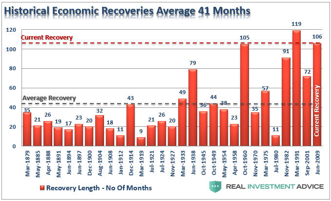
What a yield curve inversion actually means is that the interest-rate situation has become extreme, but there is no telling how extreme it will become before the eventual breaking point is reached. Furthermore, although there was a yield-curve inversion prior to at least the past seven US recessions, Japan’s most recent recessions were not preceded by inverted yield curves and there is no guarantee that short-term interest rates will rise by enough relative to long-term interest rates to cause the yield curve to become inverted prior to the next US recession. In fact, a good argument can be made that due to the extraordinary monetary policy of the past several years the start of the next US recession will NOT be preceded by a yield curve inversion.
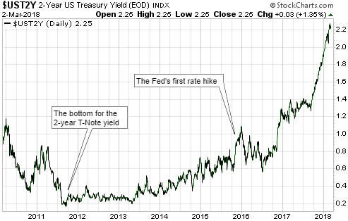
Previous US yield curve inversions have happened up to 18 months prior to the start of a recession, and as mentioned above it’s possible that there will be no yield curve inversion before the next recession. Therefore, we wouldn’t want to be depending on a yield curve inversion for a timely warning about the next recession or financial crisis. However, the yield curve can provide us with a much better, albeit still imperfect, recession/crisis warning in the form of a confirmed trend reversal from flattening to steepening. This was discussed in numerous TSI commentaries over the years and was also covered in a blog post last December.
There are two reasons that a reversal in the yield curve from flattening to steepening is a more useful recession/crisis warning signal. First, it is timelier. Second, it should work regardless of whether or not the yield curve becomes inverted.
Now, from a practical speculation standpoint it is not essential to understand WHY the yield curve reverses from flattening to steepening ahead of major economic problems bubbling to the surface. It is enough to know that it does. However, if you understand why the curve has reversed direction ahead of previous recessions you will understand why it either should or might not reverse direction in a timely manner in the future. After all, if extraordinary monetary policy could prevent the yield curve from becoming inverted ahead of the next recession then perhaps it also could prevent the yield curve from reversing course the way it has in the past.
With regard to understanding the why, the first point to grasp is that the boom phase of the cycle is characterised by borrowing short-term to lend/invest long-term. This puts upward pressure on short-term interest rates relative to long-term interest rates, meaning that it causes the yield curve to flatten. Also, when the boom is mature and is approaching its end there will be a scramble for additional short-term financing to a) complete projects that were started when monetary conditions were easier and b) address cash shortages that have arisen due to completed projects not delivering the predicted cash flows. This puts further upward pressure on short-term rates relative to long-term rates, and could, although won’t necessarily, cause the yield curve to become inverted.
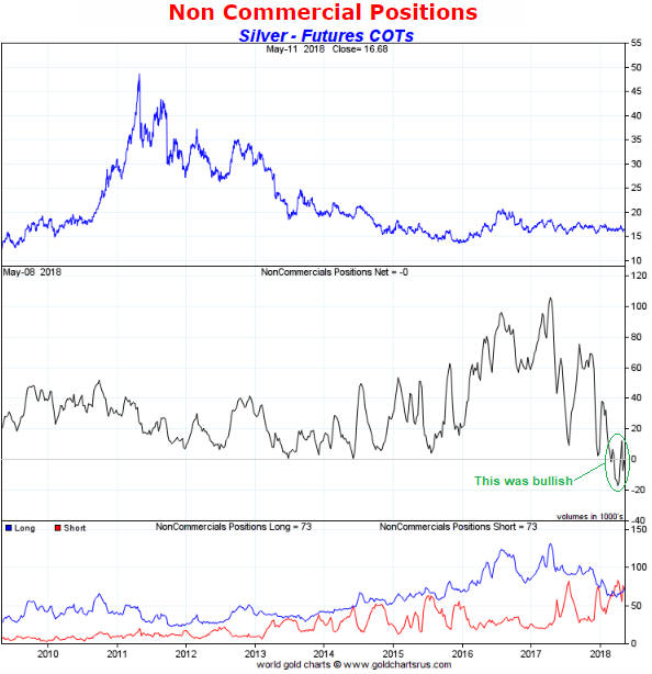
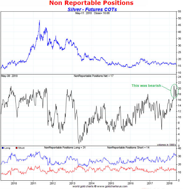
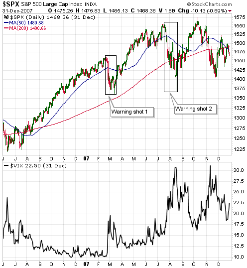
Next, as the boom nears its end the quantity of loan defaults will begin to rise and the opportunities to profit from short-term leverage will become scarcer. Everything will still seem fine to casual observers, central bankers, the average economist and the vast majority of commentators on the financial markets, but it will now be apparent to a critical mass of astute operators (investors, speculators and financiers) that many of the investments that were incentivised by years of easy money were ill-conceived. These operators will begin shifting towards ‘liquidity’ and away from risk.
The aforementioned increasing desire for the combination of safety and liquidity leads to greater demand for cash and gold. But more importantly as far as this discussion is concerned, it boosts the demand for short-term Treasury debt relative to long-term Treasury debt (thus putting downward pressure on short-term interest rates relative to long-term interest rates). The reason is that the shorter the term of the Treasury debt, the lower the risk of an adverse price movement. For example, if you lend $10B to the US government via the purchase of 3-month T-Bills then in three months’ time you will have something worth $10B, but if you lend $10B to the US government via the purchase of 10-year T-Notes then in three months’ time you could have something that is worth significantly more or less than $10B.
As an aside, what an investor focused on boosting liquidity really wants is cash, but if he has billions of dollars then cash is not a viable option. This is because the cash would have to be deposited in a bank, which means that the investor would be lending the money to a bank and taking the risk of a massive loss due to bank failure. Lending to the US government is a much safer choice.
In summary, it’s mainly the desire for greater liquidity and safety that begins to emerge at the tail-end of a boom that causes the yield curve to stop flattening and start steepening. As demonstrated by the events of the past few years the central bank has substantial power to postpone the end of a boom, but eventually a breaking point will be reached and when it is the yield curve’s trend will change from flattening to steepening.