In an earlier blog post I discussed the relationship between gold and inflation expectations. Contrary to popular opinion, gold tends to perform relatively poorly when inflation expectations are rising and relatively well when inflation expectations are falling.
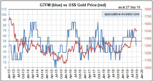
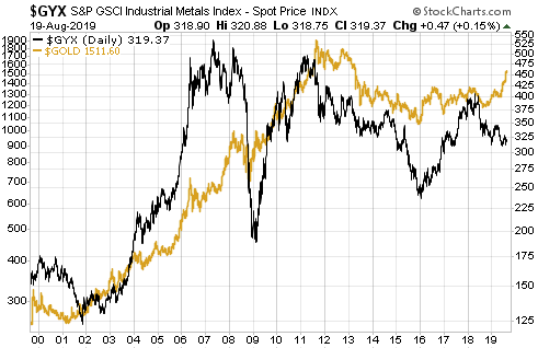
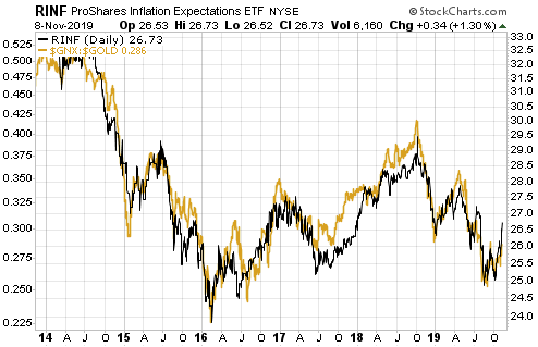
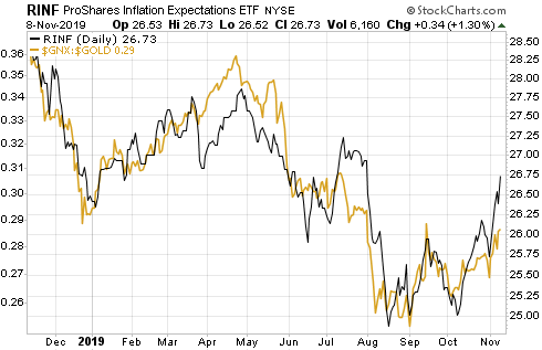
The relationship outlined above is very clear on the following charts. The first chart shows that over the past 6 years there has been a strong positive correlation between RINF, an ETF designed to move in the same direction as the expected CPI, and the commodity/gold ratio (the S&P Spot Commodity Index divided by the US$ gold price). In other words, it shows that a broad basket of commodities has outperformed gold during periods when inflation expectations were rising and underperformed gold during periods when inflation expectations were falling. The second chart shows the same comparison over the past 12 months. Notice that inflation expectations bottomed for the year (to date) in mid-August and the commodity/gold ratio bottomed about two weeks later.
A large part of the reason for the strong inverse relationship between gold’s relative strength and inflation expectations is the general view that “inflation” of 2%-3% is not just normal, it is beneficial. In fact, most people have been conditioned to believe that it’s a serious economic problem necessitating draconian central bank intervention if money fails to lose purchasing power at a slow and steady pace.
Eventually the rate of “price inflation” will rise to a level where it starts being seen by the public as a major economic problem, and, as a result, the desire to maintain cash savings will enter a steep decline. It is at this point that the relationship depicted above will stop working and the demand for gold will begin to surge in parallel with rising inflation expectations. In other words, at some point the relationship depicted on the above chart will reverse due to declining confidence in the official money. This point probably will arrive within the next 10 years, but probably won’t arrive within the next 12 months. Over the next 12 months it’s likely that gold will continue to be favoured during periods of falling inflation expectations and other commodities will continue to be favoured during periods of rising inflation expectations.
So, if you think that the recent inflation-expectations bounce is the start of a trend then you should be looking for opportunities to increase your exposure to commodities such as oil and copper, not gold. My guess is that inflation expectations bottomed during August-October of this year, but I’m open to the possibility that the bottoming process will extend into early next year.