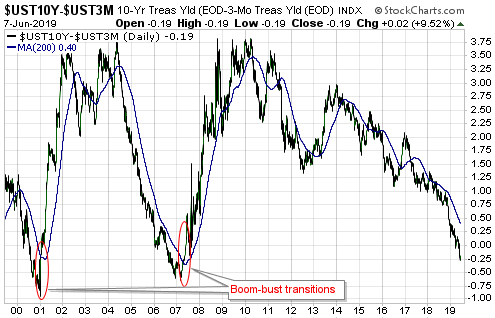
Below is an excerpt from a recent TSI commentary.
An investment’s true fundamentals exert pressure on its price. It is not unusual for the price to trend in the opposite direction to the fundamentals for a while, but if fundamentals-related pressure consistently acts in one direction then the price should eventually fall into line by trending in that direction. Our “true fundamentals” models for gold, the US stock market, the Dollar Index and commodities (the GSCI Commodity Index) are attempts to quantify the magnitude and direction of fundamentals-related pressure.
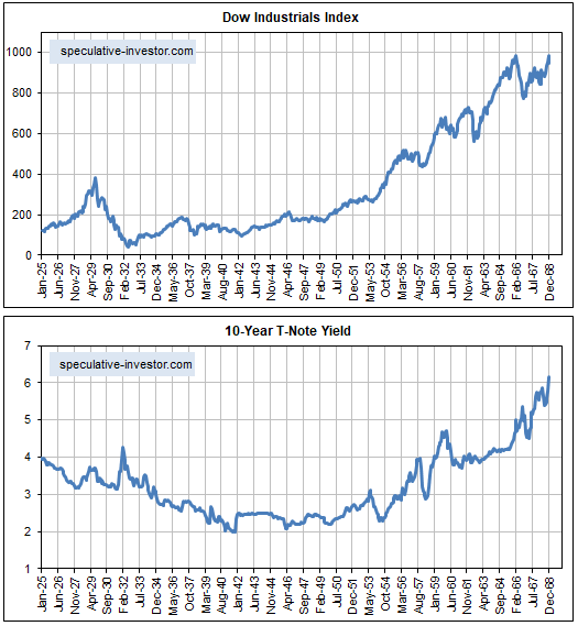
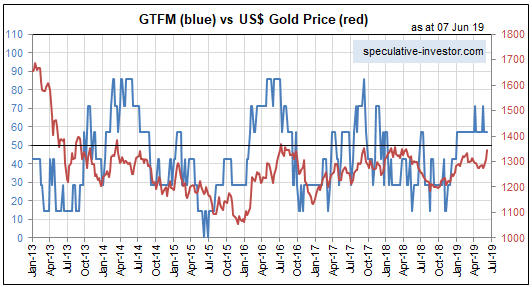
We have a lot of confidence in our Gold True Fundamentals Model (GTFM), because we understand why it should work and we know that it has worked well over a long enough period to rule out luck/randomness. It isn’t a short-term timing indicator, but all intermediate-term trends in the US$ gold price over the past 17 years* have been in line with the fundamentals as reflected by the GTFM. However, we have less confidence in our other true fundamentals models.
We recently have given more thought to the construction of our Equity True Fundamentals Model (ETFM), which is designed to indicate the direction and magnitude of fundamentals-related pressure on the US stock market (as represented by the S&P500 Index).
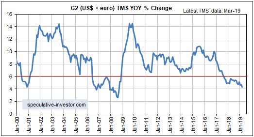
The version of the ETFM that we have been using takes into account credit spreads, the yield curve, the real interest rate (as indicated by the 10-year TIPS yield), the relative strength of the banking sector and the G2 monetary inflation rate, with the monetary inflation rate given a greater weighting than the other inputs. However, we now think it was a mistake to put extra emphasis on monetary inflation. This is because although the rate of change in the money supply is the most important long-term driver of the stock market, the time between a trend change in monetary inflation and the effects of this trend change becoming evident in the stock market is long and variable.
In an effort to make the ETFM more useful over the intermediate-term (6-18 month) periods that are of primary interest to us we have made two changes to the Model’s construction. First, we have reduced the emphasis on monetary inflation so that it has the same weighting as the Model’s other inputs. Second, the ISM New Orders Index (NOI) has been added as an input to the Model. This input will be set to 1 when the NOI is 55 or above and set to 0 when the NOI is below 55. This is being done because a) the stock market tends to perform much better when the NOI is greater than 55 than when the NOI is less than 55, and b) there is a strong tendency for the NOI to fall below 55 PRIOR to periods of significant stock market weakness, meaning that weakness in the NOI is not simply a reaction to weakness in the stock market.
The above changes didn’t make a big difference to the historical performance of the ETFM, but they did make the Model a little more sensitive to shifts in the fundamental winds. This is a plus, because the original model wasn’t sensitive enough. Note, as well, that these changes did not alter the current signal. Both the original ETFM and the new/improved ETFM switched from neutral to bearish on 19th April 2019.
Here is a chart comparing the new ETFM (the blue line) with the SPX since the start of 2002. Stock market fundamentals are considered to be bearish when the ETFM is below 50, neutral when the ETFM equals 50 and bullish when the ETFM is above 50.
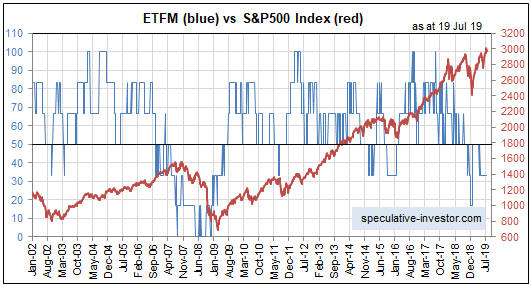
The true fundamentals are equity-bearish at the moment. If they remain bearish then the price eventually WILL fall into line. Furthermore, the longer the price trends upward or stays elevated in parallel with a bearish fundamental backdrop, the faster the eventual downward price move is likely to be.
*For some of the GTFM inputs we don’t have data prior to the early-2000s, so we can’t compare the GTFM and the gold price during earlier periods.