Print This Post Print This Post

Looking at oil from different perspectives

October 25, 2021

[This blog post is a modified excerpt from a commentary published at TSI about two weeks ago. We've updated the charts and prices to reflect the current market situation.]

Today we’ll take a brief look at oil through three different lenses: The long-term price-action lens, the physical supply-demand lens and the macro-economic lens.

The following chart shows the significance of the US$76-$77 price level above which oil has moved over the past few weeks. This price level acted as support during large downward corrections in 2011-2012 and capped the 2016-2018 rally.

The move above major resistance is not a short-term buy signal, because the market is ‘overbought’ (which, by the way, doesn’t guarantee that the price will fall, but does mean that the risk of new buying is relatively high). However, it is a reward for those who added to their oil exposure when the commodity and the related equities were ‘oversold’ at various times over the past three months and is consistent with our view that the cyclical advance will extend into 2022.

oil_251021

With regard to likely future performance, of far greater importance than the break above long-term resistance is that the physical supply situation remains unusually ‘tight’. We know this is the case because strong backwardation (meaning: nearer-dated contracts are priced well above later-dated contracts) prevails in the oil futures market. This is evidenced by the downward slope on the following chart. Strong backwardation can only arise and be sustained in the oil market during a period when the demand for oil is high relative to the currently available supply.

The most recent data on the following chart is for the situation at 14th October 2021, but the futures curve continues to have a steep downward slope. For example, at the time of writing oil for delivery in December of this year is priced at $84.55, whereas oil for delivery in December-2022 is priced at $72.58 and oil for delivery in December-2023 is priced at only $66.56.

Note that the prices of oil futures are NOT forecasts of where the spot price will be in the future. Instead, the futures price relative to the spot price reflects the cost of storage. Since the cost of storage is always above zero, the futures price will always be higher than the spot price unless there is a current shortage of the physical commodity.

oilfuturescurve_251021
Chart source: https://www.erce.energy/graph/wti-futures-curve/

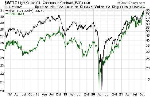
Our last chart shows that the oil price and the Inflation Expectations ETF (RINF) usually trend in the same direction. This positive correlation is part and parcel of a broader positive correlation between commodity prices (as represented by indices such as GNX) and inflation expectations.

Both oil and inflation expectations have resumed their cyclical upswings following corrections during the second and third quarters of this year.

oil_RINF_251021

At the moment, the price action, the supply-demand fundamentals and the macro-economic backdrop (as reflected by inflation expectations) are saying the same thing. They are all saying that we should expect the oil price to continue its upward trend.

Print This Post Print This Post

US Recession/Expansion Watch

October 11, 2021

[This blog post is a brief excerpt from a recent TSI commentary]

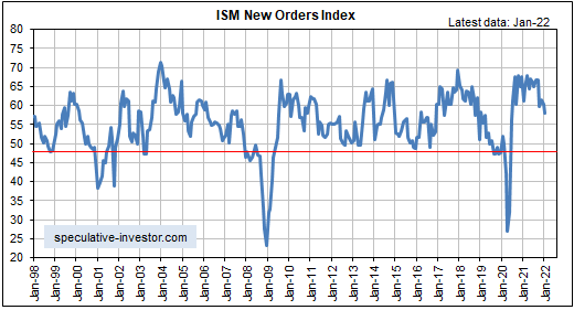
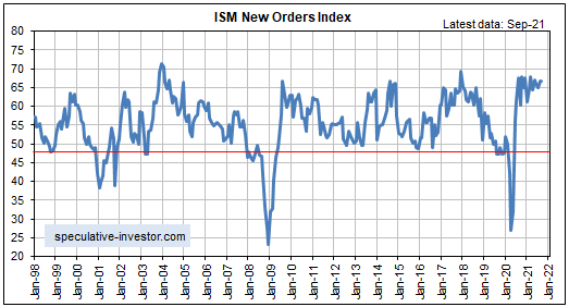
The latest leading economic data indicate that the US recovery/expansion is intact and that US GDP will continue to grow at an above-average rate for at least two more quarters, albeit not as quickly as it grew during the first half of this year. Of particular relevance, the following monthly chart shows that the ISM Manufacturing New Orders Index (NOI), one of our favourite leading economic indicators, remains near the top of its 20-year range. The ISM NOI leads Industrial Production by 3-6 months.

Note that the GDP growth number for Q3-2021, the preliminary calculation of which will be reported late this month, could reveal substantial deceleration from the 6%-7% growth that was reported for the first two quarters of this year. In fact, it could be as low as 2%. However, the financial markets are aware of this and went at least part of the way towards discounting the slowdown over the past few months. More importantly, there’s a good chance that US economic activity will re-accelerate late this year and into the first quarter of next year. This will be partly due to inventory building but mainly due to millions of people re-entering the workforce (millions of people who were paid by the government NOT to produce are going to become productive due to the expiry, early last month, of the federal government’s $300/week unemployment subsidy).

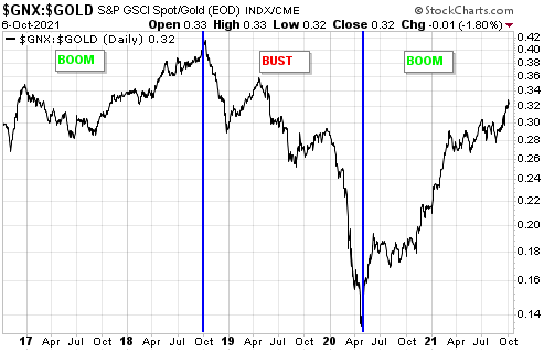
The performances of leading and coincident economic indicators show that the US economy remains in the boom phase of the boom-bust cycle, meaning that the economic landscape remains bullish for industrial commodities relative to gold. Consequently, the major upward trend in the commodity/gold ratio (GNX/gold) evident on the following chart should extend into next year.

In conclusion and as stated in previous commentaries over the past few months, the probability of the US economy re-entering recession territory prior to mid-2022 is extremely low, although current money-supply trends warn that a boom-to-bust transition and an equity bear market could begin as soon as the first half of 2022. This would suggest the second half of 2022 for the start of the next US recession, but there’s no point trying to look that far ahead. Our favourite leading indicators should give us ample warning.

Print This Post Print This Post

Boom-Bust Cycle Update

October 4, 2021

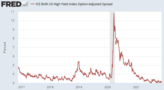
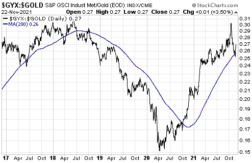
There are two things that always happen at or prior to the start of a boom-to-bust transition for the US economy. One is a clear-cut widening of credit spreads and the other is pronounced weakness in the Industrial Metals Index (GYX) relative to the gold price. These indicators have sometimes warned incorrectly that a bust was about to begin, but they have never failed to signal an actual boom-to-bust transition in a timely manner. Below are charts showing the current positions of these reliable boom-bust indicators.

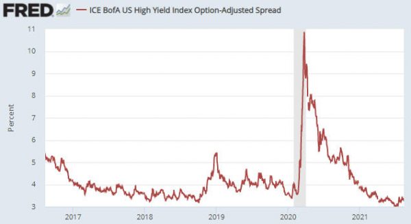
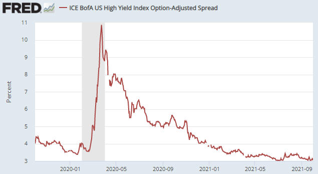
The first chart shows the US High Yield Index Option-Adjusted Spread (HYIOAS), a good indicator of US credit spreads.

In early-July of this year the HYIOAS was at its lowest level in more than 10 years and not far from an all-time low. It spiked upward around the middle of July, but it has since returned to near its low. This means that credit spreads in the US remain close to their narrowest levels ever.

Note that a credit-spread reversal would be signalled by the HYIOAS making a higher short-term high AND moving back above 4%. The first of these criteria (the initial warning) would be triggered by a move above 3.5%.

HYIOAS_041021

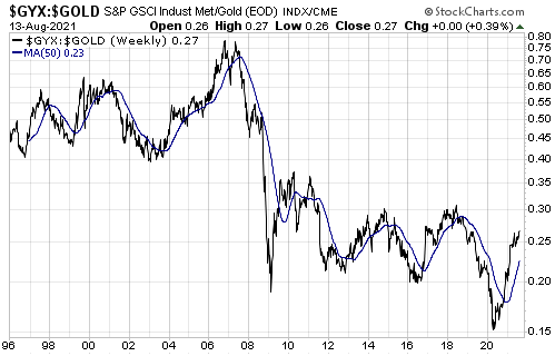
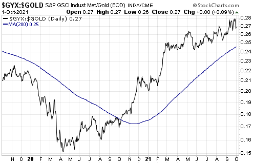
The next chart shows the GYX/gold ratio. To generate a boom-to-bust warning the line on this chart would have to move below its 200-day moving average, but currently it is in a clear-cut upward trend and not far from its cycle high.

GYX_gold_041021

Clearly, neither of the indicators that in the past have always warned prior to the start of a boom-to-bust transition for the US economy is close to triggering. This means that the economic boom* that began during the second quarter of 2020 remains in full swing. Furthermore, as things currently stand it looks like the start of a boom-to-bust transition is at least six months away.

For long-side speculations and investments, during the boom phase of the cycle it’s important to emphasise assets and commodities that do well during booms. For example, industrial commodities (e.g., energy, base metals, lithium, rare-earths) generally should be favoured over gold during the boom phase, with the opposite applying during the bust phase. This may seem like a statement of the bleeding obvious, but a lot of market participants stay bullish on certain investments and bearish on others regardless of whether the economy is in the boom phase or the bust phase.

*An economic boom is a period of generally-rapid economic activity fuelled by monetary inflation. It does not necessarily involve sustainable economic progress. In fact, most of the apparent gains achieved during the boom tend to be relinquished during the subsequent bust.

Print This Post Print This Post

Collapsing prices in an inflationary environment

September 13, 2021

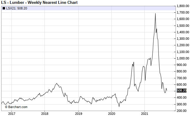
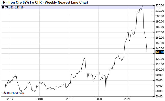
Over the past four months, in parallel with spectacular gains in the prices of coal and natural gas prices there have been spectacular declines in the prices of lumber and iron-ore. The following charts show the 70% crash in the lumber price from its May-2021 peak and the 40% crash in the iron-ore price from its July-2021 peak.

lumber_130921

ironore_130921

A common argument against there being a general inflation problem is that the large rises in commodity prices are due to temporary market-specific supply issues, leading to large price declines as soon as the supply issues are resolved. The plunges in the prices of lumber and iron-ore can be cited to support this argument.

There is an element of truth to this line of thinking. However, the same argument could have been made throughout the 1970s, in that every large commodity-price rise during that decade could be put down to a market-specific supply issue.

As long as the inflation doesn’t become ‘hyper’, that is, as long as the value of money doesn’t collapse relative to everything, a large and rapid rise in the price of a commodity will result in additional supply and/or reduced demand, eventually leading to a large price decline. This sequence of events played out in full in the lumber and iron-ore markets over the past 12 months and by the time we get to the middle of next year it likely will have played out in full in the natural gas and coal markets.

The clue that the price action has monetary roots is in its frequency, that is, in the number of markets that are experiencing huge price run-ups. Each huge price run-up in isolation can be put down to market-specific supply constraints, but when the same thing happens in so many different markets at different times within a multi-year period then we can be sure that the root cause is linked to the monetary system itself.

In the current environment, the root cause is the combination of rapid monetary inflation courtesy of the central bank and a huge increase in government deficit-spending. Thanks to the Fed, the supply of US dollars is about 50% greater today than it was two years ago. Thanks to the government, the newly-created money did a lot more than elevate the prices of financial assets.

Print This Post Print This Post
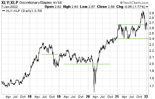
The Crisis-Monetisation Cycle

September 7, 2021

[This blog post is an excerpt from a TSI commentary]

Our view has always been that as an organisation with unlimited power to create money out of nothing and with no rigid constraints on what it can buy with the money it creates, the Fed would never ‘run out of bullets’. The opposing view put forward by many financial-market analysts and commentators was that the Fed eventually would be overwhelmed by a virtual tidal wave of debt defaults and other deflationary forces.

The idea that the Fed could get overwhelmed by deflationary forces should have been killed by last year’s events, because the Fed proved that there were no lengths to which it would not go to prop-up equity prices, prevent widespread debt default and ensure that the US dollar continued to lose purchasing power. However, apparently it wasn’t. The view that deflation is on the horizon is not as popular as it once was, but it remains very much alive. We therefore wonder how far down the path of money destruction the Fed will have to go before smart people stop seeing deflation as the biggest threat. Unfortunately, over the next few years we are going to find out.

The US economy is immersed in a crisis-monetisation cycle, as are many other economies. In the US, a crisis or a deflation scare or a recession or even just a steep stock market decline prompts the Fed to start monetising assets, with the speed and magnitude of the monetisation ramping up until equity and consumer prices resume their long-term upward trends. This has been going on for decades and explains why the US stock market’s valuation keeps making higher highs and higher lows.

The big change over the past 18 months is that the US federal government has become more involved in promoting the perpetual price inflation, partly because there is political capital to be gained by taking actions that boost wages and partly because, at a superficial level at least, there have been no negative economic consequences to date associated with the massive increase in the government’s debt. The government’s actions are ensuring that the new money affects goods and services prices in addition to asset prices.

The crisis-monetisation cycle doesn’t end in deflation. The merest whiff of deflation just encourages central bankers and politicians to do more to boost prices. In fact, the occasional deflation scare is necessary to keep the cycle going. The cycle only ends when most voters see “inflation” as the biggest threat to their personal economic prospects.

Print This Post Print This Post
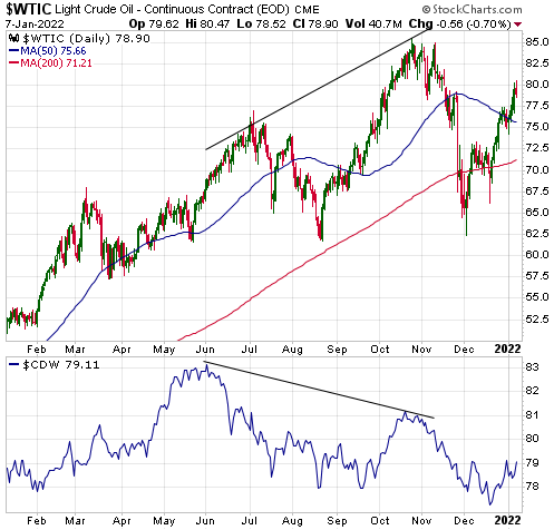
No gold bull, yet

August 31, 2021

The measuring stick is critical when determining whether an asset is in a bull market. If a measuring stick is losing value at a fast enough pace, then almost everything will appear to be in a bull market relative to it. For example, pretty much everything in the world has been rising in value rapidly over the past several years when measured in terms of the Venezuelan bolivar. It should be obvious, though, that not everything can be simultaneously in a bull market. To determine which assets/investments are in a bull market we can’t only go by performance relative to any national currency; we must also look at the performances of assets/investments relative to each other.

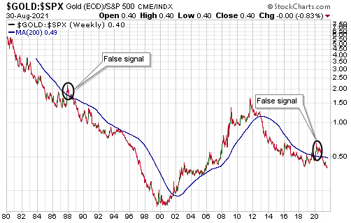
That’s where the gold/SPX ratio (the US$ gold price divided by the S&P500 Index) comes in handy. Gold and the world’s most important equity index are effectively at opposite ends of the ‘investment seesaw’. Due to their respective natures, if one is in a long-term bull market then the other must be in a long-term bear market. In multi-year periods when they are both trending upward in dollar terms it means that the dollar is in a powerful bear market, not that gold and the SPX are simultaneously in bull markets.

The following weekly chart removes the US$ from the equation and measures gold against its main competition (the SPX). The blue line on the chart is the 200-week MA. In the past, crosses through the 200-week MA by the gold/SPX ratio have been useful in confirming changes to gold’s long-term trend, although there were two false signals (October-1987 and March-2020) that resulted from stock market crashes.

The chart shows that the gold/SPX ratio recently broke below its 2018 low and is at its lowest level of the past 15 years. This implies that the gold bear market that began in 2011 has not ended.

gold_SPX_310821

Over the past 12 months a monetary-inflation-fuelled economic boom has been in full swing. This is not the sort of environment in which gold should perform well. On the contrary, gold tends to come into its own after a boom starts to unravel, that is, after a boom-to-bust transition gets underway. This could happen during the first half of next year.

Print This Post Print This Post
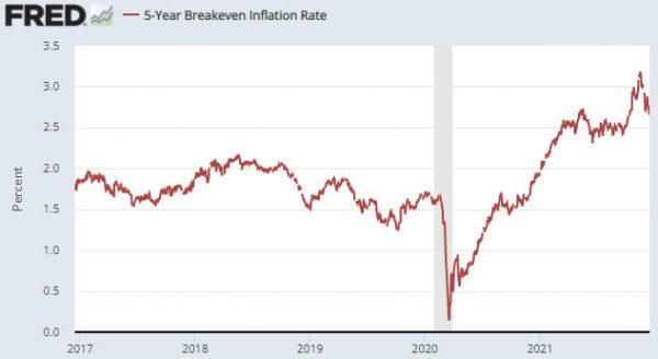
What is the ‘real’ interest rate?

August 23, 2021

The real interest rate is the nominal interest rate adjusted for the expected change in the associated currency’s purchasing power, where “expected” is the operative word. It is not the nominal interest rate adjusted for the currency’s loss of purchasing power over some prior period.

To further explain, when you buy an interest-bearing security the ‘real’ income that you receive will be determined by the future change in the currency’s purchasing power. For example, the real return from a note that matures in 12 months will be determined by the change in the currency’s purchasing power over the coming 12 months, not the change in the currency’s purchasing power over the preceding 12 months. Of course, when you buy the security you have no way of knowing what will happen to the currency’s purchasing power in the future, but your decision to buy will be based on the nominal yield offered by the security and what you EXPECT to happen to the currency. What happened to the purchasing power of the currency in the past is only relevant to the extent that it affects the expectations of investors.

Consequently, it is not appropriate to estimate the ‘real’ interest rate by subtracting a measure of historical purchasing power loss, such as the percentage change in the CPI over the last 12 months, from the current nominal yield. Doing so would result in a meaningless number even if the CPI were a valid indicator of purchasing-power loss.

A knock-on effect is that the numerous articles and reports that attempt to explain how the price of something responds to changes in the real interest rate, where the real interest rate is calculated by subtracting the change in the CPI over some prior period from the current nominal interest rate, can be put into the “not even wrong” category. They are nonsensical.

Just to be clear, the CPI and similar price indices are inherently flawed indicators of “inflation”, but even if they were good indicators of “inflation” it would make no sense to subtract the historical index change from the present-day nominal interest rate when attempting to estimate the ‘real’ return.

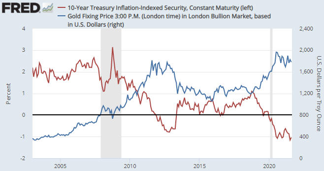
If the main concern is the effects of interest rates and “inflation” on the prices of assets, commodities and gold, then the numbers that matter are today’s nominal interest rates and inflation expectations. In the US these numbers are combined to generate the yields on Treasury Inflation Protected Securities (TIPS), in that the TIPS yield is the nominal yield minus the expected CPI. The TIPS yield is not an accurate indicator of the real interest rate in absolute terms, but it is an accurate indicator of the real interest-rate TREND and whether the real interest rate today is high or low relative to where it was in the past.

The following chart compares the 10-year TIPS yield with the US$ gold price. A negative correlation is apparent (the trend in the TIPS yield is often the opposite of the trend in the gold price), especially since 2007. The negative correlation doesn’t always apply, though, because the gold price is not determined solely by the real interest rate. There are several other fundamental influences, including credit spreads and the yield curve (the TIPS yield is just one of seven inputs to our Gold True Fundamentals Model).

gold_TIPS_230821

Treasury Inflation Protected Securities were first issued in 1997 and the Fed’s data used in the above chart doesn’t go back further than 2003, so the TIPS market can’t tell us what happened to real interest rates in the 1970s and 1980s. However, the non-availability of a valid number or methodology is not a good reason to use a bogus number or methodology.

Print This Post Print This Post
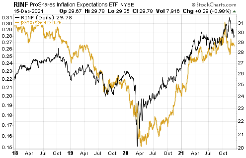
Signalling a boom-to-bust transition

August 16, 2021

[This post is an excerpt from a recent report published at TSI]

There are two things that always happen at or prior to the start of a boom-to-bust transition* for the US economy. One is a clear-cut widening of credit spreads. The other is pronounced weakness in the Industrial Metals Index (GYX) relative to the gold price. These indicators have been known to generate false positives, meaning that there have been times when they have warned incorrectly that a bust was about to begin. However, as far as we can tell they have never generated a false negative, that is, they have never failed to signal an actual boom-to-bust transition in a timely manner.

There are many different credit-spread indicators. We use three, one of which is the US High Yield Index Option-Adjusted Spread (HYIOAS). As illustrated below, over the past month this indicator has risen slightly from a 10-year low. This means that credit spreads in the US are close to their narrowest levels of the past ten years.

After the HYIOAS has dropped well below 4%, a reversal is signalled by the index making a higher short-term high AND moving back above 4%. At the moment, the first of these criteria would be triggered by a move above 3.5%.

Turning to the second of the reliable boom-bust indicators mentioned above, displayed below is a weekly chart of the GYX/gold ratio. To generate a boom-to-bust warning the line on this chart would have to reverse downward and move below its 50-week moving average. Given that it made a new 2-year high last week it is a long way from doing this.

Summing up, neither of the indicators that in the past have always warned prior to the start of a boom-to-bust transition for the US economy is currently close to triggering. However, within a boom there will be ebbs and flows in economic growth and confidence. Economic growth and confidence have declined a little over the past two months and it’s possible that the decline will become more pronounced over the coming two months, all within the context of a boom that currently shows no signs of ending.

*A boom is defined as a period lasting 2-3 years or longer during which monetary inflation creates the illusion of robust economic progress. A bust is a period usually lasting 1-3 years during which the mal-investments of the boom are liquidated, leading to general economic hardship. Bust periods sometimes, but not always, contain official recessions.

Print This Post Print This Post
The monetary inflation crash continues

August 3, 2021

[This blog post is an excerpt from a report recently published at TSI]

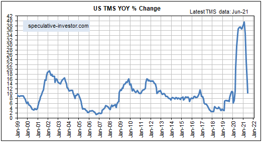
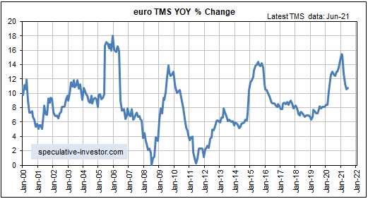
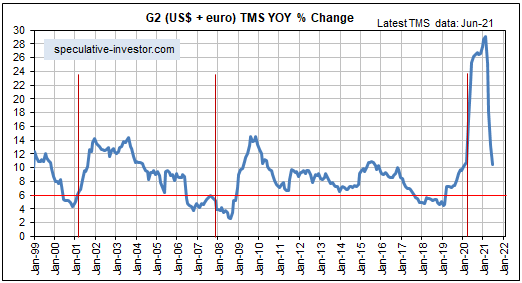
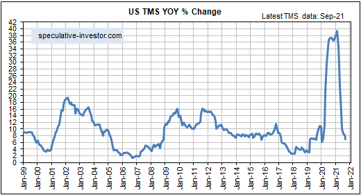
The spectacular rise in the money supply growth rate that began in March of last year predictably led to an equally spectacular decline after the effects of the central banking world’s initial frenzied response to the ‘coronacrisis’ dropped out of the year-over-year calculations. Displayed below are charts showing the spectacular declines over the past few months in the monetary inflation rates of the US, the euro-zone and the G2 (the US plus the euro-zone).

Note that the steep declines probably will continue for one more month, after which the year-over-year growth rates should level out. Also note that the vertical red lines on the G2 monetary inflation chart indicate the starting times of US recessions.

As mentioned in previous TSI commentaries, the monetary backdrop will stop being supportive for the US stock market after the annual TMS growth rate drops below 6%. This could happen as soon as the first quarter of next year, but a lot will depend on commercial bank lending. For example, if commercial banks ramp-up their lending then the US monetary inflation rate could stay in the 7%-10% range for a long time even if the Fed ‘tapers’. Something along these lines happened during 2014-2016.

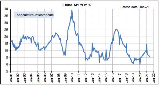
The monetary situation in China is very different. As illustrated by the following chart, the year-over-year growth rate of China’s M1 money supply is close to a multi-decade low.

All else remaining the same, the relatively small amount of monetary inflation in China over the past 16 months would pave the way for China’s economy to be relatively strong over the next few years. However, all else isn’t remaining the same, in that the Communist Party of China (that is, Xi Jinping) is becoming increasingly dictatorial and heavy-handed in its dealings with the private sector.

We’ve written previously that the H1-2021 global monetary inflation reversal probably won’t be a major driver of prices over the balance of this year. This is due to the time it takes for a change in the money-supply growth trend to ‘ripple through’ the financial markets and the economy. However, unless the Fed and the ECB generate a new monetary tsunami over the next several months, the G2 monetary inflation rate could become low enough by early next year to set off a boom-to-bust transition.

Print This Post Print This Post
No boom-to-bust transition, yet

July 20, 2021

[This is a modified excerpt from a commentary published at TSI on 18th July 2021]

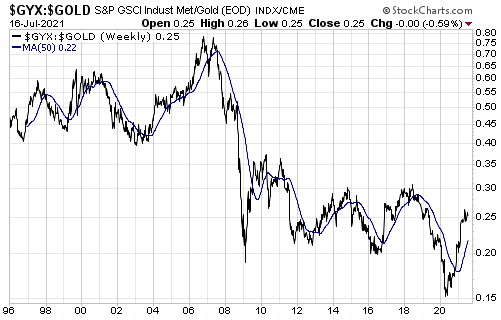
One of the most useful intermediate-term indicators of the financial/economic landscape is the performance of industrial metals relative to gold as indicated by the GYX/gold ratio. This ratio turns down prior to financial crises and major economic slowdowns and turns up in the early stages of recoveries. It occasionally makes a ‘head fake’ move, but over the 25 years of its history it has never failed to reverse course in a timely manner.

With reference to the following weekly chart, we define “reverse course” to mean cross from above to below or below to above the 50-week MA (the blue line). For example, GYX/gold turned down ahead of the 1998 Russian/LTCM crisis, the 2001-2002 recession and equity bear market, the 2007-2009 Global Financial Crisis, the 2011-2012 European debt crisis, the 2015 Yuan-devaluation panic, and the Q4-2018 stock market panic that forced the Fed to do an about-face. Note that after turning down ahead of the Q4-2018 panic it didn’t turn back up until the great reflation trade got underway in Q2-2020.

As an aside, ratios that use gold would not be such reliable indicators of important economic and financial-market trends if the gold price were distorted in a big way by manipulation.

Currently there are signs in the equity, bond, commodity and currency markets that a shift away from risk is underway. These signs actually began to appear in March and became more pronounced over the past few weeks. For example, we have been fixating on the ratio of the Russell2000 Small-Cap ETF (IWM) to the S&P500 Large-Cap ETF (SPY), which peaked in March and broke out to the downside early this month. With the early-July downside breakout, this indicator changed from a ‘yellow flag’ to a ‘red flag’ as far as the stock market’s short-term prospects were concerned.

However, there is no evidence in the performance of the GYX/gold ratio that we are dealing with anything more serious than corrections to the major trends that got underway during the second quarter of last year. At least, there isn’t yet.

It’s possible that such evidence will emerge over the months ahead, so we must pay attention to new data and not blindly assume that the future will be a simple extrapolation of the past.

Print This Post Print This Post
When will rising interest rates become a major problem for the stock market?

July 5, 2021

We asked and answered the above trick question in a blog post on 22nd March. It’s a trick question because although rising interest rates put downward pressure on some stock market sectors during some periods, they are never the primary cause of major, broad-based stock market declines. After all, the secular equity bull market that began in the early-to-mid 1940s and ended in the mid-to-late 1960s unfolded in parallel with a rising interest-rate trend, and the preceding secular equity bear market unfolded in parallel with a declining interest-rate trend.

As explained in the above-linked post from March-2021, when assessing the prospects of the stock market we should be more concerned about monetary conditions than interest rates. The reason, in a nutshell, is that it isn’t always the case that rising interest rates indicate tightening monetary conditions or that falling interest rates indicate loosening monetary conditions. For example, there was a substantial tightening of monetary conditions in parallel with falling interest rates during 2007-2008.

When attempting to determine the extent to which monetary conditions are tight or loose, one of the most important indicators is the growth rate of the money supply itself.

Rapidly inflating the money supply leads to a period of unsustainable economic vigour called a boom, while a subsequent slowing of the monetary inflation rate leads to a transition from boom to bust. Furthermore, once a boom has been set in motion a subsequent unravelling that eliminates all or most of the superficial progress becomes inevitable. The unravelling can be delayed by maintaining a fast pace of money-supply growth, but doing so will have the effect of making the eventual bust more severe.

Over the past 25 years, booms have begun to unravel within 12 months of the year-over-year growth rate of G2 (US plus eurozone) True Money Supply (TMS) dropping below 6%. In the typical sequence there is a decline in the G2 monetary inflation rate to below 6%, followed within 12 months by the start of an economic bust (the unravelling of the monetary-inflation-fuelled boom), followed within 12 months by an official recession. Usually, the broad stock market begins to struggle from the time the boom starts to unravel, that is, from the time the G2 monetary inflation rate drops below 6%.

In the above-linked post from March-2021, we concluded:

…it’s likely that the unravelling of the current boom will begin with the monetary inflation rate at a higher level than in the past. However, with the G2 TMS growth rate well into all-time high territory and still trending upward it is too soon (to put it mildly) to start preparing for an equity bear market.

It is still too soon to start preparing for an equity bear market (as opposed to a significant correction, which may well be on the cards), but the following chart of the G2 TMS growth rate shows that there has been a dramatic change over the past few months. Based on what has happened and what probably will happen on the monetary front, the conditions could be ripe for the next boom-to-bust transition to begin during the first half of next year.

G2TMS_060721

Print This Post Print This Post
Revisiting the most important gold fundamental

June 23, 2021

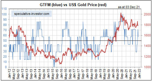
There are seven inputs to my Gold True Fundamentals Model (GTFM), one of which is an indicator of US credit spreads (a credit spread is the difference between the yield on a relatively high-risk bond and the yield on a relatively low-risk bond of the same duration). In a blog post on 12th April I wrote that if I had to pick just one fundamental to focus on at the moment, it would be credit spreads.

The average credit spread is the most reliable indicator of economic confidence. When economic confidence is high or in a rising trend, credit spreads will be narrow or in a narrowing trend. And when economic confidence is low or in a declining trend, credit spreads will be wide or in a widening trend. It therefore isn’t surprising that over the past 25 years there was a pronounced rise in US credit spreads prior to the start of every period of substantial weakness in the US economy and every substantial gold rally. This is as it should be.

Credit spreads being narrow or in a narrowing trend is a characteristic of an economic boom caused by creating lots of money out of nothing. In fact, the main reason for the popularity of inflation policy (pumping up the money supply) is that the policy initially leads to rising economic confidence as evidenced by narrowing credit spreads. It is only much later that the negative effects of the policy bubble to the surface, but by then enough time will have passed that the link between cause and effect will be obscured and the negative effects can be blamed on exogenous events as opposed to bad policy.

In my 12th April post I included a chart that showed a proxy for the average US credit spread. The chart’s message at the time was that credit spreads had been in a strong narrowing trend (reflecting rising economic confidence) for about 12 months and had become almost as low/narrow as they ever get. This implied that anyone who over the preceding several months had been betting on a large stock market decline or a large rally in the gold price had been betting against both logic and history. I pointed out that economic confidence was probably about as high as it would get, but that it could stay at a high level for more than a year.

An update of the same chart is displayed below. It shows that nothing has changed, in that over the ensuing period credit spreads essentially drifted sideways near their multi-decade lows. This means that the economic boom remains in full swing.

CreditSpread_230621

During an economic boom it isn’t a good idea to trade gold from the long side, except for the occasional multi-month trade after the gold market becomes ‘oversold’ in sentiment and momentum terms. However, if the economic boom is accompanied by rising inflation expectations and interest rates, as is the case with the boom that kicked off last year, it usually will pay to be long industrial commodities in general and energy in particular.

Print This Post Print This Post
When will the next US recession begin?

June 7, 2021

[This blog post is an excerpt from a TSI commentary published last week]

Our view for the past 11-12 months has been that last year’s US recession ended in June plus/minus one month, making it the shortest recession in US history. The latest leading economic data indicate that the recovery is intact and that the strong GDP growth reported for the first quarter of this year will continue.

Of particular relevance, the following monthly chart shows that the ISM New Orders Index (NOI), one of our favourite leading economic indicators, remains near the top of its 20-year range. The ISM NOI leads Industrial Production by 3-6 months.

The performances of leading and coincident economic indicators show that the US economy remains in the boom phase of the boom-bust cycle, meaning that the economic landscape remains bullish for industrial commodities relative to gold. Therefore, the small amount of relative strength demonstrated by gold over the past two months is probably part of a countertrend move that will run its course within the next three months.

A year ago our view was that there would be a strong rebound in economic activity fueled by monetary stimulus, fiscal stimulus and the release of pent-up demand after COVID-related restrictions were removed, but that the rebound would be short-lived. Specifically, we were looking for the US economy to recover rapidly during the second half of 2020, level off during the first half of 2021 and return to recession territory by the first half of 2022. This view was revised in response to leading indicators and by October of last year we were expecting the period of strong growth to extend through the first half of 2021.

Based again on leading indicators, we now expect the period of above-average GDP growth to continue throughout 2021, albeit with a slower growth rate during the second half than during the first half. Furthermore, the probability of the US economy re-entering recession territory as soon as the first half of 2022 is now extremely low. To get a recession within the next 12 months there will have to be another shock of similar magnitude to the virus-related lockdowns of 2020.

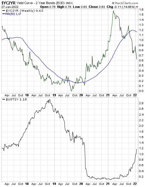
As far as what happens beyond the first half of next year, it’s largely pointless trying to look that far ahead. One thing we can say is that the current position of the yield curve suggests that the next US recession will not begin earlier than 2023. To further explain this comment we will make use of the following chart of the US 10yr-2yr yield spread, a good proxy for the US yield curve.

A major yield-curve trend reversal from flattening (indicated by a falling line on the chart) to steepening (indicated by a rising line on the chart) generally occurs during the 6-month period prior to the start of a recession. After that, what tends to happen is:

a) The yield curve steepens throughout the recession and for 1-2 years after the recession is over.

b) The yield curve peaks and a long (3-year +) period of curve flattening gets underway.

c) The curve eventually gets as flat as it is going to get and reverses direction, warning that a recession will begin within the ensuing 6 months.

Currently, there is a lot of scope for curve steepening prior to peak ‘steepness’. To be more specific, right now the 10-year T-Note yield is about 1.5% above the 2-year T-Note yield, but previous periods of curve steepening didn’t end until the 10-year T-Note yield was at least 2.5% above the 2-year T-Note yield. Moreover, history tells us that there will be a multi-year period of curve flattening between the peak in yield-curve steepness and the start of a recession.

We expect that the current economic cycle will be compressed, but it still could take years for the yield curve to return to the position where it is warning of recession.

Due to unprecedented manipulation of interest rates it could be different this time, meaning that the end of the current boom could coincide with a yield curve that contrasts with the typical pre-recession picture. However, regardless of what happens to the yield curve near the end of the current boom there will be timely warnings of a boom-to-bust transition in the real-time data, including an upward reversal in credit spreads. At the moment, such warnings are conspicuous by their absence.

Print This Post Print This Post

Changing with the times

May 24, 2021

[This blog post is an excerpt from a TSI commentary that was published last week]

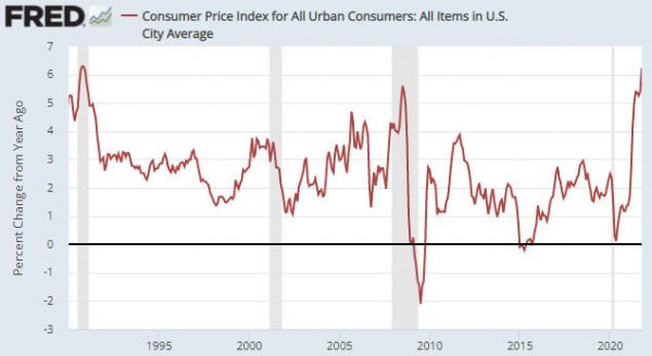
Senior policymakers at the Fed assert that the “inflation” surge of the past several months will prove to be transitory, and it isn’t hard to find market analysts and economists who agree with this assessment. A point we want to make today is that anyone who has been financially positioned for the deflation or “disinflation” that supposedly will follow the period of “transitory inflation” has missed a great opportunity encompassing an inflationary burst of historic magnitude.

In the above sentence we didn’t use the word “historic” lightly. As evidence we present three charts from Yardeni.com.

The first chart shows that the ISM Prices-Paid Indices for both Manufacturing and Services are at 10-year highs and are close to multi-decade highs.

The next chart shows that the percent of small businesses that are raising their average selling prices is the highest since 1981. In other words, this indicator of price increases is at a 40-year high!

The final chart shows the average of prices paid and the average of prices received as determined by the Fed’s regional business surveys. Both Prices Paid and Prices Received are at multi-decade highs, but notice that the Prices Paid line has risen to a much greater extent than the Prices Received line. This means that profit margins are being compressed by the inflation.

It’s perfectly fine to have an opinion about what will happen in the future, but it’s important to position your portfolio in a way that will enable you to profit from the overarching trends currently in progress. Since the second half of March last year and especially since early November of last year the three inter-related trends that have dominated the financial markets are rising inflation expectations, rising economic confidence and US$ weakness. The combination of these trends is very bullish for commodity prices, both in fiat currency terms and in gold terms.

There are warning signs that the above-mentioned trends are in their final phases, but they haven’t ended yet. Therefore, at the moment it’s reasonable to be positioned based on the assumption that what worked over the past six months will continue to work, albeit with a ‘nod’ to the likelihood that some of the dominant trends could be near their ends. From our perspective, that ‘nod’ has involved building up exposure to gold. However, when the evidence of a general trend shift becomes clearer it will be important to change with the times and not doggedly stick with the positioning that was aligned with previous conditions. In other words, don’t make the mistake that was made over the past 7-14 months by the perennial US$ and T-Bond bulls.

Print This Post Print This Post

The Boom Continues

May 11, 2021

[This blog post is an excerpt from a TSI commentary published on 9th May 2021]

The major trends in monetary inflation result in a boom-bust cycle. In particular, a rising trend in the money-supply growth rate leads to increased consumption and investment spending, ushering-in the boom phase of the cycle. A subsequent decline in the rate of money-supply growth reveals the investing errors of the boom and leads to a liquidation process, which is the bust phase of the cycle. In other words, monetary inflation causes the boom and the boom causes the bust.

Once a boom is set in motion by creating lots of money out of nothing, a painful bust that eliminates all or most the boom’s apparent gains is inevitable. The only question is the timing. Even if the central bank tries to keep the boom going forever by maintaining a rapid pace of money-supply growth, all it will do is set the scene for the eventual bust to involve hyperinflation and a total economic breakdown.

Unfortunately, the timing question can’t be answered well in advance of the start of the boom-to-bust transition. However, there are indicators that usually generate warning signals early enough to be useful. Two such signals are credit spreads and the gold/commodity ratio.

When a boom is in progress, credit spreads are relatively narrow or in a narrowing trend and gold is relatively cheap or in a cheapening trend. As evidenced by the following chart, that’s exactly what has been happening over the past 13 months and especially over the past 6 months (the black line on the chart is a credit-spread indicator and the yellow line on the chart is the gold/commodity ratio). Furthermore, although gold has done well in US$ terms since late-March and ended last week at a 2-month high, relative to commodities (as represented by the GSCI Spot Commodity Index – GNX) it tested its 12-month low last week. With credit spreads near their narrowest levels in more than 12 months, this makes sense. It means that the US boom is intact.

When the boom is close to its end the gold/commodity ratio should start trending upward and credit spreads should start widening.

Print This Post Print This Post
The ‘V’ Recovery

May 5, 2021

In an article at the TSI Blog in May of last year we explained why the US economic rebound from the H1-2020 plunge into recession probably would look like a ‘V’. Our conclusion at that time was: “There will be a ‘V’ shaped recovery, but due to the destruction of real wealth stemming from the lockdowns the rising part of the V is bound to be much shorter than the declining part of the V. This will lead to a general realisation that life for the majority of people will be far more difficult in the future than it was over the preceding few years.” This assessment was close to the mark, but not totally correct.

During the few months after we posted the above-linked article at the TSI Blog our views regarding the likely strength and longevity of the economic rebound — as outlined in TSI commentaries — shifted. Specifically, in commentaries published at TSI between June and November of last year we began to anticipate a longer rebound with an acceleration of economic activity during the first half of 2021. This was due to a) the central bank’s promise to maintain accommodative monetary conditions for years despite the emerging evidence of an “inflation” problem, b) the eagerness of the US federal government to continue showering the populace with money, c) the expected natural release of pent-up demand as COVID-related restrictions were removed and d) the likelihood of the US government approving a multi-trillion-dollar infrastructure spending program regardless of the November-2020 election outcome. Due to this combination of factors, a full ‘V’ recovery has occurred when measured in GDP terms. This is illustrated by the following chart.

GDP_050521

The GDP rebound does not reflect sustainable progress. Due to the way that GDP is calculated, a dollar of counterproductive spending is the same as a dollar of productive spending. For example, if the government pays people to dig holes in the middle of nowhere and then fill them in, the payments will add to GDP even though the process wastes resources and adds nothing to the economy-wide pool of wealth. Over the past 12 months there has been a lot of counterproductive spending.

The popular economic indicator called “GDP” actually reflects money-supply growth more than it reflects economic progress. By simultaneously giving the money supply a hefty boost and pretending that the purchasing power of money is essentially unchanged, the impression can be created that the economy is moving ahead in leaps and bounds while the total amount of real wealth actually shrinks.

When speculating and investing, however, it’s important to take advantage of the artificial boom and not fritter away your personal wealth betting against the monetary tide. Such bets will become appropriate at some point (as determined by various leading indicators), but they haven’t been appropriate over the past six months and they are not appropriate today.

Print This Post Print This Post
Will tax increases derail the US equity bull market?

April 27, 2021

[This blog post is an excerpt from a report published at the TSI website on 25th April]

The US stock market was reminded last Thursday that the Biden Administration plans to increase taxes to cover part of the cost of its spending proposals. This caused a pullback in the S&P500 Index (SPX) that lasted only a few hours. The next day the tax risk was forgotten and a marginal new all-time high was recorded. Does this mean that the stock market is immune to higher taxes?

Before we answer the above question it’s worth pointing out that there always will be a substantial economic cost to a substantial increase in government spending, regardless of the method used to pay for the spending. Of the three possible payment methods an increase in taxes is probably the most honest, because it’s the method that makes the cost of the spending most obvious to everyone.

Another method of paying for an increase in government spending involves adding to the government debt pile via the sale of bonds to the private sector. As discussed in a TSI blog post last week, the main cost associated with this method is the transfer of private-sector investment to government spending.

In essence, when taxes are hiked to pay for increased government spending then the cost to the economy is a reduction in private-sector income, whereas when debt is used to pay for increased government spending then the cost to the economy is a reduction in private-sector investment. Both methods will hinder economic progress.

The third method is to use “inflation”, a.k.a. “financial repression”, to pay for the spending. This is what happens when the central bank monetises the bulk of the debt issued by the government to finance an increase in its spending. In effect, the real value of the debt is lessened over time by depreciating the money in which the debt is denominated. This causes a reduction in average living standards due to an increase in the cost of living relative to wages. It also magnifies economic inequality because it hurts the asset-poor to a far greater extent than it hurts the asset-rich. In fact, the asset-rich often profit from the debt monetisation process.

Returning to the question we posed in the opening paragraph, higher taxes or the risk of higher taxes could be the ‘excuse’ for the intermediate-term stock market correction we think will happen during the second half of this year. However, we doubt that tax increases will reverse the market’s long-term trend. The reason is that the long-term upward trend in nominal equity prices is driven by the Fed’s idiotic belief that currency depreciation is helpful and the relentless flow of money into “passive” investment vehicles.

The most likely cause of a long-term trend reversal in the stock market is the general belief taking hold that inflation is “public enemy number one”. Until that happens, every substantial decline in the US stock market will be met with a flood of new money courtesy of the Fed.

Print This Post Print This Post
The true cost of government debt

April 19, 2021

Current government debt loads will never be paid off. Instead, new debt will replace expiring old debt. Also, new debt will be issued to pay the interest on existing debt and to finance increased government spending, thus ensuring that the total debt pile continues to grow. At a superficial level it therefore seems as if government debt is neither a cost that will be borne by the current generation of taxpayers nor a cost that will be borne by future generations. After all, how could a debt that no one will ever have to repay be a genuine financial burden?

The mistake that most people make is to assume that the main cost of government debt is associated with the obligation to repay. This assumption leads to the conclusion that if for all practical purposes there never will be a requirement to pay off or even to pay down the debt, then the debt effectively is costless and there really is such a thing as a free lunch. However, the assumption is wrong.

If government debt is purchased by the private sector, then the main cost is actually immediate and is due to the transfer of private-sector investment to government spending. For example, money that would have been invested in building businesses that add to the wealth of the economy is diverted to government programs. In general, politically-motivated spending does not add to the economy-wide pool of wealth. In fact, it often does the opposite.

To put it more succinctly, adding to the government’s debt converts one form of spending, the bulk of which would have been productive in a relatively free economy, to a different form of spending, the bulk of which will be unproductive.

But what if government debt were purchased by the central bank using money created out of nothing? According to MMT, such debt would be costless as long as there was sufficient slack in the economy (as determined by “inflation” statistics).

In this case the cost of the debt is not immediate. In fact, when an increase in government spending is financed via the creation of new money the short- and intermediate-term effects usually will be positive, with the costs only becoming apparent years later in the form of busted bubbles, major recessions and slower long-term economic progress. The most important costs of such policy stem from the falsification of prices caused by the injection of the new money. Many of the investments that are made in response to these misleading price signals turn out to be of the “mal” variety and end up being liquidated.

Summing up, the main cost of government debt has very little to do with the future repayment obligation it implies. If the debt is purchased by the private sector using existing money then the most important cost is an immediate reduction in productive investment, whereas if the debt is financed via monetary inflation then the most important cost will be a long-term reduction in economic progress due to the mal-investment incentivised by the new money.

Print This Post Print This Post
The most important gold fundamental right now

April 12, 2021

[This blog post is an excerpt from a TSI commentary published within the past fortnight]

There are seven inputs to our Gold True Fundamentals Model (GTFM), one of which is an indicator of US credit spreads (a credit spread is the difference between the yield on a relatively high-risk bond and the yield on a relatively low-risk bond of the same duration). If we had to pick just one fundamental to focus on at the moment, it would be credit spreads.

The average credit spread is not the only indicator of economic confidence, but it is the most reliable. When economic confidence is high or in a rising trend, credit spreads will be narrow or in a narrowing trend. And when economic confidence is low or in a declining trend, credit spreads will be wide or in a widening trend. As a consequence, over the past 25 years there was a pronounced rise in US credit spreads prior to the start of 1) every period of substantial weakness in the US economy, 2) every substantial stock market decline, and 3) every substantial gold rally.

The following chart shows a proxy for the average US credit spread. Notice that credit spreads have been in a strong narrowing trend (reflecting rising economic confidence) over the past 12 months and are now almost as low/narrow as they ever get. This implies that economic confidence won’t get much higher than it is right now. It also implies that anyone who over the past several months has been betting on a large stock market decline or a large rally in the gold price has been betting against both logic and history.

As mentioned above, economic confidence is probably about as high as it is going to get. This implies that the next big move will be a decline, but be aware that confidence sometimes will stay at a high level for more than a year. For example, the above chart shows that credit spreads languished at a very low level (meaning: confidence hovered at a very high level) from February-2017 to September-2018.

We doubt that confidence will hover at a high level for a lengthy period this time around. Instead, we expect that there will be an economic confidence reversal within the next few months. However, there is no need to forecast the reversal, because credit spreads should provide us with a timely warning.

Print This Post Print This Post
Relentless price-insensitive buying

April 5, 2021

[Below is an excerpt from a TSI commentary. It was published about six weeks ago but remains applicable.]

We have focused on the monetary tsunami set in motion by central banks, but there is another force contributing to the record-high valuations in the US stock market. That force is the shift towards passive and ETF-focused investing that began more than two decades ago and has come to dominate flows within the stock market.

So-called “passive” strategies use rules-based investing, often to track an index by holding all of its constituent components or a representative sample of those components. There is no discretion on the part of the asset manager. For example, money going into an S&P500 index fund will be allocated to all of the stocks in the S&P500 according to their weight in the index, meaning that the stocks with the highest market capitalisations will receive the lion’s share of the money flowing into such a fund.

Due to passive investing, the more expensive a stock becomes the more investment it will attract and the more expensive it will become. For example, in the S&P500 Index the current weighting of Apple is 500-times greater than that of Xerox, so when money flows into an S&P500 index fund the proportion that gets allocated to the purchase of Apple shares will be automatically 500-times greater than the proportion that gets allocated to the purchase of Xerox shares. Therefore, rather than a relatively high valuation stemming from past outperformance being an impediment to future relative strength, it will tend to create additional relative strength.

This wouldn’t be a major issue if passive investing constituted a small part of the market, but the strategy has grown to be by far the most important source of demand for stocks in the US. This means that the largest net buyer of US equities each month is price insensitive (value blind).

Summing up the above, every month a large amount of money flows into funds that allocate with no consideration of value.

Furthermore, many “active” fund managers now trade ETFs rather than individual stocks and many of these ETF’s are rules-based. For example, rather than go to the trouble of selecting/monitoring the stocks of individual oil companies, these days an active manager who is bullish on oil is likely to buy shares of the Energy Select Sector ETF (XLE). This ETF tracks a market-cap-weighted index of US energy companies in the S&P 500, so the more expensive an oil company becomes the greater will be its weighting in XLE and the larger the amount of money that will be allocated to it whenever the demand for the ETF pushes the ETF’s price above its net asset value.

The increasing popularity of ETFs among “active” managers tends to cause the stocks that have the largest weightings in ETFs to become relatively strong, regardless of whether the strength is warranted based on the performances of the underlying businesses. That is, the increasing use of ETFs by active managers exacerbates the effect on market-wide valuation of the increasing popularity of passive investing.

A consequence is that the market no longer mean-reverts the way it used to. In theory, it could keep getting more expensive ad infinitum.

In practice, it won’t get more expensive ad infinitum because at some point something will happen (for example, a major inflation scare that causes the Fed to slam its foot on the monetary brake) that causes the direction of the passive flows to reverse. This is part of the explanation for why the March-2020 decline was exceptional. In March-2020, the decision to shut down large parts of the economy in reaction to a virus caused the massive price-insensitive buyer to become a net seller for a short period. The result for the S&P500 Index was the quickest-ever 35% decline from an all-time high.

In conclusion, be wary of confident claims to the effect that today’s record-high valuations imply that a major top is close in terms of time or price. The reality is that valuations could go much higher. Also be wary of bullish complacency, because at some point the flows will reverse. The risk that flows will reverse with little warning is why we are about 35% in cash despite our expectation that the equity bull market will continue for at least a few more months.

Print This Post Print This Post