Print This Post Print This Post

Uranium’s stealth upward trend

March 4, 2019

It’s likely that by the middle of the next decade, most new cars, trucks and buses will be Electric Vehicles (EVs). As a consequence, it’s a good bet that over the next several years the demand for both gasoline and diesel will shrink dramatically while the demand for electricity (to recharge EV batteries) experiences huge growth. Part of this demand growth will be satisfied by nuclear power, which is why uranium is an indirect play on the EV trend.

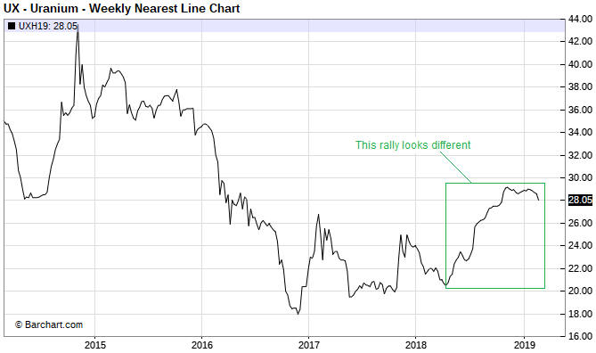
The uranium price might have begun to discount the aforementioned shift in demand in that it has been quietly trending upward since around April of last year (a weekly chart is displayed below). I say “quietly” because the rally has been accompanied by very little in the way of speculative enthusiasm. On the contrary, the rally that began last April has been accompanied by widespread scepticism.

This is an important sentiment change. Whereas every multi-month up-move in the uranium price prior to last year was greeted as if it heralded the beginning of a bull market, almost everyone has dismissed the most recent rally as just another counter-trend bounce. Being bearish on uranium has become easy, but bull markets begin when it’s easy to be bearish.

uranium_040319

I’m not convinced that a uranium bull market is underway, but I do think that for the uranium-mining sector the intermediate-term risk/reward is skewed decisively towards reward. The reason is that the mining stocks could achieve large price gains with or without a genuine bull market in the underlying commodity. All it would take, I think, is a move by the uranium price into the $30s to convince many speculators that a major trend reversal had occurred and prompt aggressive buying of uranium-mining equities.

It used to be that owning shares of the Global X Uranium Fund (URA) was the simplest and surest way of participating in a uranium-mining rally, but that is no longer the case due to the changes that were made to this fund last year. As outlined HERE, during the second quarter of last year the index that URA tracks was changed from the Solactive Global Uranium Total Return Index to the Solactive Global Uranium & Nuclear Components Total Return Index. Thanks to this change, seven of URA’s current top ten holdings have no correlation with the uranium price.

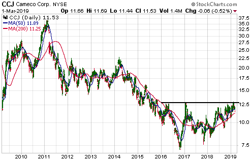
Nowadays, owning the shares of Cameco (CCJ) is the surest way of participating in a uranium-mining rally.

It looks to me like CCJ is not far from completing a 3-year base (see chart below). I like the idea of gradually building up a position on weakness while the basing process continues.

CCJ_040319

Print This Post Print This Post

What the Fed is doing: perception versus reality

February 26, 2019

[This blog post is an excerpt from a TSI commentary published on 24th February]

Based on the par value of maturing securities on its balance sheet there was scope for the Fed to withdraw as much as $43B from the financial markets on 15th February. A week ago we noted that this ‘liquidity drain’ had no effect on the stock market, possibly because the effect would occur on the next trading day (Tuesday 19th February) or because the Fed chose to withdraw a lot less money than it could have. Now that the Fed has issued its latest weekly balance sheet update we can see why there was no effect from this potential bout of “quantitative tightening” (QT). We can also see that the general perception of what the Fed is doing has deviated in a big way from what the Fed actually is doing.

During the 7-day period from 13th to 20th February the Fed’s securities portfolio fell by $31B. In other words, the Fed implemented $31B of a potential maximum $43B of QT. Over the same period, however, the amount of money in the US federal government’s account at the Fed fell by $44B. This means that there was a $31B withdrawal of liquidity by the Fed in parallel with a $44B injection of liquidity by the government, resulting in a net liquidity ADDITION of $13B. No wonder there wasn’t a noticeable negative effect on the stock market from the Fed’s actions.

The difference between a Fed liquidity injection and a government liquidity injection is that whereas the Fed can inject new money, the government can only recycle existing money (the government returns to the economy the money it previously removed via borrowing or taxation). Government liquidity injections therefore are not inflationary, but their short-term effects can be similar to Fed liquidity injections.

Note that at 20th February the government had about $330B in its account at the Fed. This means that the government currently has the ability to inject up to $330B into the economy, but depending on the size of its desired cash float it may or may not make additional injections in the short-term.

Also note that notwithstanding all of the ‘dovish’ talk that has emanated from the Fed over the past two months, the QT program has continued. From 2nd January to 20th February the Fed removed $63B from the economy as part of its “balance sheet normalisation”. The pace of the liquidity removal is slower than the Fed’s self-imposed $50B/month limit, but it is not correct to say — as some pundits have said — that the Fed has stopped tightening. The Fed is still pulling on the monetary reins.

That the Fed is still tightening means that there is a substantial mismatch at the moment between perception and reality. The general perception is that the Fed is now either on hold or preparing to loosen, but, as mentioned above, this most definitely is not the case. Consequently, bullish speculators in the stock, commodity and gold markets are getting ahead of themselves.

It’s possible that the Fed will end its monetary tightening within the next few months, but that’s only going to happen if there’s another pronounced shift away from risk. To put it another way, the more the markets discount an easing of monetary policy the less chance the easing will occur. In fact, if the stock market extends its upward trend into May-June then the Fed probably will resume its rate-hiking in June.

Print This Post Print This Post
Gold generally does what it is supposed to do

February 18, 2019

Like every other financial market in world history, the gold market is manipulated. However, anyone who believes that manipulation of the gold market is an important influence on major gold-price trends does not understand the true fundamental drivers of the gold price.

To paraphrase Jim Grant, gold’s market value is the reciprocal of confidence — in the banking system (including the central bank), the economy and the government. In other words, gold should do relatively well when confidence is on the decline and relatively poorly when confidence is on the rise.

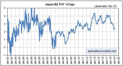
By comparing the gold/commodity ratio with measures of monetary and/or economic confidence it can be shown that gold generally does exactly what it should do. There are periods of divergence, but these tend to be short (no more than a few months) and barely noticeable on long-term charts.

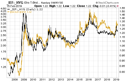
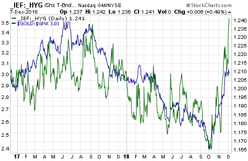
The point outlined above can be illustrated by comparing the gold/commodity (gold/GNX) ratio with the IEF/HYG ratio, which I’ve done in the following chart.

The IEF/HYG ratio is fit for our purpose because it is a measure of what’s happening to credit spreads, and because the economy-wide credit-spread trend is one of the best indicators of economic confidence. Specifically, the IEF/HYG ratio increases when credit spreads are widening (indicating declining economic confidence) and decreases when credit spreads are narrowing (indicating rising economic confidence).

Therefore, it is fair to say that the following chart compares the gold/commodity ratio with the reciprocal of confidence in the US economy.

Lo and behold, the two lines on the chart track each other quite closely.

goldGNX_creditsp_180219

Print This Post Print This Post
The absurdity known as “TARGET2″

February 11, 2019

[This blog post is an excerpt from a commentary posted at TSI about three weeks ago]

TARGET2 is the system set up in the euro-zone to clear inter-bank payments. The Bundesbank (Germany’s central bank) describes it as a payment system that enables the speedy and final settlement of national and cross-border payments. The problem is that often there is no “final settlement” under TARGET2. Instead, credits and debits can build up indefinitely.

To understand the issue it first must be understood that although the 19 countries that comprise the euro-zone use a common currency, the euro-zone isn’t really a unified monetary system. It is more like 19 separate monetary systems, each of which is overseen by a National Central Bank (NCB). These NCBs are, in turn, overseen and coordinated by the ECB. TARGET2 is the means by which money is transferred quickly and efficiently between these 19 separate monetary systems. The transfer may well be quick and efficient, but, as noted above, it often doesn’t result in final settlement.

Further explanation is provided by the Bundesbank, as follows:

…both the Bundesbank and the Banque de France will be involved in a cross-border payment transaction made in settlement of a German export to France, for instance. That transaction begins when the French importer’s commercial bank in France debits the purchase amount from the importer’s account and submits a credit transfer in TARGET2 to the German exporter’s commercial bank in Germany. The Banque de France then debits the amount from the TARGET2 account it operates for the French commercial bank and posts a liability owed to the Bundesbank. For its part, the Bundesbank posts a claim on the Banque de France and credits the amount to the German commercial bank’s TARGET2 account. The transaction is concluded when the commercial bank credits the amount in question to the account it operates for the German exporter.

At the end of the business day, all the intraday bilateral liabilities and claims are automatically cleared as part of a multilateral netting procedure and transferred to the ECB via novation, leaving a single NCB liability to, or claim on, the ECB.

Viewed in isolation, the transaction used as an example above leaves the Banque de France with a liability to the ECB and the Bundesbank with a claim on the ECB at the end of the business day. These claims on, or liabilities to, the ECB are generally referred to as TARGET2 balances.

The example given above by the Bundesbank refers to a German export to France, but the same process would apply when someone transfers money from a bank deposit in one EZ country to a bank deposit in another EZ country. For example, the electronic wiring of funds from a commercial bank account in Italy to a commercial bank account in Luxembourg would leave the Banca d’Italia with a liability to the ECB and the Banque Centrale du Luxembourg with a claim on the ECB.

The process described above means that there is never any net clearing of cross border payments at the NCB level. Unless the money flowing in one direction (into Country X) equals the money flowing in the opposite direction (out of Country X), credit/debit balances will build up and there is no limit to how large these balances can become.

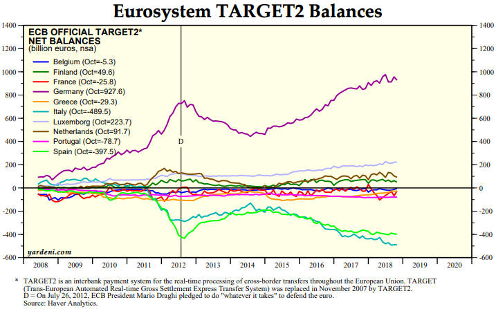
As illustrated by the following chart from Yardeni.com, this is not just a hypothetical issue. The NCBs of some EZ countries, most notably Germany and Luxembourg, now have huge positive TARGET2 balances, and the NCBs of some other EZ countries, most notably Italy and Spain, now have huge negative TARGET2 balances.

As at October-2018, the central bank of Germany was owed 928 billion euros by the TARGET2 system, while together the central banks of Italy and Spain owed 887 billion euros to the TARGET2 system. Is this a problem?

The system is so strange that there doesn’t appear to be a clear-cut answer to the above question, at least not one that we can fathom. It could be a huge problem or it could be no problem at all.

The Bundesbank is sitting there with an asset valued at almost 1 trillion euros that will never pay any interest and cannot be collected. At first blush this appears to be a huge problem. It implies that at some point the asset will have to be written off, perhaps leading to a very expensive bailout funded by German taxpayers. But then again, due to the way the current monetary system works it may well be possible for TARGET2 balances to grow indefinitely with no adverse consequences. That’s why we haven’t devoted any commentary space to this issue in the past.

If we were forced to give an answer to the above question it would be that rising interest rates, burgeoning government debt levels and private bank failures will become system-threatening issues in the EZ long before the TARGET2 balances pose a major threat.

Print This Post Print This Post

Misconceptions about US bank reserves

February 4, 2019

Bank reserves are a throwback to a time when the amount of receipts for money (gold) that could be issued by a bank was limited by the amount of money (gold) the bank held in reserve. Under the current monetary system bank reserves have no real meaning, since it isn’t possible for a dollar in a bank deposit to be genuinely backed by a dollar held somewhere else. The dollar can’t back itself! However, it is still important to understand what today’s bank reserves are/aren’t and how changes in the reserves quantity are linked to changes in the economy-wide money supply. Remarkably, these bank-reserve basics are misunderstood by almost everyone who comments on the topic.

The simplest way for me to deal with the common misunderstandings about bank reserves is in point form, so that’s how I’ll do it. Here goes:

1) Bank reserves aren’t money, that is, they are not considered to be general media of exchange and are not counted in the True Money Supply (TMS). Instead, they provide ‘backing’ for part of the money supply.

2) A corollary of the above is that banks can’t use their reserves to buy things outside the Federal Reserve system.

3) Banks can lend their reserves to other banks, but the banking industry as a whole cannot expand or shrink its reserves. In other words, the banking industry has no control over its collective reserves. The central bank has total control.

4) Bank reserves can be shifted around within accounts at the Fed, but the only way that reserves can leave the Fed and enter the economy is via the withdrawal, by the public, of physical currency from banks. For example, when $100 is withdrawn from an ATM, $100 is converted from deposit currency to physical currency. This doesn’t alter the money supply, but it causes the bank to lose a $100 liability (the bank customer’s deposit) and a $100 asset (the physical currency held in the bank’s vault). When the quantity of physical currency held in a bank’s vault gets too small, the bank will replenish its supply by withdrawing reserves from the Fed in the form of new paper dollars. Although it may appear that this imposes some sort of limit on the supply of physical dollars, the Fed stands ready, willing and able to meet any increase in demand. This is further discussed in point 5).

5) Under the current monetary system, reserves effectively are created out of nothing. To be more precise, the Fed creates reserves when it purchases bonds and other assets. Since there is no limit to the dollar value of assets that can be purchased by the Fed, the banking system will never run short of the reserves it needs to meet the public’s demand for physical currency. Also, the Fed can remove reserves whenever it wants by selling bonds and other assets.

6) Except for the siphoning of reserves in response to the public’s increasing demand for physical currency, it is accurate to say that reserves at the Fed stay at the Fed until they are removed by the Fed. A corollary — as already mentioned in point 3) — is that the commercial banking industry cannot draw-down its reserves.

7) The Fed pays interest on ALL reserves, not just so-called “excess reserves”. In any case and as outlined below, for all intents and purposes all US bank reserves, with the exception of the relatively small portion required to meet any increase in the demand for physical currency, are now excess and have been for the past few decades.

8) The way the US monetary system now works it is fair to say that all reserves are excess. The reason is that the quantity of bank reserves has no bearing on the amount by which banks expand/contract credit. In effect, the US now has a zero-reserve fractional reserve banking system. That’s why it was possible for the greatest expansion of bank credit in modern US history, which took place during 1990-2007, to happen while the commercial banking industry had almost no reserves. During this period total bank credit rose by $6 trillion, from $2.5T to $8.5T, while bank reserves at the Fed dwindled from $64B to $40B.

9) Further to point 8), bank lending doesn’t ‘piggy-back’ on bank reserves. It possibly did 40 years ago, but it hasn’t for at least the past 25 years. Hopefully, economics textbooks eventually will be updated to reflect this reality.

10) An implication of points 7) and 8) is that interest payments on reserves are neither an incentive nor a disincentive to bank lending. When a bank makes a loan to a customer it doesn’t lose any reserves and therefore continues to collect the same interest-on-reserves payment from the Fed.

11) The sole purpose of paying interest on reserves is to enable the Fed to hike the Fed Funds Rate during a period when the banks are inundated with reserves, without having to massively reduce the quantity of reserves. This was discussed in previous blog posts, for example HERE.

12) When the Fed was ‘quantitatively easing’ many pundits wrote that it was adding to bank reserves but not the money supply. This is wrong. When the Fed buys X$ of securities as part of a QE program it adds X$ to bank reserves AND it adds X$ to the economy-wide money supply. I previously described the process HERE.

13) By the same token, now that the Fed is ‘quantitatively tightening’ it is not just removing bank reserves. When the Fed sells X$ of securities as part of what it refers to as its balance-sheet normalisation program it removes X$ from bank reserves AND it removes X$ from the economy-wide money supply. In essence, it’s the process I described in the above-linked post (point 12) in reverse. That’s why the balance-sheet normalisation program is vastly more important, as far as monetary conditions are concerned, than the rate-hiking program.

Print This Post Print This Post
Random Predictions For 2019

January 28, 2019

[This blog post is an excerpt from a TSI commentary published about three weeks ago and covers a few general thoughts about what will happen in the financial world this year. Specific thoughts about what I expect this year from the stock, gold, bond, currency and commodity markets have also been included in TSI commentaries over the past three weeks.]

1) Early last year we predicted that the US stock market would experience greater-than-average volatility over the year ahead. This obviously happened, as there were more 2%+ single-day moves in the SPX during 2018 than in an average year.

We expect the same for this year, that is, we expect price volatility to remain elevated. The reason is that the two most likely scenarios involve abnormally-high price volatility. One of these scenarios is that a cyclical bear market began last October, and bear markets are characterised by periods of substantial weakness followed by rapid rebounds. The other scenario is that a very long-in-the-tooth cyclical bull market is about to embark on its final fling to the upside.

2) When attempting to predict when a period of economic growth will end it is futile to look more than 6-12 months into the future, because there are no leading recession indicators that can predict that far ahead with acceptable reliability. There are, however, leading indicators that can be used to determine the probability of a recession beginning within the next few quarters.

Early last year these indicators told us that a US recession would not begin during the first half of the year. They currently tell us that the US economy stands a good chance of commencing a recession this year, most likely during the second half of the year. Note, though, that if a recession does get underway this year it won’t become official until 2020, because recessions usually aren’t confirmed by the National Bureau of Economic Research until about 12 months after they start.

3) Regarding ‘cryptoassets’, at around this time last year we wrote:

…it’s a good bet that the Bitcoin bubble reached its maximum level of inflation late last year. Also, the broader bubble in cryptoassets is set to burst during the first quarter of this year.

And:

By the end of 2018 it will be apparent that the public’s enthusiasm for Bitcoin and the “alt-coins” was one of history’s great speculative manias.

This assessment looks correct.

We don’t have a strong opinion about what will happen to ‘cryptoassets’ in 2019. This is partly because there is no reasonable way to determine the fair value of these assets. For Bitcoin, for example, a price of $3,000 is no more or less sensible than a price of $30,000 or a price of $300.

Distributed ledgers can be very useful, but there should be ways to implement them without consuming a lot of resources. If so, the price of Bitcoin eventually will drop to almost zero.

A year ago we also predicted:

Despite spectacular collapses in the prices of the popular ‘cryptoassets’ during 2018, central banks including the Fed and the ECB will firm-up plans to introduce their own blockchain-based currencies. This will be driven by a desire to eliminate physical cash, the thinking being that if there is no physical money it will be more difficult for the average person to make/receive unreported payments and escape a negative interest rate.

As far as we know the major central banks didn’t firm-up plans to introduce their own blockchain-based currencies last year, but we continue to expect that they will — for the reasons mentioned above.

4) Regarding the Fed’s expected actions in 2018, early last year we wrote:

Due to rising commodity prices it’s a good bet that “price inflation” will become a higher-profile issue during the first half of 2018, prompting the Fed to move ahead with its quantitative tightening (QT) and make two more rate hikes. However, both the QT and the rate-hiking will be put on hold during the second half of the year in reaction to increasing downside volatility in the stock market.

We got the anticipated rate hikes during the first half and the increasing downside stock-market volatility during the second half of last year, but the Fed stuck to its guns. However, over the past three weeks the Fed Chairman has made it clear that the Fed will be quick to change direction if the stock market continues to decline and/or the economic numbers point to significant weakness.

For 2019 we expect one Fed rate hike, most likely in June. Also, we expect that people ‘in the know’ will explain to senior Fed members that it’s the balance-sheet reduction program (QT) that really counts, prompting the Fed to slow the pace of QT during the first half and conclude the QT program before year-end.

5) The ECB has just ended its QE program and has a tentative plan to implement its first rate hike during the third quarter of 2019. Given that nothing has been learned from the failed monetary experiments of the past few years, it’s a good bet that evidence of declining economic activity in the future will be met by the ramping-up or reintroduction of policies that failed in the past. Therefore, we predict that the ECB will not increase its targeted interest rates this year and will restart QE during the second half of the year.

6) This is not a prediction for 2019, but rather an observation that could apply for decades to come. We suspect that the age of real estate has ended.

We don’t mean that from now on it will be impossible to achieve good returns by investing in real estate, but that gone are the days when anyone could buy a house almost anywhere and likely end up with a sizable profit as long as they held for 10 years or more. From now on only astute investors will consistently make good returns from real estate, where “astute” means able to time the cyclical swings in the broad market or able to correctly anticipate future supply-demand imbalances in specific areas.

For the average person, residential property will transition from an investment to what it was prior to the 1970s: a consumer good (something bought solely for its use value).

The reason for the change is the interest-rate trend. The 3-4 decade downward trend in interest rates resulted in a 3-4 decade upward trend in housing affordability for buyers using debt-based leverage (that is, for the vast majority of buyers). There were corrections along the way, but provided that long-term interest rates continued to make lower lows there would eventually be a pool of new debt-financed buyers able to pay a much higher price.

There’s a good chance that the secular interest-rate trend reversed from down to up during 2016-2018. If so, future house buyers that don’t have good timing and/or substantial area-specific knowledge generally won’t make long-term capital gains on their residential property purchases.

Print This Post Print This Post
No confirmation of a gold bull market, yet

January 14, 2019

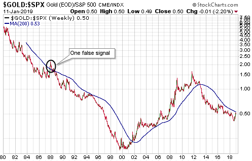
The ‘true fundamentals’ began shifting in gold’s favour in October of last year and by early-December the fundamental backdrop was gold-bullish for the first time in almost a year. However, there is not yet confirmation of a new gold bull market from the most reliable indicator of gold’s major trend. I’m referring to the fact that the gold/SPX ratio is yet to achieve a weekly close above its 200-week MA. Here’s the relevant chart:

gold_SPX_LT_140119

The significance of the gold/SPX ratio is based on the concept that the measuring stick is critical when determining whether something is in a bull market. If a measuring stick is losing value at a fast pace then almost everything will appear to be in a bull market relative to it. For example, pretty much everything in the world has been rising in value rapidly over the past few years when measured in terms of the Venezuelan bolivar. It should be obvious, though, that not everything can be simultaneously in a bull market. To determine which assets/investments are in a bull market we can’t only go by performance relative to any national currency; we must also look at the performances of assets/investments relative to each other.

That’s where the gold/SPX ratio comes in. Gold and the world’s most important equity index are effectively at opposite ends of the ‘investment seesaw’. Due to their respective natures, if one is in a long-term bull market then the other must be in a long-term bear market. In multi-year periods when they are both trending upward in dollar terms it means that the dollar is in a powerful bear market, not that gold and the SPX are simultaneously in bull markets.

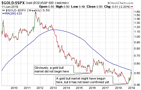
An implication — as noted on the following chart — is that a gold bull market did not begin in December-2015. Gold cannot be in a bull market and at the same time be making new 10-year lows relative to the SPX, which is what it was doing until as recently as August-2018. At least, it can’t do that if a practical and sensible definition of “bull market” is used.

It’s possible that a gold bull market got underway in August-2018, but as mentioned above this has not yet been confirmed.

gold_SPX_10yr_140119

Print This Post Print This Post
The Japanese government is still pegging the gold price

January 8, 2019

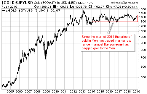
About five months ago I posted an article in response to stories that the Chinese government had pegged either the SDR-denominated gold price or the Yuan-denominated gold price. These stories were based on gold’s narrow trading range relative to the currency in question over the preceding two years, as if government manipulation were the only or the most plausible explanation for a narrow trading range in a global market. To illustrate the silliness of these stories I came up with my own story — that it was actually the Japanese government that was pegging the gold price. My story had, and still has, the advantage of being a better fit with the price data.

Just to recap, my story was that the Japanese government took control of the gold market in early-2014 and subsequently kept the Yen-denominated gold price at 137,000 +/- 5%. They lost control in early-2015 and again in early-2018, but in both cases they quickly brought the market back into line.

The following chart shows that they remain in control.

gold_Yenpeg_080119

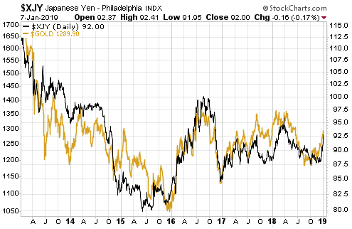
The narrow sideways range of the Yen gold price over the past 5 years is due to the Yen being the major currency to which gold has been most strongly correlated. The correlation is positive, meaning that the prices of gold and the Yen have a strong tendency to trend in the same direction. This is evidenced by the following daily chart, which compares the US$ price of gold with the US$ price of the Yen.

gold_Yen_080119

Moving from the fantasy world to the real world, the relationship depicted above doesn’t exist because the Japanese government is pegging gold to the Yen. It exists because both gold and the Yen trade like safe havens, meaning that they tend to do relatively well when economic growth expectations and the general desire to take-on risk are on the decline, and relatively poorly when economic growth expectations and the general desire to take-on risk are on the rise.

Gold trades like a safe haven because in part that’s what it is. The Yen is a piece of crap, but it trades like a safe haven due to the relentless popularity of Yen carry trades. These carry trades involve borrowing/shorting the Yen to finance long positions in higher-yielding currencies, and are a form of yield-chasing speculation. Periodically they have to be exited in a hurry to mitigate the losses caused by declining prices in the aforementioned high-yielding speculations. When this happens the Yen rallies, and sometimes the rallies are dramatic. Last week, for example.

Divergences or non-confirmations between gold and the Yen can create trading opportunities. However, the two markets are in line with each other at the moment, meaning that there is currently no divergence or non-confirmation worth trading.

Print This Post Print This Post
The Fed unwittingly will continue to tighten

December 18, 2018

The Fed probably will implement another 0.25% rate hike this week, but at the same time it probably will signal either an indefinite pause in its rate hiking or a slowing of its rate-hiking pace. The financial markets have already factored in such an outcome, in that the prices of Fed Funds Futures contracts reflect an expectation that there will be no more than one rate hike in 2019. However, this doesn’t imply that the Fed is about to stop or reduce the pace of its monetary tightening. In fact, there’s a good chance that the Fed unwittingly will maintain its current pace of tightening for many months to come.

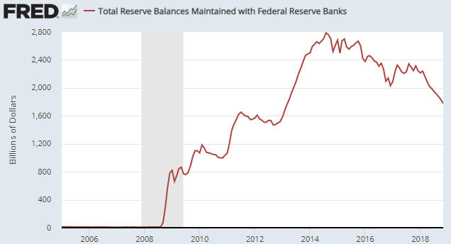
The reason is that the extent of the official monetary tightening is not determined by the Fed’s rate hikes; it’s determined by what the Fed is doing to its balance sheet. If the Fed continues to reduce its balance sheet at the current pace of $50B/month then the rate at which monetary conditions are being tightened by the central bank will be unchanged, regardless of what happens to the official interest rate targets.

Another way of saying this is that a slowing or stopping of the Fed’s rate-hiking program will not imply an easier monetary stance on the part of the US central bank as long as the line on the following chart maintains a downward slope.

The chart shows the quantity of reserves held at the Fed by the commercial banking industry. A decline in reserves is not, in and of itself, indicative of monetary tightening, because bank reserves are not part of the economy’s money supply. However, when the Fed reduces bank reserves by selling securities to Primary Dealers (as is presently happening at the rate of $50B/month) it also removes money from the economy*.

BankReserves_171218

I use the word “unwittingly” when referring to the likelihood of the Fed maintaining its current pace of tightening because, like most commentators on the financial markets and the economy, the decision-makers at the Fed are oblivious to what really counts when it comes to monetary conditions. They are labouring under the false impression that monetary tightening is effected mainly by hiking short-term interest rates and that the current balance-sheet reduction program is a procedural matter with relatively minor real-world consequences.

Therefore, over the next several weeks there could be a collective sigh of relief in the financial world as traders act as if the Fed has taken its foot off the monetary brake, followed by a collective shout of “oops!” when it becomes apparent that monetary conditions are still tightening.

*When the Fed sells X$ of securities to a Primary Dealer (PD) the effect is that X$ is removed from the PD’s account at a commercial bank and X$ is also removed from the reserves held at the Fed by the PD’s bank.

Print This Post Print This Post
The fundamental backdrop turns bullish for gold…almost

December 10, 2018

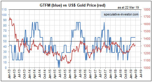
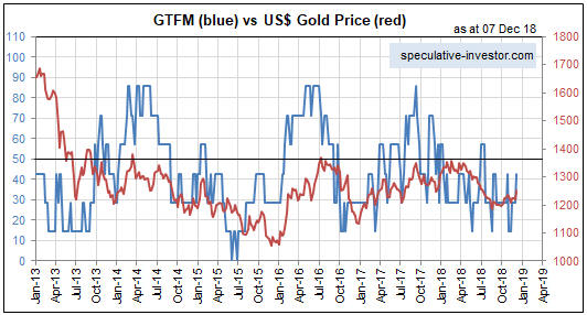
Apart from a 2-week period around the middle of the year, my Gold True Fundamentals Model (GTFM) has been bearish since mid-January 2018. There have been fluctuations along the way, but at no time since mid-January have the true fundamentals* been sustainably-supportive of the gold price. However, significant shifts occurred over the past fortnight and for the first time in quite a while the fundamental backdrop is now very close to turning gold-bullish. In fact, an argument could be made that it has already turned bullish.

Below is a chart comparing the GTFM (in blue) with the US$ gold price (in red).

The above chart understates the significance of the recent fundamental shift, because it appears that the GTFM has done no more than rise to the top of its recent range while remaining in bearish territory (which, of course, it has). However, a look beneath the surface at what’s happening to the GTFM’s seven individual components reveals some additional information.

The most important piece of additional information is the recent widening of credit spreads. The credit spreads input to the GTFM turned bullish four weeks ago, but since then it has moved a lot further into bullish territory. This has improved the fundamental situation (from gold’s perspective) without affecting the GTFM calculation.

Here is a chart showing the positive correlation between a measure of US credit spreads (the green line) and the gold/GNX ratio (gold relative to commodities in general). As economic confidence declines, credit spreads widen and gold strengthens relative to other commodities.

All things considered, for the first time in many months the true fundamentals appear to be slightly in gold’s favour. If the recent trend in the fundamental situation continues then we should see the gold price return to the $1300s early next year, but, of course, that’s a big if. Furthermore, even if the fundamental backdrop continues to shift in gold’s favour over the weeks ahead it will make sense for speculators who are long gold and the related mining equities to take money off the table when sentiment and/or momentum indicators issue warnings.

*Note that I use the term “true fundamentals” to distinguish the actual fundamental drivers of the gold price from the drivers that are regularly cited by gold-market analysts and commentators. According to many pontificators on the gold market, gold’s fundamentals include the volume of metal flowing into the inventories of gold ETFs, China’s gold imports, the volume of gold being transferred out of the Shanghai Futures Exchange inventory, the amount of “registered” gold at the COMEX, India’s monsoon and wedding seasons, jewellery demand, the amount of gold being bought/sold by various central banks, changes in mine production and scrap supply, and wild guesses regarding JP Morgan’s exposure to gold. These aren’t true fundamental price drivers. At best, they are distractions.

Print This Post Print This Post
Revisiting the gold-backed Yuan fantasy

November 27, 2018

[This is an excerpt from a commentary posted at TSI about three weeks ago]

In an article titled “China’s monetary policy must change” Alasdair Macleod discusses a path that China’s government could take to make the Yuan gold-backed and thus bring about greater economic stability in China. Keith Weiner pointed out some flaws in the Macleod article, including the fact that the sort of Gold Standard that involves pegging a national currency to gold is just another government price-fixing scheme and therefore doomed to fail. We will single out an error in the article that Keith didn’t address and then briefly explain why a gold-backed Yuan is a pipe dream.

This excerpt from the article contains the error we want to focus on:

China’s manufacturing economy will be particularly hard hit by the rise in interest rates that normally triggers a credit crisis. Higher interest rates turn previous capital investments in the production of goods into malinvestments, because the profit calculations based on lower interest rates and lower input prices become invalid.

No, higher interest rates do not turn previous capital investments in the production of goods into malinvestments. A rise in interest rates can help reveal malinvestments for what they are, but it doesn’t create them.

Malinvestment occurs on a grand scale when the banking system creates a large amount of money out of nothing, generating false interest-rate signals and making it seem as if the amount of real savings in the economy is much greater than is actually the case. In response to the misleading (artificially low) interest rates and the increased future demand that these interest rates imply (more saving in the present implies more consumption in the future), investments are made in productive capacity. Many of these investments will prove to be ill-conceived, because future demand will turn out to be lower than expected. The investments only appeared to make sense due to the false impressions created by banks loaning copious quantities of new money into existence.

Another way to look at the situation is that a build-up of real savings requires a temporary reduction in consumption. Think of it as a savings-consumption trade-off. People abstain from consumption in the short term so that they will be able to consume more in the long term. When that happens on an economy-wide basis, interest rates move lower.

The falling interest rate indicates that savings are being increased and, by extension, that consumption will be higher in the future. In other words, the falling interest rate is a message that long-term investments in productive capacity are likely to pay off. The problem is that when money is created in large amounts out of nothing, interest rates tend to fall at the same time as consumption is increasing. So, entrepreneurs are being told (by the falling interest rate) that consumption will be greater in the future and to invest accordingly, but at the same time consumers are spending aggressively and ‘tapping themselves out’. Naturally, this doesn’t end well.

The crux of the matter is that malinvestment stems from artificially low interest rates. Also, once it has happened, it has happened. Rising interest rates can be part of the process via which the mistakes are revealed, but the mistakes won’t disappear if interest rates are prevented from rising. Putting it another way, it is not possible to avoid the painful consequences (economic recession or depression) that follow a period during which malinvestment was rife. This is relevant, because the Macleod article argues that interest rates could be kept low in China by linking the Yuan to gold and that by doing this the amount of existing investment that falls into the ‘mal’ category could be greatly reduced.

The reality is that regardless of what happens to interest rates in the future, the extent of the previous malinvestment is such that China’s economy will experience either a collapse or a very long period (probably at least a decade) of virtual stagnation. Given the control that the government has over the banking industry, we guess the latter.

The point is that linking the Yuan to gold wouldn’t be a way around the massive problems that are already baked into the cake. In any case this is a side issue, because there are two simpler reasons that the idea of a gold-backed Yuan is a non-starter.

The first reason is that in a world in which most international trades are US$-denominated, tying any currency apart from the US$ to gold would result in that currency’s exchange rate becoming as volatile as the US$ gold price. In fact, the exchange rate of the gold-backed currency would be totally determined by the performance of the US$ gold price. For example, if the US$ gold price were to rise by 20% in quick time then so would the exchange rate (against the US$) of the gold-backed currency.

The second and more important reason is that any government that implemented a Gold Standard would be relinquishing control of its currency. There would be no further scope for the manipulation of interest rates and currency exchange rates. Also, there no longer would be any scope for debt monetisation in particular and monetary stimulus in general. If we were to make an ordered list of the governments that are LEAST likely to give up these powers, China’s government would be at the top.

Summing up, linking the Yuan to gold would not prevent China’s economy from suffering the consequences of the widespread malinvestment of the past decade and probably would lead to much greater volatility in the prices of imports and exports. Most importantly, there is no way that the control freaks who lead the Communist Party of China are going to implement a monetary system that severely restricts their ability to intervene.

Print This Post Print This Post
The cost of government debt is immediate

November 19, 2018

Most warnings about large increases in government indebtedness revolve around future repayment obligations. For example, there is the concern that greatly increasing the government debt in the present will necessitate much higher taxes in the future. For another example, there is the concern that if the debt load is cumbersome at a time of very low interest rates, then as interest rates rise the interest expense will come to dominate the budget and lead to an upward debt spiral as more money is borrowed to pay the interest on earlier debt. Although these concerns are valid they miss two critical points, including the main problem with government borrowing.

The first of the missed points is that there is no intention to repay the debt or even to reduce the total amount of debt. This is one way that government debt is very different to private debt. Nobody would ever lend money to a private organisation unless there was a good reason to believe that the debt eventually would be repaid, but when it comes to the government the plan is for the total debt to grow indefinitely. It will grow faster during some periods than other periods, but it will always grow. Therefore, it makes no sense to agonise over how the debt will be repaid. It simply won’t be repaid or even reduced.

The current debt-based monetary system has been designed to expand…and expand…until it collapses and is replaced by something else.

Of course, the idea of debt repayment gets plenty of lip service. It has to be that way to avoid a premature collapse. The old Russian joke “we pretend to work and they pretend to pay us” springs to mind, but in this case it’s “the government pretends to care about debt repayment and bond investors pretend to believe them”. It’s a game, and for bond investors one of the guidelines of the game is “you’ll be fine as long as there are still plenty of people pretending to believe the government’s promise to pay”.

A consequence is that the rate of increase in government debt only matters to the extent that it affects the timing of the monetary system’s collapse.

The second of the missed points, and the main problem with government borrowing, is that the costs of the borrowing are immediate as well as long-term. The reason is that with one exception, every dollar added to the government’s debt pile results in a dollar less invested in the private sector. In effect, government debt accumulation adds to government spending at the expense of private-sector investment. This is a negative for economic progress, although it can give a short-term boost to economic activity in the same way that activity gets boosted by hurricane damage.

The one exception mentioned above is when the government debt is monetised by the banking industry (the central bank or the commercial banks). In this case it appears that new savings are magically created to finance the government’s deficit spending, but what actually happens is that misleading price signals are generated. In particular, interest rates are artificially lowered. The ramifications are less negative in the short-term and more negative in the long-term.

Summing up, when the government goes further into debt the biggest problem isn’t that it places a burden on future generations, since the debt will never be repaid anyway. The biggest problem is the immediate dampening effect it has on economic progress.

Print This Post Print This Post
Gold Inflation

November 12, 2018

Here are two long-term charts illustrating the annual rate at which gold is extracted from the ground. The second of these charts shows why mine production can be ignored when trying to understand what happened to the gold price over the preceding few years or figure out what’s likely to happen to the gold price over the next few years.

The first chart shows the amount of gold produced by the global mining industry during each year from 1900 through to 2017 (data sourced from the US Geological Survey). The second chart shows the percentage increase in the world’s above-ground gold supply during each year (1900-2017) resulting from that year’s new mine production. In effect, the second chart shows the gold inflation rate.

Notice that over the past 70 years the annual rate of gold inflation has almost always been between 1.5% and 2.0% and has never strayed far from the 1.5%-2.0% range. In other words, regardless of what’s happening in the world, the total supply of gold increases by approximately the same tiny amount each year.

Over the past 60 years, trend changes in the annual rate of gold inflation appear to be lagged reactions to major price changes, with the 7-10 year lag being due to the time it takes from a major price-related incentive to appear and new mines to be brought into production. For example, the upward trend in the gold inflation rate that began in the early-1980s was probably a reaction to the major price advance that began in the early-1970s.

goldprodn_121118

goldinflation_121118

Print This Post Print This Post
The stocks-bonds interplay

November 2, 2018

It’s normal for the stock market to ignore a rising interest-rate trend for a long time. The reason is that while the interest rate is a major determinant of the value of most corporations, the interest rate that matters for equity valuation isn’t the current one. What matters is the level of interest rates for a great many years to come. Therefore, a rise in interest rates only affects the stock market to the extent that it affects the general perception of where interest rates will be over the next decade or longer.

To further explain, the value of a company is the sum of the present values of all its future cash flows, with the present value of each future cash flow determined via the application of a discount rate (interest rate). Nobody knows what these cash flows will be or what the appropriate discount rate should be, but guesses, also known as forecasts, are made. Clearly, when discounting a set of cash flows spanning, say, the next 30 years, it won’t make sense to simply use the current interest rate. Instead, the analyst doing the calculation will have to make a stab at what will happen to interest rates in the future.

The analyst’s ‘stab’ naturally will be influenced by what is happening in the present, but the future interest rate levels that are plugged into valuation models won’t be adjusted in response to what are considered to be normal fluctuations in the current interest rate. It’s only when the current interest rate breaks out of an established range that it affects expectations in a big way.

That, in a nutshell, is why it isn’t a fluke that the 3rd October downside breakout in the bond market (represented by TLT in the following chart) coincided with the start of a rapid downward re-pricing in the stock market.

TLT_011118

In addition to stocks being influenced by big moves (breakouts from ranges) in bonds, bonds are influenced by big moves in stocks. That’s especially so when important stock-market support levels are breached with little warning. For example, within a few days of the 3rd October downside breakout in the bond market setting in motion a sharp decline in the stock market, the stock market’s weakness was helping to prop-up the bond market. Interestingly, though, the quick 10% decline in the S&P500 Index from its peak led to only a minor rebound in the bond market, despite there being a record-high speculative net-short position in bond futures. As illustrated above, TLT didn’t even manage to rebound by enough to test its 3rd October downside breakout and has dropped back to near its early-October low in response to this week’s recovery in the stock market.

The bond market’s lacklustre response to the recent equity weakness suggests that equities will have to weaken further before the interest-rate trend transforms from a stock-market head-wind to a stock-market tail-wind. Also, the fact that the bond market has already dropped back to near its October low suggests that the stock market will be unable to make significant additional gains without pushing interest rates to new multi-year highs. This, in turn, suggests that there is minimal scope for additional short-term strength in the stock market.

Print This Post Print This Post
Revisiting the age-old relationship between interest rates and prices

October 22, 2018

There is an age-old relationship between prices and interest rates that Keynesian economists have called a paradox (“Gibson’s Paradox”). The relationship was clearer during the Gold Standard era, but as I explained in a previous post it is still apparent if prices are measured in gold.

To understand “Gibson’s Paradox” and why it actually isn’t a paradox, refer to the earlier post linked above. Suffice to say that when money is sound or at least a lot sounder than it is today, interest rates don’t drive prices and prices don’t drive interest rates; instead, on an economy-wide basis both prices (in general) and risk-free interest rates are driven by changes in societal time preference. Moreover, as mentioned above and explained in my earlier post, even with today’s massive, continuous manipulation of interest rates by central banks the relationship is still evident, but only when interest rates are compared to a wholesale price index denominated in gold.

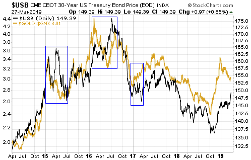
The commodity/gold ratio is the price of a broad-based basket of commodities in gold terms. In essence, it is a wholesale price index using gold as the monetary measuring stick. Also, the risk-free US interest rate that is least affected by the direct manipulation of the Fed is the yield on the 30-year T-Bond, so if the age-old relationship still works then what we should see is a positive correlation between the commodity/gold ratio and the T-Bond yield. Or, looking at it from a different angle, what we should see is a positive correlation between the gold/commodity ratio and the T-Bond price. That’s exactly what we do see.

Using the Goldman Sachs Spot Commodity Index (GNX) to represent commodities, the following chart shows that the age-old relationship has worked over the past 12 years when gold is the monetary measuring stick.

gold_USB_LT_221018

The next chart zooms in on the most recent 2 years and shows that over the past three weeks there has been a significant divergence, with the gold/commodity ratio turning upward and the T-Bond price staying on a downward path. It’s a good bet that this divergence will be eliminated within the next two months via either a decline in the gold/commodity ratio to a new multi-year low or a rebound in the T-Bond. My money is on the latter.

gold_USB_221018

Print This Post Print This Post
Credit spreads and the stock market

October 16, 2018

This post was prompted by a recent article authored by the always thought-provoking Pater Tenebrarum (a pseudonym) at acting-man.com. The article looks at the relationship between credit spreads and the stock market, in particular the historical tendency for credit spreads to begin widening prior to substantial stock market declines and thus to act as timely warning signals of impending stock market trouble. The conclusion is: “…it seems…more likely that a stock market decline will put pressure on junk bonds, instead of weakness in junk bonds providing advance warning of an impending stock market decline. The stock market sell-off in the past week did in fact very slightly lead a surge in high yield spreads.” I don’t know that this conclusion is wrong, but at this time the evidence to support it is not persuasive.

It first should be understood that credit spreads generally begin widening ahead of bear markets, but they generally DON’T lead short-term stock-market corrections. Therefore, the fact that they didn’t warn of the October-2018 sell-off is not meaningful at this time. It will become meaningful only if the October-2018 sell-off proves to be the first decline in a bear market, which is unlikely.

The fact that the most recent stock market sell-off appeared to slightly lead an up-tick (not a surge) in high yield spreads is also not meaningful. The following chart shows that junk bonds often trend with equities (the chart compares the iShares High Yield Corporate Bond ETF with the S&P500 ETF), so actually it is normal for short-term stock market corrections to go hand-in-hand with minor expansions of credit spreads. That’s what happened over the past 2 weeks, what happened in January-February of this year and what happened on numerous other occasions in the past.

HYG_SPY_161018

The above-linked article makes the interesting point that credit spreads in the euro-zone and the US have diverged over the past year, with the former embarking on a widening trend in late-October of last year while the latter continued to contract. If credit spreads were still useful leading indicators of major stock-market trends then this divergence should have been accompanied by dramatic relative weakness in European equities. Since it was accompanied by dramatic relative weakness in European equities this is hardly evidence that credit spreads have lost their usefulness.

Could the influence of QE prevent credit spreads from signaling a trend reversal ahead of the next equity bear market?

I don’t see how. QE led to yield-chasing behaviour, which, in turn, caused credit spreads to become a lot narrower than they would have been. Having been compressed to artificially small quantities, credit spreads should if anything be more sensitive than usual to changes in the financial and economic backdrops.

Summing up, credit spreads have a strong tendency to widen ahead of equity bear markets. It could be different this time, but right now I can’t think of a good reason why it should be different. In any case, there is no need to rely on just one leading indicator.

Print This Post Print This Post
The ultimate financial crisis will be inflationary

October 15, 2018

I’ve read many comments to the effect that the next financial crisis will be like 2007-2008, only worse. However, the sole reason that many people are talking about a coming 2008-like crisis is because the happenings of 2008 are still fresh in the memory. Market participants often expect the next crisis to look like the last one, but it never does. Consequently, the general prediction about the next financial crisis with the highest probability of success is that it won’t be anything like 2008. It could, for example, revolve around an inflation scare rather than a deflation scare. In fact, the current monetary system’s ultimate financial crisis, meaning the crisis that leads to a new monetary system, will have to be inflationary.

The ultimate financial crisis will have to be inflationary, because deflation scares provide ‘justification’ for central bank money-pumping and thus enable the long-term credit expansion to continue with only minor interruptions. To put it another way, a crisis won’t be system-threatening as long as it can be ameliorated by central banks doing what they do best, which is promote inflation.

A related point is that a crisis won’t be system-threatening as long as it involves an increase in demand for the official money. The 2007-2008 crisis was such an animal. Like every other crisis in the US since 1940 it did not involve genuine deflation, almost regardless of how the word deflation is defined. The money supply continued to grow, the total supply of credit did no worse than flatten out, and, as illustrated by the following long-term chart, there was nothing more than a downward blip in the Consumer Price Index. However, with the stock market losing more than half its value and commodity prices collapsing, for 6-12 months it sure felt like deflation was happening.

CPI_LT_151018
Chart source: dshort

What actually happened during 2008 was a deflation scare, as opposed to genuine deflation. I define a deflation scare as a period when the total supply of money and credit continues to grow, but a surge in the demand for money makes it seem as if the economy is experiencing severe deflation.

Since there is no limit to the amount of new money and credit that can be created out of nothing by the central bank, it will always be possible for the central bank to keep the current system going in the face of a crisis that involves a surge in the demand to hold the official money. The problem (for the monetary authorities) will occur when the crisis involves a plunge in the demand for the official money. In such a situation the central bank’s most powerful weapon becomes not just ineffective, but counter-productive*.

The bottom line is that regardless of its other details, if the next crisis involves deflation or a deflation scare then it will be just another bump in the road. It will prompt another bout of aggressive money-pumping that will alleviate the perceived shortage of money and eventually inflate new investment bubbles. Only a crisis that entails a decline in the desire to hold the official money can be an existential threat to the monetary system.

*Creating money out of nothing is always counter-productive if the goal is to hasten long-term economic progress, but it can be productive if the goal is to prolong the existence of a debt-based monetary system.

Print This Post Print This Post
The battle between bearish fundamentals and bullish sentiment continues

October 8, 2018

In a 13th August blog post I noted that for the first time this year the sentiment backdrop had become decisively supportive of the gold price. I also noted that the fundamental backdrop remained unequivocally gold-bearish, and then attempted to answer the question: What will be the net effect of these counteracting forces? My answer was that regardless of sentiment there could not be an intermediate-term upward trend in the gold price until the fundamentals turned gold-bullish, but a $100 short-term rebound was possible even without a significant fundamental improvement. What’s the current situation?

The current situation is similar. Since my 13th August post the sentiment backdrop has become slightly more bullish, the fundamental backdrop has become slightly more bearish, and the price is roughly unchanged at around $1200. Therefore, it’s fair to say that the battle between bearish fundamentals and bullish sentiment has been a draw thus far.

Just to recap, the most important fundamental drivers of the US$ gold price are credit spreads, the yield curve, the real interest rate (the TIPS yield), the relative strength of the banking sector, the US dollar’s exchange rate, the bond/dollar ratio and the general trend of commodity prices. These are the inputs to my Gold True Fundamentals Model (GTFM), a chart of which is displayed below.

Apart from a short period from late-June to mid-July when it was ‘whipsawed’, the GTFM has been continuously bearish since mid-January. No wonder the gold market has struggled this year.

GTFM_081018

The upshot is that due to the bullish sentiment a bounce in the gold price of up to $100 is still a realistic short-term possibility, but due to the bearish fundamentals a much larger rally is not.

The fundamental backdrop is always shifting, so the fact that it is gold-bearish right now doesn’t mean that it will remain so for a long time to come. For example, additional weakness in the stock market would improve gold’s true fundamentals if it caused a significant decline in economic confidence and fostered the belief that the Fed will put its rate-hiking program on hold. However, until/unless such a shift happens, expectations regarding gold’s short-term prospects should be modest.

Print This Post Print This Post
Five years is a long time to be wrong

October 3, 2018

In a few previous blog posts (for example, HERE) I discussed the limitations of sentiment as a market timing tool. It certainly can be helpful to track the public’s sentiment and use it as a contrary indicator, and some of my most successful trades have been partly based on sentiment extremes. However, these days I place less weight on sentiment than I did in the past.

As mentioned in earlier posts, there is no better example of sentiment’s limitations as a market timing tool than the US stock market’s performance over the past few years. This is evidenced by the following chart from Yardeni.com. The chart shows the performance of the Dow Jones Industrials Index over the past 31 years with vertical red lines to indicate the weeks when the Investors Intelligence (II) Bull/Bear ratio was at least 3.0 (a bull/bear ratio of 3 or more suggests extreme optimism within the surveyed group).

Notice that while vertical red lines (indicating extreme optimism) coincided with some important price tops, there were plenty of times when a vertical red line did not coincide with an important price top. Also, notice that with the exception of a multi-quarter period during 2015-2016 when the market was in correction mode, optimism has been extreme almost continuously since Q4-2013.

In effect, sentiment has been consistent with a bull market top for the bulk of the past five years, but there is still no evidence in the price action that the bull market has ended. On the contrary, while there is a high risk of a significant correction in the short term, the long-term leading indicators I track point to the bull market extending well into 2019.

Regardless of what happens from here, five years is a long time for a contrarian to be wrong.

IIbullbear_031018

Print This Post Print This Post
There will be warnings!

September 18, 2018

[This blog post is a slightly-modified excerpt from a TSI commentary published about three weeks ago. Not much has changed in the meantime.]

If you rely on the mainstream financial press for your information then you could be forgiven for believing that financial crises happen with no warning. However, there are always warnings if you know where to look.

Here are four leading indicators of financial stress and/or economic confidence that are both easy to monitor and worth monitoring. It’s likely that all four of these indicators will issue timely warnings prior to the next financial crisis and a virtual certainty that at least two of them will.

1) The yield curve, as depicted on the following chart by the 10yr-2yr yield spread.

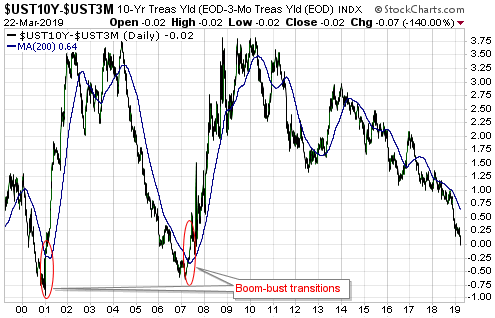
As explained in many previous commentaries, the yield curve ‘flattening’ to an extreme and then beginning to steepen warns that an inflation-fueled boom has begun to unravel. For example, the yield curve reached its maximum ‘flatness’ in November-2006 and provided clear evidence of a reversal in June-2007. That was the financial crisis warning. By August of 2007 the ‘steepening’ trend was accelerating.

The yield curve’s current situation looks more like Q4-2006 than Q3-2007. It is nothing like 2008.

2) Credit spreads, as depicted on the following chart by the difference between the Merrill Lynch US High Yield Master II Effective Yield and the yield on the 10-Year T-Note.

Credit spreads start to widen, indicating a decline in economic confidence and/or a rise in the perceived risk of default at the junk end of the debt market, well before a recession or crisis. For example, evidence of a new widening trend in credit spreads emerged in July-2007 and by November-2007 it was very obvious that trouble was brewing.

Note that when it comes to warning of a coming crisis, credit spreads are far more likely to generate a false positive signal than a false negative signal, that is, they are far more likely to cry wolf when there’s no wolf than to remain silent when there is a wolf.

Right now they are silent.

3) The short-term interest rate at which banks lend to other banks versus the equivalent interest rate at which the US federal government borrows money, as depicted on the following chart by the LIBOR-UST3M spread.

When trouble begins to brew in parts of the banking system it gets reflected by higher interest rates being charged for short-term inter-bank loans well before it becomes common knowledge. This causes the spread between 3-month LIBOR (the average 3-month interbank lending rate) and the 3-month T-Bill yield to increase. For example, the LIBOR-UST3M spread was languishing at around 0.20% in early-2007, indicating minimal fear within the banking system, but then began to rise steadily and reached 0.75% in June-2007. This was an early warning sign of trouble. The spread then pulled back into July-2007 before rocketing up to 2.25% in August-2007. This constituted a very loud warning. After that the spread became very volatile and moved as high as 4.5% at the peak of the Global Financial Crisis in October-2008.

At the moment the LIBOR-UST3M spread is languishing at around 0.20%.

4) The gold price relative to industrial metals prices, as depicted on the following chart by the gold/GYX ratio (the US$ gold price divided by the Industrial Metals Index).

The gold/GYX ratio acts like a credit spread. This is because gold’s performance relative to the industrial metals sector tends to go in the same direction as economic confidence. In particular, when confidence begins to decline in the late stage of a boom or the early stage of a bust, the gold/GYX ratio begins to trend upward.

The following chart illustrates the long-term positive correlation between gold/GYX and a credit spread indicator in the form of the IEF/HYG ratio.

The gold/GYX ratio recently bounced from the bottom of its 7-year range. If the bounce continues and gold/GYX exceeds its early-2018 high it would be the first sign of a declining trend in economic confidence.

Currently, none of the above indicators is warning that a financial crisis is imminent or even that a financial crisis is starting to develop. The probability could change as new information becomes available, but based on the present values of the best leading indicators there is almost no chance that a financial crisis will erupt within the next three months.

A stock market crash is a different ‘kettle of fish’, because while a financial crisis always will be accompanied by a large decline in the stock market it is possible for a large decline in the stock market to occur in the absence of a financial crisis. The 1987 stock market crash is an excellent example.

While the four indicators mentioned above should issue timely warnings prior to a financial crisis, they may not warn of a stock market crash that isn’t part of a broader crisis. As is the case with a financial crisis, though, a stock market crash won’t happen ‘out of the blue’. In particular, the stock market won’t make a new all-time high one day and crash the next. This is because it takes time (generally at least two months) from the ultimate price high to create the sentiment backdrop that makes a crash possible.

In summary, short-term stock market risk is high, but there are no warning signs that a financial crisis is brewing or that a stock market crash (as opposed to, say, a 10% correction) is a realistic short-term possibility.

Print This Post Print This Post