[This blog post is a modified excerpt (for example, it contains updated charts) from a recent commentary published at www.speculative-investor.com]
Think back to how bullish almost everyone was about the US dollar’s prospects at the start of this year. Also recall that our view at the time was that the Dollar Index (DX) was set to make a very important peak in January-2025, after which it would trend downward for at least a year. Actually, our view going into this year was that the DX had commenced a cyclical decline in September-2022 and would resume its cyclical decline in January-2025. The fact that it recently made a new cycle low confirms that the DX has, indeed, been in a cyclical bear market since September of 2022 and that the strong rally from the September-2024 low was nothing more than a countertrend move. So, what now?
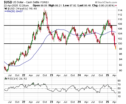
Before attempting to answer the above question, we present herewith a daily chart and a weekly chart of the DX. The daily chart shows the virtual crash of the past two weeks, while the weekly chart shows that the DX has broken below its July-2023 low and is at its lowest level since April of 2022. Both charts show that the DX is extremely oversold.
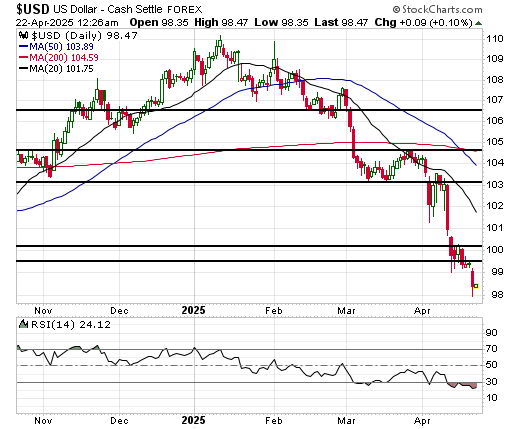
Due in part to the performance of the US$ gold price, we doubt that the DX’s cyclical decline is complete. This is because on an intermediate-term basis the gold market does not react to trends in the US dollar’s exchange rate, it projects them. For example, gold’s strength last year projected future US$ weakness against other currencies. The fact that the US$ gold price has just made a new all-time high projects future weakness in the DX.
The way that the DX’s true fundamentals are expected to evolve over the months ahead (they are expected to remain bearish) and the paths taken by the DX following comparable highs in September-2022 and January-2017 also point to additional downside.
However, thanks to the recent collapse it’s likely that the bulk of the decline is in the past.
We have had and continue to have the mid-90s in mind as a target for the DX’s ultimate cycle low. This target may have seemed unreasonably bearish a few months ago, but it is only a few points below the current level. At the same time, a countertrend rebound could result in the DX returning to the 104-105 range.
Further to the above, we are now short-term and intermediate-term neutral on the DX. The ultimate cycle low probably won’t be set until the final few months of this year, but the rebound potential is now at least as large as the remaining downside potential.