Don’t think like a lawyer

July 21, 2017

The job of a judge or juror is to impartially weigh the evidence and arguments put forward by both sides in an effort to determine which side has the stronger case. The job of a lawyer is to argue for one side, regardless of whether that side happens to be right or wrong. As a speculator it is important to think like a judge or a juror, not a lawyer.

Unlike a lawyer, a speculator can change sides ‘mid-stream’ if necessary to keep himself on the side favoured by the current evidence. There is no need for him to stick to a position come what may. However, changing sides is easier said than done, which is why so many speculators and commentators aren’t able to do it. Rather than let the evidence determine their stance, they adopt a stance and then look for confirming evidence. If they come across conflicting evidence, they downplay it. They aren’t aware of it, but their goal is to prove a particular case rather than align themselves with the strongest case.

Sometimes the case that a speculator desperately wants to prove also happens to be the case supported by the strongest evidence, enabling him to make large gains. However, if he continues to think like a lawyer he will eventually run into the problem that the weight of evidence shifts. After the inevitable shift happens he will steadfastly maintain his earlier position and lose whatever advantage he previously gained from being on the right side of the market.

In my speculations and financial-market writings I’m sometimes guilty of thinking like a lawyer. That’s why I developed the gold model (the Gold True Fundamentals Model – GTFM) that was discussed in a blog post last month. This model prevents my own biases and opinions from getting in the way when assessing whether the fundamental backdrop is bullish or bearish for gold.

The bottom line is that there is never a requirement for a speculator to defend a position. Unlike a lawyer, he is free to change with the evidence.

Inflation as far as the eye can see

July 18, 2017

Many investors pigeon-hole themselves as “inflationists” or “deflationists”, where an inflationist is someone who expects more inflation over the years ahead and a deflationist is someone who expects deflation. I am grudgingly in the inflation camp, because the overall case for more inflation is strong.

I use the word “grudgingly” in the above sentence for two reasons. First, more inflation adds to the existing economic problems and will eventually result in major social upheaval, so when I predict that there will be inflation as far as the eye can see I don’t want to be right. Second, it means that I get lumped together with the perennial forecasters of imminent hyperinflation, even though my only mentions of hyperinflation over the past 17 years were to explain why it had zero probability of happening anytime soon.

With regard to the US situation, the main reason the case for more inflation is strong is that it doesn’t depend on private-sector credit expansion; it depends on the ability and willingness of the Fed to monetise sufficient assets to keep the total supply of money growing. A consistent theme in my commentaries over the 17 years since the birth of the TSI subscription service has been that the Fed could and would keep the inflation going after the private sector became saturated with debt.

Prior to 2008 there was very little in the way of empirical evidence to support the belief that the Fed could keep the inflation going in the face of a private-sector credit contraction, but that’s no longer the case. Thanks to what happened during 2008-2014 we can now be certain that the Fed has the ability to counteract the effects on money supply, asset prices and the so-called “general price level” of widespread private-sector de-leveraging. The only question left open to debate is: will the Fed CHOOSE to do whatever it takes to keep the inflation going in the future?

Based on the publicly-stated views of those who operate the monetary levers as well as on the economic remedies prescribed by today’s most influential economists and financial journalists, there’s a high probability that the answer is yes. At least, there is a high probability that the answer will be yes until the fear of inflation becomes much greater than the fear of deflation. However, the Fed is faced with a difficult challenge. It does not (I assume) want to engineer a steep decline in the dollar’s purchasing power, so every step of the way it tries to do no more than the minimum necessary to ensure a steady and modest rate of purchasing-power loss, with 2%-per-year having become the semi-official target.

The challenge is actually more than difficult; it’s impossible. The impossible-to-solve problem faced by the Fed and all the other central banks is that it can never be determined, in real time, what the aforementioned “minimum” is, because money-supply changes affect the economy in unpredictable ways and with large/variable delays. The economy therefore ends up careening all over the place and we occasionally get deflation scares, which are periods when it seems as if genuine deflation is about to happen. Paradoxically, the deflation scares are highly inflationary because they always prompt the Fed to ramp up the rate of money pumping, but while a deflation scare is in progress it can feel like the deflationists are finally going to be right.

I’m not ruling out the possibility that the deflationists will eventually be right. I hope that they will be right in the not-too-distant future, because more inflation will only add to the economic distortions and lead to an even bigger problem down the track. It’s just that they are, in effect, betting that devotees to the central planning ideology will suddenly realise the error of their ways and let nature take its course. The odds are very much against this bet paying off.

Trying to solve the sentiment conundrum

July 3, 2017

[This post is a modified excerpt from a recent TSI commentary]

In a 12th June blog post I revisited the potential pitfalls in using sentiment as a market timing tool. As an example of a pitfall, the post included a chart of the Investors Intelligence (II) bull/bear ratio suggesting that US stock market sentiment had been consistent with a bull-market top for the bulk of the past four years. Even though the chart helped to make my point it is appropriate to question how sentiment, when used as a contrary indicator, could be so wrong for so long.

I’ve come up with a possible explanation for why measures of US stock-market sentiment that worked well as contrary indicators in the past have not been useful of late. The reason relates to the third of the potential pitfalls outlined in the above-linked blog post. Specifically:

…regardless of what sentiment surveys say, there will always be a lot of bears and a lot of bulls in any financial market. It must be this way otherwise there would be no trading and the market would cease to function. As a consequence, if a survey shows that almost all traders are bullish or that almost all traders are bearish then the survey must be dealing with only a small — and possibly not representative — segment of the overall market.

The explanation I’ve come up with is that prior to the past few years the II sentiment survey, which is a survey of investment advisors who regularly publish their views via newsletters, reflected the sentiment of the investing public, but this is not so much the case anymore. Prior to the past few years the advisors and the general public would become increasingly bullish or increasingly bearish together, with high levels of optimism invariably following persistent price strength and high levels of pessimism invariably following either persistent or dramatic price weakness. Over the past few years, however, the perceptions of these two groups took separate paths. Investment advisors became very optimistic in reaction to the strong upward trend in prices, but for the most part the general public remained unenthusiastic about the stock market.

The change described above can be illustrated by comparing the II bullish percentage with the AAII (American Association of Individual Investors) bullish percentage, which has been done on the chart displayed below. The AAII survey is based on the opinions of retail investors, that is, the general public.

The chart shows that prior to 2014 the II (the blue line) and AAII (the black line) bullish percentages typically moved up and down together within a similar range, but that from 2014 onward the II bullish percentage tended to be significantly higher. Furthermore, the distance between the two survey results has increased since early this year, with the II bullish percentage remaining above 50 and the AAII bullish percentage spending most of its time in the 25-35 range. The most recent results show an II bullish percent of 54.9 and an AAII bullish percent of 29.7.

IIvsAAII_030717

It seems that the general public’s stock-market sentiment has not reached an optimistic extreme during the current cycle. Does this mean that there’s a lot more price strength to come or does it mean that the next major price top will happen without the general public having fully embraced the upward trend?

I don’t know, but it’s definitely possible that the public will never fully embrace the latest bullish trend for the simple reason that it is financially incapable of doing so. Having had its savings decimated when earlier Fed-fueled investment booms inevitably collapsed it may not have the financial wherewithal to enthusiastically participate in the Fed’s latest bubble-blowing venture.

Addressing Keith Weiner’s objections to “Gold’s True Fundamentals”

June 27, 2017

A 23rd June post at the TSI Blog described the model (the Gold True Fundamentals Model – GTFM) that I developed to indicate the extent to which the fundamental backdrop is bullish for gold. The GTFM is an attempt to determine a single number that incorporates the most important fundamental drivers of the gold price, where I define “fundamental driver” as something that happens in the economy or the financial markets that causes a significant change in the desire/urgency to own gold in some form. Keith Weiner subsequently posted an article objecting to some of my “fundamental drivers”, which would be fine except that his article contains several misunderstandings of these price drivers and/or how I am using them. The purpose of this post is to address these misunderstandings and provide a little more information on the GTFM’s components.

1. The ‘Real’ Interest Rate

Keith states: “The Real Interest Rate is the Nominal Interest Rate – inflation.” No, that’s not what the real interest rate is, although many people wrongly calculate it that way.

Keith and I agree that it is not possible to calculate the economy-wide change in money purchasing-power (PP), but even if it were possible to come up with a single number that represented prior “inflation” the real interest rate would not be the nominal interest rate minus this number. The reason, to explain using an example, is that the real return that will be obtained by someone who makes a 12-month investment today in an interest-bearing security will have nothing to do with the change in the PP of money over the preceding 12 months. Instead, the real return that will be obtained by this person will be determined by the change in money PP over the ensuing 12 months.

Now, we can obviously never know in advance what the real return on any interest-bearing security or deposit will be, but since the advent of Treasury Inflation-Protected Securities (TIPS) in 2003 it has been possible to roughly determine the real return on Treasury debt expected by the average bond trader. The TIPS yield, which is based on the EXPECTED rate of currency depreciation, is my ‘real’ interest rate proxy.

If there had been a TIPS market in the 1970s then it would probably be apparent that the large gains made by the gold price during that decade were related to a low/falling real interest rate, where the real interest rate is defined as the nominal interest rate minus the expected rate of currency depreciation. In any case, there has definitely been an inverse correlation between the TIPS yield (10-year or 5-year) and the gold price over the past 10 years. Furthermore, the correlation has strengthened over the past 2 years.

By the way, it’s the DIRECTION, not the value, of the TIPS yield that matters to gold and that is taken into account by the GTFM.

The inverse relationship between the TIPS yield and the gold price is far from perfect, the reason being that there are times when other price drivers are more influential. That’s why the ‘real interest rate’ has only a one-seventh weighting in the GTFM.

2. The Yield Curve

There has never been a strong and consistent short-term correlation between the gold price and the yield curve, but near major turning points the yield curve tends to be the dominant driver.

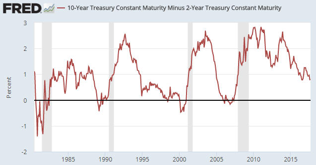
In broad terms, the boom phase of the central-bank-promoted boom-bust cycle is generally associated with a flattening yield curve and the bust phase is generally associated with a steepening yield curve. Gold generally performs better during the bust phase, when the curve is steepening. Somewhat counterintuitively, banks tend to do best during the long periods of yield-curve flattening. This can be demonstrated empirically and makes sense if you understand how the central-bank-promoted boom-bust cycle works.

A major flattening trend in the US yield curve got underway during the second half of 2011 and continues to this day. This flattening trend is associated with a boom, which, in turn, has temporarily helped the banks and reduced the desire to own gold.

3. Credit Spreads

The trend in credit spreads is one of the best measures of the overall trend in economic confidence, with widening spreads (yields on lower-quality bonds rising relative to yields on higher-quality bonds) being indicative of declining economic confidence. Gold tends to do relatively well during periods when economic confidence is on the decline, that is, during periods when credit spreads are widening. I have demonstrated this in the past using charts.

4. The Relative Strength of the Banking Sector

Keith writes: “We haven’t plotted it, but we assume bank stocks will outperform the broader stock market when the yield curve is steeping by way of falling Fed Funds rate. This is when the banks’ net interest margin is rising, and they are getting capital gains on their bond portfolio too. At the same time, credit spreads are narrowing, so the banks are getting capital gains on their junk bonds.

No, that’s not how it works. Refer to my yield curve comments above for a very brief explanation.

The banking sector will often fare poorly during major yield-curve steepening trends because a banking crisis is often a primary cause of the steepening trend. In any case, this indicator is based on the concept that the investment demand for gold will be boosted by declining confidence in the banking system and reduced by rising confidence in the banking system.

5. The US Dollar’s Exchange Rate

More often than not, the US$ gold price trends in the opposite direction to the Dollar Index. However, there are times when a crisis outside the US causes both a rise in the US$ on the FX market and a large rise in the US$ gold price. The fact that the inverse correlation between the gold price and the Dollar Index can break down in a big way at times is why the US dollar’s performance on the FX market only has a one-seventh weighting in the GTFM. To put it another way, if the gold price always moved in the opposite direction to the Dollar Index then there would be no reason for gold traders to consider anything except the Dollar Index.

6. The General Trend in Commodity Prices

I have included the general trend in commodity prices as indicated by the S&P GSCI Commodity Index (GNX) in the GTFM for the practical reason that there are times when it tips the balance. That is, there are times when a strong upward trend in commodity prices enables the US$ gold price to rise despite an otherwise slightly-bearish (for gold) fundamental backdrop and there are times when a strong downward trend in commodity prices causes the US$ gold price to fall despite an otherwise slightly-bullish fundamental backdrop.

7. The Bond/Dollar Ratio

There are fundamental reasons for the existence of a positive correlation between the bond/dollar ratio (the T-Bond price divided by the Dollar Index) and the US$ gold price, but I currently don’t have the time or the inclination to go into these reasons. Instead, for the sake of brevity I present the following chart-based comparison of the gold price and the bond-dollar ratio. The positive correlation is obvious and is evident over much longer periods than the 3-year period covered by this chart.

gold_USBUSD_260617

I hope the above goes at least part of the way towards explaining the components of my gold model.