Money Matters

March 30, 2018

[This blog post is an excerpt from a recent TSI commentary]

The year-over-year rate of growth in the US True Money Supply (TMS) was around 11.5% in October of 2016 (the month before the US Presidential election) and is now only 2.4%, which is near a 20-year low. Refer to the following monthly chart for details. In terms of effects on the financial markets and the economy, up until recently the US monetary inflation slowdown was largely offset by continuing rapid monetary inflation elsewhere, most notably in Europe. However, the tightening of US monetary conditions has started to have noticeable effects and these effects should become more pronounced as the year progresses.

The tightening of monetary conditions eventually will expose the mal-investments of the last several years, which, in turn, will result in a severe recession, but the most obvious effect to date is the increase in interest rates across the entire curve. The upward acceleration in interest rates over the past six months has more than one driver, but it probably wouldn’t have happened if money had remained as plentiful as it was two years ago.

It would be a mistake to think that the tightening has been engineered by the Fed. The reality is that the Fed has done very little to date.

The Fed has made several 0.25% increases in its targeted interest rates, but the main effect of these rate hikes is to increase the amount of money the Fed pays to the commercial banks in the form of interest on reserves (IOR). It doesn’t matter how you spin it, injecting more money into banks ain’t monetary tightening!

The Fed’s actual efforts on the monetary loosening/tightening front over the past 5 years are encapsulated by the following weekly chart of Reserve Bank Credit (RBC). This chart shows that there was a rapid rise in RBC during 2013-2014 that ended with the completion of QE in October-2014. For the next three years RBC essentially flat-lined, which is what should be expected given that the Fed was neither quantitatively easing nor quantitatively tightening during this period. In October-2017 the Fed introduced its Quantitative Tightening (QT) program. To date, this program has resulted in only a small reduction in RBC, but the plan is for the pace of the QT to ramp up.

Strangely, the most senior members of the Fed appear to believe that their baby-step rate hikes constitute genuine tightening and that the contraction of the central bank’s balance sheet is neither here nor there. The reality is the opposite.

So, the Fed is not responsible for the large decline in the US monetary inflation rate and the resultant tightening of monetary conditions that has occurred to date.

The responsibility for the tightening actually lies with the commercial banks. As illustrated by the next chart, the year-over-year rate of growth in commercial bank credit was slightly above 8% at around the time of the Presidential election in late-2016 and is now about 3%.

We won’t be surprised if a steepening yield curve prompts commercial banks to collectively increase their pace of credit creation over the next two quarters, but with the Fed set to quicken the pace of its QT the US monetary inflation rate probably will remain low by the standards of the past two decades. At the same time, the ECB will be taking actions that reduce the monetary inflation rate in the euro-zone. This could lead to stock and bond market volatility during the second half of this year that dwarfs what we’ve witnessed over the past two months.

Another look at gold’s true fundamentals

March 20, 2018

The major long-term driver of the gold price is confidence in the official money and in the institutions (governments, central banks and private banks) that create/promote/sponsor the official money. As far as long-term investors are concerned the gold story is therefore a simple one: gold will be in a bull market when confidence in the financial establishment (money, banks and government) is in a bear market and gold will be in a bear market when confidence in the financial establishment is in a bull market.

In real time it often doesn’t seem that simple, though, because on a weekly, monthly or even yearly basis a lot can happen to throw an investor off the scent. However, the risk of being thrown off the scent can be reduced by having an objective way of measuring the ebbs and flows in the confidence that drives, among other things, the performance of the gold market. That’s why I developed the Gold True Fundamentals Model (GTFM). The GTFM is determined mainly by confidence indicators such as credit spreads, the yield curve, the relative strength of the banking sector and inflation expectations, although it also takes into account the US dollar’s exchange rate and the general commodity-price trend.

An alternative to objective measurement is to rely on gut feel, but gut feel is notoriously unreliable in such matters because it is, by definition, influenced by personal biases. For example, it will be influenced by “projection bias”. This is the assumption that if you perceive things in a certain way, then most other people will perceive them in the same way. Projection bias plays a big part in a lot of gold market analysis. The market analyst will observe central bank or government actions that from his/her perspective are blatantly counter-productive, and go on to assume, often wrongly, that most market participants will view the actions in the same way.

Another alternative is to assume that gold’s fundamentals are always bullish and therefore that any large or lengthy price decline must be the result of a grand price-suppression scheme. Given its absurdity it’s amazing how popular this line of thinking has become in the gold market. Then again, it’s a line of thinking that has been aggressively promoted over the past two decades and has a certain emotional appeal.

Due to the effects of market sentiment the gold price occasionally will diverge from its ‘true fundamentals’ (as indicated by the GTFM) for up to a few months, but ALL substantial upward and downward trends in the gold price over the past 15 years have been consistent with the fundamental backdrop.

Does this invalidate the idea that manipulation happens in the gold market?

Of course not. Every experienced and knowledgeable trader/investor knows that all financial markets have always been subject to manipulation and always will be subject to manipulation. It does, however, invalidate the idea that there has been a successful long-term gold-price-suppression program.

The current situation (as at the end of last week) is that gold’s true fundamentals, as indicated by the GTFM, have been bearish for the past 10 weeks. Also, the true fundamentals have spent more time in bearish territory than bullish territory since the second half of last September. Refer to the following chart comparison of the GTFM and the US$ gold price for details.

GTFM_200318

Now, considering the fundamental backdrop it seems that the gold price has held up remarkably well over the past several months, but that conclusion only emerges if your sole measuring stick is the US$. When performance relative to the other senior currency (the euro) and the world’s most important equity index (the S&P500) are taken into account it becomes clear that the gold market has been weak. Here are the relevant charts.

gold_euro_200318

gold_SPX_200318

The fundamental backdrop is continually shifting and potentially could turn gold-bullish within the next few weeks. It just isn’t bullish right now. Also, there could be a strong rally in the US$ gold price in the face of neutral-bearish fundamentals. If so, we would be dealing with a US$ bear market as opposed to a gold bull market.

In a gold bull market the ‘value’ of an ounce of gold rises relative to the major equity indices and both senior currencies. For this to happen the true fundamentals would have to be decisively bullish most of the time.

The rising interest-rate trend

March 5, 2018

The rising interest-rate trend in the US isn’t new and isn’t related to the Fed’s so-called “policy normalisation” program. However, it has only just started to matter.

That the rising interest-rate trend isn’t new and isn’t related to the Fed’s rate-hiking efforts is clearly illustrated by the following chart. This chart shows that the US 2-year T-Note yield began trending upward in 2011 — more than 6 years ago and more than 4 years prior to the Fed’s first rate hike.

UST2Y_050318

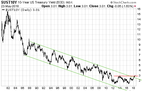
As we go further out in duration we find later beginnings to the rising-yield trend. This is evidenced by the following three charts, the first of which shows that the 5-year yield bottomed in mid-2012, the second of which shows that the 10-year yield double-bottomed in mid-2012 and mid-2016, and the third of which shows that the 30-year yield continued to make lower lows until mid-2016. But even in the case of the 30-year yield the rising trend is now more than 18 months old.

UST5Y_050318

UST10Y_050318

UST30Y_050318

Given that US interest rates have been rising for more than 6 years at the short end and more than 18 months at the long end, why has the trend suddenly begun to draw a lot of attention in the mainstream press?

The answer is: because rising yields on credit instruments have begun to put downward pressure on equity prices. The stock market is capable of ignoring rising interest rates for long periods, as has been demonstrated by the market action of the past few years. However, if a rising interest-rate trend persists for long enough it transforms, as far as the stock market is concerned, from an irrelevance to the most important thing.

The way that interest rates gradually turned upward over several years despite the relentless downward pressure applied by the central bank suggests that we are dealing with the end of a very long-term decline. In other words, there’s a good chance that we are now in the early stages of a 1-2 decade (or longer) rising interest-rate trend. But how could that be, when debt levels are very high and the economy-wide savings rate is very low?

Under the current monetary regime, major upward trends in interest rates are not driven by the desire to consume more in the present (the desire to save less) or by rapidly-increasing demand for borrowed money to invest in productive enterprises. That, in essence, is a big part of the problem — interest-rate trends do not reflect what they should reflect. Instead, major upward trends in interest rates are driven primarily by rising inflation expectations, or, to put it more aptly, by declining confidence in money.

Of particular relevance, under the current monetary regime it is not only possible for a large, general increase in the desire to save to be accompanied by rising interest rates, it is highly probable that when a large rise in interest rates happens it will be accompanied by a general desire to save more. It’s just that the desire for greater savings won’t manifest itself as a greater desire to hold cash. It will, instead, manifest itself as a desire to hold more of something with near-cash-like liquidity that is not subject to arbitrary devaluation by central banks and governments. Gold is the most obvious example.

The warning shots of 2007

February 26, 2018

[This post is a slightly-modified excerpt from a recent TSI commentary]

For a market analyst there is an irresistible temptation to seek out one or more historical parallels to the current situation. The idea is that clues about what’s going to happen in the future can be found by looking at what happened following similar price action in the past. Sometimes this method works, sometimes it doesn’t.

Assuming that the decline from the January-2018 peak is a short-term correction that will run its course before the end March (my assumption since the correction’s beginning in late-January), the recent price action probably is akin to what happened in February-March of 2007. In late-February of 2007 the SPX had been grinding its way upward in relentless fashion for many months. The VIX was near an all-time low and there was no sign in the price action that anything untoward was about to happen, even though some cracks had begun to appear in the mortgage-financing and real-estate bubbles. Then, out of the blue, there was a 5% plunge in the SPX. On the following daily chart this plunge is labeled “Warning shot 1”.

After the February-March ‘hiccup’ the SPX resumed its bull market. Both the stock market and the economy were believed to be in good shape, with the problems that had emerged in the realm of sub-prime mortgage lending generally considered to be contained to that relatively-unimportant part of the economy. No less of an authority than Ben Bernanke assured us that these problems were, indeed, contained.

The upward trend continued until mid-July, at which point another ‘out of the blue’ plunge began. This time the decline lasted 5 weeks and wiped 11% off the SPX. On the following daily chart it is labeled “Warning shot 2”.

The July-August decline was taken more seriously by almost everyone, including the Fed’s senior management. It was taken seriously enough, in fact, to prompt a reversal in the Fed’s monetary policy. The Fed entered rate-cutting mode.

During the weeks following the August-2007 low there was still widespread optimism. The overall economy was supposedly still strong, the Fed was being supportive and, as everyone knows, you should never fight the Fed.

The SPX went on to make a marginal new high in October-2007 and then commenced a bear market that over the ensuing 17 months would result in a loss of almost 60%.

The SPX was more stretched to the upside in January of 2018 than it was in February of 2007 and the more recent plunge was twice as big, but we could be dealing with Warning Shot 1. Also, this time around there may not be a second warning shot.