[This post is a modified excerpt from a recent TSI commentary.]
We regularly look at what’s happening with monetary inflation around the world, but today we’ll focus exclusively on the US monetary inflation rate. This is because of the recent evidence that the unusually-low level of this long-term monetary indicator is starting to have a significant short-term effect.
The following chart shows that the year-over-year rate of change in US True Money Supply (TMS), a.k.a. the US monetary inflation rate, made a new 12-year low in August-2019. Furthermore, the latest TMS growth figure for the US is very close to the 20-year low registered in September-2006.
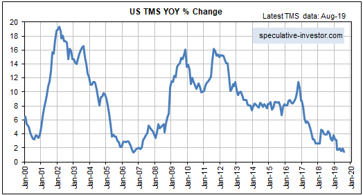
Within three months of the TMS growth trough in September-2006 the first obvious crack appeared in the US mortgage debt/securitisation bubble. The crack was a trading update issued by HSBC on 5th December 2006 that noted the increasing “challenges” being faced by the Mortgage Services operations of HSBC Finance Corporation. This initial sign of weakness was followed by the appearance of a much larger crack on 7th February 2007. That’s when HSBC issued another trading update that included a profit warning due to substantially increased loan impairment charges. Within days of this February-2007 HSBC update, the shares of sub-prime lending specialists such as New Century Financial and NovaStar Financial went into freefall. This marked the beginning of the Global Financial Crisis, although the US stock market didn’t top out until October of 2007 and industrial commodities such as oil and copper didn’t top out until mid-2008.
The above-mentioned events could be relevant to the current situation, in that the recent chaos in the US short-term funding market could be the initial ‘crack’ in today’s global debt edifice. While the low rate of US monetary inflation was not the proximate catalyst for the recent chaos, there is little doubt that it played a part. Temporary issues such as a corporate tax deadline and a large addition by the US Treasury to its account at the Fed would not have had such a dramatic effect if the money supply had been growing at a ‘normal’ pace.
Generally, when the money supply is growing very slowly within a debt-based monetary system, a relatively small increase in the demand for cash can create the impression that there is a major cash shortage.
Now, if there’s one thing we can be sure of it’s that the next crisis will look nothing like the last crisis. The financial markets work that way because after a crisis occurs ‘everyone’, including all policy-makers, will be on guard against a repeat performance, making a repeat performance extremely improbable. Therefore, we can be confident that even if the recent temporary seizure of the US short-term funding market was a figurative shot across the bow, within the next couple of years there will NOT be a major liquidity event that looks like the 2007-2008 crisis. However, some sort of crisis, encompassing an economic recession, is probable within this 2-year period.
The nature of the next crisis will be determined by how the Fed reacts to signs of economic weakness and short-term funding issues such as the one that arose a few weeks ago. In particular, quick action by the Fed to boost the money supply would greatly reduce the probability of a deflation scare and greatly increase the risk that the next crisis will involve relatively high levels of what most people call “inflation”.
As an aside, there’s a big difference between the Fed cutting its targeted short-term interest rates and the Fed directly boosting the money supply. For example, in reaction to signs of stress in the financial system the Fed commenced a rate-cutting program in September of 2007, but it didn’t begin to directly pump money into the system until September of 2008. In effect, during the last crisis the Fed did nothing to address liquidity issues until almost two years after the appearance of the initial ‘crack’. As a consequence, the monetary inflation rate remained low and monetary conditions remained ‘tight’ until October of 2008 — 12 months after the start of an equity bear market and 10 months after the start of an economic recession.
Early indications are that the Fed will be very quick to inject new money this time around, partly because 2007-2008 is still fresh in the memory. These early indications include the rapidity of the Fed’s response to the effective seizure of the “repo” market last month and the fact that last Friday the Fed introduced a $60B/month asset monetisation program. This program is QE in everything except name. In other words, the Fed already has resumed Quantitative Easing even though GDP is growing at about 2%/year, the unemployment rate is at a generational low and the stock market is near an all-time high.
In summary, while it is too early to have a clear view of how the next major crisis will unfold, something along the lines of 2007-2008 can be ruled out. Also, there are tentative signs that the next crisis will coincide with or follow a period of relatively high “inflation”.