Accelerating Monetary Inflation

December 25, 2019

[This post is an excerpt from a recent TSI commentary]

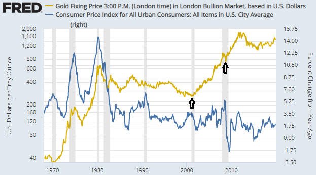
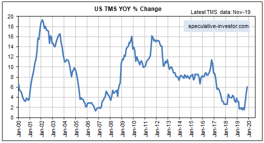
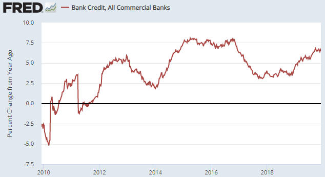
Over the past three months the year-over-year rate of growth in US True Money Supply (TMS), a.k.a. the US monetary inflation rate, has jumped from a 12-year low of 1.5% to a 2.5-year high of 6.1%. Refer to the first of the following charts for the details. This is due to the combination of the Fed’s new money-pumping scheme, which we are told is not QE even though it is identical to QE in terms of its effect on bank reserves, the money supply and the financial markets, and the expansion of commercial bank credit at close to its fastest pace in 10 years. The second of the following charts shows the year-over-year rate of change in commercial bank credit. If the commercial banking system continues to expand credit at the current pace and the Fed runs its new asset monetisation program until at least the end of March, then by the third quarter of next year the US monetary inflation rate will be above 10%. What does this mean for the financial markets and the economy?

Once a boom turns to bust there is nothing the Fed can do to stop or even delay the hardship that most people experience during periods of economic recession or depression. There also is very little the Fed can do after the boom-bust transition has occurred to prevent asset prices from tumbling. However, before the boom collapses, as eventually it must, it can be given a second (or a third or a fourth or a fifth) wind by a substantial new injection of money. Therefore, IF the boom is still mostly intact then the strong rebound in monetary inflation could prolong the cycle.

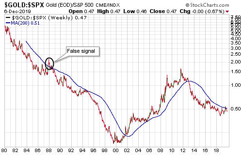
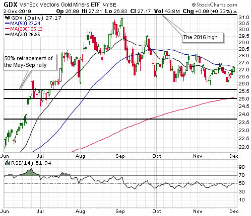
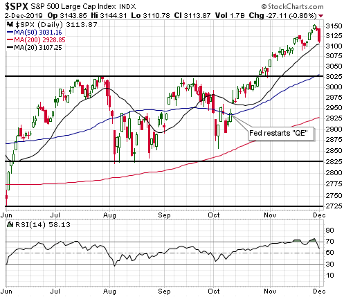
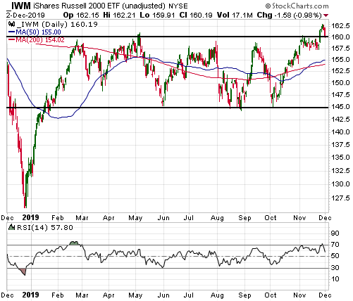
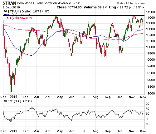
Given that the senior US stock indices are at all-time highs in dollar terms and are yet to signal long-term downward reversals in gold terms, it’s possible that the boom is intact. This means that the rebound in monetary inflation COULD prolong the boom phase of the current cycle. Whether it actually will is not knowable at this time. One of the ‘tells’ will be whether or not there is a sizable pick-up over the next three months in new manufacturing orders.

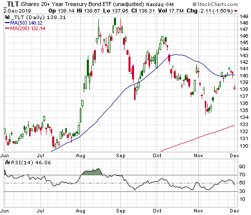
If the boom phase of the cycle is extended by the monetary inflation rebound it will be bullish for oil, industrial metals and the stocks of cyclical companies (the more cyclical the better), and bearish for gold, T-Bonds and “defensive” stocks.

Gold is not a hedge against “CPI inflation”

December 16, 2019

Like old soldiers, old beliefs never die. In the financial world, one of the many old beliefs that clings to life despite a pile of conflicting evidence is the one about gold being primarily a hedge against, or a play on, so-called “CPI inflation”.

The belief that big moves in the gold price are primarily driven by “price inflation” as measured by the CPI was spawned by what happened during 1972-1982. As illustrated by the following chart, there was a strong positive correlation between the gold price and the 12-month rate of change in the CPI during this period. However, it is clear that the positive correlation of 1972-1982 did not persist over the subsequent 37 years. In particular, the chart shows that the most recent two major rallies in the gold price (the rallies that began in early-2001 and late-2008) had nothing to do with “CPI inflation”. These rallies got underway in the midst of steep declines in the CPI’s growth rate and were at no time supported by a rapidly-rising CPI. The chart also shows that 2019’s significant up-move in the gold price had nothing to do with a rising rate of “CPI inflation”.

gold_CPI_161219

All substantial gold rallies are driven by falling confidence in the monetary authorities. The fall in confidence can be associated with so-called “price inflation”, but it certainly doesn’t have to be. As was the case with the major gold rallies that began in 2001 and 2008, it can be associated with stock market weakness, concerns about future economic growth, stresses in the banking system and minimal “price inflation”.

At some point within the next 10 years there could be a major bullish trend in the gold price that is linked to a large rise in the CPI, but that’s not the most likely scenario. There’s a better chance that the next major gold rally will be set in motion by a long-term trend reversal in the US stock market. In fact, even the gold bull market of the 1970s had more to do with a long-term bearish trend in US equities (the US stock market peaked in the late-1960s and bottomed in 1982) than rapid “price inflation”.

Naturally, the US$ gold price will rise over very long (50+ year) periods as the US$ depreciates, but so will the US$ prices of many other assets. Within this group of assets that tend to rise in terms of depreciating currency over the very long term, gold’s unique property is its counter-cyclicality. Gold racks up the bulk of its long-term appreciation during the bust phases of economic cycles.

What’s required for a gold bull market?

December 10, 2019

[This blog post is an excerpt from a recent TSI commentary]

During a gold bull market the “true fundamentals”, as indicated by our Gold True Fundamentals Model (GTFM), will be bullish most of the time. However, even during a bear market there can be periods of a year or longer when the fundamental backdrop is bullish most of the time. This means that the GTFM can’t be used to determine whether gold’s long-term trend is bullish or bearish. The historical sample size is small, but the most important prerequisite for the start of a gold bull market appears to be the start of a bear market in US equities.

That’s why we use a long-term weekly chart of the gold/SPX ratio with a 200-week MA to identify gold bull and bear markets. Unfortunately, at this time the chart (see below) is noncommittal, because gold/SPX bottomed in August of 2018 but is yet to make a sustained break above its 200-week MA. It’s possible that a gold bull market got underway in August of last year, but it’s also possible that we are dealing with a 1-2 year up-swing within a bear market.

The inverse long-term relationship between gold and the US stock market is not always evident over the short-term or even the intermediate-term, although over the past two years it does seem like the gold market and the stock market have been taking turns. This is illustrated by the following chart. The chart shows that there was a net gain in the SPX over the periods when gold trended downward and a net loss in the SPX over the periods when gold trended upward.

The implication is that gold’s next 3-month+ upward trend should unfold over a period in which the SPX generates a poor return (most likely a significant loss).

Charts of interest

December 3, 2019

The following charts relate to an update on the markets that was just emailed to TSI subscribers.

1) Gold

gold_blog_021219

2) The Gold Miners ETF (GDX)

GDX_blog_021219

3) The Yen

Yen_blog_021219

4) The S&P500 Index (SPX)

SPX_blog_021219

5) The Russell2000 ETF (IWM)

IWM_blog_021219

6) The Dow Transportation Average (TRAN)

TRAN_blog_021219

7) The iShares 20+ Year Treasury ETF (TLT)

TLT_blog_021219