The best way to play the ‘ag’ bull market

September 8, 2020

[This blog post is an excerpt from a recent TSI commentary, with updated charts and minor modifications]

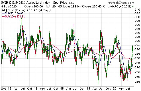
As is the case with the natural gas price, the price of the S&P Agricultural Index (GKX) appears to have made a cycle low via a double bottom in April and June of this year. At this stage the rebound from the Q2-2020 bottom doesn’t look more significant than any of the other rebounds of the past five years (see chart below), but the combination of rampant monetary inflation, rising inflation expectations and increasingly-volatile weather due to natural climate cycles is the recipe for a much longer and larger rally.

GKX_080920

For at least the past 12 months we have argued that owning the stocks of fertiliser producers such as Mosaic (MOS) and Nutrien (NTR) is the best way for most people to participate in the agricultural (‘ag’) commodities bull market that potentially will unfold during 2020-2022. That continues to be our view. Although the fertiliser producers only provide indirect exposure to rising prices for ag commodities, obtaining direct exposure via the stock market involves owning ETFs that usually suffer substantial value leakage due to the “futures roll”.

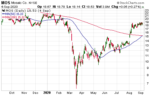
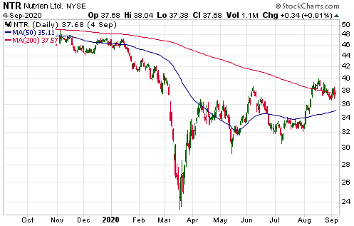
The following daily charts show that the aforementioned stocks have rebounded strongly from their March-2020 lows but remain well below their highs of the past 12 months.

MOS_080920

NTR_080920

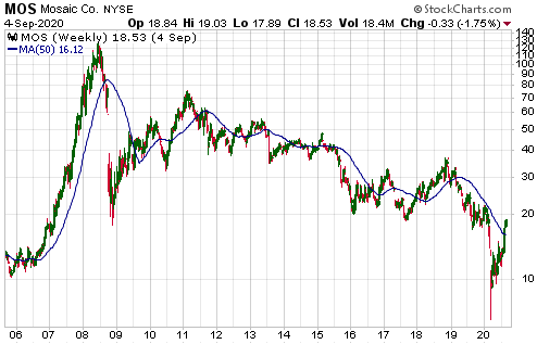
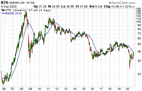
Not evident on the above daily charts is the fact that MOS and NTR are trading at small fractions of their 2008 peaks. The following weekly charts provide some additional perspective.

MOS_weekly_080920

NTR_weekly_080920

We think that the risk/reward ratios of these stocks are roughly equivalent, with NTR being less risky and MOS offering greater leverage. Both companies were very profitable in the June-2020 quarter and should become even more profitable over the quarters/years ahead.

The Fed’s footprints are all over the financial markets

August 31, 2020

[This blog post is an excerpt from a TSI commentary published within the past two weeks]

Many analysts downplay the Fed’s influence on bond yields, but we don’t think it’s possible to explain the following chart without reference to the massive yield-suppressing boot of the Fed. The chart compares the 10-year T-Note yield with the 10-Year Breakeven Rate, a measure of the market’s inflation (CPI) expectations. The Breakeven Rate is calculated by subtracting the Treasury Inflation Protected Security (TIPS) yield from the associated nominal yield.

The chart reveals that the 10-year T-Note yield generally moves in the same direction as the 10-Year Breakeven Rate. This is hardly surprising, given that the expected “inflation” rate is usually the most important determinant of the long-term interest rate. In particular, a higher expected “inflation” rate usually will result in a higher long-term interest rate. However, something very strange has happened since March of 2020. Since that time there has been a large rise in the expected CPI while the nominal 10-year yield has drifted sideways near its all-time low.

As far as we can tell, there are only two ways that the sort of divergence witnessed over the past five months between inflation expectations and nominal bond yields could come about.

One way is capital flight from outside the US to the perceived safety of the US Treasury market that overrides other effects on bond prices/yields. This is what happened during 2011-2012, which is the only other time that a substantial rise in inflation expectations coincided with flat or declining nominal US bond yields. In 2011-2012, capital flight to the US was prompted by the euro-zone’s sovereign debt crisis.

Manipulation by the Fed is the other way that the divergence could arise.

Over the past five months there has been no evidence of capital flight to the US. Therefore, it’s clear that the Fed has maintained sufficient pressure to prevent the nominal 10-year bond yield from responding in the normal way to a large rise in the bond market’s inflation expectations. Not without ramifications, though.

A large rise in the expected “inflation” rate in parallel with a flat nominal interest rate equates to a large decline in the ‘real’ interest rate. In this case, it equates to the ‘real’ US 10-year interest rate moving well into negative territory. This has put irresistible downward pressure on the US$ and irresistible upward pressure on the prices of most things that are priced in dollars, including gold, equities, commodities and houses. It has even put upward pressure on the price of labour, despite the highest unemployment rate since the 1930s.

At the moment the Fed undoubtedly is pleased with its handiwork. The rise in the gold price to new all-time highs could be viewed as a rebuke, but these days no-one in the world of central banking cares about the gold price. Central bankers do, however, care about the stock market, and the Fed’s governors will be patting themselves on the back for having helped the S&P500 Index fully retrace its February-March crash. They also will be pleased that the CPI is rising in spite of the deflationary pressures resulting from the lockdowns. After all, the concerns they have expressed over the years about insufficient “inflation” make it clear that the last thing they want is for your cost of living to go down*.

However, the Fed is ‘playing with fire’. Putting aside the long-term negative economic consequences of the mal-investment caused by the Fed’s money pumping and interest-rate suppression, if the Fed continues to prevent bond yields from reflecting rising inflation expectations then the steady shift currently underway towards hard assets and anything else that offers protection against currency depreciation will become a stampede. And once that happens, the sort of central-bank action that would be required to restore confidence would crash both the stock market and the economy.

If the Fed continues along its current path then an out-of-control rise in prices won’t be an issue to be dealt with in the distant future. It possibly will become an issue before the end of this year and very likely will become an issue by the middle of next year.

*Nobody with common-sense can figure out why.

The consequences of US$ weakness

August 24, 2020

[This is an excerpt from a commentary published at TSI on 16th August 2020. The message remains applicable.]

The US$ commenced a cyclical decline in March of this year and probably will trade well below current levels during the first half of 2021. From the perspective of our investing and trading, the main consequences of this weakness in the senior currency are:

1) Broad-based strength in the commodity markets. As illustrated below, the S&P Spot Commodity Index (GNX) has been trending upward since shortly after the US$ peaked.

2) Strength in emerging market equities, especially the equities that are based in emerging economies that rely heavily on commodity exports. For example, Brazilian equities. Despite the debilitating effects on Brazil’s economy of virus-related lockdowns, the following chart shows that the iShares Brazil ETF (EWZ) has done well since the US$ began trending downward.

Note that it could make sense to buy EWZ if there’s a pullback to US$26-$28 within the next several weeks.

3) Rising US inflation expectations. As illustrated below, the US 5-Year Breakeven Rate (the annual CPI increase that the market expects the US government to report over the next few years) has been trending upward since the US$ peaked.

The above consequences have been apparent over the past few months and should become more pronounced within the next 12 months, especially during the first half of next year. However, we think that in the short-term the focus of investors/speculators should be on the potential for a US$ rebound.

It’s possible that the Dollar Index (DX) will become more stretched to the downside before it commences a meaningful countertrend rally, but once a US$ rebound begins in earnest the prices that have been elevated over the past few months by US$ weakness, which means the prices of almost everything, will fall.

It does not make sense to exit all anti-US$ trades in anticipation of a short-term US$ rally. Doing so would be risky because these trades would make large additional gains if the US$ rebound were to be postponed for a month or two. Also, making a complete exit would create the problem of having to time the re-entry. However, it would make sense to hedge against a short-term US$ recovery while maintaining core exposure in line with the dollar’s longer-term weakening trend.

Speculative froth in gold and silver trading

August 17, 2020

Gold market sentiment is complicated at the moment. There are signs of speculative froth, but at the same time the total speculator net-long position in Comex gold futures is close to its low for the year despite the US$ gold price recently hitting an all-time high. A likely explanation is that large speculators are focusing more on gold ETFs than on gold futures.

The price of a gold ETF that holds physical gold will track the gold price automatically. Therefore, there never will be an increase in the amount of gold held by such an ETF unless bullish speculators become sufficiently enthusiastic to push the market price of the ETF above its net asset value (NAV). When this happens it creates an arbitrage opportunity for the ETF’s Authorised Participants (APs), which results in the addition of gold bullion to the ETF’s inventory.

The following charts from http://www.goldchartsrus.com/ show large gains in the amounts of physical gold held by GLD and IAU, the two most popular gold ETFs. Specifically, the charts show that about 400 tonnes (12M ounces) of gold was added to the combined GLD-IAU inventory over the past few months. This actually isn’t a huge amount within the context of the global gold market, but it points to aggressive buying of the ETFs.

In other words, the evidence of gold-related speculative froth is in the stock market rather than the futures market.

GLDINV_170820

IAUINV_170820

The next chart shows that the silver story is similar. Specifically, the chart shows that about 7,000 tonnes (220M ounces) of physical silver have been added to the inventory of the iShares Silver ETF (SLV) since the March-2020 price low, including about 1,900 tonnes (60M ounces) during the three-week period culminating at the early-August price high.

SLVINV_170820

The fundamental backdrop remains supportive for gold and silver, but sentiment suggests that a multi-month price top was put in place in early-August or will be put in place via a final spike within the next three weeks.