Collapsing prices in an inflationary environment

September 13, 2021

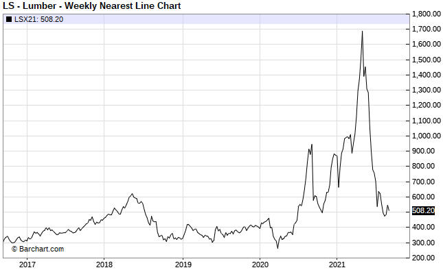
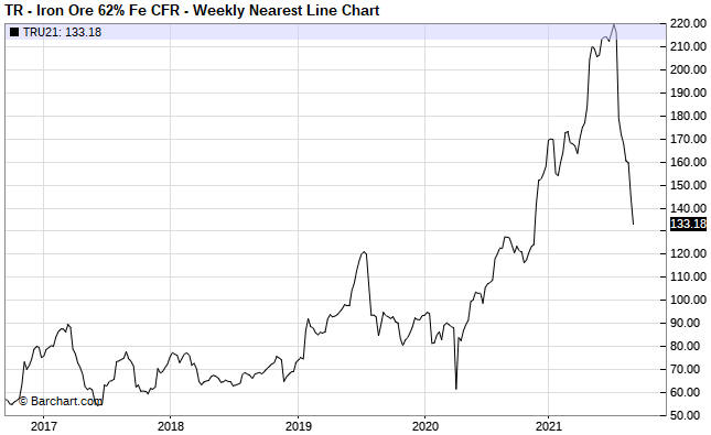
Over the past four months, in parallel with spectacular gains in the prices of coal and natural gas prices there have been spectacular declines in the prices of lumber and iron-ore. The following charts show the 70% crash in the lumber price from its May-2021 peak and the 40% crash in the iron-ore price from its July-2021 peak.

lumber_130921

ironore_130921

A common argument against there being a general inflation problem is that the large rises in commodity prices are due to temporary market-specific supply issues, leading to large price declines as soon as the supply issues are resolved. The plunges in the prices of lumber and iron-ore can be cited to support this argument.

There is an element of truth to this line of thinking. However, the same argument could have been made throughout the 1970s, in that every large commodity-price rise during that decade could be put down to a market-specific supply issue.

As long as the inflation doesn’t become ‘hyper’, that is, as long as the value of money doesn’t collapse relative to everything, a large and rapid rise in the price of a commodity will result in additional supply and/or reduced demand, eventually leading to a large price decline. This sequence of events played out in full in the lumber and iron-ore markets over the past 12 months and by the time we get to the middle of next year it likely will have played out in full in the natural gas and coal markets.

The clue that the price action has monetary roots is in its frequency, that is, in the number of markets that are experiencing huge price run-ups. Each huge price run-up in isolation can be put down to market-specific supply constraints, but when the same thing happens in so many different markets at different times within a multi-year period then we can be sure that the root cause is linked to the monetary system itself.

In the current environment, the root cause is the combination of rapid monetary inflation courtesy of the central bank and a huge increase in government deficit-spending. Thanks to the Fed, the supply of US dollars is about 50% greater today than it was two years ago. Thanks to the government, the newly-created money did a lot more than elevate the prices of financial assets.

The Crisis-Monetisation Cycle

September 7, 2021

[This blog post is an excerpt from a TSI commentary]

Our view has always been that as an organisation with unlimited power to create money out of nothing and with no rigid constraints on what it can buy with the money it creates, the Fed would never ‘run out of bullets’. The opposing view put forward by many financial-market analysts and commentators was that the Fed eventually would be overwhelmed by a virtual tidal wave of debt defaults and other deflationary forces.

The idea that the Fed could get overwhelmed by deflationary forces should have been killed by last year’s events, because the Fed proved that there were no lengths to which it would not go to prop-up equity prices, prevent widespread debt default and ensure that the US dollar continued to lose purchasing power. However, apparently it wasn’t. The view that deflation is on the horizon is not as popular as it once was, but it remains very much alive. We therefore wonder how far down the path of money destruction the Fed will have to go before smart people stop seeing deflation as the biggest threat. Unfortunately, over the next few years we are going to find out.

The US economy is immersed in a crisis-monetisation cycle, as are many other economies. In the US, a crisis or a deflation scare or a recession or even just a steep stock market decline prompts the Fed to start monetising assets, with the speed and magnitude of the monetisation ramping up until equity and consumer prices resume their long-term upward trends. This has been going on for decades and explains why the US stock market’s valuation keeps making higher highs and higher lows.

The big change over the past 18 months is that the US federal government has become more involved in promoting the perpetual price inflation, partly because there is political capital to be gained by taking actions that boost wages and partly because, at a superficial level at least, there have been no negative economic consequences to date associated with the massive increase in the government’s debt. The government’s actions are ensuring that the new money affects goods and services prices in addition to asset prices.

The crisis-monetisation cycle doesn’t end in deflation. The merest whiff of deflation just encourages central bankers and politicians to do more to boost prices. In fact, the occasional deflation scare is necessary to keep the cycle going. The cycle only ends when most voters see “inflation” as the biggest threat to their personal economic prospects.

No gold bull, yet

August 31, 2021

The measuring stick is critical when determining whether an asset is in a bull market. If a measuring stick is losing value at a fast enough pace, then almost everything will appear to be in a bull market relative to it. For example, pretty much everything in the world has been rising in value rapidly over the past several years when measured in terms of the Venezuelan bolivar. It should be obvious, though, that not everything can be simultaneously in a bull market. To determine which assets/investments are in a bull market we can’t only go by performance relative to any national currency; we must also look at the performances of assets/investments relative to each other.

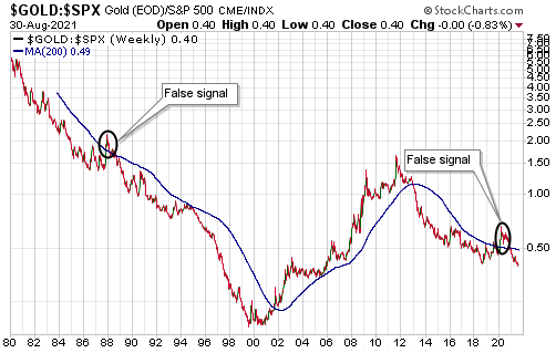
That’s where the gold/SPX ratio (the US$ gold price divided by the S&P500 Index) comes in handy. Gold and the world’s most important equity index are effectively at opposite ends of the ‘investment seesaw’. Due to their respective natures, if one is in a long-term bull market then the other must be in a long-term bear market. In multi-year periods when they are both trending upward in dollar terms it means that the dollar is in a powerful bear market, not that gold and the SPX are simultaneously in bull markets.

The following weekly chart removes the US$ from the equation and measures gold against its main competition (the SPX). The blue line on the chart is the 200-week MA. In the past, crosses through the 200-week MA by the gold/SPX ratio have been useful in confirming changes to gold’s long-term trend, although there were two false signals (October-1987 and March-2020) that resulted from stock market crashes.

The chart shows that the gold/SPX ratio recently broke below its 2018 low and is at its lowest level of the past 15 years. This implies that the gold bear market that began in 2011 has not ended.

gold_SPX_310821

Over the past 12 months a monetary-inflation-fuelled economic boom has been in full swing. This is not the sort of environment in which gold should perform well. On the contrary, gold tends to come into its own after a boom starts to unravel, that is, after a boom-to-bust transition gets underway. This could happen during the first half of next year.

What is the ‘real’ interest rate?

August 23, 2021

The real interest rate is the nominal interest rate adjusted for the expected change in the associated currency’s purchasing power, where “expected” is the operative word. It is not the nominal interest rate adjusted for the currency’s loss of purchasing power over some prior period.

To further explain, when you buy an interest-bearing security the ‘real’ income that you receive will be determined by the future change in the currency’s purchasing power. For example, the real return from a note that matures in 12 months will be determined by the change in the currency’s purchasing power over the coming 12 months, not the change in the currency’s purchasing power over the preceding 12 months. Of course, when you buy the security you have no way of knowing what will happen to the currency’s purchasing power in the future, but your decision to buy will be based on the nominal yield offered by the security and what you EXPECT to happen to the currency. What happened to the purchasing power of the currency in the past is only relevant to the extent that it affects the expectations of investors.

Consequently, it is not appropriate to estimate the ‘real’ interest rate by subtracting a measure of historical purchasing power loss, such as the percentage change in the CPI over the last 12 months, from the current nominal yield. Doing so would result in a meaningless number even if the CPI were a valid indicator of purchasing-power loss.

A knock-on effect is that the numerous articles and reports that attempt to explain how the price of something responds to changes in the real interest rate, where the real interest rate is calculated by subtracting the change in the CPI over some prior period from the current nominal interest rate, can be put into the “not even wrong” category. They are nonsensical.

Just to be clear, the CPI and similar price indices are inherently flawed indicators of “inflation”, but even if they were good indicators of “inflation” it would make no sense to subtract the historical index change from the present-day nominal interest rate when attempting to estimate the ‘real’ return.

If the main concern is the effects of interest rates and “inflation” on the prices of assets, commodities and gold, then the numbers that matter are today’s nominal interest rates and inflation expectations. In the US these numbers are combined to generate the yields on Treasury Inflation Protected Securities (TIPS), in that the TIPS yield is the nominal yield minus the expected CPI. The TIPS yield is not an accurate indicator of the real interest rate in absolute terms, but it is an accurate indicator of the real interest-rate TREND and whether the real interest rate today is high or low relative to where it was in the past.

The following chart compares the 10-year TIPS yield with the US$ gold price. A negative correlation is apparent (the trend in the TIPS yield is often the opposite of the trend in the gold price), especially since 2007. The negative correlation doesn’t always apply, though, because the gold price is not determined solely by the real interest rate. There are several other fundamental influences, including credit spreads and the yield curve (the TIPS yield is just one of seven inputs to our Gold True Fundamentals Model).

gold_TIPS_230821

Treasury Inflation Protected Securities were first issued in 1997 and the Fed’s data used in the above chart doesn’t go back further than 2003, so the TIPS market can’t tell us what happened to real interest rates in the 1970s and 1980s. However, the non-availability of a valid number or methodology is not a good reason to use a bogus number or methodology.