Print This Post Print This Post

Gold and the Boom-Bust Cycle

March 1, 2021

[This blog post is a modified excerpt from a commentary published at TSI on 21st February]

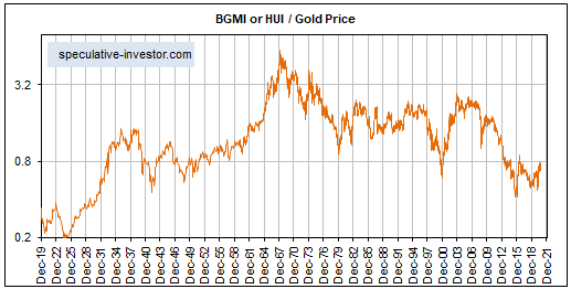
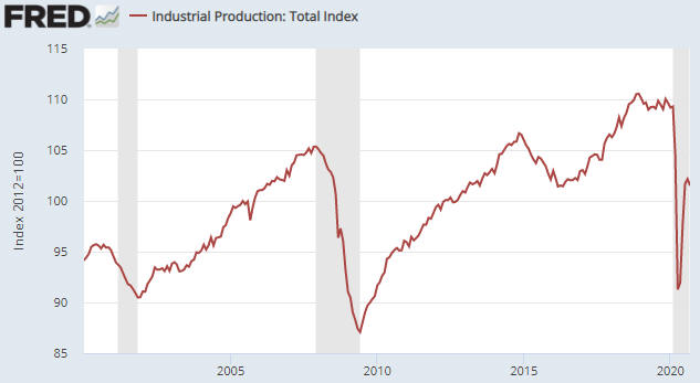
The true fundamentals* have been trending in a gold-bearish direction since early-October of last year, which is a large part of the reason that the gold price has been in a downward trend for the past several months. The majority of these true fundamentals are measures of confidence in the economy and/or the banking system, the theory — which is supported by decades of empirical evidence — being that gold performs relatively well in the bust phase of the boom-bust cycle and relatively poorly in the cycle’s boom phase.

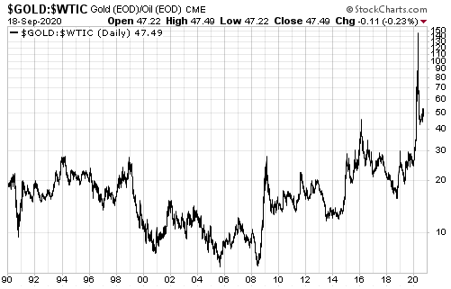
Just to be clear, if the US$ is weak enough then it certainly is possible to make gains in US$ terms via being long gold during a boom, but you will do better by being long other things including industrial commodities. Hence the use, above, of the word “relatively”.

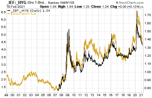
Credit spreads are one useful measure of economic confidence, with widening spreads indicating falling confidence and narrowing spreads indicating rising confidence. This implies that the direction and level of credit spreads indicate whether the economy is in the boom phase or the bust phase. That’s why the gold/commodity ratio generally has trended up and down with credit spreads, which is exactly what it should do.

Below is a chart that illustrates the relationship mentioned above. In this case metals are being compared with metals by looking at how gold performed relative to industrial metals (represented by the Industrial Metals Index – GYX) during periods of widening and narrowing credit spreads.

Unfortunately, the data for the credit spread indicator used in this chart starts in 2007, so for the first eight years of the chart there is only the gold/GYX ratio. However, a longer-term credit-spread indicator would confirm that gold/GYX’s 2001-2002 upward trend coincided with an economic bust and gold/GYX’s 2003-2006 downward trend coincided with an economic boom.

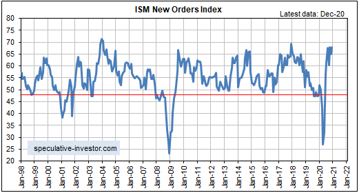
The chart suggests that there was a major economic boom during 2003-2006 and major economic busts spanning mid-2007 to mid-2009 and Q4-2018 to March-2020. The period from mid-2009 through to Q3-2018 contained a series a relatively minor booms and busts.

My guess is that the current boom will be short by historical standards, but there is no need to guess correctly because real-time data will provide timely warnings that the transition from boom to bust has begun. Right now there is no evidence that the boom is over.

*I use the term “true fundamentals” to distinguish the actual fundamental drivers of the gold price from the drivers that are regularly cited by gold-market analysts and commentators. According to many pontificators on the gold market, gold’s fundamentals include the volume of metal flowing into and out of the inventories of gold ETFs, China’s gold imports, the volume of gold being transferred out of the Shanghai Futures Exchange inventory, the amount of “registered” gold at the COMEX, India’s monsoon and wedding seasons, jewellery demand, the amount of gold being bought/sold by various central banks, changes in mine production and scrap supply, and various manipulation stories including wild guesses regarding JP Morgan’s exposure to gold. These aren’t true fundamental price drivers. They are distractions (at best) and should be ignored.

Print This Post Print This Post

The coming “inflation” problem in the US

February 23, 2021

Due to the central-banking world’s unshakeable belief that money must continually lose purchasing power and the current authority of the central bank to do whatever it takes to achieve its far-reaching goals, the greater the perceived threat of deflation the more monetary inflation there will be. That’s why the endgame for the current monetary system involves rapid “price inflation”. This has been obvious for a long time, but some well-known analysts are just starting to cotton-on.

There were examples of the aforementioned phenomenon (the greater the fear of deflation, the higher the rate of monetary inflation) during 2001-2002 and again during 2008-2009, but 2020 provided the best example yet. As evidence we point to the following chart and the fact that the quantity of US dollars created during the 12-month period ending January-2021 (4.8 trillion) is greater than the entire US money supply at the beginning of 2007.

TMS_blog_230321

As an aside, it would be a good thing if deflation were the high-probability outcome that many analysts/commentators still claim it is, because deflation is relatively easy to prepare for. To prepare for deflation all you have to do is be ‘cashed up’, whereas in a high-inflation environment you are forced to speculate just to avoid a large loss of purchasing power.

At the moment the world’s most influential central bankers and economists don’t see a problem with rapid monetary inflation, because according to their favourite indicators previous large increases in the supply of money over the past two decades had only minor effects on the purchasing power of money. Also and as noted at the start of this discussion, the central-banking world is labouring under the belief that the economy would benefit from more “price inflation”.

However, in response to the most recent monetary inflation surge there will be a lot more traditional “price inflation” than a) there was in response to the previous money-supply growth spurts and b) the average central banker would consider to be beneficial. This isn’t only because of the much larger amount of money creation this time around, but also because of the way the new money is being distributed.

Whereas most of the new money created in reaction to earlier deflation scares was injected into the financial markets and stayed there, via the “stimulus” programs implemented last year and that are on the cards for this year the US government is, in effect, sucking a lot of money out of the bond market and sending it to the general public. Also, there will be a huge infrastructure spending bill that will do something similar (siphon money from the bond market to the public).

The Fed technically is still injecting new money into the financial markets by purchasing bonds from Primary Dealers, which means that it is doing what it did in response to earlier deflation scares. However, for all intents and purposes it is now monetising a rapidly-expanding government budget deficit.

According to the book Monetary Regimes and Inflation, all of the great inflations of the 20th Century were preceded by central bank financing of large government deficits. Furthermore, in every case when the government deficit exceeded 40% of expenditure and the central bank was monetising the bulk of the deficit, which has been the case in the US over the past 12 months, a period of high inflation was the result. In some cases hyperinflation was the result.

Print This Post Print This Post

TSI Themes

February 17, 2021

At any given time there will be many investable themes ‘on the go’ within the financial markets, but due to time constraints we cannot cover all or even most of these themes at TSI. Instead, we pick out a few to focus on.

For the information of non-subscribers, here is a summary of the themes that we focused on during the second half of last year and that remain focal points of the regular TSI commentaries.

1) Aggressive monetary and fiscal stimulus will create the illusion of global economic strength (an artificial economic boom).

2) The rising trend in inflation expectations that began during the first half of 2020 will extend through the first half of 2021 and possibly for years to come.

3) The US dollar is immersed in a cyclical bear market that began in March of 2020.

4) Multi-year bullish trends are underway in industrial and agricultural commodities.

5) The electrification of transport is an unstoppable global trend that will have major bullish implications for certain commodities, especially lithium, manganese and the rare-earth elements.

6) The cannabis-legalisation trend in the US is accelerating and will enable US-focused cannabis companies to achieve rapid sales growth during 2021-2022.

7) Gold will perform poorly relative to industrial commodities until the transition to the next economic bust phase begins.

Our own account has some exposure to other themes, but the above list covers the ones we have been concentrating on as far as the TSI commentaries are concerned. We expect that all of the above will remain applicable over the coming few months, but that changes will be required at some point this year due to prices becoming too stretched to the upside or signs of an economic downturn becoming evident in our favourite leading indicators or “inflation” moving well beyond what the Fed deems appropriate.

Print This Post Print This Post

Rampant Speculation

February 8, 2021

[This blog post is an excerpt from a commentary posted at TSI last week]

We assume that everyone reading this has at least superficial knowledge of the incredible goings-on around the stock of GameStop (GME), a video game retailer. The GME situation became so extraordinary last week that it drew the attention of senior US policymakers, but more importantly it is representative of what’s happening throughout the stock market and is symptomatic of the US money supply’s Fed-driven explosive growth.

There are no ‘good guys’ in the GME saga. The small traders who banded together via Reddit to create a massive “short squeeze” in the stock of a company that was on its way to bankruptcy have no right to claim the moral high ground, because they set out to do more damage to an already-broken price discovery process in order to make a ‘quick buck’. The short sellers who were ‘squeezed’ paid a legitimate price for poor risk management. The brokers that without warning imposed restrictions on the trading of GME and in some cases forced their customers out of the stock were simply acting to limit their own exposure, in that stockbrokers can be left ‘holding the bag’ when prices go crazy and traders can’t meet margin calls. And politicians are trying to portray themselves as being supportive of the ‘little guy’ while ignoring the underlying cause.

On a side note, the problem with ‘squeezing the shorts’ in the stock of a company with very little underlying value is that if the squeeze is successful then there will be almost no buyers on the way back down. As a result, successful short squeezes are often followed by spectacular price collapses.

GME_050221

The underlying cause of the crazy price action is the explosive money-supply growth engineered by the Fed. This record-breaking expansion of the money supply hasn’t led to rapid rises in official measures of “price inflation” YET, but its effects are plain to see. One of the most obvious effects at the moment is the rampant speculation in parts of the stock and commodity markets.

The participants in each bubble believe that there are some fundamental considerations that make their bubble special, meaning that their bubble is believed to be not actually a bubble but a reasonable assessment of future prospects. For example, Tesla bulls believe that Tesla’s market cap makes sense considering the company’s future earnings potential, bitcoin bulls believe that bitcoin’s price rise is justifiable and is nothing compared to what’s coming, and many retail equity traders now believe that the stock market offers them a sure-fire way to make a lot of money very quickly without the need to do any real work.

However, all of the spectacular price rises are part of the same story. All of today’s bubbles are linked to what’s being done to money and they all will burst at around the same time, disabusing ‘investors’ of the notion that their favourite bubble is somehow special.

Recognising that an investment is a bubble isn’t a good reason to bet against the investment. In fact, it’s the opposite. Betting against a bubble is one of the surest ways to lose money quickly.

The goal should be to participate in a bubble while paying very careful attention to managing risk. As long as profits are harvested on a regular basis, a sizable cash reserve is maintained and debt-based leverage is avoided, astute investors/speculators can do well during a bubble without taking excessive risk. They won’t do as well as the true believers, but they won’t give back all of their gains after the inevitable collapse occurs.

Print This Post Print This Post

Rising fear of inflation

January 26, 2021

[This post is an excerpt from a commentary published at TSI on 17th January 2021]

The US yield curve, represented on the following weekly chart by the spread between the 10-year T-Note yield and the 2-year T-Note yield, has been steepening since the third quarter of 2019. Moreover, the pace of the steepening is accelerating.

yieldcurve_blog_260121

A steepening of the yield curve can be primarily driven by decreasing yields on short-dated treasuries or increasing yields on long-dated treasuries. The former results from a general increase in the desire to hold the most liquid and lowest-risk financial assets, such as cash and T-Bills. It is bullish for gold and bearish for commodities and most equity sectors. The latter results from a general increase in inflation expectations. It is also bullish for gold but is more bullish for commodities and certain equity sectors.

The steepening that occurred from the third quarter of 2019 through the first half of 2020 was driven by declining yields on short-dated treasuries, but the steepening that has occurred since August-2020 was driven by rising yields on long-dated treasuries, that is, by rising inflation expectations.

Given what the US government and the Fed have done and plan to do, it shouldn’t be a surprise to anyone that inflation expectations are in a rising trend and that the trend is accelerating. Of particular significance, President-elect Biden has proposed a new “stimulus” package with a US$1.9 trillion price tag, and it is well known that this spending package will be followed by an infrastructure bill that probably will involve another $1-$2 trillion of additional spending. Also, we have statements from the Fed to the effect that now is not the time to be talking about reducing the monetary accommodation and that there won’t be any tightening until an inflation problem is obvious to all.

The Fed could try to suppress one of the symptoms of a burgeoning inflation problem by attempting to control the yield curve, that is, by ramping-up its purchases of long-dated treasuries with the aim of lowering yields at the long end of the curve. However, that would amount to creating more money out of nothing in an effort to address a problem caused by creating too much money out of nothing. Even by the Fed’s own standards this would be counterproductive.

The bottom line is that there will be a lot more inflation and a further large increase in inflation fear before there is a realistic chance of a deflation scare.

Print This Post Print This Post

Gold versus Bitcoin

January 20, 2021

[This blog post is an excerpt from a TSI commentary published last week]

Does the rapid rise in the bitcoin price and the slide in the gold price over the past several months indicate that bitcoin is sapping demand from gold? The short answer is no, because the performance of gold makes sense without reference to bitcoin. A longer answer requires discussing the major differences between gold and bitcoin.

The differences between gold and bitcoin are far more significant than any similarities. Neither is money in the only practical definition of the term (the general medium of exchange), but gold trades like money. Of particular relevance, the demand to hold money (and therefore gold) tends to rise during ‘busts’ and fall during ‘booms’. A consequence is that gold generally doesn’t do well when the stock market is ‘bubbling’.

Bitcoin, in contrast, trades like an illiquid commodity, because that’s what it is. No money or widely-used currency in history has ever traded the way bitcoin has traded and it’s reasonable to assume that none ever will.

The spectacular rise in the bitcoin price over the past 10 months is related to the bubble that has formed in the stock market and the associated spectacular rises in the stock prices of the companies with which the public has become infatuated. Obviously, Tesla (TSLA) is such a company. The following chart compares the bitcoin price with the Tesla share price.

gold_bitcoin_190121

Bitcoin ‘bubbled with the stock market in 2020. It also ‘bubbled’ with the stock market during 2017 and if it had been around at the time it almost certainly would have ‘bubbled’ with the stock market during 1999-2000, whereas the desire to hold money or gold diminishes when the prices of speculative assets are rocketing upward in real terms. Who wants to own gold when the record of the past 1 year, 5 years and 10 years ‘proves’ that you will do much better by owning QQQ (the NASDAQ100 ETF)?

It’s likely that the gold price will embark on its next intermediate-term advance at around the time that the bitcoin price reaches an important top. That’s not because bitcoin has been draining demand from gold, but because a top for the bitcoin price probably will occur at around the same time as a top for speculation in general and a trough in the desire to hold cash reserves.

We still could be a few months away from a major top for speculation in general, so at this time it is still better to be ‘long’ consumable commodities and speculative assets than to be ‘long’ gold.

Print This Post Print This Post

US Recession/Recovery Watch

January 11, 2021

There are a handful of leading economic indicators that when taken together have provided timely warnings of every US recession and recovery for at least the past sixty years. A monthly feature at TSI is a discussion, primarily based on these indicators but also taking into account expected monetary and fiscal policies, of the prospects for the US economy over the ensuing 6-12 months.

At the end of 2019, before anyone outside Wuhan had heard of the new coronavirus, the leading indicators we track pointed to a 60% probability of the US economy entering recession during the first half of 2020 and an 80% probability of the US economy entering recession before the end of 2020. The only reason the probabilities weren’t even higher was the possibility that the Fed’s money pumping following its 2019 “pivot” would push the recession start into 2021. The lockdowns of March-2020 eliminated any possibility that the inevitable recession would be postponed.

By early-July of 2020 it became clear, based on the same leading indicators, that the recession catalysed by the H1-2020 lockdowns was over. This informed our decision to begin favouring industrial commodities over gold.

It’s important to continue weighing new data and making adjustments in real time as required, but based on what is currently known the probability of the US economy slipping back into recession during the first half of 2021 is extremely low. There is, however, an uncomfortably high probability of the US economy re-entering recession territory during 2022.

Here’s what we wrote in our latest monthly US Recession/Recovery Watch, which was part of a commentary published at TSI last week:

We called an end to the 2020 US recession in early-July of last year, mainly due to the spectacular rise in the ISM New Orders Index (NOI) that had just occurred. This call has been supported by subsequent data and eventually should be confirmed by the National Bureau of Economic Research (NBER)*, making last year’s recession the shortest in US history. The latest ISM data, which were published earlier this week, indicate that the recovery is intact.

The following monthly chart shows that the NOI remains near the top of its 20-year range, meaning that the US economy continues to recover from the devastation caused by the lockdowns directed by the government during the first half of last year.

ISMNOI_blog_110121

Based on the economic and monetary data published over the past couple of months it’s possible that later this month the US government’s statisticians will report annualised nominal GDP growth of at least 10% for Q4-2020 and likely that the US economy will achieve annualised nominal GDP growth of at least 5% during the first half of 2021. Are you long industrial commodity stocks?

The strength is largely artificial and will evaporate soon after the Fed is forced by blatant evidence of an inflation problem to end the monetary stimulus, but that is probably a story for the second half of this year and beyond. Over the next 1-2 quarters it’s a good bet that the monetary tsunami will continue, courtesy of both the Fed and the government. For example, the US federal government has just sent $600 “stimulus” checks to most Americans, but that won’t be the end of it. President-elect Biden wants to send another $2000 to every American and a massive infrastructure spending program is ‘on the cards’.

It’s amazing what the government can do when it stops pretending to care about its own indebtedness and embraces the spirt of Modern Monetary Theory (MMT).

*It can take the NBER, the official arbiter of US recession dates, a year or more to confirm a recession start/end date.

Print This Post Print This Post

Gold mining stocks are trades, not investments

December 29, 2020

[This post is an excerpt from a commentary posted at TSI last month]

Gold mining is — to use technical jargon — a crappy business. It doesn’t have to be, it just works out that way due to irresistible incentives associated with the post-1970 monetary system. We explained why in TSI commentaries and some articles at the TSI Blog (for example, HERE) during 2014-2015.

The explanation revolves around the boom-bust cycle caused by the monetary machinations of the banking establishment (the central bank and the commercial banks). For the economy as a whole, malinvestment occurs during the boom phase of the cycle and the bust phase is when the proverbial chickens come home to roost (the investing mistakes are recognised and a general liquidation occurs). For the gold mining industry, however, the malinvestment occurs during the economy’s bust phase, because the boom for gold mining coincides with the bust for the broad economy.

To further explain, rapid monetary inflation distorts relative price signals and in doing so incentivises investments that for a while (usually at least a few years) create the impression that the economy is powering ahead. Eventually, however, many of these investments are revealed for what they are (ill-conceived), with the revelation stemming from rising costs, declining profits or the absence of profit, resource shortages within the economic sectors that ‘boomed’ the most, and rising short-term interest rates due to a scramble for financing to complete projects and/or deal with cash flow problems.

After it starts to become clear that many of the boom-time investments were based on unrealistic expectations, a general drive to become more liquid gets underway. Many people sell whatever they can in an effort to pay expenses and service debts, thus kicking off an economic bust (recession or depression).

For the average person, becoming more ‘liquid’ usually involves obtaining more cash. However, corporations and high-net-worth individuals often prefer other forms of ‘liquidity’, including Treasury Bills and gold. That, in essence, is why the demand for gold tends to rise during the bust phase of the economy-wide boom-bust cycle.

The rising demand for gold pushes up gold’s price relative to the prices of most other assets and commodities, which elevates the general interest in gold mining. Eventually there will be a flood of money towards the gold mining industry that boosts valuations and that the managers of gold mining companies will use for something. That something will be project developments or acquisitions.

Regardless of how high market valuations move or how costly new mine developments become, gold-mining company managers will never say: “We don’t want your money because there currently are no acquisitions or new projects that make economic sense.” Instead, they will take the money and put it to work, based on the assumption that current price trends can be extrapolated into the distant future. The result invariably will be an artificial boom in the gold mining industry characterised by a cluster of high-cost investments that eventually get revealed as ill-conceived. Massive write-offs and an industry-wide retrenchment will ensue as surely as night follows day, thus obliterating the wealth created by the industry during the boom.

Gold itself is not made less valuable by the monetary-inflation-caused inefficiencies and widespread wastage that periodically beset the gold-mining industry. That’s why the gold mining sector, as represented on the following weekly chart by the Barrons Gold Mining Index prior to 1995 and the HUI thereafter, has been in a downward trend relative to gold bullion since 1968. That’s right — gold mining stocks, as a group, have been trending downwards relative to gold for more than 50 years!

BGMI_gold_291220

The trend illustrated by the above chart is a function of the current monetary system and won’t end before the current system is replaced. The trend could end within the next ten years, but it didn’t end in 2020 and almost certainly won’t end in 2021 or 2022. An implication is that if you want to make a long-term investment in gold, then buy gold. Gold mining stocks are for trading.

Print This Post Print This Post

Important things to know about inflation, deflation and economic ‘stimulus’

December 7, 2020

1. There is no longer any correlation between bank reserves and the economy-wide money supply, meaning that the “money multiplier” taught in economics classes no longer applies.

2. In the US the government-Fed combination can increase the money supply to almost any extent independently of the private banks. That is, monetary inflation does not rely on the expansion of credit via the private banking industry.

3. The Fed is not constrained in any way by the need/desire to maintain a strong balance sheet.

4. The bulk of the central bank’s money creation involves the monetising of EXISTING assets, meaning that the central bank can increase the money supply without increasing the economy-wide quantity of debt. Furthermore, the central bank is capable of monetising almost anything.

5. A motivated central bank will always be able to increase the money supply, and growth in the money supply always leads to higher prices SOMEWHERE in the economy. For speculators and investors, the challenge is to figure out where.

6. The bond and currency markets eventually could impose practical limits on government borrowing and monetary inflation, but the government will be free to borrow and the Fed will be free to inflate as long as the bond and currency markets remain cooperative.

7. A corollary of points 5 and 6 is that the probability of the US experiencing deflation will remain low until after the T-Bond and/or the US$ tank. Putting it another way, the probability of the US experiencing deflation will remain low until after inflation is widely perceived to be a major problem.

8. There are long and variable time delays between changes in the money supply and the appearance of the price-related effects of these changes. This leads to an inverse relationship between the rate of monetary inflation and the fear of inflation, because the average person’s fears/expectations are based on the effects of previous money-supply changes as opposed to what’s currently happening on the monetary front.

9. An increase in the general price level is not the most important effect of monetary inflation. Of far greater importance: monetary inflation changes the STRUCTURE of the economy in an adverse way, by a) distorting relative prices, leading to malinvestment on a broad scale, and b) transferring undeserved benefits to the first receivers of the new money at the expense of everyone else.

10. Because monetary stimulus changes the structure of the economy, its bad effects cannot be cancelled-out by the subsequent withdrawal of the stimulus. Instead, the distortions/wastage caused by monetary stimulus will be revealed after the flow of new money is restricted. An attempt to sustain the stimulus indefinitely, and thus avoid the collapse that inevitably follows a period of inflation-fueled ‘growth’, will end in hyperinflation.

11. “Money velocity” is a redundant concept at best and a misleading one at worst. The same can be said about the famous Equation of Exchange (MV = PT), which is where money velocity (V) comes from. In the real world there is money supply and there is money demand; there is no such thing as money velocity.

12. Falling prices are never a problem — they are either the natural consequence of increasing productivity (real economic growth) or part of the solution to a problem (in the case of a bursting credit bubble).

13. A corollary of point 12 is that the central bank’s attempts to force prices to rise either counteract the benefits of increasing productivity or prevent the correction of the problems stemming from a credit bubble.

14. Credit expansion can foster sustainable economic growth only when it involves the lending of real savings by private individuals or corporations.

15. Economic growth is driven by savings and production, not consumer spending.

16. The government and the central bank have no real capital or wealth that can be used to help the economy in times of trouble. Therefore, monetary and fiscal “stimulus” programs involve stealing from one set of people and giving to another set of people. Obviously, the economy cannot be strengthened by large-scale theft.

Print This Post Print This Post

More on gold and inflation expectations

November 30, 2020

A lot of widely held beliefs associated with the financial markets and the economy are in conflict with the historical record and/or logic. One that I have addressed many times in the past (most recently HERE) is the belief that gold tends to be relatively strong when inflation expectations are rising.

Rising inflation expectations eventually could transform into a collapse in monetary/economic confidence, at which point gold would exhibit extreme relative strength. However, the run-of-the-mill increases in inflation expectations that occurred over the past few decades generally led to weakness in gold relative to the basket of commodities represented by the S&P Spot Commodity Index (GNX).

Here’s an update of the chart I have presented in previous blog posts that illustrates the relationship mentioned above. The chart shows a strong positive correlation over the past four years between the GNX/gold ratio and RINF, an ETF designed to move in the same direction as the expected CPI. That is, the chart shows that a broad basket of commodities tended to outperform gold during periods when inflation expectations were rising and underperform gold during periods when inflation expectations were falling.

GNXgold_RINF_301120

As an aside, related to the above chart is the following chart comparing the commodity/gold (GNX/gold) ratio with the yield on the 10-year Treasury Note (TNX). Given the positive correlation between the commodity/gold ratio and inflation expectations, it isn’t surprising that there is a positive correlation between the commodity/gold ratio and the 10-year interest rate.

GNXgold_TNX_301120

This year, inflation expectations bottomed in March and then trended higher. That’s the main reason why, in TSI commentaries over the past seven months and especially over the past two months, I have written that it was appropriate to favour industrial commodities over gold.

I currently expect the rising inflation expectations trend to continue for another 2-3 quarters. This means that I expect continued outperformance by industrial commodities for another 2-3 quarters, of course with corrections along the way. A correction (a period of relative strength in the gold price) actually could begin soon, partly because the gold price is now stretched to the downside while the prices of commodities such as copper, zinc, oil and iron-ore are stretched to the upside.

Print This Post Print This Post

Revisiting Goldmoney

November 17, 2020

[Below is an excerpt from a TSI commentary published about two weeks ago. This discussion is being reproduced at the blog because it updates an opinion that was outlined at the blog way back in 2015-2016.]

Goldmoney (XAU.TO) originally was called BitGold and first began trading on the stock market in 2015. We wrote about the company four times at the TSI Blog during 2015-2016 (HERE, HERE, HERE, and HERE). The general theme of these writeups was: The company has a great product, but the stock is wildly overpriced.

Here’s how we summed up the Goldmoney business in the last of the above-linked blog posts:

From the perspective of a Goldmoney user, the business is great. Customers can store gold, use gold as a medium of exchange and even take delivery of physical gold in manageable quantities, all at a low (or no) cost. From the perspective of a Goldmoney shareholder, however, the business is not so great. Of particular significance, unlike a mutual fund that charges a fee based on AUM (Assets Under Management), Goldmoney charges nothing to store its customers’ assets (gold bullion). This means that the larger the amount of Goldmoney’s AUM, the greater the net cost to the owners of the business (Goldmoney’s shareholders).

It’s important that under the current fee structure, Goldmoney will generally lose money on customers who use the service primarily for store-of-value purposes. This is where PayPal has a big advantage over Goldmoney. Nobody views their PayPal account as a long-term store of value. Instead, they view it as short-term parking for money to be spent, and when the money is spent PayPal usually gets a commission. This results in PayPal being very profitable, with earnings of US$1.2B (US$1.00/share) in 2015. Many of Goldmoney’s customers, however, view the service as a convenient way to store their physical gold. They don’t want to spend their gold, they want to save it.

Based on what I’ve seen to date I continue to believe that Goldmoney offers a great product, but is operating an inherently low-margin business deserving of a low valuation. Use the service, but don’t buy the stock.

Since 2016 the company has grown a lot, mainly by acquiring similar or related businesses. Most importantly, it has modified its business model and now generates revenue/earnings from precious metals storage and lending. The fee structure is outlined HERE.

Over the same period the share price has trended down from highs of C$8.00 in 2015 and 2017 to a current level of C$2.18. Incredibly, the fundamental value of an XAU share is higher today with the stock trading near C$2 than it was in 2015-2017 when speculative fervour briefly caused the shares to trade as high as C$8.

Goldmoney Inc. now owns/operates two precious metals businesses called Goldmoney.com and Schiff Gold. Revenue for these businesses is earned as a weight of precious metal each time a client buys, sells, exchanges, takes delivery or stores precious metals through one of these businesses. Also, Goldmoney owns 37% of a jewellery manufacturer called Mene Inc. (MENE.V) and earns interest (in precious metals form) through the lending of precious metals to Mene. Lastly, Goldmoney owns/operates a company called Lend & Borrow Trust (LBT) that generates income by making fiat currency loans that are fully secured by precious metals.

The bulk of XAU’s earnings is in the form of precious metals that accumulate on the balance sheet. Furthermore, balance sheet assets not allocated to current working capital, investments and intangible assets are used to purchase and hold physical precious metals, the idea being that XAU’s holdings of gold, silver, platinum and palladium ounces will grow steadily over time.

With a Goldmoney account it is easy to buy and sell physical precious metals (PMs) at very competitive bid-ask spreads, with the PMs stored in secure vaults on an allocated basis (each client has ownership of specific pieces of metal). Also, it is possible to take delivery of your metal. Therefore, it could make sense to build up direct ownership of PMs via a Goldmoney.com account.

Alternatively, as long as the shares are purchased when they are trading near book value (BV), owning XAU shares is a reasonable way to build up indirect ownership of PMs. Owning the shares has the added advantage that if the company is well-managed then the amount of physical metal per share will increase over time.

The current BV is C$2.28/share including goodwill and C$1.79/share excluding goodwill. We think the latter number is the more relevant and therefore that the shares would be very attractive for long-term investment purposes at around C$1.80. However, the current premium to the C$1.79/share BV is not excessive, so if you are interested in XAU then it could make sense to take an initial position near the current market price of C$2.18.

Print This Post Print This Post

The increasing risk of hyperinflation

November 2, 2020

[This post is an excerpt from a recent TSI commentary]

This year has been nothing if not interesting. Many unprecedented things have happened, one example being the performance of the US Industrial Production (IP) Index. As shown below, IP effectively fell off a cliff during March-April of this year. During May-July it climbed about half-way back up the cliff face before stopping in its tracks over the past two months. Nothing like this ever happened before.

When we say nothing like this ever happened before we are referring to the speed of the change. In magnitude terms the IP Index suffered a similar peak-to-trough decline during the Global Financial Crisis, but what took eighteen months during 2007-2009 took only two months in 2020. And after the 2007-2009 recession it took about two years for the IP Index to recover half of what it lost, as opposed to three months in 2020. In other words, what took 3.5 years during 2007-2011 took only five months in 2020.

The reason for the unprecedented speed of this year’s collapse is that the US economy didn’t fall off a cliff; it was pushed. The government (meaning: politicians and bureaucrats at the federal and state levels) deliberately crashed the economy. Policymakers then mounted such an extraordinary rescue attempt that personal income actually rose while the economy crashed and unemployment soared, which explains the unprecedented speed of the rebound.

The economic recovery stalled over the past two months (the IP Index for September was roughly the same as the IP Index for July), mainly because the government slowed the pace at which it was doling out ‘free’ money. The pace of the government’s money distribution is bound to ramp up after the November election, which probably will enable the economy to look strong during the first half of next year. However, there is no chance of a self-sustaining recovery. The main reason is that deluging the populace with newly created money does nothing to repair the damage caused by the lockdowns. On the contrary, it leads to capital consumption and sets the stage for another plunge into recession territory.

The biggest risk, however, isn’t that the ‘stimulus’ efforts won’t work and that the US economy will be back in recession within the next two years. That’s more of an inevitability than a risk. The risk of greatest concern is that policymakers will become even more aggressive in their misguided efforts to help and that these efforts will lead to hyperinflation.

For the first time since we started publishing these reports two decades ago, we cannot write that the probability of the US experiencing hyperinflation within the next two years is close to zero. The probability isn’t high, but it is significant.

Print This Post Print This Post

Wright’s Law, EVs, and the stupidity of inflation targeting

October 19, 2020

[This blog post is an excerpt from a recent TSI commentary]

Moore’s Law, which is based on a comment by Intel co-founder Gordon Moore in the 1960s, states that the number of transistors on a chip doubles every two years. In effect, it states that the computer industry’s efficiency doubles every two years. Moore’s Law worked well in the semiconductor/computer industry for a few decades, but that was due to a set of circumstances that existed in that particular industry over a certain time rather than the general applicability of the ‘law’. The ‘law’ no longer works in the computer industry and can’t be applied in a useful way to technology in general. Wright’s Law, on the other hand, is more useful when it comes to explaining and predicting the effects of technology-driven improvements in efficiency. Wright’s Law pre-dates Moore’s Law by about 30 years (it was postulated by Theodore Wright in 1936) and states that for every cumulative doubling of units produced, costs will fall by a constant percentage.

The reason that Wright’s Law works better than Moore’s Law (Wright’s Law can be applied to all industries and has even been more accurate than Moore’s Law in the computer industry) is that it focuses on cost as a function of units produced rather than time. The beauty of Wright’s Law is that once an industry has been around for long enough to determine the relationship between the increase in units produced and the reduction in unit cost, accurate predictions can be made regarding what’s likely to happen over years and even decades into the future. The limitation is that a certain amount of history is required to establish the percentage reduction in cost that accompanies a certain increase in the production rate.

It should be possible to apply Wright’s Law to any growing industry. Of particular relevance to this discussion it should apply in the Electric Vehicle (EV) industry over the next several years, whereas it should no longer apply in the Internal Combustion Engine (ICE) vehicle industry. It probably won’t apply to ICE vehicle manufacturing in the future because the production rate of such vehicles appears to have peaked on a long-term basis. As evidence we cite the following chart of light vehicle sales in the US since the mid-1970s. This chart shows that the 9-month moving average of annualised light vehicle sales in the US peaked in 2005 and is lower today than it was in the mid-1980s.


Chart Source: advisorperspectives.com

Total light vehicle sales have peaked in many parts of the world, but EV sales are experiencing exponential growth. This implies that vehicle components that are specific to EVs, most notably batteries and electric motors, are going to get cheaper and cheaper. This will not only improve the economics of EVs in absolute terms, it will improve the economics of EVs relative to ICE vehicles.

Taking into account the life-of-vehicle cost, that is, the cost to buy plus the on-going costs to run and maintain, EVs already are competitive with ICE vehicles without the requirement for government subsidies, but within the next three years the economic benefits of choosing an EV over an ICE vehicle will become irresistible to most new car buyers in developed countries. This will happen with or without government incentives to buy EVs. It will happen because of Wright’s Law.

An implication is that current car and truck manufacturers that can’t figure out how to make EVs that consumers want to buy will disappear. Another implication will be a large increase in demand for the commodities that go into vehicle components that are specific to EVs. The commodities that spring to mind are the rare earth metals Neodymium and Praseodymium (NdPr), which are used in electric motors, and lithium, nickel and manganese, which are used in EV batteries.

Keep in mind, though, that the size of the EV market is limited by an overall light vehicle market that probably will be smaller in 15 years than it is today, because the combination of self-driving and ride-sharing will bring the age of personal car ownership to an end.

Wright’s Law naturally results in huge benefits for the average person, but central bankers think that they have to fight it. Even though prices naturally fall over time due to economic progress, central bankers believe that prices should rise, not fall. Therefore, they deliberately try to counteract the efficiency improvements that people in the marketplace are constantly trying to create. They do so by pumping new money into the economy or by encouraging commercial banks to lend new money into existence.

In general, the fast-growing industries that are focused on technological advancement are still able to reduce prices in the face of the central bank’s price-distorting efforts. This leads to the price rises being concentrated in industries where, due to government regulations or the nature of the industry, there is less scope for technology to drive prices downward. For example, Amazon.com was able to drive prices downward in the face of the Fed’s “inflationary” efforts, but most of its brick-and-mortar competitors were not. Other examples are the education and healthcare industries, where regulations and direct government ownership get in the way.

It’s hard to overstate the stupidity of a central bank strategy that is designed to make the economy less efficient. Currently we have the absurd situation in which the faster the rate of technological progress, the more that central banks do to create “inflation” and thus offset the benefits of this progress. They aren’t doing this because they are malicious, they are doing it because they are trapped within an ideological framework that prevents them from understanding the way the world works.

Print This Post Print This Post

Another look at gold versus inflation expectations

October 13, 2020

I discussed the relationship between gold and inflation expectations a couple of times in blog posts last year (HERE and HERE). Contrary to popular opinion, gold tends to perform relatively poorly when inflation expectations are rising and relatively well when inflation expectations are falling.

The relationship is illustrated by the chart displayed below. The chart shows that over the past seven years there has been a strong positive correlation between RINF, an ETF designed to move in the same direction as the expected CPI, and the commodity/gold ratio (the S&P Spot Commodity Index divided by the US$ gold price). In other words, the chart shows that a broad basket of commodities outperformed gold during periods when inflation expectations were rising and underperformed gold during periods when inflation expectations were falling.

This year, inflation expectations crashed during February-March in reaction to the draconian economic lockdowns imposed by governments and then recovered after central banks and governments tried to mitigate the lockdown-related devastation by showering the populace with money. This resulted in a crash in the commodity/gold ratio early in the year followed by a rebound in commodity prices relative to gold beginning in April.

RINF_GNXgold_121020

The above chart shows that the rebound in the commodity/gold ratio from its April-2020 low was much weaker than the rebound in inflation expectations. This happened because there are forces in addition to inflation expectations that act on the commodity/gold ratio and some of these forces have continued to favour gold over commodities. Of particular relevance, the rise in inflation expectations has been less about optimism that another monetary-inflation-fuelled boom is being set in motion than about concerns that a) the official currency is being systematically destroyed and b) the private sector’s ability to produce has been curtailed on a semi-permanent basis.

Inflation expectations probably will continue to trend upward over the coming 12 months and this should lead to additional strength in industrial commodities relative to gold, but less strength than implied by the relationship depicted above. It probably will happen this way because more and more economic activity will be associated with government spending, which does nothing for long-term progress.

Eventually the relationship depicted above will be turned on its head due to plummeting confidence in both the government and the central bank, that is, at some point rising inflation expectations will start being associated with an increase in the perceived value of gold relative to commodities and pretty much everything else.

Print This Post Print This Post

Gold mining fundamentals remain supportive

September 29, 2020

[This blog post is a modified excerpt from a recent TSI commentary]

It is estimated that about 50% of the production costs of the average gold miner are linked to energy. That’s why the gold/oil ratio is a reasonable proxy for the average profit margin across the gold mining industry.

The gold/oil ratio peaked in April of this year and then plunged. Refer to the following chart for the details. It’s a good bet that the April-2020 peak was the major (long-term) variety since it was driven by a spectacular collapse in the oil price that almost certainly won’t be repeated within the next few years. This implies that the industry-wide gold mining profit margin peaked on a long-term basis during the first half of this year.

For two reasons, the high probability that the gold/oil ratio peaked on a long-term basis 5-6 months ago is not bearish for gold mining stocks.

The first reason is that the plunge in the gold/oil ratio from its April-2020 peak ended with the ratio at a multi-decade high. In other words, by historical standards the gold price is still very high relative to the cost of energy, meaning that gold mining profit margins remain elevated. That’s why we expect the gold mining indices/ETFs to trade at much higher levels within the next 12 months.

The second reason is that when the gold/oil ratio retains about half of its gain from a major low (in this case in 2018) to a major high, which it has done to date, the time from a major gold/oil ratio peak to a major gold mining peak tends to be 1.5-2.5 years. This implies that the cyclical advance in the gold mining sector that began in 2018 won’t end before the second half of 2021, although be aware that a sustained move below 40 in the gold/oil ratio would warn a multi-year peak was either in place or close.

Print This Post Print This Post

The inflationary depression of the 2020s

September 22, 2020

[This blog post is an excerpt from a recent TSI commentary]

The 4-8 year period beginning in February of this year potentially will contain three or more official recessions and come to be referred to as the Depression of the 2020s. If so, unlike the Depression of the 1930s the Depression of the 2020s will be inflationary.

The Depression of the 1930s was deflationary in every sense of the word, but the primary cause of the deflation was the performance of the money supply. We don’t have the data to calculate True Money Supply (TMS) during the 1930s, but we have the following chart showing what happened to the M1 and M2 monetary aggregates from 1920 to 1953. The chart shows that there was a substantial contraction in the US money supply during 1929-1933 and that the money supply was no higher in 1938 than it had been at the start of the decade.

Clearly, the money-supply situation today could not be more different from the money-supply situation during the early-1930s*.

One reason for the difference is that during the 1930s the Fed was restricted by the Gold Standard. The Gold Standard was diluted in 1933, but throughout the 1930s the US$ was tethered to gold.

The final official link between the US$ and gold was removed in 1971. This made it possible for the Fed to do a lot more, but as far as we can tell the Fed actually didn’t do a lot more in the 1990s than it did in the 1960s. It has been just the past 20 years, and especially the past 12 years, that the Fed has transmogrified from an institution that meddles with overnight interest rates and bank reserves to a central planning agency that attempts to micro-manage the financial markets and the economy. After history’s greatest-ever mission creep, it now seems that there is nothing associated with the financial markets and the economy that is outside the Fed’s purview.

In parallel with the expansion of the Fed’s powers and mission there emerged the idea that for a healthy economy the currency must lose purchasing power at the rate of around 2% per year. This idea has come to dominate the thinking of central bankers, but it has never been justified using logic and sound economic premises. Instead, when asked why the currency must depreciate by 2% per year, a central banker will say something along the lines of: “If the inflation rate drops well below 2% then it becomes more difficult for us to implement monetary policy.”

As an aside, because of the way the Fed measures “inflation”, for the Fed to achieve its 2% “inflation” target the average American’s cost of living probably has to increase by at least 5% per year.

Due to the central-banking world’s unshakeable belief that money must continually lose purchasing power and the current authority of the central bank to do whatever it takes to achieve its far-reaching goals, the greater the perceived threat of deflation the more monetary inflation there will be. We saw an example of this during 2001-2002 and again during 2008-2009, but 2020 has been the best example yet. The quantity of US dollars created since the start of this year is greater than the entire US money supply in 2002.

It actually would be positive if deflation were the high-probability outcome that many analysts/commentators claim it is, because deflation is relatively easy to prepare for and because 1-2 years of severe deflation would set the stage for strong long-term growth. However, one of today’s dominant driving forces is the avoidance of short-term pain regardless of long-term cost, so there will be nothing but inflation until inflation is perceived to be the source of the greatest short-term pain. This doesn’t mean that a depression will be sidestepped or even postponed. What it means is that the next depression — which may have already begun — will be the inflationary kind.

*US True Money Supply (TMS) has expanded by 35% over the past 12 months.

Print This Post Print This Post

Money Creation Mechanics

September 10, 2020

Since the Fed implemented its first Quantitative Easing (QE) program in 2008-2009, many analysts have claimed that QE adds to bank reserves but does not increase the money supply (bank reserves aren’t counted in the money supply). Such claims are patently wrong.

Anyone who bothered to do some basic calculations would see that when the Fed monetises securities, as it does when implementing QE, it adds to the economy-wide supply of money. Specifically, if you add-up the increases in the dollar amounts of demand and savings deposits within the commercial banking system during a period in which the Fed ran a QE program and subtract from this the amount of money loaned into existence during the period by commercial banks, you will find that the difference is approximately equal to the net dollar value of securities purchased by the Fed.

The fact is that when the Fed buys X dollars of securities from a Primary Dealer (PD), either as part of a QE program or a non-QE open market operation, it adds X dollars to the PD’s deposit at a commercial bank AND it adds X dollars to the reserve account at the Fed of the PD’s bank. Another way to look at the situation is that the Fed’s purchases of securities add covered money (money in commercial bank deposits covered by reserves at the Fed) to the economy.

The process is described at the top of page 6 in the Fed document linked HERE. Some parts of this document are out of date in that it was written well before the Fed started paying interest on reserves and before commercial banks were able to reduce their required reserve amounts to zero via the process called “sweeping”, but the mechanics of the Fed’s direct money creation haven’t changed.

The persistent claims that the Fed’s QE doesn’t boost the money supply are not only wrong, but also dangerous. The creation of money out of nothing distorts relative prices, leading to mal-investment and slower economic progress. Consequently, the failure to identify the direct link between QE and money-supply growth makes the QE seem far less harmful than is actually the case.

Print This Post Print This Post

The best way to play the ‘ag’ bull market

September 8, 2020

[This blog post is an excerpt from a recent TSI commentary, with updated charts and minor modifications]

As is the case with the natural gas price, the price of the S&P Agricultural Index (GKX) appears to have made a cycle low via a double bottom in April and June of this year. At this stage the rebound from the Q2-2020 bottom doesn’t look more significant than any of the other rebounds of the past five years (see chart below), but the combination of rampant monetary inflation, rising inflation expectations and increasingly-volatile weather due to natural climate cycles is the recipe for a much longer and larger rally.

GKX_080920

For at least the past 12 months we have argued that owning the stocks of fertiliser producers such as Mosaic (MOS) and Nutrien (NTR) is the best way for most people to participate in the agricultural (‘ag’) commodities bull market that potentially will unfold during 2020-2022. That continues to be our view. Although the fertiliser producers only provide indirect exposure to rising prices for ag commodities, obtaining direct exposure via the stock market involves owning ETFs that usually suffer substantial value leakage due to the “futures roll”.

The following daily charts show that the aforementioned stocks have rebounded strongly from their March-2020 lows but remain well below their highs of the past 12 months.

MOS_080920

NTR_080920

Not evident on the above daily charts is the fact that MOS and NTR are trading at small fractions of their 2008 peaks. The following weekly charts provide some additional perspective.

MOS_weekly_080920

NTR_weekly_080920

We think that the risk/reward ratios of these stocks are roughly equivalent, with NTR being less risky and MOS offering greater leverage. Both companies were very profitable in the June-2020 quarter and should become even more profitable over the quarters/years ahead.

Print This Post Print This Post

The Fed’s footprints are all over the financial markets

August 31, 2020

[This blog post is an excerpt from a TSI commentary published within the past two weeks]

Many analysts downplay the Fed’s influence on bond yields, but we don’t think it’s possible to explain the following chart without reference to the massive yield-suppressing boot of the Fed. The chart compares the 10-year T-Note yield with the 10-Year Breakeven Rate, a measure of the market’s inflation (CPI) expectations. The Breakeven Rate is calculated by subtracting the Treasury Inflation Protected Security (TIPS) yield from the associated nominal yield.

The chart reveals that the 10-year T-Note yield generally moves in the same direction as the 10-Year Breakeven Rate. This is hardly surprising, given that the expected “inflation” rate is usually the most important determinant of the long-term interest rate. In particular, a higher expected “inflation” rate usually will result in a higher long-term interest rate. However, something very strange has happened since March of 2020. Since that time there has been a large rise in the expected CPI while the nominal 10-year yield has drifted sideways near its all-time low.

As far as we can tell, there are only two ways that the sort of divergence witnessed over the past five months between inflation expectations and nominal bond yields could come about.

One way is capital flight from outside the US to the perceived safety of the US Treasury market that overrides other effects on bond prices/yields. This is what happened during 2011-2012, which is the only other time that a substantial rise in inflation expectations coincided with flat or declining nominal US bond yields. In 2011-2012, capital flight to the US was prompted by the euro-zone’s sovereign debt crisis.

Manipulation by the Fed is the other way that the divergence could arise.

Over the past five months there has been no evidence of capital flight to the US. Therefore, it’s clear that the Fed has maintained sufficient pressure to prevent the nominal 10-year bond yield from responding in the normal way to a large rise in the bond market’s inflation expectations. Not without ramifications, though.

A large rise in the expected “inflation” rate in parallel with a flat nominal interest rate equates to a large decline in the ‘real’ interest rate. In this case, it equates to the ‘real’ US 10-year interest rate moving well into negative territory. This has put irresistible downward pressure on the US$ and irresistible upward pressure on the prices of most things that are priced in dollars, including gold, equities, commodities and houses. It has even put upward pressure on the price of labour, despite the highest unemployment rate since the 1930s.

At the moment the Fed undoubtedly is pleased with its handiwork. The rise in the gold price to new all-time highs could be viewed as a rebuke, but these days no-one in the world of central banking cares about the gold price. Central bankers do, however, care about the stock market, and the Fed’s governors will be patting themselves on the back for having helped the S&P500 Index fully retrace its February-March crash. They also will be pleased that the CPI is rising in spite of the deflationary pressures resulting from the lockdowns. After all, the concerns they have expressed over the years about insufficient “inflation” make it clear that the last thing they want is for your cost of living to go down*.

However, the Fed is ‘playing with fire’. Putting aside the long-term negative economic consequences of the mal-investment caused by the Fed’s money pumping and interest-rate suppression, if the Fed continues to prevent bond yields from reflecting rising inflation expectations then the steady shift currently underway towards hard assets and anything else that offers protection against currency depreciation will become a stampede. And once that happens, the sort of central-bank action that would be required to restore confidence would crash both the stock market and the economy.

If the Fed continues along its current path then an out-of-control rise in prices won’t be an issue to be dealt with in the distant future. It possibly will become an issue before the end of this year and very likely will become an issue by the middle of next year.

*Nobody with common-sense can figure out why.

Print This Post Print This Post

The consequences of US$ weakness

August 24, 2020

[This is an excerpt from a commentary published at TSI on 16th August 2020. The message remains applicable.]

The US$ commenced a cyclical decline in March of this year and probably will trade well below current levels during the first half of 2021. From the perspective of our investing and trading, the main consequences of this weakness in the senior currency are:

1) Broad-based strength in the commodity markets. As illustrated below, the S&P Spot Commodity Index (GNX) has been trending upward since shortly after the US$ peaked.

2) Strength in emerging market equities, especially the equities that are based in emerging economies that rely heavily on commodity exports. For example, Brazilian equities. Despite the debilitating effects on Brazil’s economy of virus-related lockdowns, the following chart shows that the iShares Brazil ETF (EWZ) has done well since the US$ began trending downward.

Note that it could make sense to buy EWZ if there’s a pullback to US$26-$28 within the next several weeks.

3) Rising US inflation expectations. As illustrated below, the US 5-Year Breakeven Rate (the annual CPI increase that the market expects the US government to report over the next few years) has been trending upward since the US$ peaked.

The above consequences have been apparent over the past few months and should become more pronounced within the next 12 months, especially during the first half of next year. However, we think that in the short-term the focus of investors/speculators should be on the potential for a US$ rebound.

It’s possible that the Dollar Index (DX) will become more stretched to the downside before it commences a meaningful countertrend rally, but once a US$ rebound begins in earnest the prices that have been elevated over the past few months by US$ weakness, which means the prices of almost everything, will fall.

It does not make sense to exit all anti-US$ trades in anticipation of a short-term US$ rally. Doing so would be risky because these trades would make large additional gains if the US$ rebound were to be postponed for a month or two. Also, making a complete exit would create the problem of having to time the re-entry. However, it would make sense to hedge against a short-term US$ recovery while maintaining core exposure in line with the dollar’s longer-term weakening trend.

Print This Post Print This Post