ZeroHedge tries to create more drama out of nothing

April 11, 2016

A post at ZeroHedge (ZH) on 8th April discusses an 11th April Fed meeting as if it were an important and unusual event. According to the ZH post:

With everyone’s focus sharply attuned on anything to do with the Fed’s rate hike policy, many will probably wonder why yesterday the Fed announced that this coming Monday, April 11, the Fed will hold a closed meeting “under expedited procedures” during which the Board of Governors will review and determine advance and discount rates charged by the Fed banks.

As a reminder, the last time the Fed held such a meeting was on November 21, less than a month before it launched its first rate hike in years.

As explained at the TSI Blog last November in response to a similar ZH post, these “expedited, closed” Fed meetings happen with monotonous regularity. For example, there were 5 in March, 4 in February and 5 in January. Furthermore, ZH’s statement that 21 November was the last time the Fed held such a meeting to “review and determine advance and discount rates charged by the Fed banks” is an outright falsehood. The fact is that a meeting for this purpose happens at least once per month. For example, there were 2 such meetings in March and 1 in February.

Is it possible that the misinformation in the above-linked ZH post was an honest mistake? Yes, it’s possible, but it isn’t likely.

Print This Post Print This Post

The Missing Link

March 25, 2016

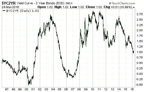
The most important fundamental driver of the gold market that hasn’t yet begun to move in a gold-bullish direction is the US yield curve, represented on the following chart by the 10yr-2yr yield spread. The yield curve is bullish for gold when it is getting steeper, as indicated by a rising 10yr-2yr yield spread (a rising line on the following chart). With the 10yr-2yr yield spread having recently made a new 8-year low and not yet shown any sign of reversing upward, the yield curve remains unequivocally gold-bearish.

yieldspread_blog_250316

The yield curve is also one of the most important economic indicators to not yet warn of a US recession. Note that contrary to popular opinion it isn’t an inversion of the yield curve (the 10yr-2yr yield spread dropping below zero) that warns of a recession, it’s a trend reversal from flattening to steepening after the yield-spread has fallen to a multi-year low.

Based on what happened over the past 50 years, a trend reversal in the yield spread is not a prerequisite for a gold bull market. As long as sufficient other fundamental drivers (e.g. credit spreads and the real interest rate) are gold-bullish it is possible for gold to commence a bull market in the absence of a supportive yield curve. This is exemplified by the bull market that began during 1976-1977. However, it would be unprecedented for a US recession to begin in the absence of an upward reversal in the 10-yr-2yr yield spread.

Print This Post Print This Post

The great inflation-unemployment trade-off stupidity

March 22, 2016

The 15th March Financial Times article that I rubbished in a blog post last week contained the comment: “the 1970s ‘Phillips Curve’ trade-off between unemployment and inflation is alive and well“. Unbeknownst to me at the time, since I never tune in to Federal Reserve press events, Fed chief Janet Yellen said almost exactly the same thing at the 17th March post-FOMC press conference. Specifically, she said: “The Phillips Curve is alive“, by which she meant the purported trade-off between general price inflation and unemployment (the idea that lower unemployment generally comes at the cost of higher inflation and lower inflation generally comes at the cost of higher unemployment) was becoming an important consideration. This statement reveals cluelessness in three different ways.

First, the Phillips Curve and the theory behind it does NOT suggest that there is a trade-off between unemployment and general price inflation. In fact, it says nothing whatsoever about the relationship between general price inflation and unemployment. The Phillips Curve is about the relationship between changes in REAL wages and changes in employment. It is basic supply-demand stuff. As explained by John Hussman back in 2011:

Phillips demonstrated a principle that is well-known to every economist: very simply, when a useful resource becomes scarce, its price tends to increase relative to the prices of other goods and services. That finding doesn’t need all sorts of intellectual contortions or modeling tricks to make it “work,” because it is one of the most basic laws of economics.

The true Phillips Curve, then, is a relationship between unemployment and real wages. When workers are scarce, wages tend to rise faster than the general price level. When workers are plentiful, wages tend to rise slower than the general price level.

Second, the empirical data clearly show that there is no consistent relationship between general price inflation and unemployment. The above-linked Hussman article includes the relevant evidence in chart form. That is, even if the misrepresentation and misuse of the Phillips Curve is put aside, no economist who has bothered to check the historical data could believe in the inflation-unemployment trade-off.

Third, any half-decent economist would realise that there is no basis under sound economic theory for there to be a trade-off between unemployment and “price inflation”. The simple reason is that economic progress, which usually leads to more opportunities for employment, results from increasing productivity and, all else being equal, would therefore tend to be associated with a falling, not a rising, general price level. That is, all else being equal there should be a positive correlation rather than a trade-off between unemployment and “price inflation”. Of course, in the real world all is not equal, first and foremost because the central bank is constantly manipulating prices. Based on the fatally flawed models to which they are committed, central banks try to curtail the decline in the general price level that would naturally stem from economic progress. In doing so they falsify the price signals upon which the market economy relies, thus creating greater inefficiency.

The nicest thing I can say about Janet Yellen is that she doesn’t appear to be as stupid and dangerous as Mario Draghi, although I’ll change my mind about that if she ends up taking the Fed down the negative-interest-rate path.

Print This Post Print This Post

Are speculators too optimistic about the gold price?

March 21, 2016

Jordan Roy-Byrne recently posted an interesting video discussing gold’s Commitments of Traders (COT) data. The video was a response to numerous articles warning that the COT situation was flashing a danger signal. I agree with Jordan’s interpretation, which is that the COT data are probably not predicting a large decline in the gold price.

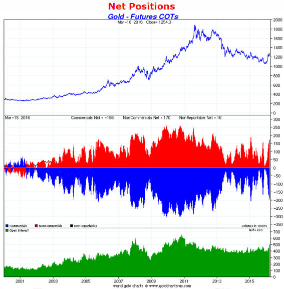
The main point of the above-linked video is similar to a point I’ve made numerous times in TSI commentaries over the years. The point is that there are no absolute benchmarks when it comes to sentiment indicators in general and the COT situation in particular (the COT reports are nothing more than sentiment indicators). A level that constitutes an ‘overbought’ warning in a bear market will usually not be applicable in a bull market, in that during a multi-year bullish trend the market will tend to become more ‘overbought’ and stay ‘overbought’ for longer. Of particular relevance, the speculative net-long position in gold futures that coincides with a short-term price top will generally reach much higher levels during a bull market than during a bear market. In fact, by the time a bull market has been in progress for 2-3 years the levels that marked short-term ‘overbought’ extremes during the preceding bear market could now mark short-term ‘oversold’ extremes.

In other words, sentiment must be considered within the context of the long-term price trend.

Unfortunately, in the early part of a new long-term trend there is usually no way to know, for sure, that the trend has changed. In gold’s case there is evidence that a cyclical bull market has begun, but the evidence is not yet conclusive. That’s why it is prudent to take information such as the COT data at face value.

I view gold’s current COT situation, which is reflected on the following chart from Sharelynx.com, as a valid warning that short-term downside risk is at least as high as the remaining short-term upside potential. At the same time I realise that if gold has entered a new cyclical bull market then the speculative net-long position (the red bars on the chart) is going to get much larger within the coming two years.

goldCOT_210316

Print This Post Print This Post