[This blog post is an excerpt from a recent commentary published at www.speculative-investor.com]
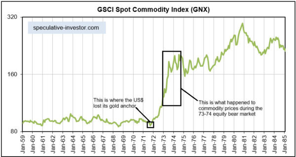
We expect that a 1-2 year or perhaps even longer upward trend in commodity prices will begin this year. Although we will refer to this upward trend as a bull market, strictly speaking it shouldn’t be labelled as such. This is because there actually is no such thing as a commodity bull market, meaning a bull market in a broad index of commodities such as the GSCI Spot Commodity Index (GNX) or the CRB Index. There are only gold bull markets that eventually expand to encompass most commodities. In other words, what we are anticipating is an expansion of the gold bull market to encompass most other commodities.
Gold bull markets begin and are sustained by monetary and governance factors. In short, there is a decline in confidence in the official money and/or the banking system and/or the government that causes an increase in the demand for gold, meaning an increase in the desire to hold gold bullion. These bull markets have nothing to do with gold supply, since for all intents and purposes the supply of gold is constant over a normal investment timeframe*.
Eventually, the issues that have been discounted by the gold market lead to higher prices for many other commodities, but, for all commodities other than gold and to a lesser extent silver, supply can be a major price driver. In fact, the non-monetary commodities that have the most severe supply restrictions tend to be the ones that rise in price the most after monetary/governance factors set in motion a broad upward trend.
Every cycle is different in some way and this time around one of the major differences has been the extent to which price trends have been elongated by the concerted attempts, during 2023-2024, to counteract the Fed’s monetary tightening by pre-emptive recession-like deficit spending on the part of the US government and actions by both the Fed and the Treasury that sustained ‘liquidity’ in the financial markets. These actions postponed the start of a US recession by 1-2 years and also, we think, substantially widened the gap between the start of a gold bull market and the start of a broad upward trend in commodity prices (a gold bull market began in Q4-2022 and a general commodity bull market is yet to begin).
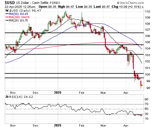
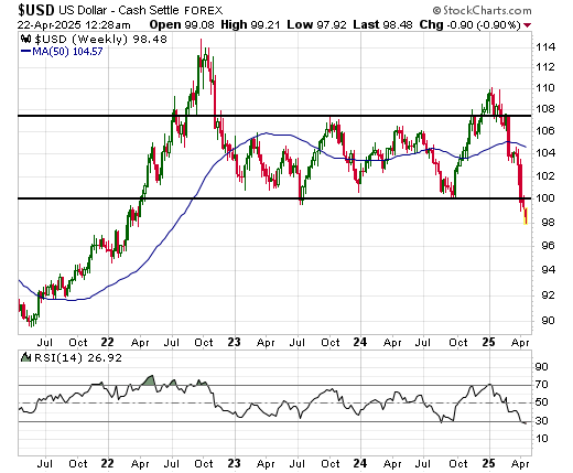
Just as the performance of the gold price telegraphed weakness in the US dollar, it is telegraphing a large, broad upward trend in commodity prices. Furthermore, the upward price trend will be exacerbated by artificial shortages caused by Trump’s trade war. Like the Covid lockdowns, the tariffs and the uncertainty regarding future tariffs have disrupted and will continue to disrupt supply chains.
We expect that a broad upward trend in commodity prices will begin after it becomes sufficiently clear that the US economy is in recession to prompt monetary and fiscal measures designed to stimulate economic activity. This is likely to happen before the end of this year and could happen as soon as the next three months.
*Almost all the gold that has ever been mined remains available to satisfy demand today, with the global mining industry adding only about 1% to this existing stockpile every year.