The pace of US money-supply growth slows to a crawl. Is this a major problem for the stock market?

April 22, 2019

A popular view is that the Fed has given up on monetary tightening and as a result the stock market should continue to trend upward over the months ahead. This view is based on flawed reasoning.

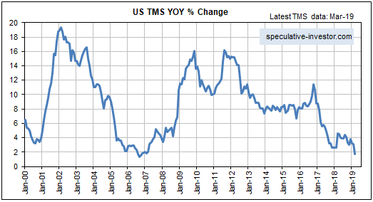
The reality is that the Fed possibly will give up on monetary tightening later this year, but currently the Fed is pulling quite firmly on the monetary reins via its on-going balance-sheet normalisation (that is, balance-sheet reduction) program. Moreover, the Fed’s on-going withdrawal of money from the economy is not being fully offset by the actions of the commercial banks, so the overall US money-supply situation is becoming increasingly restrictive. This is evidenced by the following chart of the year-over-year (YOY) change in US True Money Supply (TMS). The chart shows that in March-2019 the US monetary inflation rate made a 12-year low.

However, the unusually slow pace of US money-supply growth is not a good reason to be short-term bearish on the US stock market. This is partly because changes in the financial markets lag changes in the monetary backdrop by long and variable amounts of time. It is also because of a point that was covered in a TSI blog post about three weeks ago.

The point I’m referring to is that whether the overall monetary situation is ‘tightening’ or ‘loosening’ is not solely determined by the change in money supply. Instead, over periods of up to a few years the change in the demand for money (meaning: the change in the desire to hold/obtain cash as an asset) often will dominate the change in the supply of money.

In general terms, the change in overall liquidity is determined by the change in the supply of money relative to the change in the demand to hold cash or cash-like securities. As a consequence, it’s possible for the liquidity situation to be tight even if the monetary inflation rate is very high and/or rapidly increasing. A great example is the period from September-2008 to March-2009, when a large and fast increase in the US money supply was more than offset by a surge in the demand for money. Also, it’s possible for there to be abundant liquidity even if the monetary inflation rate is very low. A good example occurred over the past 3-4 months.

Although the supply side of the monetary equation tends to be dominated by the demand side of the equation over the short-to-intermediate-term, today’s unusually low monetary inflation rate is still significant. It means that only a small increase in the demand to hold cash could bring about another plunge in the stock market. To put it another way, due to the low monetary inflation rate the US stock market is far more vulnerable than usual to a short-term increase in risk aversion.

Taking a wider-angle view, the money-supply situation also leads to the conclusion that if a bear market did not begin last year (it most likely didn’t) then it will begin by the second half of next year at the latest. Other indicators will be required to narrow-down the timing.

The gold/commodity ratio makes another T-Bond forecast

April 9, 2019

[In a blog post last October I mentioned that a recent divergence between the gold/commodity ratio and the T-Bond price had bullish implications for the T-Bond. A strong rebound in the T-Bond soon got underway. Another divergence between the gold/commodity ratio and the T-Bond price has since developed, this time with bearish implications for the T-Bond. A discussion of the most recent divergence was included in a TSI commentary published on 28th March and is reprinted below.]

The gold/commodity (g/c) ratio and the T-Bond price tend to move in the same direction. As previously explained, this tendency is associated with what Keynesian economists call a paradox (“Gibson’s Paradox”) and Austrian economists call a natural and perfectly understandable consequence of the relationship between time preference and prices. The reason for revisiting the gold-bond relationship today is that a significant divergence developed over the past three months and such divergences are usually important.

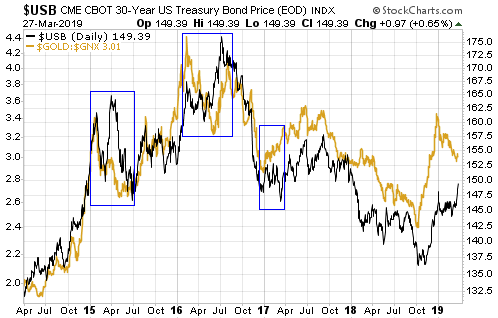
The following chart illustrates our point that the gold/commodity ratio (the US$ gold price divided by the GSCI Spot Commodity Index) and the T-Bond price move in the same direction most of the time. It also shows that over the past three months the two quantities have diverged, with the g/c ratio trending downward while the T-Bond price extended its upward trend and moved to a marginal new 12-month high.

Given that the relationship between the g/c ratio and the T-Bond has a solid fundamental basis, that is, given that it’s not a case of random correlation, it should continue to apply. Therefore, we expect that the divergence will close over the months ahead — via either a rise in the g/c ratio to above its December-2018 high or a decline in the T-Bond price to well below its February-2019 low.

The divergence probably will close via a decline in the T-Bond price, because if there is a leader in this relationship it is the g/c ratio. For example, in each of the three biggest divergences of the past five years (the areas inside the blue boxes drawn on the above chart), the g/c ratio reversed course months in advance of the T-Bond. The g/c ratio also led the T-Bond by 2-3 months at the Q3-2017 top and by a couple of weeks at the Q4-2018 bottom. In other words, the recent performance of the g/c ratio is a reason to be intermediate-term bearish on the T-Bond.

One realistic possibility is that the T-Bond is now topping similarly to how it bottomed between December-2016 and March-2017. Back then, both the g/c ratio and the T-Bond turned up at around the same time (in late December of 2016), but whereas the g/c ratio trended upward throughout the first quarter of 2017 the T-Bond made a marginal new low in March before commencing an upward trend of its own. This time around the g/c ratio and the T-Bond turned down at around the same time (in late December of 2018), but whereas the g/c ratio has continued along a downward path the T-Bond has risen to a marginal new multi-month high.

Money supply is only part of the monetary story

April 2, 2019

[This blog post is an excerpt from a recent TSI commentary]

The Quantity Theory of Money (QTM) holds that the change in money Purchasing Power (PP) is proportional to the change in the Money Supply (MS). It’s a bad theory, because it doesn’t reflect reality.

There are three main reasons that QTM doesn’t work in the real world, the first being that money PP can’t be expressed as a single number. There is no such thing as the “general price level”. Instead, at any point in time there are millions of individual prices that cannot be averaged to arrive at something sensible. That being said, QTM wouldn’t work even if it were possible to determine the “general price level”.

The second reason that QTM doesn’t work in the real world is that new money never gets injected uniformly throughout the economy. A consequence is that different prices get affected in different ways at different times, depending on who the first receivers of the new money happen to be. For example, during normal times the commercial banks are responsible for almost all money creation, with new money entering the economy via loans to the banks’ customers, whereas during 2008-2014 most new US dollars were created by the Fed and injected into the financial markets via the purchasing of bonds.

However, even if there existed a single number that accurately represented money PP and new money was injected uniformly throughout the economy, the Quantity Theory of Money STILL wouldn’t work. The reason is that as is the case with the price of anything, the price of money is determined by supply AND demand. (As an aside, in the real world there is no such thing as money velocity.) In other words, the price (PP) of money never could be properly explained/understood by reference to only the supply of money. We’ll now expand on this point.

Over the very long term, changes in money supply dominate changes in money demand, where by money demand we mean the desire to hold cash as an asset rather than the desire to obtain money to facilitate current purchases. However, during periods of up to a few years the change in money demand often will dominate the change in money supply. A good example is September 2008 through to March 2009. During this period the Fed rapidly increased the money supply, but the Fed’s actions were overwhelmed by increasing demand for money. Furthermore, when prices suddenly started rising in March-April of 2009 it was not only because the money supply had grown, but also because the demand for money had begun to fall.

In relation to the above it’s important to understand that in addition to affecting the supply of money, the Fed and other central banks affect the demand for money. This is very relevant to the recent past. Over the past three months the Fed continued to reduce the money supply, but statements emanating from the Fed had the effect of reducing the desire to hold cash. The net effect was a general increase in ‘liquidity’ even while the Fed acted to reduce the money supply.

Unfortunately, there is no way to analyse the monetary situation that is both simple and accurate. In particular, there is no simple equation that indicates the real-world relationship between money supply and money purchasing-power.

The fundamental backdrop remains slightly bullish for gold

March 26, 2019

I haven’t discussed gold’s true fundamentals* at the TSI Blog since early December of last year, at which time I concluded: “All things considered, for the first time in many months the true fundamentals appear to be slightly in gold’s favour. If the recent trend in the fundamental situation continues then we should see the gold price return to the $1300s early next year…” The “recent trend in the fundamental situation” did continue, enabling my Gold True Fundamentals Model (GTFM) to turn bullish at the beginning of this year (after spending almost all of 2018 in bearish territory) and paving the way for the US$ gold price to move up to the $1300s.

The following weekly chart shows that after moving slightly into the bullish zone (above 50) at the beginning of January, the GTFM has flat-lined (the GTFM is the blue line on the chart, the US$ gold price is the red line). Based on the current positions of the Model’s seven inputs, its next move is more likely to be further into bullish territory than a drop back into bearish territory.

As an aside, the bullish fundamental backdrop does not preclude some additional corrective activity in the near future.

GTFM_260319

The most important GTFM input that is yet to turn bullish is the yield curve, as indicated by the 10year-2year yield spread or the 10year-3month yield spread. This input shifting from bearish to bullish requires a reversal in the yield curve from flattening (long-term rates falling relative to short-term rates) to steepening (long-term rates rising relative to short-term rates). If the reversal is driven primarily by falling short-term interest rates it indicates a boom-to-bust transition, such as occurred in 2000 and 2007, whereas if the reversal is driven primarily by rising long-term interest rates it points to increasing inflation expectations.

As illustrated below, at the end of last week there was no evidence of such a trend change in the 10year-3month yield spread.

The US$ gold price could rise to the $1400s during the second quarter of this year as part of an intermediate-term rally, but to get a gold bull market there probably will have to be a sustained trend reversal in the yield curve.

*I use the term “true fundamentals” to distinguish the actual fundamental drivers of the gold price from the drivers that are regularly cited by gold-market analysts and commentators. According to many pontificators on the gold market, gold’s fundamentals include the volume of metal flowing into the inventories of gold ETFs, China’s gold imports, the volume of gold being transferred out of the Shanghai Futures Exchange inventory, the amount of “registered” gold at the COMEX, India’s monsoon and wedding seasons, jewellery demand, the amount of gold being bought/sold by various central banks, changes in mine production and scrap supply, and wild guesses regarding JP Morgan’s exposure to gold. These aren’t true fundamental price drivers. At best, they are distractions.