Monetary Inflation Roundup

May 14, 2019

[This blog post is an excerpt from a recent TSI commentary]

Here is our monthly update on what’s happening on the monetary inflation front in a few different regions/countries.

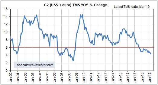
The G2 (US plus euro-zone) monetary inflation rate dropped to a 10-year low in March-2019 and has now spent 19 months below the boom-bust threshold of 6%. Refer to the following chart for details.

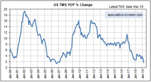
The low rate of G2 monetary inflation stems from the very low rate of money-supply growth in the US. During March the year-over-year (YOY) rate of growth in euro supply was 7.6%, which although well down from a 2014 peak of 14% is still quite high. The rate of growth in US$ supply, however, was only 1.8%.

The slow (by modern standards) rate of G2 money-supply growth boosts the risk that a global recession will begin in 2019, but, as noted in the past, the monetary inflation rate is a long-term indicator that leads economic and financial-market conditions by amounts of time that can vary substantially from one cycle to the next. When attempting to predict the start time of the next recession we therefore rely on other leading indicators, three of which were discussed in last week’s Interim Update.

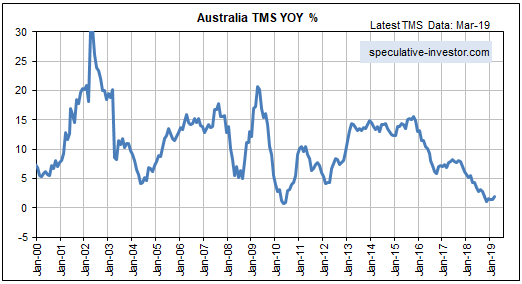
Australia’s monetary inflation rate has picked up a little over the past few months, but the country remains on the verge of monetary deflation.

The very slow money-supply growth has had an effect on Australia’s property market, in that over the past 12 months residential property prices have fallen by an average of 6.9% on a nationwide basis and 10.9% in Sydney (the largest and most expensive city in Australia). Refer to the article posted HERE for more detail.

Actually, the decline to near zero in Australia’s monetary inflation rate is both a cause and an effect of the slight (to date) deflation of the property investment bubble. Commercial banks have been making it more difficult for house buyers to obtain credit, leading to a pullback in prices and a slowdown in the pace at which new money is created.

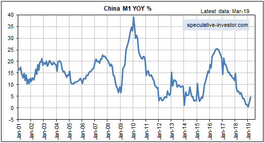
In January-2019 the year-over-year (YOY) growth rate of China’s M1 money supply dropped to its lowest level since 1989. There was an insignificant up-tick in February, but the recent attempts by China’s government to promote credit expansion started to ‘bear fruit’ in March. Refer to the following chart for details.

We wonder if this is too little too late to kick-start a new surge in the demand for industrial commodities.

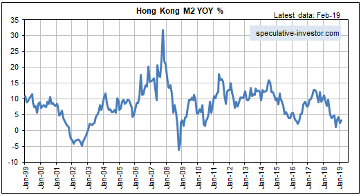
Hong Kong hasn’t escaped the general monetary-inflation slowdown. As illustrated below, the YOY rate of growth in HK’s M2 money supply has languished near a 10-year low in the 1%-4% range over the past several months.

Remarkably, HK’s low monetary inflation rate is yet to have a pronounced effect on the world’s most expensive real estate. Property prices dropped in HK during August-December of last year, but they rose in January and the majority view is that a rise to new highs is in store.

Due to the monetary backdrop, we think there’s a high risk of a double-digit decline in HK property prices over the next 12 months.

Almost everyone knows that the Bank of Japan (BOJ) has pumped a huge amount of money into the Japanese economy, so the lack of “price inflation” in Japan is something of a quandary. Analysts have let their imaginations run wild in an attempt to explain this strange set of circumstances, and the situation in Japan has even been cited as proof that increasing the money supply doesn’t cause prices to rise. However, anyone who didn’t blindly assume that the BOJ’s actions were leading to rapid money-supply growth and instead took the trouble to check what was actually happening to Japan’s money supply would quickly realise that explaining Japan’s lack of “price inflation” requires no stretch of the imagination. The fact is that Japan’s monetary inflation rate over the past 25 years has been consistent with an “inflation” rate of approximately zero.

The persistently low rate of monetary inflation in Japan is illustrated by the following chart. The chart shows that the YOY rate of increase in Japan’s M2 money supply averaged about 2% over the past 27 years and about 2.5% over the past 10 years. It is currently about 2.4%. Assuming productivity growth of 2%-3%, these money-supply figures are consistent with a flat general price level.

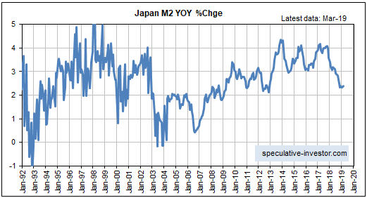
Note that QE in Japan is different from QE in the US. When the Fed implements QE it boosts the supply of bank reserves and the supply of money on a one-for-one basis (bank reserves aren’t counted in the money supply), but the BOJ’s QE adds far more to bank reserves than to the money supply. Note also that the Fed’s QE created a lot less “price inflation” than many people were expecting for the reasons outlined HERE.

The Japanese economy has benefited from the persistently slow rate of monetary inflation and the resulting stability of the currency, but at the same time it has been hurt by the massive diversion of resources to the government. The net result is an economy that isn’t exactly vibrant, but also isn’t that bad.

To summarise the above information, the pace at which new money is being created around the world remains unusually slow.

What is GLD’s gold inventory telling us?

May 6, 2019

An increase in the amount of gold bullion held by GLD (the SPDR Gold Shares) and other bullion ETFs does not cause the gold price to rise. The cause-effect works the other way around and in any case the amount of gold that moves in/out of the ETFs is always trivial compared to the metal’s total trading volume. However, it is reasonable to view the change in GLD’s gold inventory as a sentiment indicator.

Ironically, an increase in the amount of physical gold held by GLD and the other gold ETFs is indicative of increasing speculative demand for “paper gold”, not physical gold. As I explained in previous blog posts (for example, HERE), physical gold only ever gets added to GLD’s inventory when the price of a GLD share (a form of “paper gold”) outperforms the price of gold bullion. It happens as a result of an arbitrage trade that has the effect of bringing GLD’s market price back into line with its net asset value (NAV). Furthermore, the greater the demand for paper claims to gold (in the form of ETF shares) relative to physical gold, the greater the quantity of physical gold that gets added to GLD’s inventory to keep the GLD price in line with its NAV.

Speculators in GLD shares and other forms of “paper gold” (most notably gold futures) tend to become increasingly optimistic as the price rises and increasingly pessimistic as the price declines. That’s the explanation for the positive correlation between the gold price and GLD’s physical gold inventory illustrated by the following chart. That’s also why intermediate-term trend reversals in the GLD gold inventory tend to follow reversals in the gold price. The thick vertical lines on the following chart mark the intermediate-term trend reversals in the US$ gold price.

GLDinventory_060519

Interestingly, the increase in the GLD inventory that occurred in parallel with the most recent upward trend in the gold price was relatively small. This suggests that the price rally was driven more by increasing demand for physical gold than by increasing demand for paper gold. Furthermore, the minor downward correction in the gold price since the February-2019 short-term peak has been accompanied by a disproportionately large decline in GLD’s physical inventory. In fact, at the end of last week GLD held about 30 tonnes less gold than it did when the gold price was bottoming in the $1170s last August. Again, this suggests that the gold price has been supported by demand for the physical metal.

In terms of influence on the gold price, speculative trading of gold futures is vastly more important than speculative trading of GLD shares. Therefore, assumptions about paper versus physical demand shouldn’t be based solely on the change in the GLD inventory. The situation in the gold futures market also must be taken into account.

I won’t get into the details in this post, but changes in futures-market positioning and open interest over the past few months are consistent with the idea that the demand for physical gold has been strong relative to the demand for paper gold.

The relatively strong demand for physical gold does not imply that a big gold-price rally is coming, but it does imply that the downside price risk is low.

Gold, Commodities, and Bob Moriarty’s New Book

April 29, 2019

If you look hard enough you will always be able to find reasons that the gold price is about to rocket upward, because such reasons always exist regardless of whether gold’s prospects are bullish or bearish. More generally, searching for reasons that something specific is about to happen is a bad way to speculate or invest because it will always be possible to find evidence to support any preconceived view. Rather than attempting to justify preconceived views, it is much better to approach the markets with an open mind and to base buy/sell decisions on objective indicators with good long-term track records.

One of the financial world’s most reliable indicators is the gold/commodity (g/c) ratio. The g/c ratio is more predictable than the US$ gold price, or to be more accurate the g/c ratio has a more consistent relationship with other markets than does the US$ gold price. This is possibly because removing the ever-changing dollar from the equation suppresses ‘noise’ and amplifies ‘signal’.

The following chart is an example of the g/c ratio’s consistent, and therefore predictable, relationship with another market. It shows that almost all of the time the g/c ratio (as represented by the US$ gold price divided by the GSCI Spot Commodity Index) trends in the same direction as credit spreads (represented here by the IEF/HYG ratio).

The relationship depicted below is sufficiently reliable that if you know, or at least have a good idea regarding, what will happen to credit spreads over a certain period, then you will be able to accurately forecast whether gold will strengthen or weaken relative to the average commodity over the period. By the same token, knowledge about whether gold is poised to strengthen or weaken relative to the average commodity leads to a high-probability forecast about credit spreads.

gold_creditsp_290419

There are other inter-market relationships involving the g/c ratio that work just as well as the one mentioned above, and at the beginning of this year I used one of these to forecast that gold would be weak relative to commodities during the first half and strong relative to commodities during the second half of 2019. The first-half forecast has panned out to date. The second-half forecast still looks plausible but is subject to revision based on what happens to various indicators over the next couple of months.

Another of the financial world’s most reliable indicators is sentiment. An accurate reading of market sentiment doesn’t lead to specific conclusions about future price movements, and as discussed HERE there are pitfalls associated with using sentiment to guide buy/sell decisions. However, understanding how sentiment affects the markets can give an investor a decisive edge.

I’m not going to write about why or how sentiment can be used to good effect when attempting to time buys and sells in the financial markets. I’m also not going to mention the most useful indicators of market sentiment. The reason is that Bob Moriarty has covered this ground and more in his latest book: “Basic Investing in Resource Stocks: The Idiot’s Guide“. The Kindle version of the book is only US$6, or just a little more than the price of a large cappuccino at my local cafe.

Bob’s book is essential reading for anyone speculating in junior resource stocks, especially anyone who is inexperienced or hasn’t coped well with the huge swings in these stocks in the past.

At one point during the book I thought that Bob was making successful speculation in the stocks of small mining and oil companies seem too easy, because the hard reality is that even when you understand the most effective way to trade these stocks you still will stumble into traps from time to time. However, later in the book Bob warns the reader that large losses can happen even when all the ducks appear to be in a row. He does this by recounting some amusing stories about his own failed speculations and the management teams that helped to create these failures.

Even if you already know how to use sentiment and how to operate profitably at the speculative end of the stock market, you will get something out of the Bob Moriarty book linked above. It’s well worth the 6 bucks for the electronic version or the 12 bucks for the paper version.

The pace of US money-supply growth slows to a crawl. Is this a major problem for the stock market?

April 22, 2019

A popular view is that the Fed has given up on monetary tightening and as a result the stock market should continue to trend upward over the months ahead. This view is based on flawed reasoning.

The reality is that the Fed possibly will give up on monetary tightening later this year, but currently the Fed is pulling quite firmly on the monetary reins via its on-going balance-sheet normalisation (that is, balance-sheet reduction) program. Moreover, the Fed’s on-going withdrawal of money from the economy is not being fully offset by the actions of the commercial banks, so the overall US money-supply situation is becoming increasingly restrictive. This is evidenced by the following chart of the year-over-year (YOY) change in US True Money Supply (TMS). The chart shows that in March-2019 the US monetary inflation rate made a 12-year low.

However, the unusually slow pace of US money-supply growth is not a good reason to be short-term bearish on the US stock market. This is partly because changes in the financial markets lag changes in the monetary backdrop by long and variable amounts of time. It is also because of a point that was covered in a TSI blog post about three weeks ago.

The point I’m referring to is that whether the overall monetary situation is ‘tightening’ or ‘loosening’ is not solely determined by the change in money supply. Instead, over periods of up to a few years the change in the demand for money (meaning: the change in the desire to hold/obtain cash as an asset) often will dominate the change in the supply of money.

In general terms, the change in overall liquidity is determined by the change in the supply of money relative to the change in the demand to hold cash or cash-like securities. As a consequence, it’s possible for the liquidity situation to be tight even if the monetary inflation rate is very high and/or rapidly increasing. A great example is the period from September-2008 to March-2009, when a large and fast increase in the US money supply was more than offset by a surge in the demand for money. Also, it’s possible for there to be abundant liquidity even if the monetary inflation rate is very low. A good example occurred over the past 3-4 months.

Although the supply side of the monetary equation tends to be dominated by the demand side of the equation over the short-to-intermediate-term, today’s unusually low monetary inflation rate is still significant. It means that only a small increase in the demand to hold cash could bring about another plunge in the stock market. To put it another way, due to the low monetary inflation rate the US stock market is far more vulnerable than usual to a short-term increase in risk aversion.

Taking a wider-angle view, the money-supply situation also leads to the conclusion that if a bear market did not begin last year (it most likely didn’t) then it will begin by the second half of next year at the latest. Other indicators will be required to narrow-down the timing.