Physical gold ‘flowing’ into GLD and the other gold ETFs does not cause the gold price to rise and physical gold flowing out of gold ETFs does not cause the gold price to fall. The cause and effect actually works the other way around, with the price change being the cause and the flow of gold into or out of the ETFs being the effect. I’ve covered the reasons before (for example, HERE and HERE), but cause and effect are regularly still being mixed up in gold-related articles so I’m revisiting the topic.
The Net Asset Value (NAV) of a gold ETF such as GLD naturally moves up and down by the same percentage amount as the gold price, so a change in the gold price will not necessarily require any change in the size of GLD’s bullion inventory. It’s only when GLD’s market price deviates from its own NAV that a change in bullion inventory occurs. For example, assume that the gold price gains 10%. In this case, GLD’s NAV will gain 10% and there will be no increase or decrease in GLD’s inventory as long as GLD’s market price also rises by 10%. However, if GLD’s market price rises by 11% then gold will be added to the ETF’s inventory to bring its market price and NAV back into line, and if GLD’s market price rises by only 9% then gold will be removed from the ETF’s inventory to bring its market price and NAV back into line.
Note that the manager of the ETF doesn’t have to initiate anything in the above-described process. The ETF’s Authorised Participants (APs) initiate the process in order to generate arbitrage profits. More specifically, a deviation between market price and NAV creates an opportunity for the ETF’s APs to pocket risk-free profits by selling or buying gold bullion and simultaneously buying or selling ETF shares.
All ETFs work the same way. That is, there’s nothing special about the way GLD works. The modus operandi ensures that the market prices of ETFs usually track their NAVs very closely.
Why, then, does the following chart show a long-term positive correlation between the gold price and GLD’s bullion inventory?
Because traders of GLD shares tend to get more optimistic about gold’s prospects and buy more aggressively AFTER the gold price has risen, causing GLD’s market price to rise relative to its NAV and prompting arbitrage that results in the addition of bullion to the ETF’s inventory. And because traders of GLD shares tend to become more pessimistic about gold’s prospects and sell more aggressively AFTER the gold price has fallen, causing GLD’s market price to fall relative to its NAV and prompting arbitrage that results in the removal of bullion from the ETF’s inventory. The correlation is far from perfect, because GLD traders won’t always become increasingly optimistic in reaction to a price rise or increasingly pessimistic in reaction to a price decline.
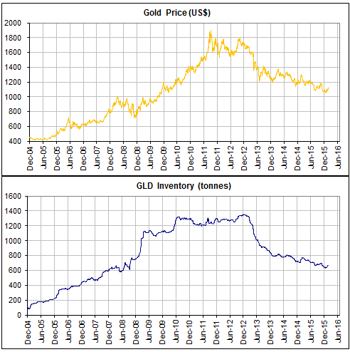
A final point worth making is that the annual change in GLD’s bullion inventory has always been very small relative to the total size of the gold market. Given the size of the total aboveground gold supply, there is very little chance that a few hundred tonnes per year moving into or out of GLD’s coffers could have a significant effect on the price.
So, the answer to the question “What do changes in GLD’s bullion inventory tell us about the future gold price?” is: nothing.