[This blog post is an excerpt from a recent commentary at www.speculative-investor.com]
Based on their extreme valuations, AI-focussed equities are in a bubble and have been for a considerable time, but what about the investments in AI infrastructure such as datacentres, semiconductors, servers and the associated power supplies? Does the rapid rate of investing in AI-related hardware, software and buildings constitute a bubble?
We suspect that it does, but at this time there is no way of knowing. Investment that turns out to be malinvestment always is based on forecasts of future demand that prove to be far too optimistic, but not all optimistic forecasts of future demand turn out to be wrong.
One sign that the investment underway in AI-related hardware and software constitutes a bubble is the creative ways that are being used to fund it. For example, the following meme reflects how three of the most important companies in the AI world recently funded each other. NVIDIA invested US$100B in OpenAI, which used the money to buy server capacity from Oracle, which used the money to purchase chips from NVIDIA. This circular transaction boosted the equity valuations and the revenues of all three companies involved.

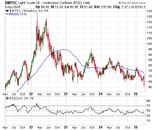
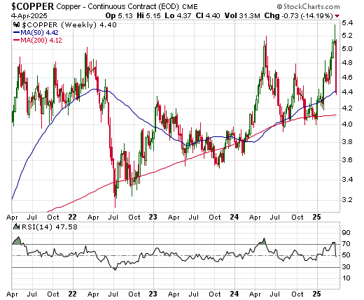
Our 1-2-year bullish outlooks for some industrial commodities, including natural gas, uranium, copper and tin, are linked in part to the AI buildout. Therefore, could the bursting of the AI bubble cut-short the cyclical commodity bull market?
We don’t think so, for six reasons.
First, even if the stock prices of AI-focussed companies were to crash soon, the investment in the associated AI infrastructure probably would add significantly to commodity demand for at least another two years. This is based on the datacentres already under construction and planned to commence construction in the near future.
Second, there are other important potential drivers of increased commercial demand for commodities, chief among them being the rebuilding of Ukraine, the rebuilding of Gaza and the construction of the massive Yarlung Tsangpo Hydroelectric Project in China.
Third, restrictions on international trade are likely to put upward pressure on commodity prices in some parts of the world, including the US, by making the international trading of commodities less efficient. For example, whereas previously it would have made sense to import a commodity rather than produce it locally, due to tariffs it could make more sense to produce locally. However, it generally takes several years to build a new mine and the mine-building process itself consumes large quantities of commodities.
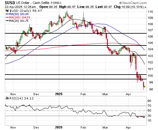
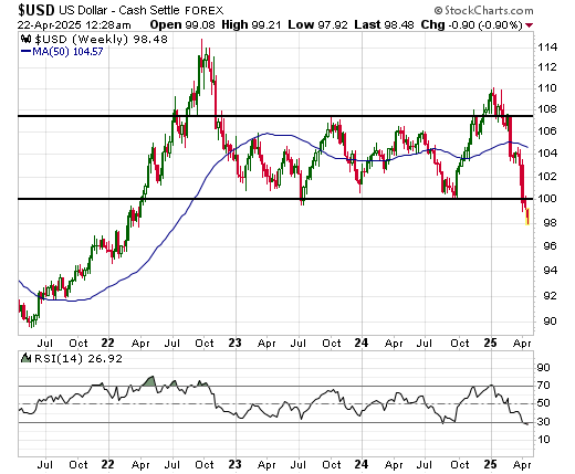
Fourth, the combination of a weaker US$ and increased government spending around the world will both support the commercial demand for commodities and boost the speculative demand for commodities as an inflation hedge.
Fifth, even though investment in ‘renewable’ energy such as solar and wind is now being de-emphasised or actively discouraged by the US government, there continues to be massive investment in these forms of energy around the world and especially in China. This will boost the commercial demand for industrial metals.
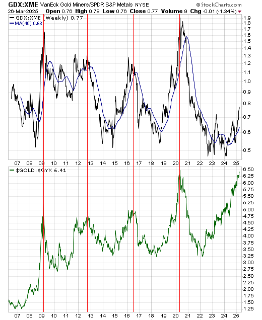
Sixth, the gold bull market of the past few years projects a commodity bull market over the next few years (commodity bull markets are just gold bull markets that have broadened).
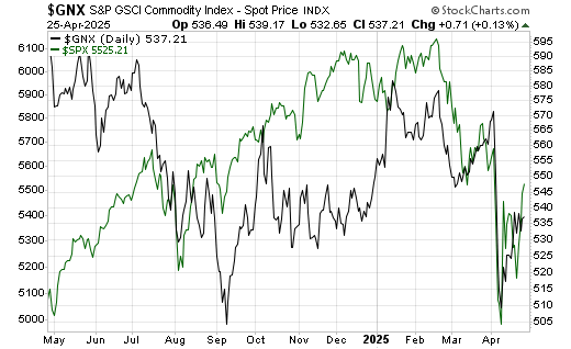
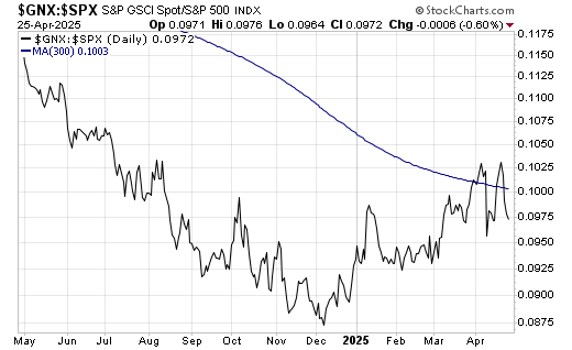
In our opinion, the rise in the prices of some commodities over the past six months is just a taste of what’s to come.