The Investment Seesaw

June 11, 2022

[This blog post is an excerpt from a TSI commentary published on 5th June 2022]

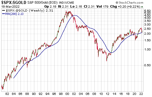
A point we’ve made many times in the past* is that gold and the world’s most important equity index (the S&P500 Index – SPX) are at opposite ends of a virtual investment seesaw. Due to their respective natures, if one is in a long-term bull market then the other must be in a long-term bear market. In multi-year periods when they are both trending upward in dollar terms it means that the dollar is in a powerful bear market, not that gold and the SPX are simultaneously in bull markets (the one that is actually in a bull market will be determined by the performance of the gold/SPX ratio). Recently, our ‘investment seesaw’ concept was part of the inspiration for the Synchronous Equity and Gold Price Model (SEGPM) created by Dietmar Knoll. This model is a quantitative relationship between the SPX, the US$ gold price and the US money supply (the model uses the M2 monetary aggregate), and is explained on pages 251-266 of Incrementum’s latest “In Gold We Trust” report.

Before delving into how the SEGPM works, it’s worth pointing out that there have been previous attempts to link changes in the stock market and the gold price to changes in the money supply. These attempts failed. With regard to the stock market they failed because a strong positive correlation between the senior equity index and the money supply only exists during equity bull markets, that is, the money supply in isolation fails to account for the major swings in the stock market. For example, during the 9-year period from March-2000 to March-2009 there was huge growth in the US money supply, but the SPX was 50% lower at the end than it was at the start of this period.

With regard to the gold market the aforementioned attempts failed first and foremost because the underlying premise is wrong, in that there is no good reason for the gold price to track the US money supply. Also, we know from the historical record that valuations for gold that are based solely on the US money supply can deviate hugely from the real world for DECADES at a time, which means that they have no practical value.

The sorts of models mentioned above have never worked over complete cycles because they consider the SPX and the money supply or gold and the money supply, as opposed to an SPX-gold combination (both ends of the ‘investment seesaw’) and the money supply.

The SEGPM is based on the idea that there are periods when an increase in the money supply will boost the SPX more than it will boost the gold price and other periods when an increase in the money supply will boost the gold price more than it will boost the SPX, with the general level of trust/confidence** in money, the financial system and government determining whether the SPX or gold is the primary beneficiary of monetary inflation. During long periods when trust/confidence is high or trending upward, increases in the money supply will tend to do a lot for the SPX and very little for gold. The opposite is the case during long periods when trust/confidence is low or falling.

Dietmar Knoll found that adding the SPX to 1.5-times the US$ gold price (and applying a scaling factor) resulted in a number that has done a good job of tracking the M2 money supply over many decades. The correlation is illustrated by charts included in the above-linked Incrementum report, but we have created our own charts using True Money Supply (TMS) instead of M2. Our charts are displayed below.

Each of the following two monthly charts compares the US TMS with the sum of the S&P500 Index and 1.5-times the US$ gold price. The only difference between these charts is the scaling of the Y-axis. The first chart uses a linear scale and the second chart uses a log scale.

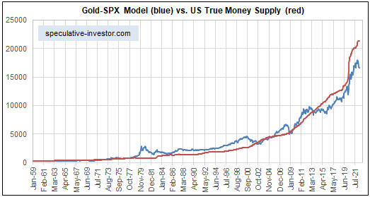
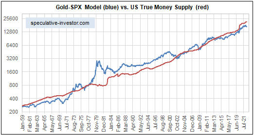
The log-scaled chart displayed above indicates that since 1959 there have been only three multi-year periods during which the SEGPM deviated by a substantial amount from the money supply. The first was during 1969-1971 due to the extreme under-valuation of gold (the gold price was fixed at the time and unable to respond to the monetary inflation and declining confidence of the time). The second was during 1979-1980 due to a gold market bubble. The third was during the second half of the 1990s due to a stock market bubble.

Interestingly, both charts indicate that the current SPX+gold level is low relative to the money supply. If we are right to think that an economic bust (a 1-3 year period of declining confidence) has begun, then this suggests that there is a lot of scope for the gold price to increase over the next couple of years even if the pace of money-supply growth is slow. To be more specific, it suggests the potential for the US$ gold price to double over the next two years with TMS growth of only 5% per year.

*For example, in the May-2017 blog post linked HERE

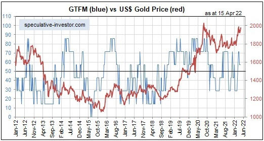
**The general level of trust/confidence is quantified by our Gold True Fundamentals Model (GTFM)

Print This Post Print This Post

Gold and the ‘Real’ Interest Rate

May 24, 2022

[This blog post is an excerpt from a commentary published at TSI last week]

One of the few commonly-believed things about gold that is actually true is that gold tends to become more valuable when the real interest rate is trending downward and less valuable when the real interest rate is trending upward. Furthermore, although the real interest rate trend is just one of seven inputs to our Gold True Fundamentals Model (GTFM) and usually doesn’t have a greater effect than the other inputs, over the past three months it clearly has been the dominant fundamental influence on the US$ gold price. This prompted us to ask: Have there been times in the past when the change in the real interest rate trumped all other considerations?

Before we answer the above question we’ll reiterate a point we’ve made numerous times in the past, which is that the only way to get an accurate read on the real US interest rate trend is via the yields on Treasury Inflation Protected Securities (TIPS). Unfortunately, the TIPS market did not exist prior to 2003, so there is no way of measuring the performance of real interest rates during earlier periods. In particular, it would be extremely useful to know the performance of real interest rates during the 1970s (the last time that “inflation” was widely viewed as “Public Enemy No. 1”), but the information simply isn’t available. It is tempting to calculate the real interest rate that prevailed in earlier periods by using what is available, for example, by subtracting the year-over-year change in the CPI from the nominal interest rate. However, you can’t make up for the lack of a legitimate number by using a bogus one.

As far as we can tell, during the 19.5 years since the TIPS market came into being there has been only one other multi-month period when the real interest-rate trend caused a sizable move in the gold price that was counter to the overall fundamental backdrop. That period was March-October of 2008, which is the first of the three real interest rate (10-year TIPS yield) surges labelled on the following chart. During March-October of 2008 the overall fundamental backdrop was supportive for gold, but the real interest rate rise was large enough and fast enough to trump the bullish influences on the US$ gold price.

By the way, the second of the three real interest rate surges labelled on the chart occurred during April-September of 2013. This one doesn’t qualify because it occurred when economic growth expectations were rising and the overall fundamental backdrop was bearish for gold.

Like the real interest rate surge during March-October of 2008, the one that began on 8th March of this year has occurred in parallel with collapsing economic growth expectations. The difference is that whereas the 2008 surge in the TIPS yield was driven by plunging inflation expectations, the 2022 surge has been driven by rising nominal interest rates.

Despite the overall gold-bullish fundamentals, in 2008 the US$ gold price remained in a downward trend until the TIPS yield peaked. Gold then quickly retraced its decline and gold mining stocks sprang back like beachballs that had been held underwater. Based on the way things are going it is likely that something similar will happen this year.

Print This Post Print This Post

Putin’s Price Hike

May 15, 2022

[This blog post is a brief excerpt from a TSI report published last week]

Central banks and governments rarely, if ever, take responsibility for obvious inflation problems. They never have to, because by the time an inflation problem becomes obvious a lot of time will have transpired since the implementation of the policies that caused it. Furthermore, due to the aforementioned time between cause and effect it generally will be possible for policymakers to point the finger of blame at external influences from the more recent past. A great example is the Biden Administration’s references to the current US inflation problem as “Putin’s price hike”.

The foundation for today’s inflation was laid many years ago by a central bank that reacted to every bout of serious economic and/or stock market weakness by pumping up the money supply, but it was in 2020 that ‘the rubber hit the road’ so to speak. Beginning in March of 2020, this is what happened:

1) The government shut down large sections of the economy in reaction to a pandemic. This was a heavy-handed, low-tech and short-sighted political decision that gave scant consideration to the collateral damage it would cause to both the economy and public health. Unfortunately, an economy isn’t like an engine that can be stopped and then restarted with no ill effects. On the contrary, many supply chains will be permanently broken when large sections of the economy are shut down. Establishing new supply chains often will take time (at least several months and perhaps even years), and in the interim there will be shortages.

2) The government-driven economic collapse prompted the Fed to create several trillion new dollars out of nothing, thus expanding the total US money supply by 40% in one year. This is the single most important contributor to the current inflation problem, and yet the Fed generally is portrayed as the solution to the problem rather than the primary cause of it.

3) To mitigate the extreme short-term hardship caused by its own actions, the government distributed to individuals and businesses a substantial portion of the new money created by the Fed. In effect, the government showered the population with money, and as a result the 2020 recession coincided with a rapid increase in personal income. Nothing like this had ever happened before.

Summing up the above, as part of a reaction to COVID-19 the government caused the supply of many goods to shrink, and at the same time the government teamed up with the Fed to engineer a large increase in the monetary demand for goods. This created an obvious “inflation” problem well before Russia invaded Ukraine.

The major inflation problem that existed prior to Russia’s invasion of Ukraine has since become worse, but not due to the invasion itself. Russia’s invasion of Ukraine could not have made a significant difference to inflation in the US or in most other parts of the world if not for the economic sanctions imposed against Russia. The sanctions have added to the problem.

The anti-Russia sanctions have done new damage to supply chains and deprived the world of critical resources, but to what end? Economic sanctions have never worked in the past and there is no reason to expect that this time will be different. In fact, the evidence to date indicates that the sanctions have not only done nothing to help innocent Ukrainians or discourage the perpetrators of the war (in Russia, Putin is now more popular than ever), but also caused hardship for innocent people throughout the world.

In conclusion, the current US inflation problem was caused by the combination of a huge increase in the US money supply, US government programs that effectively showered the population with money, supply disruptions caused by COVID-related lockdowns and additional supply disruptions caused by a raft of anti-Russia sanctions that have no chance of achieving anything positive. That is, the “inflation” that has become the primary focus of US policymakers is the result of domestic US policy choices. Therefore, calling it “Putin’s price hike” is disingenuous to put it mildly.

Print This Post Print This Post

US monetary inflation and boom-bust update

May 2, 2022

[This blog post is an excerpt from a TSI commentary published last week]

The phenomenal rise in the US monetary inflation rate from early-2020 to early-2021 set in motion an economic boom. There remains some doubt as to whether the boom is over, but the weight of evidence indicates that it probably is.

Booms contain the seeds of their own destruction, meaning that a painful economic bust becomes inevitable after there has been sufficient monetary inflation to foster a boom. Usually, the boom begins to unravel after the pace at which new money is being created (loaned into existence by commercial banks and/or electronically ‘printed’ by the central bank) drops below a critical level, but note that the bust phase cannot be postponed indefinitely by maintaining a rapid level of money-supply growth. On the contrary, an attempt to keep the boom going via an ever-increasing pace of money creation will cause the eventual bust to be the hyper-inflationary kind, which is the worst kind because it crushes the prudent along with the imprudent.

Over the past few decades a boom-to-bust transition for the US economy didn’t begin until after the monetary inflation rate (the year-over-year True Money Supply (TMS) growth rate) dropped below 6%. However, due to the structural damage to the economy resulting from the Fed’s manipulations of money and interest rates over many decades and especially over the past decade, it’s possible that this time around a bust will begin with the monetary inflation rate at a higher level than in the past. That is, even though the latest money-supply figures* reveal that the year-over-year TMS growth rate remains slightly above the 6% boom-bust threshold (refer to the monthly chart below), it’s possible that the US economy has entered the bust phase of the cycle.

Actually, it’s LIKELY that the US economy has entered the bust phase. This is because even though the monetary inflation rate has not yet dropped below our boom-bust threshold, it has dropped far enough to bring about a significant widening of credit spreads and cause the 10Y-2Y yield-spread to become inverted briefly in early-April.

The most important boom-bust timing indicator that is yet to signal an end to the boom is the gold price relative to the prices of industrial metals such as copper. As illustrated by the following chart, since peaking last October the copper/gold ratio has chopped around at a high level. It must make a sustained break below its March-2022 low to signal the sort of relative strength in gold that would be consistent with the bust phase of the cycle.

*The Fed published the money-supply data for March-2022 on Tuesday 26th April.

Print This Post Print This Post

The status of gold’s “true fundamentals”

April 18, 2022

My Gold True Fundamentals Model (GTFM) takes into account the seven most important fundamental drivers of the US$ gold price (the real interest rate, the yield curve, credit spreads, the relative strength of the banking sector, the strength of growth stocks relative to defensive stocks (an indicator of whether the financial world is tilting towards growth or safety), the general trend in commodity prices and the bond/dollar ratio) to arrive at a number between 0 and 100 that indicates the extent to which the fundamental backdrop is gold-bullish. 100 signifies maximum bullishness and 0 signifies minimum bullishness (maximum bearishness).

Although it can be helpful in figuring out when to buy/sell gold-related investments, the GTFM is not designed to be a market timing indicator. Instead, it indicates the direction of the pressure on the gold price being exerted by the fundamentals that matter.

The most recent significant shift in the GTFM (the blue line on the following weekly chart) was from bearish to bullish during the second half of February this year. Four of the seven inputs to the GTFM are bullish at this time, so the Model’s output remains in bullish territory.

GTFM_180422

I expect that the GTFM will move a little further into bullish territory within the coming month due to the Yield Curve input (one of the three currently-bearish inputs) flipping to bullish.

There are three ways that the Yield Curve input to the GTFM could turn bullish within the next few weeks, one or two of which probably will happen. One way is for the 10Y-2Y yield spread to become more inverted than it was in late-March. A second way is for the 10Y-2Y yield spread to signal the start of a steepening trend, which at this point of the cycle also would be a recession warning. A third way is for the 2-year T-Note yield to generate preliminary evidence of a downward trend reversal, which it could do by moving below its 50-day MA.

The following chart of the 2-year T-Note yield shows that the 50-day MA is a long way below the current yield. However, it is rising rapidly and should be above 2% by the end of this month.

UST2Y_180422

Given what’s happening in related markets, I expect that the GTFM’s February-2022 upward reversal and shift into bullish territory will prove to be sustainable, meaning that I expect the gold market to have a fundamental tailwind for at least several more months.

Print This Post Print This Post

A secular trend has changed

April 10, 2022

[This blog post is an excerpt from a recent TSI commentary]

For 36 years the yield on the 10-year T-Note moved lower within the channel drawn on the following chart. Depending on how the lines are drawn, an upside breakout from this channel may or may not have just occurred. If an upside breakout has occurred or occurs later this year following a pullback over the next few months, would this confirm the end of the secular downward trend in interest rates?

UST10Y_blog_110422

It’s not that simple. Obviously, an upside breakout from the long-term channel would be consistent with the trend having changed from down to up, but prices often generate misleading signals via failed breaks below chart-based support or above chart-based resistance. However, there are fundamental reasons to be confident that a long-term trend change has occurred.

The fundamental reasons revolve around the monetary and fiscal responses to the pandemic in 2020, which in combination created such a massive inflation problem that the forces putting downward pressure on interest rates have been overwhelmed. The official response to COVID wasn’t the straw that broke the camel’s back, it was the bazooka that blew the camel to pieces.

There were two parts to the official COVID response that set the stage for a directional change in the secular interest-rate trend. First, there was the imposition of widespread lockdowns that caused the prices of most commodities to collapse and prompted a panic into Treasury securities, leading to a blow-off move to the downside in Treasury yields. Second, there was the effort by the Fed and the government to mitigate the short-term pain stemming from the lockdowns, which involved expanding the total US money supply by 40% in less than a year and ‘showering’ the population with money. The effort was very successful at mitigating short-term pain, but at the expense of economic progress and living standards beyond the short-term. The adverse effects of the actions taken to reduce/eliminate short-term pain during 2020 and the first half of 2021 will be evident for many years to come.

We thought that the secular downward trend in interest rates had ended shortly after the blow-off move in Q1-2020, and this opinion has been subsequently supported by a lot of evidence. However, all secular trends have tradable countertrend moves. We are anticipating a tradable move to the downside in US government bond yields over the next several months.

Print This Post Print This Post

US monetary inflation and the boom-bust cycle

March 28, 2022

[This blog post is an excerpt from a recent TSI commentary]

The phenomenal rise in the US monetary inflation rate from early-2020 to early-2021 fuelled a speculative mania in the stock market and set in motion an economic boom, while the subsequent plunge in the monetary inflation rate will lead to an equity bear market and an economic bust. A lot of speculation has been wrung-out of the stock market in parallel with the plunge in the pace of new money creation, but there remains some doubt as to whether or not the economic boom is over.

Just to recap, a boom is a surge in economic activity, involving both consumption and investing, in response to price signals caused by monetary inflation. It fosters the impression that great economic progress is being made, but most of the apparent gains achieved during the boom will prove to be ephemeral because the underlying price signals are false/misleading. It will turn out that there are insufficient resources (labour and materials) to complete projects and/or that resources cost a lot more than planned and/or that the consumption forecasts upon which business additions/expansions were based were far too optimistic. The realisation, stemming from rising costs and lower-than-forecast cash flows, that many of the investments made during the boom years were ill-conceived sets in motion the bust phase of the cycle. During the bust phase, boom-time investments get liquidated.

The economic bust will be ‘explained’ by Keynesians* as a collapse in aggregate demand stemming from a mysterious collapse in confidence (“animal spirits”) and will prompt policies aimed at creating a new boom (a new batch of false price signals upon which future investing mistakes will be based), thus perpetuating the cycle.

As mentioned above, there remains some doubt as to whether or not the latest US economic boom is over. Some indicators say it is, while others are yet to confirm. Also, although the monetary inflation rate has crashed from its February-2021 high, the following monthly chart shows that it is still slightly above the boom-bust threshold of 6%**.

We defined the threshold based on the historical record, in that over the past few decades a boom-to-bust transition for the US economy didn’t begin until after the monetary inflation rate dropped below 6%. However, due to the structural damage to the economy resulting from the Fed’s manipulations of money and interest rates over many decades and especially over the past decade, it’s possible that a bust will begin with the monetary inflation rate at a higher level than in the past.

In any case, the monetary inflation rate should never be used for timing purposes. There are other measures, such as credit spreads, that signal when the monetary inflation rate has risen far enough to set in motion a boom or fallen far enough to set in motion a bust. These measures suggest that the US economy is now in the early part of a bust, although the evidence is not yet conclusive.

*All senior central bankers and most politicians are Keynesians.

**Due to tough year-over-year comparisons, we thought that the US monetary inflation rate (the year-over-year rate of growth of the True Money Supply) would drop below 6% during the first two months of this year. The reason it didn’t is that more than $800B was added to the money supply over the course of those months. The 2-month money-supply surge to begin 2022 was due to a reduction in the Fed’s reverse repo program (this put about $300B back into circulation), an increase in commercial bank credit (this created about $240B of new money), Fed monetisation of securities (this created about $150B of new money) and, we suspect, the flight of some money to the US to escape the troubles in Europe.

Print This Post Print This Post

A major stock market peak in hard currency terms

March 22, 2022

[This blog post is an excerpt from a recent commentary published at TSI]

Gold is inherently a stronger currency than the US$. This is because the total supply of gold increases by about 1.5% every year, whereas the total supply of US dollars seldom grows at a rate of less than 4% per year and periodically experiences double-digit annual percentage growth. As a result, the US stock market should peak in gold terms well before it peaks in US$ terms, which is exactly what has happened in the past.

The following weekly chart shows the S&P500 Index in gold terms since 1980. With regard to the past 25 years, the two peaks that stand out on this chart occurred in September-2018 and July-1999. In the first case, the peak in the SPX/gold ratio preceded the SPX’s nominal dollar peak by about 16 months (the SPX didn’t peak in dollar terms until February-2020). In the second case, the peak in the SPX/gold ratio preceded the SPX’s nominal dollar peak by about 8 months (the SPX peaked in dollar terms in March-2000).

The most recent peak in the SPX/gold ratio occurred at the beginning of December-2021. Based on what’s happening on the monetary and economic fronts, we think that this will turn out to be a major top (a top that holds for at least 3 years). At this stage, however, what we have is a pullback to the 200-week MA, which would be consistent with either an intermediate-term correction within an on-going major upward trend or the first leg of a new major downward trend.

The point we want to make today is that even if the decline over the past three months of the SPX/gold ratio was the first leg of a new major downward trend (the most likely scenario, in our opinion), it would not be out of the ordinary for the SPX to make a new all-time high in dollar terms during the second half of this year or the first half of 2023.

Print This Post Print This Post

The shift from boom to bust may have begun

March 8, 2022

[This blog post is an excerpt from a commentary published at TSI on 6th March 2022]

The latest leading economic data indicate that the US expansion is intact. This is the case even though the following monthly chart reveals that the ISM Manufacturing New Orders Index (NOI), one of our favourite leading economic indicators, has been working its way downward since hitting a cycle peak about 12 months ago. The reason is that it’s normal for the rate of improvement — which is what the NOI is measuring — to decline while the economy remains in the expansion phase. That being said, we’ve noted over the past two months that the pace of US economic activity is set to slow markedly during the first half of this year.

We wrote a month ago that due to “inflation” remaining near its cycle peak while the pace of economic activity slows, the ‘real’ GDP growth rate during the first quarter of this year could be close to zero. That was before Russia attacked Ukraine and the West imposed severe economic sanctions on Russia, causing additional large increases in commodity prices. As a result of these price increases, the official “inflation” statistics such as the CPI will be higher for longer and calculations of ‘real’ growth will be lower. This could well mean that the headline US GDP growth numbers will be negative in both Q1-2022 and Q2-2022.

Note that a sign of the downward pressure on economic activity resulting from high inflation is the decline in ‘real’ wages. The monthly US Employment Report issued on Friday 4th March contained an estimate that hourly earnings had increased by 5.1% year-over-year in nominal dollar terms. While this is high compared to the average of the past two decades, it’s likely that the cost of living increased by 8%-12% over the same period. This implies that real hourly earnings have fallen by at least a few percent over the past 12 months.

Will the Powell-led Fed make a series of rate hikes in the face of a shrinking economy in response to price rises that are due to supply disruptions? We don’t think so. A Volcker-led Fed would have begun hiking interest rates long ago, but “Mississippi Jay” is the most dovish Fed chairman ever. The Fed almost certainly will make a 0.25% rate hike this month, but we continue to suspect that it will then go on hold for the remainder of the year.

At this stage the leading recession indicators we follow do NOT point to a recession beginning within the next six months (two quarters of negative GDP growth can occur in the absence of a recession), but there’s now a high probability that a boom-to-bust transition will begin during the first half of this year. The recent widening of credit spreads is warning that this is the case, but to confirm a boom-to-bust transition the credit-spread widening will have to be joined by a downward trend reversal in the GYX/gold ratio (the Industrial Metals Index relative to the US$ gold price) and/or a downward trend reversal in the 2-year T-Note yield. The chart displayed below shows that the GYX/gold ratio ended last week at a multi-year high and near the level at which it peaked in 2014 and 2018.

As noted in previous TSI commentaries, the start of a boom-to-bust transition usually precedes the start of an official recession by at least a few quarters.

Print This Post Print This Post

Shift from boom to bust could begin soon

February 15, 2022

[This blog post is an excerpt from a commentary published at TSI about 1.5 weeks ago]

The latest leading economic data indicate that the US expansion is intact. This is the case even though the following monthly chart reveals that in January-2022 the ISM Manufacturing New Orders Index (NOI), one of our favourite leading economic indicators, dropped to its lowest level since June-2020. The reason is that it’s normal for the rate of improvement — which is what the NOI is measuring — to decline while the economy remains in the expansion phase. That being said, there are signs that the pace of economic activity will slow markedly during the first half of this year.

Note that the NOI would have to drop below 55 to stop being a positive influence on the US stock market and below 48 to warn of a recession. We won’t be surprised if it drops below 55 within the next two months, but a decline to below 48 is probably at least 2-3 quarters away.

Regarding the pace of US economic growth, in our previous four “US Recession/Expansion Watch” monthly discussions we wrote that we expected US economic activity to re-accelerate during the final months of 2021 and the early part of 2022 due to inventory building and millions of people returning to the workforce. That happened (for exactly the reasons expected*) and was confirmed by the preliminary estimate of annualised GDP growth coming in at 6.9% for Q4-2021. It was also confirmed by Real Gross Private Domestic Investment (RGPDI), a quarterly statistic that acts as a leading indicator of recession starts and a coincident indicator of recession ends. As illustrated below, RGPDI rose sharply to a new all-time high in the fourth quarter of last year.

Note that the vertical red lines on the following chart mark official recession start dates.

However, the financial markets don’t care what happened months ago; they care what’s going to happen over the months/quarters ahead and there is evidence that the GDP growth rates reported for the first two quarters of this year will be MUCH lower than the rate reported for the final quarter of last year. In fact, due to “inflation” remaining near its cycle peak while the pace of economic activity slows, the “real” GDP growth rate during the first quarter of this year could be close to zero.

The preponderance of evidence from leading economic indicators and confidence indicators points to the H1-2022 economic slowdown occurring within the context of an economic boom, although a pronounced slowdown within a boom and the early part of a boom-to-bust transition can be indistinguishable.

Money-supply trends warn that a boom-to-bust transition could begin as soon as the first half of this year, but the start of a boom-to-bust transition usually precedes the start of an official recession by at least a few quarters and leading economic indicators are a long way from issuing recession warnings. Therefore, the next US recession probably won’t begin any earlier than Q4-2022.

*We noted at the time they were announced that the initial BLS estimates for jobs growth in November and December of last year had massively understated the strength of the US labour market. The latest monthly employment report, which was issued on Friday 4th February, contained revisions to previous months that corrected the errors. The corrections resulted in a combined increase of 709K to the November-December jobs growth total. As a consequence, the employment data now show that the US economy added 1.83M jobs in Q4-2021 and 2.3M jobs over the past four months.

Print This Post Print This Post