Is a US banking crisis brewing?

March 3, 2023

[Below is an excerpt from a commentary posted at TSI on 19th February. Subsequently there have been no significant changes in the data, so the conclusion remains the same.]

Cutting to the chase, the short answer to the above question is no. Here is the longer answer:

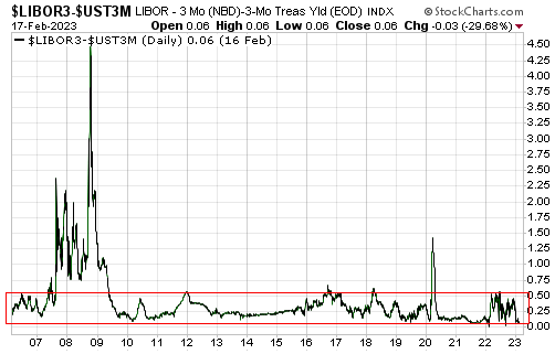
Banks becoming suspicious of each other is one of the early signs that a banking crisis is brewing. This suspicion is indicated by a rise in the average interest rate that banks charge each other for short-term financing relative to the interest rate paid by the US federal government for financing of similar duration. For example, under normal (non-crisis) conditions the spread between 3-month LIBOR, a widely used interbank interest rate, and the yield on a 3-month Treasury Bill oscillates between 0% and 0.50%, but when some banks start becoming concerned about the financial strength of other banks the spread breaks above 0.50%.

The following daily chart shows the performance of the aforementioned interest rate spread since early-2006. The Global Financial Crisis of 2007-2009 sticks out on this chart and was signalled by an initial surge above 0.50% during the second quarter of 2007. During the period covered by this chart the only other move to well above the top of the normal range occurred during the March-2020 COVID crash, but it was very short-lived as the Fed acted immediately to ensure that the economic shutdowns perpetrated by governments did not create problems for the commercial banks. Also worth noting is that there were minor signs of banking-system stress in Q4-2011, Q3-2016, Q1-2018 and the first half of 2022 that did not develop into crises.

Importantly, the chart shows that the current spread is close to zero, which means that the interbank market is as calm (lacking in suspicion) as it ever gets.

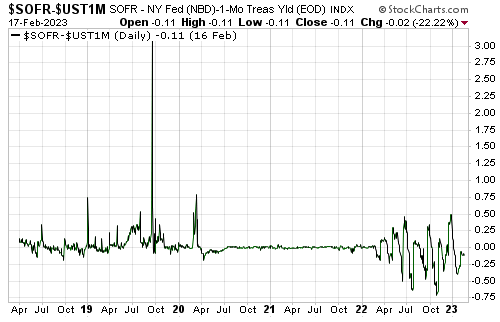
Another interest rate spread worth monitoring is the Secured Overnight Financing Rate (SOFR) minus the yield on the 1-month Treasury Bill. The SOFR is the interest rate that banks and hedge funds pay to borrow overnight money in the US Repo (Repurchase Agreement) market. It has a much shorter history than the LIBOR, but it is gaining in popularity. Like the LIBOR-Treasury spread discussed above, a substantial and sustained rise in the SOFR-Treasury spread would indicate increasing suspicion/stress in the banking system.

The following chart shows that the SOFR-Treasury spread has been far more volatile during the past 12 months than it was during the bulk of 2020-2021, but that it has oscillated around zero and currently is slightly below zero (a level indicating a general lack of concern).

Note that the huge upward spike in the SOFR-Treasury spread in 2019 was due to the “Repo Crisis” in September of that year. The Fed circumvented this crisis very quickly via emergency liquidity injections.

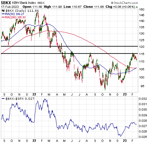
Unusual increases in the above interest rate spreads would warn that a banking crisis was brewing. Also, prior to a banking crisis there would be persistent and pronounced weakness in bank equities relative to the broad stock market.

The lower section of the following chart shows that there was significant weakness in the Bank Index (BKX) relative to the broad stock market (represented by the SPX) during February-March of last year, but that the BKX/SPX ratio is in a short-term upward trend and is at roughly the same level today as it was in early-April of last year.

Banking crises don’t come out of nowhere. Enough people inside and outside the banking industry see them coming and take steps to protect themselves or profit from the fallout that early warning signs emerge. Currently there are no such signs.

Print This Post Print This Post

The Rebuilding of Ukraine

February 8, 2023

[This blog post in an excerpt from a recent TSI commentary]

It is clear that Russia’s invasion of Ukraine has escalated into a major war. It is also clear that the conflict has evolved into a NATO proxy war against Russia. We don’t know how it will end and the extent to which the shooting will expand beyond Ukraine’s borders, but it’s very likely to result in the near-complete destruction of Ukraine. This almost certainly means that during the years following some form of peace agreement, there will be an effort to rebuild Ukraine funded by…you.

At the moment there’s no point attempting to analyse the ramifications of the Ukraine rebuilding in detail, because there’s no way of knowing when the war will end. It could end within the next two months or it could drag on for another two years. The issues we want to address in brief today are that the rebuilding effort will 1) be colossal (probably trillions of dollars), 2) cause a large and sudden increase in the demand for industrial commodities, and 3) be funded mainly by the citizens of the countries that provided military assistance to Ukraine. The entire episode will be a Keynesian stimulus program writ large. You destroy an entire country and then pay to bring it back to the way it was, creating a veritable tidal wave of “aggregate demand” in the process.

Regarding how the rebuilding will be funded, the key is that under the current monetary system anything that is paid for by the government initially will appear to be free. For example, since the start of the Russia-Ukraine war the US government has spent or committed to spend about US$105B to assist in Ukraine’s defence. This spending, which equates to about $800 per US household, has widespread support within the electorate, but how much support would it have if every household had received a bill for $800 for “military assistance to Ukraine”? Undoubtedly a lot less.

The reason that the Ukraine assistance and many other large government spending programs are either supported or ignored by the general public is that from the perspective of most people there is no cost. Nobody gets a bill or immediately has to pay higher taxes to cover the spending. Instead, the government just adds more debt to the ever-growing pile. Furthermore, sometimes the debt is purchased by the central bank with money created out of nothing, in which case there isn’t even a need for private investors to part with any money to fund the government deficit-spending.

Almost regardless of how high the cost of supporting Ukraine’s military efforts, it will be minor compared to the cost that eventually will be incurred in the rebuilding of Ukraine. However, for the reason outlined above, the huge cost initially won’t appear to be a major problem because it won’t adversely affect the personal finances of most people. There simply will be an addition to the existing pile of government debt. It won’t be until a year or two later, when the large demand for scarce resources resulting from the debt-financed rebuilding has caused interest rates and the cost of living to sky-rocket, that the adverse effects will be apparent to the general public.

Industrial metals such as copper, zinc, and nickel, and specialty metals such as lithium and the rare-earths, are among the resources that should have the greatest increases in demand relative to supply once the Ukraine rebuilding gets underway. This is because shortages of these commodities are already in the works due to the “energy transition” to which the political world is committed. An implication is that having investments linked to the production of these commodities will be a way for people to profit from or protect themselves against the “inflation” that will be unleashed after the fighting stops and governments set about trying to repair what they destroyed.

That reconstruction will follow the destruction is something to be aware of. Urgent action is not required, however, because at this time there are no signs that the destruction is about to end.

Print This Post Print This Post

A false upside breakout?

January 27, 2023

[This blog post is an excerpt from a TSI commentary published on 22nd January 2023]

It goes without saying that the early stage of every large rally contains a break above resistance and the early stage of every large decline contains a break below support. However, most upside breakouts are not followed by large rallies and most downside breakouts are not followed by large declines. More interestingly, it is not uncommon for the best rallies to begin shortly after breaks BELOW obvious support and for the largest declines to begin shortly after breaks ABOVE obvious resistance. The reason is that breaching obvious resistance/support shakes out many weak-handed speculators and in doing so can create a sentiment platform capable of launching a substantial move in the opposite direction.

There are countless examples of the phenomenon described above, including gold’s performance over the past several months. Last September-October the US$ gold price breached important and obvious support defined by the lows of the preceding two years, but the breach of support did not have bearish implications. Instead, it marked the END of a 2-year bearish trend and in all likelihood ushered in a cyclical bull market.

We are revisiting this topic today because the S&P500 Index (SPX) is positioned such that it could soon generate a misleading signal in the form of a break above obvious resistance.

The potential upside breakout is associated with the downward trend-line drawn on the following daily SPX chart. Every chart-watcher and his dog are paying close attention to this trend-line and many of them undoubtedly would interpret a move above it as evidence that the bear market is over. However, the historical record suggests that the bear market won’t end until many months after the monetary trend becomes favourable, which probably means no sooner than the final quarter of this year.

There are fundamental differences between the present day and any previous period, but in price-action terms the current equity bear market has, to date, been similar to the equity bear market of 2000-2002. Both bear markets followed spectacular bubbles that were focused on tech stocks, involved stair-step declines rather than liquidity-driven collapses, and contained signs of internal strength after the initial multi-month declines.

Interestingly, during the course of the 2000-2002 bear market the SPX broke above a downward trend-line that is not unlike the trend-line drawn on the above chart. As illustrated below, about a week after the ‘bullish’ upside breakout in March-2002 the SPX commenced its largest decline of the bear market.

We don’t know that the SPX will break above its downward trend-line in the near future, although it stands a good chance of doing so. The point we want to stress today is that if the trend-line is breached it will not imply that the bear market is over or even that there will be significant gains over the weeks immediately ahead. On the contrary, an upside breakout could lead quickly to the best opportunity to date to enter bearish speculations.

Print This Post Print This Post

US monetary tightening and the Fed’s cluelessness

January 11, 2023

[This blog post is a modified excerpt from a commentary published at TSI in April of 2022. The main changes are updates to the chart and the numbers.]

The US monetary tightening commenced in February of 2021– the month that the US monetary inflation rate peaked at the extraordinary level of 40%. The monetary inflation rate has since collapsed to around 0% and if the Fed has its way will fall even further over the months ahead. Why is this important?

The overarching reason it’s important is that changes in the monetary inflation rate, that is, changes in the rate at which new money is created out of nothing, drive the economy’s boom-bust cycle. More specifically, large increases in the monetary inflation rate result in periods during which the economy is superficially strong and optimism abounds (the boom phase), while subsequent reductions in the monetary inflation rate lay bare the ill-conceived boom-time investments and usher in the bust phase.

Associated with the major trends in the monetary inflation rate that drive the boom-bust cycle are major trends in the yield curve.

A discussion of the relationship between the monetary inflation rate and the yield curve, including a full explanation of why an inversion of the yield curve has preceded all US recessions of the past sixty years, can be found HERE. The bottom line is that trends in the monetary inflation rate drive trends in the yield curve, with a yield curve inversion being caused by a decline in the monetary inflation rate from a high level to a low level. That is, both a flattening of the yield curve to the point where it becomes inverted and a shift in the economy from boom to bust are eventual effects of a downward trend in the monetary inflation rate.

The strong positive correlation between the US monetary inflation rate and the US yield curve is illustrated by the following monthly chart. On this chart the yield curve is represented by the monthly average of the 10year-2year yield-spread and is shown in red. The monetary inflation rate is the year-over-year percentage change in True Money Supply (TMS) and is shown in blue.

TMS_yieldcurve_110123

One difference between the current cycle and previous cycles is that monetary conditions in the current cycle became sufficiently tight to drive parts of the yield curve into inverted territory when the Fed was just STARTING a monetary tightening campaign.

Does the Fed have any idea what it is doing?

Before answering the above question it is worth reiterating that the Fed is a Keynesian institution. Within the Keynesian framework the economy can be viewed as a bathtub filled with an amorphous liquid called “aggregate demand”, and it is the job of the central bank and the government to add or remove liquid to keep the level of the tub in a range deemed desirable. In the real world, however, there are millions of individuals making production, consumption and investment decisions for myriads of reasons. Consequently, in the real world there is no such thing as the Keynesian “aggregate demand” and it is ridiculous to view the economy as a bathtub that can be filled/emptied by policymakers to optimise performance.

Returning to the above question, the Fed seems to believe that it can make up for the recklessness of its actions during 2020-2021 by becoming excessively ‘tight’ during 2022-2023. At least, that’s the only plausible explanation for why it started reducing its balance sheet by up to US$95B per month, thus removing up to $95B of money from the economy every month, after the monetary inflation rate had already dropped far enough to bring on the bust phase of the cycle.

Also, the Fed seems to believe that it can address rapidly rising prices resulting from supply shortages by engineering a further tightening of monetary conditions, as if reducing the availability of money will remove the constraints on supply caused by COVID-related policies and anti-Russia sanctions.

The reality is that after an inflation problem has been created via a large increase in the money supply, removing money from the economy cannot help. Actually, it will lead to additional distortions of relative price signals and thus greater economic weakness. What’s desirable is money-supply stability.

So, the answer to the question is no. Even taking into account the limitations imposed by the fatally flawed Keynesian framework in which it operates, the Fed appears to have no idea what it is doing.

Print This Post Print This Post

The coming plunge in short-term interest rates

December 22, 2022

[This blog post is an excerpt from a recent TSI commentary]

Market interest rates always lead Fed-controlled interest rates at important turning points. Therefore, when trying to figure out whether interest rates have peaked or troughed, don’t look at what the Fed is saying; look at what the markets are saying.

The above statement is illustrated by the following chart comparison of the Fed Funds Rate (the green line), an overnight interest rate totally controlled by the Fed, and the 2-year T-Note Yield (the blue line), a short-term interest rate that is influenced by the Fed but ultimately determined by the market. The chart shows that at cyclical trend changes since the mid-1990s, the 2-year T-Note yield always changed direction in advance of — usually well in advance of — the Fed Funds Rate (FFR). For example, focusing on the downward trend changes we see from the chart that a) the 2-year yield reversed downward in Q4-2018 and the FFR followed in mid-2019, b) the 2-year yield reversed downward in mid-2006 and the FFR followed in mid-2007, and c) the 2-year yield reversed downward in Q2-2000 and the FFR followed in Q4-2000. When the 2-year T-Note yield reversed downward in 2018, 2006 and 2000, the Fed had no idea that within 6-12 months it would be slashing the FFR.

Right now, J. Powell thinks that the Fed is going to hike its targeted interest rates 2-3 more times and then hold them at 5% or more until well into 2024. However, that’s nothing like what the Fed will do if the stock market, the GDP growth numbers, the CPI and the employment data do what we expect over the next few quarters.

Our view is that the US stock market and economy are about to tank due to the decline in the monetary inflation rate that has already occurred, causing market interest rates to fall across the yield curve. Furthermore, the longer it takes for the Fed to wake up to what’s going on, the worse it will be for both the stock market and the economy and the more rapid will be the decline in market interest rates.

The Fed is asleep, but the market has begun to discount the “inflation” collapse and the negative economic news to come. Evidence is the pullback in the 2-year T-Note yield from its high in early-November to below its 50-week MA (the blue line on the following chart). This is the first sustained break below the 50-week MA since the upward trend was established in 2021. A break below the 90-week MA (the black line on the chart) would be a definitive signal that the 2-year yield’s cyclical trend has changed from up to down.

Based on the leads and lags of the past three decades, if the early-November high for the 2-year yield proves to be the ultimate high for the cycle, which it very likely will, then the Fed has made its last rate hike and will be cutting rates by the final quarter of next year. Our guess is that the Fed’s first rate-cut will occur during the second or third quarter of 2023.

Print This Post Print This Post

US Recession Watch

December 7, 2022

[This blog post is an excerpt from a commentary published at TSI on 4th December]

At least one of two things should happen to warn that an official US recession is about to begin. One is a decline in the ISM Manufacturing New Orders Index (NOI) to below 48 and the other is a reversal of the yield curve’s trend from flattening/inverting to steepening. For all intents and purposes the first signal triggered in July-2022 when the NOI dropped to 48, whereas the second signal probably won’t trigger until the first half of next year.

The following monthly chart shows that the NOI dropped to a cycle low of 47.1 in September-2022, ticked up in October and returned to its cycle low in November, leaving the message unchanged. The NOI is signalling that a recession has started or will start soon.

The following chart also shows that the NOI dropped below 40 during the recession period of the early-2000s and dropped below 30 during the 2007-2009 Global Financial Crisis and the 2020 COVID lockdowns. We expect that it will drop below 30 next year.

The first of the two daily charts displayed below shows that the 10yr-2yr yield spread, our favourite yield curve indicator, plunged well into negative (inverted) territory during July and remains there. The second chart shows that the 10yr-3mth yield spread, which apparently is the Fed’s favourite yield curve indicator, finally followed suit over the past two months and is now as far into inverted territory as the 10yr-2yr spread.

One of our consistent messages over the past few months has been that a more extreme inversion of the US yield curve would occur before there was a major reversal to steepening. There were two reasons for this. First, the monetary inflation rate (the primary driver of the yield curve) was set to remain in a downward trend until at least early-2023. Second, it was likely that declining inflation expectations would put downward pressure on yields at the long end while the Fed’s rate-hiking campaign supported yields at the short end. For these reasons, we wrote over the past few months that by early 2023 both the 10yr-2yr and 10yr-3mth spreads could be 100 basis points into negative (inverted) territory.

As recently as two months ago our speculation that the 10yr-2yr and 10yr-3mth spreads would become inverted to the tune of 100 basis points (1.00%) by early-2023 looked extreme, especially since the 10yr-3mth spread was still above zero at the time. With both of these spreads now having become inverted by around 80 basis points, that’s no longer the case.

We doubt that the aforementioned yield spreads will move significantly more than 100 basis points into negative territory, because we expect that during the first quarter of next year economic reality (extreme weakness in the economic statistics and the stock market) will hit the Fed like a ton of bricks. This should bring all monetary tightening efforts to an abrupt end, causing interest rates at the short end to start falling faster than interest rates at the long end, that is, causing the yield curve to begin a major steepening trend.

Our conclusion over the past four months has been that the US economy had commenced a recession or would do so in the near future. Due to recent up-ticks in some coincident and lagging economic indicators, we now think that the first quarter of 2023 is the most likely time for the official recession commencement.

Print This Post Print This Post

US monetary inflation and boom-bust update

November 29, 2022

[This blog post is an excerpt from a TSI commentary published last week]

Monetary inflation is the driver of the economic boom-bust cycle, with booms being set in motion by rapid monetary inflation and busts getting underway after the rate of new money creation drops below a critical level and/or it becomes impossible to complete projects due to resource shortages. The following chart shows that the US monetary inflation rate (the year-over-year growth rate of US True Money Supply) extended its decline in October-2022 and is now only 2.6%, down from a peak of almost 40% early last year.

In previous TSI commentaries we wrote that if the Fed were to stick with its balance-sheet reduction plan then by next February the year-over-year rate of US money supply growth probably would be negative, that is, the US would be experiencing monetary deflation. Because nothing disastrous has happened to the overall US economy and the broad stock market YET (at this stage, the disasters have been confined to the economic/market sectors where speculation was the most manic), the Fed almost certainly will stick with its balance-sheet reduction plan for at least a few more months. This means there is a high probability of the US experiencing monetary deflation during the first half of 2023. What would be the likely ramifications?

In a healthy economy a year-over-year decline in the money supply of a few percent would not be a big problem, whereas an economy rife with bubble activities stemming from a massive prior increase in the money supply is not healthy and would be expected to experience a severe downturn in response to monetary deflation or even a period of relative money-supply stability. The current US economy is an example of the latter, making it acutely vulnerable to monetary deflation.

Declining money-supply growth hits the most egregious bubble activities first. For example, many of the most popular stock market speculations of the 2020-2021 bubble period already have lost more than 90% of their market values and the ‘crypto world’ is immersed in a collapse that probably isn’t close to complete. Unfortunately, though, when price signals become distorted by monetary inflation to the point where mal-investment has occurred on a grand scale, it isn’t just the businesses directly involved in the bubble activities that suffer life-threatening contractions after the bubbles burst. Almost everyone gets hurt.

A severe economic downturn during 2023 that possibly extends into 2024 is one ramification of the on-going slide in the monetary inflation rate. Another is that the US economy could experience price deflation, as indicated by the year-over-year rate of CPI growth dropping below zero, during the final quarter of 2023. This combination will, we suspect, lead to a substantial rebound in the Treasury market and a rise in the US$ gold price to new all-time highs within the coming 12 months.

It almost goes without saying that a severe recession and a collapse in the CPI during 2023 will prompt the Fed to initiate another round of money pumping with all of the usual knock-on effects, including new waves of mal-investment and price inflation.

Print This Post Print This Post

Investment Seesaw Update

November 16, 2022

[This blog post is an excerpt from a TSI commentary published last week]

Many times over the years we’ve argued that gold and the world’s most important equity index (the S&P500 Index — SPX) are at opposite ends of a virtual investment seesaw. If one is in a long-term bull market then the other must be in a long-term bear market, with the gold/SPX ratio determining where the real bull market lies. As discussed in a TSI commentary and blog post about five months ago, our ‘investment seesaw’ concept was part of the inspiration for a model, called the Synchronous Equity and Gold Price Model (SEGPM)*, that defines a quantitative relationship between the SPX, the US$ gold price and the US money supply. What is the SEGPM’s current message?

Before we answer the above question, a brief recap is in order.

In general terms and as explained in the above-linked blog post, the SEGPM is based on the concept that there are periods when an increase in the money supply will boost the SPX more than it will boost the gold price and other periods when an increase in the money supply will boost the gold price more than it will boost the SPX, with the general level of trust/confidence in money, the financial system and government determining whether the SPX or gold is the primary beneficiary of monetary inflation. During long periods when trust/confidence is high or trending upward, increases in the money supply will tend to do a lot for the SPX and very little for gold. The opposite is the case during long periods when trust/confidence is low or falling.

More specifically, the SEGPM is based on the concept that adding the SPX to 1.5-times the US$ gold price (and applying a scaling factor) results in a number that tracks the US money supply over the long-term.

The following monthly chart replicates the model using our calculation of US True Money Supply (TMS). The money supply is shown in red and the SEGPM (the sum of the S&P500 Index and 1.5-times the US$ gold price) is shown in blue.

Currently the SEGPM is as far below the money supply as it has been since 1970-1971, when the gold price was fixed at US$35/ounce. This suggests scope for a catch-up move by the gold-SPX combination over the next two years. Furthermore, if we are right to think that the US and the world are about 6 months into a 1-3 year economic bust, then the catch-up will have to happen via a rise in the US$ gold price.

*The model was created by Dietmar Knoll.

Print This Post Print This Post

US monetary inflation and boom-bust update

November 3, 2022

[This blog post is an excerpt from a commentary published at TSI last week]

Monetary inflation is the driver of the economic boom-bust cycle, with booms being set in motion by rapid monetary inflation and busts getting underway after the rate of new money creation drops below a critical level and/or it becomes impossible to complete projects due to resource shortages. The following chart shows that the US monetary inflation rate (the year-over-year growth rate of US True Money Supply) extended its decline in September-2022 and is now below 4%, down from a peak of almost 40% early last year.

Due to the economic damage done over multiple cycles by the manipulations of the central bank, the current US economic bust began at a higher rate of monetary inflation than previous busts. In addition, most things related to the current boom-to-bust transition have happened within a compressed timeframe.

In previous cycles over the past three decades, a decline in the monetary inflation rate to below 6% kicked off a sequence lasting 1-2 years encompassing an inversion of the yield curve, a substantial widening of credit spreads (the start of the credit-spreads widening trend combined with the start of an upward trend in the gold/commodity ratio marks the start of the bust phase) and a reversal of the yield curve from flattening/inverting to steepening — PRIOR to the start of an economic recession. This time around, however, all of the above except a steepening of the yield curve occurred within 7 months of a decline in the monetary inflation rate to below 8%.

There is yet to be a reversal in the yield curve from flattening/inverting to steepening, but that’s because this time around the Fed is continuing to tighten monetary conditions aggressively into the teeth of an economic recession. This is similar to what happened in 1973-1974.

To further explain the above comment, the monetary inflation rate (the blue line on the following monthly chart) drives the yield curve (the red line on the chart). Of particular relevance to this discussion, an inversion of the yield curve (the red line dropping below zero) is an EFFECT of a large decline in the monetary inflation rate, and in general a trend reversal in the yield curve from flattening/inverting to steepening requires an upward trend reversal in the monetary inflation rate.

With the downward trend in the US monetary inflation rate unlikely to end any sooner than the first quarter of next year, a trend reversal in the yield curve (to steepening) is probably still at least several months away. In the meantime, it’s reasonable to expect that the curve will move even further into inverted territory.

As mentioned in the 3rd October Weekly Update, if the Fed sticks with its current balance-sheet reduction plan for only a few more months then by February of next year the year-over-year rate of US money supply growth probably will turn negative, that is, the US will be experiencing monetary deflation. If this happens then the prices of most assets will go much lower than they are today.

As also previously mentioned, economic and stock market weakness eventually will put irresistible pressure on the Fed to commence a new monetary easing campaign, but there is nothing to be gained by trying to guess when that will be. This is because the initial attempts to ‘stimulate’ almost certainly won’t be sufficient to ignite a new boom, and because the stock market usually doesn’t bottom until well after the monetary inflation trend has reversed upward. At the moment we are a long way from such a reversal.

Print This Post Print This Post

Running faster in the wrong direction

October 25, 2022

[This blog post is a slightly modified excerpt from recent TSI commentary]

The root of Europe’s energy crisis is under-investment or outright dis-investment in nuclear energy and natural gas production/storage/transportation combined with over-reliance on intermittent and relatively inefficient forms of renewable energy. Russia’s invasion of Ukraine and the anti-Russia sanctions exacerbated the problem, but the problem was evident prior to this year. A policy course correction therefore would be appropriate (to put it mildly), but it won’t happen anytime soon.

When private companies go in the wrong direction they lose money and either change direction or go broke, but after it becomes clear that a government has gone in the wrong direction the typical response is to go faster in that direction. This is because doing otherwise would require an uncomfortable public admission that mistakes have been made or a practically impossible public admission that the political ideology underpinning the chosen direction is wrong. In the case of the shift towards increasing reliance on renewable energy, the latter (a public admission that the underlying political ideology is wrong) would be required, which is why we shouldn’t expect it. Instead, we should expect acceleration along the wrong path.

Signs of acceleration along the wrong path are not hard to find. Examples include the recent increase from 32% to 45% in the official European target for the renewable energy share of total energy, requiring a doubling of the renewable energy share within the next eight years, and the government of Victoria, Australia, recently announcing a goal to become 95% dependent on renewables by 2035.

It is not possible to achieve the renewable energy targets being set by governments, but nevertheless it’s reasonable to expect that great efforts will be made to achieve them. Here are some of the likely effects of these efforts:

1) There will be major shortages within the next few years of the minerals used in renewable energy systems, leading to vastly higher prices for these minerals and increased mining activity.

2) On a global basis there will be extensive environmental damage, and for at least the next ten years there will be increased carbon emissions, due to the additional mining and manufacturing activity associated with building the renewable energy systems.

3) There will be periodic major shortages of natural gas, oil, oil-based products (diesel and gasoline) and coal due to under-investment in the production of these commodities, leading to the existing producers of these commodities becoming far more valuable.

4) The cost of energy as a percentage of GDP will be much higher this decade than in the preceding decade, leading to a lower standard of living for the average person.

5) There will be a large rise in the price of uranium, because the expansion of nuclear energy will become politically attractive (meaning: a vote winner) in the face of periodic energy shortages and extremely high energy prices.

As investors/speculators, we can’t do anything about the adverse social and environmental consequences of the accelerating trend towards ‘renewables’. However, we can attempt to profit from points 1), 3) and 5).

Print This Post Print This Post