Gold, the stock market and the yield curve

October 16, 2017

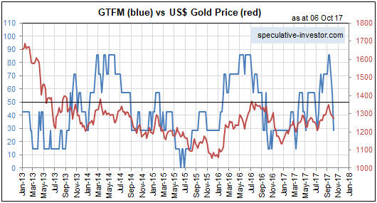
The yield curve is a remarkably useful leading indicator of major economic and financial-market events. For example, its long-term trend can be relied on to shift from flattening to steepening ahead of economic recessions and equity bear markets. Also, usually it will remain in a flattening trend while a monetary-inflation-fueled boom is in progress. That’s why I consider the yield curve’s trend to be one of the true fundamental drivers of both the stock market and the gold market. Not surprisingly, when the yield curve’s trend is bullish for the stock market it is bearish for the gold market, and vice versa.

A major steepening of the yield curve will have one of two causes. If the steepening is primarily the result of rising long-term interest rates then the root cause will be rising inflation expectations, whereas if the steepening is primarily the result of falling short-term interest rates then the root cause will be increasing risk aversion linked to declining confidence in the economy and/or financial system. The latter invariably begins to occur during the transition from boom to bust.

A major flattening of the yield curve will have the opposite causes, meaning that it could be the result of either falling inflation expectations or a general increase in economic confidence and the willingness to take risk.

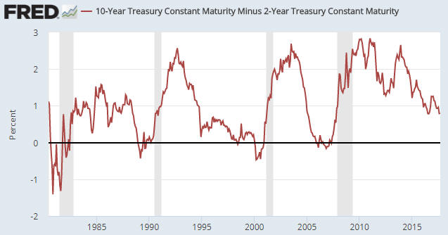
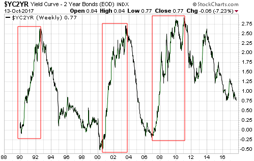
On a related matter, the conventional wisdom is that a steepening yield curve is bullish for the banking system because it results in the expansion of banks’ profit margins. While superficially correct, this ‘wisdom’ ignores the reality that one of the two main reasons for a major steepening of the yield curve is widespread, life-threatening problems within the banking system. For example, the following chart shows that over the past three decades the US yield curve experienced three major steepening trends: the late-1980s to early-1990s, the early-2000s and 2007-2011. All three of these trends were associated with economic recessions, while the first and third got underway when balance-sheet problems started to appear within the banking system and accelerated when it became apparent that most of the large banks were effectively bankrupt.

Here’s an analogy that hopefully helps explain the relationship (under the current monetary system) between major yield-curve trends and the economic/financial backdrop: Saying that a steepening of the yield curve is bullish because it eventually leads to a stronger economy and generally-higher bank profitability is like saying that bear markets are bullish because they eventually lead to bull markets; and saying that a flattening of the yield curve is bearish because it eventually — after many years — is followed by a period of severe economic weakness is like saying that bull markets are bearish because they always precede bear markets.

yieldcurve_161017

Both rising inflation expectations and increasing risk aversion tend to boost the general desire to own gold, whereas gold ownership becomes less desirable when inflation expectations are falling or economic/financial-system confidence is on the rise. Consequently, a steepening yield curve is bullish for gold and a flattening yield curve is bearish for gold.

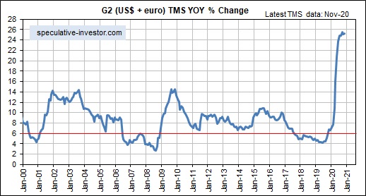
The US yield curve’s trend has not yet reversed from flattening to steepening, meaning that its present situation is bullish for the stock market and bearish for the gold market. However, the yield curve is just one of seven fundamentals that factor into my gold model and one of five fundamentals that factor into my stock market model.

Print This Post Print This Post

Updating gold’s true fundamentals

October 11, 2017

Last week I posted a short piece titled “A silver price-suppression theory gets debunked“, the main purpose of which was to direct readers to a Keith Weiner article disproving that the silver price had been dominated by the “naked” short-selling of futures. My brief post rattled the cage of GATA’s Chris Powell, who made an attempt at a rebuttal early this week and in doing so proved that 1) he doesn’t understand what arbitrage is and how it affects prices, and 2) he doesn’t understand what fundamental and technical analysis are (he seems to believe that any analysis that uses charts to display data is the ‘technical’ variety).

My approach to the gold market involves fundamentals, sentiment and technicals in that order, except when sentiment is extreme in which case it takes priority. To give non-TSI subscribers an idea of what I do, here’s a brief excerpt from the TSI commentary that was published on 8th October:

Last week, two of the seven components of our Gold True Fundamentals Model (GTFM) flipped from bullish to bearish. We are referring to the bond/dollar ratio, which broke below its moving demarcation level, and the real interest rate (the 10-year TIPS yield), which broke above its moving demarcation level. As a result, five of the seven components are now bearish and the GTFM is well into bearish territory. Here’s the updated chart:

The gold market responds more immediately, directly and accurately to changes in the fundamental backdrop than any other major financial market. This means that there is often an easy-to-identify fundamental reason for any sizable multi-week move in the gold price, but it also means that changes in the fundamental backdrop often say more about the past than the future. For example, the fact that the fundamental backdrop was gold-bearish at the end of last week doesn’t imply that there will be additional short-term weakness in the gold price. Instead, it explains the weakness that has already happened.

That being said, an understanding of the true fundamental drivers of the gold price can be used to assess the future prospects for the gold price. For example, five of the seven components of the GTFM are either directly or indirectly influenced by the bond market, with T-Bond strength generally acting to shift these components in the gold-bullish direction and T-Bond weakness generally acting to shift these components in the gold-bearish direction. Therefore, a strong expectation regarding the future direction of the T-Bond price can feed into an assessment of gold’s risk/reward.

For example, it was partly the expectation of T-Bond weakness, potentially exacerbated by the Fed taking its first genuine step along the monetary tightening path, that three weeks ago caused us to become sufficiently concerned about gold’s short-term risk/reward to suggest buying some put-option insurance. This was despite the GTFM being well into gold-bullish territory at the time.

It is now the expectation of a T-Bond rebound that causes us to view gold’s short-term risk/reward as being skewed towards reward, despite the GTFM being well into gold-bearish territory.

Print This Post Print This Post

Blatant statistical bias: Gun ownership vs. gun deaths

October 9, 2017

This post has nothing to do with the US Second Amendment or my opinion on whether gun ownership should be legal. It’s about the presentation of gun-related death statistics in a way that supports a political position rather than provides relevant information.

The following chart from a recent post at ritholtz.com compares the number of gun-related deaths to the number of guns per 100 people across many countries. It naturally shows that the country with by far the highest rate of gun ownership (the US) has by far the highest rate of gun-related deaths.

The above chart would be presented for only one reason: to persuade people that the US needs stricter gun control. However, the chart does not make the case for stricter gun control in even a small way. This is because the charted comparison is meaningless.

Obviously, the greater the availability of guns the higher the proportion of gun-related deaths. A country with zero guns will have zero gun-related deaths and a country in which everyone owns a gun will have a significant number of gun-related deaths. This is not evidence that the first country is safer than the second country.

Also, not all gun-related deaths are equal. There is, for example, a huge difference between someone using a gun to take his own life and someone using a gun to take someone else’s life. Lumping all gun-related deaths together is therefore disingenuous. It is part of a deliberate effort to mislead.

The relevant comparison isn’t the gun ownership rate and the gun-related death rate, it’s the gun ownership rate and the total homicide rate or the violent crime rate. Evidence that a higher rate of gun ownership led to a higher rate of homicide and/or a higher rate of violent crime would not prove that stricter gun control was desirable, but at least it would be relevant to the debate.

The following charts from a 2014 article at crimeresearch.org contain relevant information. These charts compare homicide rates and gun ownership rates across countries. They show that the US has a much higher gun ownership rate than average and a slightly higher homicide rate than comparable countries. The slightly higher homicide rate could be due to the higher rate of gun ownership, but it could also be due to other factors.

Screen Shot 2014-03-31 at Monday, March 31, 3.17 AM

OECD and Small Arms Survey

As mentioned at the start, this post has nothing to do with my opinion on whether the US should have stricter gun control laws. It’s about how statistics are abused to influence opinions and promote agendas.

Print This Post Print This Post

A silver price-suppression theory gets debunked

October 6, 2017

Embracing the belief that a bank or a cartel of banks has suppressed the prices of gold and silver for decades via the short-selling of futures contracts is like adopting a child. It’s a lifetime commitment through thick and thin, meaning that once this belief takes hold there is no amount of evidence or logic that can dislodge it.

Entering a debate with someone who is incapable of being swayed by evidence that invalidates their position is a waste of time and energy, so these days I devote no TSI commentary space and minimal blog space to debunking the manipulation-centric gold and silver articles that regularly appear. However, Keith Weiner has taken on the challenge in a recent post.

Keith’s article is brilliant. In essence, it proves that the silver market has NOT been dominated by the “naked” short-selling of futures. His arguments might not be as interesting as many of the manipulation stories, but they have the advantage of being based on facts and logic.

Don’t get me wrong; for as long as I can remember it has been apparent to me that gold, silver and all the other important financial markets are manipulated. However, it is also apparent to me that the price manipulation happens in both directions and never overrides the fundamentals for long. Of course, to see that this is the case you first have to know what the true fundamentals are.

Print This Post Print This Post

The Laffer Curve is misleading and dangerous

October 3, 2017

The logic underlying the Laffer Curve is that the greater the tax on production, the lesser the amount of production. As a broad-brushed economics principle this is reasonable, but the Laffer Curve itself is bogus. Unfortunately, this bogus curve is being used to justify bad government policy.

Before I get into why it is bogus and how it is being used to justify bad policy, here is a representation of the Laffer Curve from an Investopedia article:

Laffer Curve

And here is how the Laffer Curve is described in the above-linked article:

The Laffer Curve suggests that, as taxes increase from low levels, tax revenue collected by the government also increases. It also shows that tax rates increasing after a certain point (T*) would cause people not to work as hard or not at all, thereby reducing tax revenue. Eventually, if tax rates reached 100%, shown as the far right on his curve, all people would choose not to work because everything they earned would go to the government. Governments would like to be at point T*, because it is the point at which the government collects maximum amount of tax revenue while people continue to work hard.

One of the problems with the Laffer Curve is that the relationship between tax rates and tax revenue cannot be expressed as a simple curve. In fact, it can’t be expressed by any curve. This is because tax revenue is affected by a myriad of variables, not just the average tax rate. However, there are much bigger problems.

A second problem is that the Laffer Curve puts the focus on maximising government revenue when the focus of economists should be on maximising living standards. A related problem is that by putting the focus on tax rates the Laffer Curve takes the focus away from what really matters, which is the total amount spent by the government. All else remaining the same, higher government spending combined with a lower average tax rate is worse for the economy than lower government spending combined with a higher average tax rate. The reason is that if the government is running a deficit, then reducing the tax rate and simultaneously increasing government spending will quicken the pace at which private-sector savings are siphoned to the government. This happens because a government deficit can only be funded by private-sector savings.

Another problem is that there is often a big difference between the official tax rate and the effective tax rate. For example, the US corporate tax rate is presently 35%, but the average rate of corporate tax actually paid in the US is only 22%. For the purpose of this discussion let’s assume, however, that a change in the tax rate would initially lead to a proportional change in the amount of tax being paid. That is, let’s assume for the sake of argument that a 5% reduction in the US corporate tax rate would initially lead to an average reduction of 5% in the corporate tax burden. Having made this assumption we get to an additional problem.

The additional problem is that the Laffer Curve implies a potential outcome that is, as far as I can tell, impossible. If the Laffer Curve is right, then the government taking less money from the private sector potentially would result in both the government and the private sector ending up with more money. Unless I am missing something this could only be possible if the money supply were to increase, meaning that at its core the Laffer Curve relies on a form of monetary illusion.

The biggest problem of all, though, is that the Laffer Curve is downright dangerous to the extent that it seemingly removes the need to implement cuts in government spending to fund cuts in taxes. Thanks to the support provided by this bogus curve, unscrupulous and/or ignorant politicians can promote tax-cutting plans that have no offsetting spending cuts based on the idea that lower tax rates will eventually bring about a counter-balancing increase in tax revenue. The potential result is a tax-cutting plan that quickens the pace at which private-sector savings are siphoned to the government, that is, a tax-cutting plan that leads to slower economic progress.

Print This Post Print This Post

Why the Fed’s balance sheet reduction will be more interesting than watching paint dry

September 25, 2017

Janet Yellen has quipped that the Fed’s balance-sheet reduction program, which will start at $10B/month in October-2017 and steadily ramp up to $50B/month over the ensuing 12 months, will be as boring as watching paint dry. However, like many financial-market pundits she is underestimating the effects of the Fed’s new monetary plan.

In the old days, hiking the Fed Funds rate (FFR) involved reducing the quantity of bank reserves and the money supply, but that is no longer the case. Hiking the FFR is now achieved by raising the interest rate that the Fed pays to banks on reserves held at the Fed, which means that hiking the FFR now leads to the Fed injecting reserves into the banking system. This was explained in previous blog posts, including “Tightening without tightening (or why the Fed pays interest on bank reserves)“, “New tools for manipulating interest rates“, and “Loosening is the new tightening“.

In other words, under the new way of operating that was implemented in the wake of the Global Financial Crisis, hiking the FFR does not tighten monetary conditions. In fact, given that hikes in the FFR now result in more money being pumped INTO the banking system, an argument could be made that a hike in the FFR is now more of a monetary loosening than a monetary tightening. It is therefore not surprising that the rate hikes implemented by the Fed over the past two years had no noticeable effect on anything.

I mentioned in a blog post a few weeks ago that there has been a significant tightening of US monetary conditions since late last year, but this has not been due to the actions of the Fed. Rather, the rate of US monetary inflation has dropped substantially over the past 10 months due to a decline in the pace of commercial-bank credit expansion. As an aside, the substantial drop in the US monetary inflation rate would have affected the stock market in a bearish way by now if not for the offsetting effect of rapid euro-zone monetary inflation.

The Fed’s first genuine step along the monetary tightening path will happen within the next few weeks when it begins to shrink its balance sheet*. When this happens it will mark a momentous change in the monetary backdrop, and given that it will happen after the US monetary inflation rate has already tumbled it is likely to have financial-market consequences that are far more exciting than watching paint dry.

*The fact that the balance-sheet reduction will take place via the non-reinvestment of proceeds received from maturing securities rather than the selling of securities is neither here nor there. An X$/month balance-sheet reduction is an X$/month balance-sheet reduction, regardless of how it occurs.

Print This Post Print This Post

Home ownership bounces from a 50-year low

September 19, 2017

In a 2015 blog post titled “Unintended Consequences” I explained that policies implemented by the Clinton and Bush administrations to boost the rate of home ownership not only had unintended consequences, but the opposite of the intended consequence. This post is a brief update on the US home ownership situation.

As evidenced by the following chart, the government was initially successful in its endeavours. The home-ownership rate sky-rocketed during the second half of the 1990s and the first half of the 2000s as it became possible for almost anyone to borrow money to buy a house. As also evidenced by the following chart, the home-ownership rate subsequently collapsed. The collapse was an inevitable consequence of people throughout the economy first responding to the Fed’s and the government’s incentives to take on excessive debt and then finding themselves in drastically-weakened financial situations.

The home ownership rate ended up bottoming in Q2-2016 at a 50-year low.

homeownership_190917

No one in the government or at the Fed has ever admitted culpability for the mortgage-related debt binge that led to the spectacular rise and equally-spectacular fall in the US home-ownership rate. Apparently, it was a market failure.

Print This Post Print This Post

Commodities and the Commodity Currencies

September 18, 2017

[This blog post is an excerpt from a TSI commentary published about two weeks ago.]

The Australian Dollar (A$) and the Canadian Dollar (C$) are called “commodity currencies” for a reason. The reason is that regardless of what’s happening in their associated local economies, on a multi-year basis they will usually trend in the same direction as broad-based commodity indices.

Since 2001 there have been three major rallies in the A$, each lasting about 2.5 years. These 2.5-year rallies are indicated by vertical red lines and notes on the following chart. Our assumption, which is also indicated on the following chart, is that the fourth 2.5-year A$ rally began in early-2016. In other words, we are guessing that the A$ upward trend that began in early-2016 will continue until around mid-2018. As well as being based on the lengths of previous major upward trends, this guess is based on what we expect from commodity prices.

Speaking of commodity prices, in addition to the A$ the chart shows the GSCI Spot Commodity Index (GNX). Unsurprisingly, each of the 2.5-year A$ rallies indicated on the chart coincided with an upward-trending GNX. In terms of price direction, the main difference between the post-2001 performance of the A$ and the post-2001 performance of GNX is that GNX trended upward from the beginning of 2002 until its blow-off top in mid-2008 whereas the A$ experienced a flat 2-year correction during 2004-2005.

Mainly for interest’s sake (pun intended), the chart also shows the yield on the 10-year T-Note. The 10-year interest rate had a downward bias during two of the A$’s 2.5-year rallies and an upward bias during the third rally. We expect that it will have an upward bias over the course of the current (fourth) rally.

The next chart shows the relationship between the C$ and commodity prices as represented by GNX. If anything, with one notable 6-month exception the positive correlation between the C$ and GNX has been even stronger than the positive correlation between the A$ and GNX. The notable exception occurred during the first half of 2008, when a speculative blow-off move to the upside in the commodity markets was accompanied by a decline in the C$. This divergence was a warning that the commodity-price gains would prove to be temporary.

We are expecting the upward trends in the commodity indices and the commodity currencies to extend well into next year, although it’s likely that short-term corrections will begin soon.

Print This Post Print This Post

Revisiting the US yield curve

September 11, 2017

In a blog post in February of last year I explained that an inversion of the US yield curve has never been a recession signal. Instead, the genuine recession signal has always been the reversal in the curve from ‘flattening’ (short-term interest rates rising relative to long-term interest rates) to ‘steepening’ (short-term interest rates falling relative to long-term interest rates) after an extreme is reached. It just so happens that under normal monetary conditions an extreme usually isn’t reached and the reversal therefore doesn’t occur until after the yield curve becomes inverted.

The fact is that it doesn’t matter how ‘flat’ or inverted the yield curve becomes, there’s a good chance that the monetary-inflation-fueled economic boom will be intact as long as short-term interest rates are rising relative to long-term interest rates. The reason, in a nutshell, is that the boom periods are dominated by borrowing short to lend or invest long, a process that puts upward pressure on short-term interest rates relative to long-term interest rates. It’s when short-term interest rates begin trending downward relative to long-term interest rates that we know the boom is in trouble.

The following chart shows that the spread between the 10-year T-Note yield and the 2-year T-Note yield is much narrower now than it was a few years ago. This means that there has been a substantial flattening of the US yield curve. Also, the chart shows no evidence of a trend reversal. This implies that the inflation-fueled boom is still intact.

yieldcurve_110917

Print This Post Print This Post

The most useful leading indicator of the global boom-bust cycle

September 1, 2017

The long-term economic oscillations between boom and bust are caused by changes in the money-supply growth rate. It can therefore make sense to monitor such changes, but doing so requires knowing how to calculate the money supply. Unfortunately, most of the popular monetary aggregates are not useful in this regard because they either include quantities that aren’t money or omit quantities that are money.

What “Austrian” economists refer to as TMS (True Money Supply) is the most accurate monetary aggregate. Whereas popular measures such as M2, M3 and MZM contain credit instruments, TMS only contains money. Specifically, TMS comprises currency (notes and coins), checkable deposits and savings deposits.

The following chart shows the year-over-year TMS growth rate (the monetary inflation rate) in the US. It has fallen sharply over the past 8 months — from around 11% to around 5% — and is now at its lowest level since 2008.

The chart displayed above suggests that the US economic boom* is on its last legs. It may well be, but the 2002-2006/7 boom continued for almost 2 years after the US monetary inflation rate fell to near its current level in early-2005.

The reason for the long delay during 2005-2007 between the decline in the US TMS growth rate to a level that ordinarily would have ended the boom in less than 12 months and the actual ending of the boom was the offsetting effect of rapid monetary inflation in the euro-zone. This prompted me to develop a monetary aggregate that I call “G2 TMS”, which combines the US and euro-zone money supplies. Here is a monthly chart showing the growth rate of G2 TMS.

The rate of change in the G2 TMS growth rate has been the most useful leading indicator of the global boom-bust cycle over the past two decades. Of particular significance, a decline in the G2 TMS growth rate from well above 6% to below 6% warns of a shift from boom to bust within 12 months.

At the end of July the G2 TMS growth rate was slightly above the boom-bust transition level.

*An economic boom is defined as a multi-year period during which the creation of a lot of money out of nothing causes an unsustainable increase in economic activity.

Print This Post Print This Post