Gold and the Real Interest Rate

November 16, 2016

The real interest rate is one of gold’s true fundamentals, with a rising real interest rate exerting downward pressure on the gold price and a falling real interest rate exerting upward pressure on the gold price. However, it is important to keep in mind that the real interest rate is just one of several fundamental drivers of the gold price.

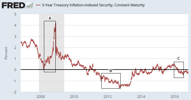
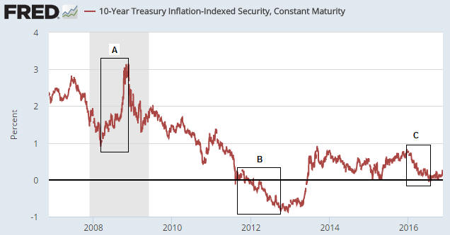
Due to the relationship between gold and the real interest rate, the gold price will often trend in the opposite direction to the 10-year TIPS yield. This is because the TIPS yield is a practical, albeit not theoretically correct, proxy for the real interest rate. For example, the sharp rise in the TIPS yield between March and November of 2008 (Period A on the following chart) coincided with a substantial downward correction in the gold price, and the multi-year decline in the TIPS yield from its November-2008 peak coincided with a powerful upward trend in the gold price.

Note, though, that the downward trend in the TIPS yield continued until September of 2012 whereas the gold price peaked in September of 2011. The period of divergence is labeled “B” on the following chart.

That the gold price stopped trending with the real interest rate for 12 months beginning in September of 2011 is related to the real interest rate being only one of several (six, to be specific) fundamental drivers of the gold price*. Other fundamental price drivers turned bearish during the second half of 2011 or the first half of 2012, thus counteracting the bullish influence of the declining real interest rate. That being said, substantial weakness in the gold price didn’t show up until after the real interest rate began to trend upward.

The real interest rate reached its post-2011 peak in December of 2015 — at around the same time that the Fed made its initial rate hike. The December-2015 downward reversal in the real interest rate marked the start of an intermediate-term rally in the gold price.

The most recent low in the real interest rate occurred in early-July (the end of Period C on the following chart) and coincided almost to the day with gold’s price top.

TIPSyield_LT_151116

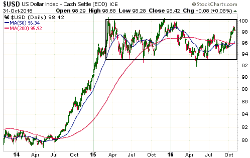
Prior to the Trump election victory there was no way of knowing whether the choppy sideways move in the real interest rate since early-July was a ‘pause for breath’ within a continuing downward trend or the start of a new upward trend. Prior to last week I therefore viewed this particular gold-market fundamental as neutral. It had stopped being a tailwind, but it hadn’t become a headwind.

The next chart shows that one consequence of last week’s post-election volatility was an upside breakout by the 10-year TIPS yield from its 4-month range. This means that the ‘real interest rate’ has temporarily become a headwind for gold.

TIPSyield_ST_151116

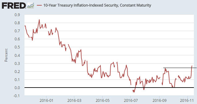
The TIPS yield is just one of six true fundamental drivers of the US$ gold price, but the post-election shift in this one indicator tipped (no pun intended) the overall fundamental balance from neutral to slightly-bearish for gold. This won’t prevent a multi-week rebound in the gold price, but the next major rally won’t begin until the fundamental backdrop has become more supportive.

*The other fundamental drivers of the gold price are the US yield curve (as indicated by the 10yr-2yr yield spread), credit spreads (as indicated by the IEF/HYG ratio), the relative strength of the banking sector (as indicated by the BKX/SPX ratio), the US dollar’s exchange rate and the overall trend for commodity prices.

Update on the Comex fear-mongering

November 7, 2016

Over the past few years there has been a lot of irrational fear-mongering within the gold commentariat regarding the potential for the Comex to default due to having insufficient physical gold in its coffers. I most recently addressed this topic in a post on 6th May.

I’m not going to repeat all the information contained in earlier posts such as the one linked above. However, here’s a very brief recap:

1) The ratio of Comex Open Interest (OI) to “Registered” gold inventory that Zero Hedge et al employed to create the impression of high default risk was not, in any way, shape or form, a valid indicator of such risk.

2) The amount of gold available for delivery at any time is the TOTAL amount of gold in the “Registered” and “Eligible” categories, not just the amount of “Registered” gold, since it is a quick and easy process to convert between “Eligible” and “Registered”.

3) The maximum amount of gold that can be demanded for delivery is the amount of OI in the nearest futures contract, not the total OI across all futures contracts.

In the above-linked post I included a chart showing that the amount of gold delivered to futures ‘longs’ over the preceding two years was much less in both absolute and relative terms than at any other time over the past decade. The chart made it clear that as the gold price fell, the desire of futures traders to ‘stop’ a contract and take delivery of physical gold also fell.

This meant that the unusually-small amount of gold in the “Registered” category was almost certainly related to an unusually-low desire on the part of futures ‘longs’ to take delivery. To put it another way, the unusually-small amount of gold in the “Registered” category was nothing more than a natural consequence of bearish sentiment.

Here was my conclusion at that time:

It’s a good bet that if a multi-year gold rally began last December (I think it did) then the desire to take delivery will increase over the next couple of years, prompting a larger amount of gold to be held in the Registered category.

Finally, here are charts from goldchartsrus.com showing that this year’s strength in the gold price led to 1) an increase in the desire of futures ‘longs’ to take delivery and 2) a related and substantial increase in the amount of “Registered” gold.

Exactly as expected.

gold_COMEXdeliv_071116

RegisteredGoldStock_071116

How should the real interest rate be measured?

November 4, 2016

Here is an excerpt from a recent TSI commentary.

Despite the popularity of doing so, subtracting the percentage change in the CPI or some other price index from the current nominal interest rate will not result in a realistic or reasonable estimate of the current ‘real’ interest rate.

The method of real interest rate calculation summarised above is wrong in two different ways, each of which is sufficient to render the result invalid. The first and most obvious way it is wrong is that the CPI does not reflect the change in the purchasing power of money. This is not just because it has been re-jigged over the decades as part of an effort to minimise its value, but also because the entire concept of a “general price level” is nonsense. There is no such thing as a general price level because disparate items cannot be averaged. To explain by way of a simple example, averaging the prices of a car, a potato and a visit to the dentist makes no more sense than averaging the goods/services themselves. Clearly, a car, a potato and a visit to the dentist cannot be averaged.

However, even if, for the sake of argument, we assume that the CPI makes sense at a conceptual level and is a satisfactory estimate of the change in the purchasing power of money, we still couldn’t use it to determine the current real interest rate. The reason is that the real rate of return obtained from an interest-producing investment has nothing to do with the historical change in the purchasing power of money and everything to do with the amount by which the purchasing power of money will change in the future. For example, if you buy a 1-year bond today your real return will be determined by how much the purchasing power of money changes over the next 12 months; not by how much it changed over the previous 12 months.

So, when you see a chart showing the nominal interest rate minus the 12-month percentage change in the CPI, what you are looking at is NOT a chart of the real interest rate.

How, then, should the real interest rate be calculated and charted?

The hard reality is that there are some things worth measuring that simply can’t be measured. The real interest rate falls into this category. By taking into account money-supply growth and population growth and by making a guess regarding productivity growth it is possible to come up with a realistic, albeit very rough, estimate of how the purchasing power of money shifted over a long historical period, but it will never be possible to calculate the current real interest rate.

The best we can do is use the financial market’s average forecast regarding the future CPI in our calculations. In other words, the best we can do is use the TIPS (Treasury Inflation Protected Security) yield as a proxy for the real interest rate, since the TIPS yield is effectively the nominal yield minus the expected CPI. A chart of the 5-year TIPS yield is displayed below and discussed in the next section (in relation to gold).

The TIPS yield is not an accurate reflection of the real interest rate because it is based on the CPI and because the market’s expectations are sometimes wrong, but for practical speculation purposes it seems to be good enough.

Interesting aspects of the current financial situation

November 1, 2016

Here are a few aspects of the current financial situation that I find interesting:

1) The spread between the 10-year T-Note yield and the 2-year T-Note yield is a proxy for the US yield curve. When this yield-spread is widening it implies that the yield curve is steepening and when this yield-spread is narrowing it implies that the yield curve is flattening.

The following chart shows that the 10yr-2yr yield-spread broke above its September high late last week. This is evidence that the US yield curve has shifted from a flattening to a steepening trend, which is a recession warning and a bearish omen for the US stock market. It is also bullish for gold, although the overall fundamental backdrop is no better than neutral for gold.

yieldcurve_311016

2) As illustrated below, the Dollar Index has been oscillating within a horizontal range for about 20 months. It has worked its way upwards since May of this year, but is roughly unchanged since the beginning of the year and is about 2 points below the top of its 20-month range.

The fact that the Dollar Index is roughly unchanged since the start of this year is interesting because the dominant fundamental driver of intermediate-term trends in the US dollar’s exchange rate (the relative strength of the US stock market) has been US$-bullish throughout this year. By rights, the Dollar Index should be well above its current level.

There are two reasons that the Dollar Index is still trapped within its horizontal range. One is that there was a huge sentiment-driven overshoot to the upside during the first quarter of 2015. The other is mentioned below.

US$_311016

3) The following chart shows the Treasury securities held in custody at the Fed for foreign central banks (FCBs). Not all US government debt securities owned by FCBs are held at the Fed, but more than half of them are and trends in the Fed’s custody holdings should reflect trends in overall holdings.

The chart shows that FCBs stopped being net buyers of US government debt in December-2013 and have been relentless net-sellers since December of last year. This tells us that FCBs have made a concerted attempt over the past 10 months to weaken the US$. This, I suspect, is a reason that the Dollar Index has remained range-bound this year to date despite the upward pressure exerted by US$-bullish fundamentals.

FCBTreasuries_311016

4) The following chart shows the amount of money held in the US federal government’s account at the Fed. Prior to the past year or so the amount of money in the Treasury’s deposit at the Fed was usually below $100B and had never been more than $200B, but something changed in November of 2015.

Since early-November of 2015 there has been a net addition of about $400B to the Treasury’s account at the Fed. This means that the Treasury has temporarily withdrawn about $400B from the US economy over the past 12 months, an action that is, in effect, a monetary tightening. This action would undoubtedly have slowed the pace of US economic activity.

The Treasury is obviously not trying to reduce the pace of economic activity. Why would it, especially in the lead-up to an election? It is, instead, trying to build-up a larger cash buffer for risk management purposes, possibly in expectation of more inter-party haggling over the debt ceiling.

TreasuryGeneral_311016

5) The final chart shows that the S&P500 Index is precariously poised near a technical precipice. A downside breakout will probably soon happen, but until support at 2120 is decisively breached there will be an outside chance of a rise to new highs prior to a tradable decline.

SPX_311016