Gold’s price should be consistent with the prices of other things

March 23, 2015

A recent Mineweb article comments: “…it does seem to be odd that given the huge undisputed flows of physical gold from West to East that the gold price has performed so badly over the past few years.” Actually, no, it doesn’t seem odd at all, since the flow of gold from sellers in one part of the world to buyers in another part of the world suggests nothing about the price. A net flow of gold from “West” to “East” is not inherently bullish and a net flow of gold from “East” to “West” would not be inherently bearish. Through bull markets and bear markets, some individuals, parts of the market and regions of the world will be net buyers and other individuals, parts of the market and regions of the world will be net sellers. Anyhow, the main purpose of this post isn’t to rehash the concept that the volume of gold being transferred between sellers and buyers contains no information about the past or likely future change in the gold price, it’s to make the point that gold’s price must bear some resemblance to the prices of other useful commodities.

Due to its nature, including its traditional role as a store of value, gold is capable of trending upward in price while most other commodities are trending downward in price. However, there are limits that have been defined by the historical record.

One of these limits is 26 barrels of oil. The historical record tells us that gold is very expensive relative to oil when the gold/oil ratio moves above 26. Even at the crescendo of the 2008-2009 Global Financial Crisis, when the fundamental backdrop was as bullish as it ever gets for gold relative to oil, the gold/oil ratio didn’t rise above 28. And yet, in January of this year the ratio got as high as 29. This was the highest since 1988 and not far from a 40-year high.

In other words, gold was so expensive relative to oil earlier this year that it would have made no sense to expect significant additional gains in the US$ gold price without a substantial recovery in the US$ oil price.

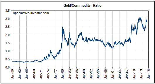
It’s a similar situation with many other commodities. For example, the following two charts show that a proxy for agricultural commodities and a proxy for commodities in general came within spitting distance of their respective 2008-2009 financial-crisis lows last week. Given that gold is presently trading about 70% above its 2008-2009 low, the appropriate question isn’t “why has gold performed so badly?” it’s “why has gold held up so well?”. I think it’s because there are plenty of well-heeled people in the world who are aware of the eventual consequences of the current monetary experiments and are buying gold as a form of insurance.

My point is that although some of gold’s most important fundamental price drivers are unique to gold, the gold price should never become completely divorced from the prices of other useful commodities. Considering the prices of other commodities, it would make no sense for the gold price to be substantially higher than it is today.

Print This Post Print This Post

Ignore per-ounce valuations for gold deposits

March 18, 2015

During 2001-2011, buying exploration-stage gold stocks with large in-ground resources at low per-ounce valuations worked well. It worked well because ‘the market’ was often more concerned about leverage and quantity than economic viability and quality. Since 2012, however, buying an exploration-stage gold-mining stock on the sole basis that owning the stock gave you relatively low-cost exposure to a lot of in-ground gold has generally not worked well, to put it mildly. For the past three years, one of the most important rules to be followed by value-oriented speculators in gold-mining stocks has been: if it ain’t economic, it ain’t worth anything. This rule will probably apply for at least two more years.

Here’s a specific example to illustrate how the per-ounce market value of an exploration-stage gold-mining stock can be very misleading.

At the closing stock prices on Tuesday 17th March, I estimate that the 1M ounces of Measured-and-Indicated (M&I) in-ground gold owned by Dalradian Resources (DNA.TO) were being valued by the market at around US$80/ounce and that the 15.7M ounces of M&I in-ground gold owned by International Tower Hill Mines (THM, ITH.TO) were being valued by the market at around US$2/oz (taking into account the net cash of the companies). This simple comparison suggests that THM offers much better value than DNA.TO, but this isn’t the case.

Based on the economic studies that have been completed to date by each company, I think that DNA offers the better value. The reason is that DNA’s deposit is economically robust at $1200/oz whereas THM’s deposit would require a gold price of more than $2000/oz just to become economically viable. Any gold deposit that currently needs a gold price of at least $2000/oz to become viable will never be worth anything, because by the time gold rises to $2000/oz, which it very likely will within the next 5 years, the deposit that needed a price of $2000/oz to be viable in early-2015 will probably need a gold price of $2500-$3000/oz to be viable.

Now, it’s certainly possible that THM will come up with a totally different mine design that enables the project to become viable at a much lower gold price. However, that’s a long shot. Based on what’s known today about the economics of THM’s Livengood project, the project’s appropriate per-ounce valuation is zero.

I’m not saying that buyers of THM won’t make money. THM and other gold stocks with blatantly uneconomic deposits will be bought during gold rallies and are capable of delivering large percentage gains in quick time. For example, THM’s stock price more than tripled from its Q4-2013 bottom to its Q1-2014 peak and almost doubled from its December-2014 bottom to its January-2015 peak. That is, stocks like this can still work well as short-term trades, despite the reality that their mining assets aren’t worth anything.

The important thing is not to kid yourself that an extremely low per-ounce valuation necessarily means that you are getting an excellent deal.

Print This Post Print This Post

Interesting US oil-production and price-inflation charts

March 16, 2015

An article by Wolf Richter contains some interesting charts showing the response of the US oil industry to the huge decline in the oil price. Two of these charts are displayed below.

The first chart shows that there has been a collapse in the rig count (the number of drilling rigs in operation), which is not surprising considering the magnitude of the price decline. It also shows that the daily oil production rate has continued to climb and has just hit a new all-time high, which is a little surprising.

The second chart shows that with flagging oil demand and the on-going upward trend in oil supply, the amount of oil in storage in the US has moved sharply higher and is now about 21% above the year-ago level.

Can the oil price bottom while supply/demand fundamentals are becoming increasingly bearish? The answer is yes, because the market is always trying to look ahead. However, at this time there is no evidence in the price action of a bottom.

US-oil-production-rig-count-2014-2015+Mar13

US-crude-oil-stocks-2015-03-11

A WSJ blog post by Josh Zumbrun contains charts suggesting that an upward reversal in US consumer prices is underway. The evidence is in data compiled by the “Billion Prices Project”, which “scrapes the Internet daily to capture changing prices online and has often foreshadowed subsequent changes in official price indexes.

Here is one of several interesting charts from the above-linked post. The “PriceStats” index is calculated by the Billion Prices Project. Based on past performance, the turn that’s showing up in the PriceStats daily index probably won’t be captured by official measures of “inflation” until reports in late April.

Print This Post Print This Post

Danger, data-mining ahead!

March 14, 2015

Depending on how it is manipulated, presented or interpreted, a set of data can be used to validate almost any theory or conclusion. For example, as I explained HERE, by changing the starting assumption the intraday London gold price data can be used to ‘prove’ either long-term suppression of the gold price or long-term elevation of the gold price. For another example, as I showed HERE, by cherry-picking the timescale of the data it is possible to demonstrate a relationship (in this case a relationship between the gold price and the US federal-debt/GDP ratio) that wouldn’t be apparent if a different timescale were chosen. I’ll now discuss a new example that was part of a 12th March article at Marketwatch.com.

I agree with the gist of the above-linked Marketwatch article, which is that the US stock market is stretched to the upside in a big way. However, the chart used in the article to make this point is a great example of data mining. Here is the chart.

The chart uses a 6-year rate of change (ROC) to suggest that the US stock market is almost as extended to the upside as it was at the top of the late-1990s mania, but why a 6-year ROC? Why not a 7-year or a 5-year ROC?

The answer is that only a 6-year ROC creates the impression that the author wants. A chart showing a 7-year ROC, for example, would actually appear to support an opposing view — that the market is not remotely stretched to the upside. As evidence I present the following chart of the Dow’s 7-year ROC. It makes the market look cheap!

Dow_7yrROC_140315

The reason that the 6-year ROC works so well to support the view that the market is dramatically extended to the upside is that the bottom of the major 2007-2009 bear market occurred exactly 6 years ago. What you are seeing in the past year’s spectacular rise in the market’s 6-year ROC is the reverse of the 2008-2009 crash. Even if the US stock market had traded sideways over the past year, the extraordinary market collapse of 2008-2009 would have ensured a moonshot in the 6-year ROC.

To put it another way, the near-vertical rise in the 6-year ROC over the past 12 months reflects the waterfall decline that happened many years ago. It does not reflect a manic upside blow-off in the current market.

If the market trades sideways from here then a year from now the 7-year ROC will show the moonshot that the 6-year ROC currently shows.

Print This Post Print This Post