(This post is a modified excerpt from a recent TSI commentary)
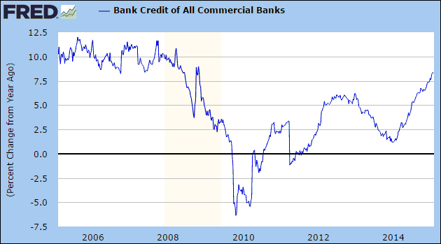
The year-over-year pace at which US commercial banks create new credit has accelerated — from a low of 1.2% at the beginning of last year to a recent high of around 8.5%. The relevant chart is displayed below. This is why the US monetary backdrop remained ‘easy’ over the past 12 months despite the gradual winding-down to zero of the Fed’s money-pumping. It is probably also why the US stock market was able to rise last year in the face of some serious headwinds.
Modern-day banking has nothing to do with capitalism. It is, instead, a type of fascism or, to use a less emotive word, corporatism. In essence, this means that it is an unholy alliance between government and private enterprise, which involves the government — directly or via its agents, such as the Federal Reserve in the US — having extensive control over the private enterprise and the private enterprise being given special privileges.
In the US and most other developed countries, the bank-government relationship generally encompasses the following repeating sequence:
1. The government either forces or provides financial incentives to the private banks to expand credit in areas where the government wants more credit to flow. At the same time, the central bank makes sure that there is plenty of scope for banks to profit by borrowing short to lend long.
2. The politically-directed or central-bank-stimulated lending causes booms in some economic sectors. While the boom continues, politicians publicly give themselves pats on the back, central bankers bathe in the glory stemming from general confidence in the financial system, and private bankers pay themselves huge bonuses.
3. The boom inevitably turns to bust, leading to massive loan losses and asset write-offs at most banks. It becomes clear that many banks are bankrupt.
4. The government and its agents provide whatever financial support is needed and implement whatever regulatory changes are needed to ensure that the private banks stay afloat. This is done at the expense of the rest of the economy but is invariably sold to the public as being either helpful to the rest of the economy or a necessary evil to prevent a more painful outcome for the overall economy.
5. The private banks, following their near-death experience, ‘pull in their horns’ and focus on repairing their balance sheets. A result is that commercial bank credit creation grinds to a halt or goes into reverse.
6. The cessation of commercial bank credit expansion is viewed by the government and its agents as a drag on the economy and, therefore, as something that must be fought.
7. Return to Step 1.
There are signs that the US is currently transitioning from Step 2 to Step 3, with the shale-oil industry being the leading edge of the next deluge of commercial bank write-offs. However, it isn’t a foregone conclusion. I know that Step 3 is coming, but the exact timing is unknowable. It’s possible, for example, that the acceleration of bank credit creation in other parts of the economy could mask the effects of the collapsing shale-oil boom.