
Every experienced trader knows that the financial markets are manipulated. They always have been manipulated and they always will be manipulated. Railing against gold-market manipulation is therefore akin to railing against the Earth revolving around the sun. Moreover, the attempts to manipulate, which, by the way, will be designed to move prices upward just as often as downward, will never be effective beyond the very short-term. As evidenced by the following charts, there is certainly no sign of a successful long-term gold-price suppression scheme.
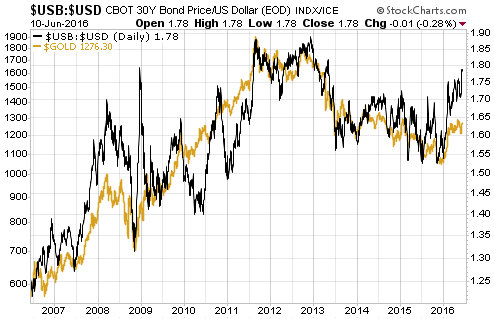
The first chart compares the US$ gold price with the bond/dollar ratio (the T-Bond price divided by the Dollar Index). This chart shows that the gold price has roughly done what it should have done, considering what was happening in the currency and bond markets, each step of the way over the past 10 years.
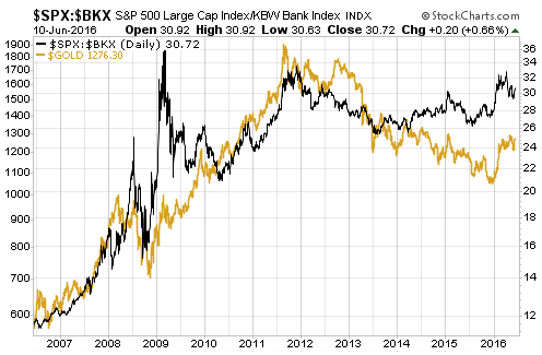
The next chart compares the US$ gold price with the SPX/BKX ratio (the broad US stock market relative to the banking sector). Those who understand gold would expect to see a positive correlation between the gold price and the SPX/BKX ratio, because gold should benefit from falling confidence in the banking sector and become less desirable during periods when investors are becoming increasingly confident in the banking sector’s prospects. There are naturally periods of overshoot and undershoot, but a positive correlation is readily apparent.
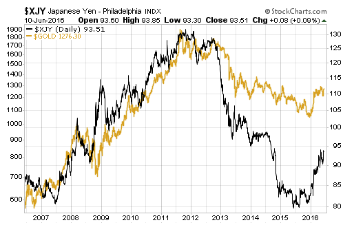
The third chart compares the US$ gold price and the Yen (the Yen/US$ rate). The gold price held up much better than the Yen during 2013-2015, but the positive correlation has been maintained.
Due to the Yen carry trade, gold’s positive correlation with the Yen has been stronger than its negative correlation with the Dollar Index for at least the past 10 years. The Yen carry trade causes the Yen to behave like a safe haven (even though it isn’t one), because carry trades tend to get put on during periods of rising confidence and taken off during periods of falling confidence.
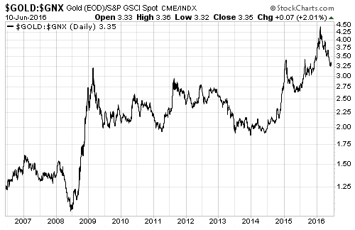
The final chart simply shows the gold/commodity ratio (gold relative to a basket of commodities represented by the Goldman Sachs Spot Commodity Index – GNX). This chart indicates that relative to commodities in general gold is almost 3-times as expensive today as it was 10 years ago. Also, for anyone who clearly remembers what happened in the financial world over the past 10 years it reveals that large and sharp rises in the gold/commodity ratio occurred exactly when they should have occurred — during periods of crisis and plunging confidence. Specifically, there were large and sharp rises: a) from mid-2015 through to early-February of 2016 as equity markets tanked around the world, b) in late-2014 and early-2015 as the financial markets fretted over what the ECB was going to do, c) in the second and third quarters of 2011 in parallel with a substantial stock-market correction and rising fears of euro-zone government debt default, and d) from mid-2008 through to February-2009 in response to the Global Financial Crisis.
By the way, gold is in a multi-generational upward price trend relative to commodities that dates back to 1971.
I look at a lot of charts comparing gold’s performance with various financial-market and economic indicators, only four of which are presented above. The overarching message is that if gold has been subject to a long-term price suppression scheme, the scheme has been totally unsuccessful.