December 31, 2015
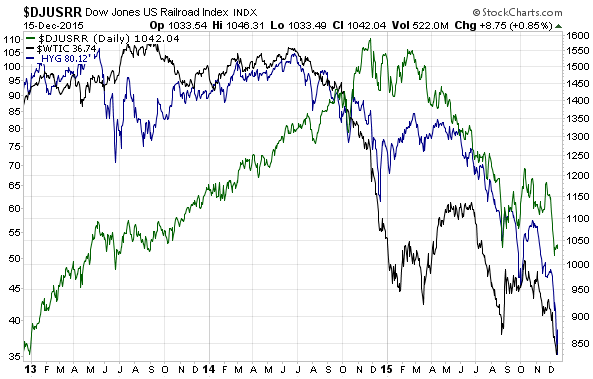
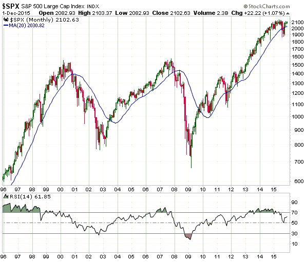
The following charts are discussed in an email sent to TSI subscribers.
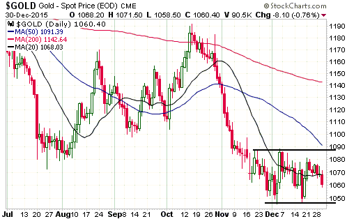
1) The US$ Gold Price
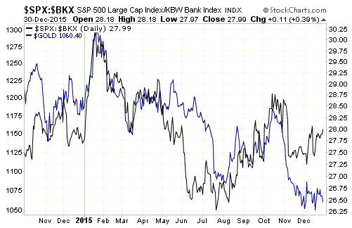
2) Gold versus the relative strength of the banking sector (as indicated by the SPX/BKX ratio)
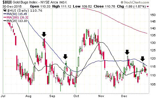
3) The HUI
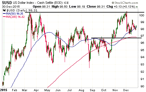
4) The Dollar Index
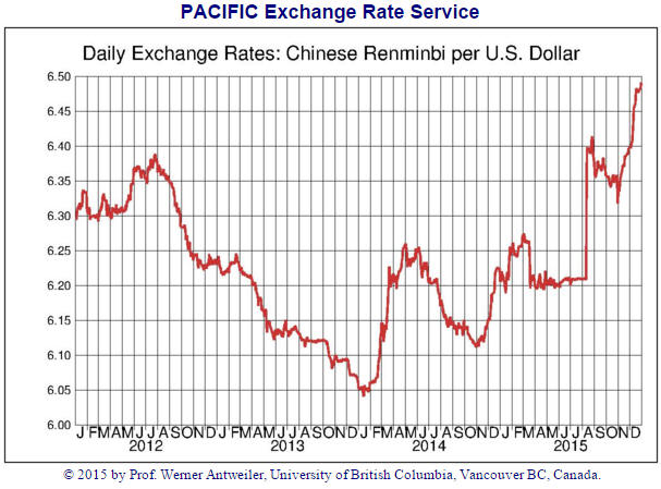
5) The US$/Yuan Exchange Rate
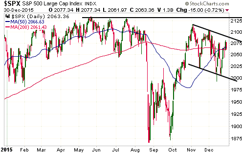
6) The S&P500 Index
7) The Europe 600 Banks Index (FX7)

 Print This Post