Print This Post Print This Post

Every central bank wants a weaker US$

December 2, 2016

This post is an excerpt from a recent TSI commentary.

Every central bank in the world, including the US Federal Reserve, now wants a weaker US$, which proves that central banks can be overwhelmed by market forces even when they are united in their goals.

Central banks outside the US want a weaker US$ due to the long-term consequences of the actions that they themselves took many years ago to strengthen the US$. To put it another way, they now want to strengthen their own currencies against the US$ because their economies are suffering from the inevitable ill-effects of the currency-depreciation policies implemented at an earlier time. As discussed in the past, currency depreciation/devaluation is always counter-productive because it “engages all the hidden forces of economic law on the side of destruction, and it does so in a manner that not one man in a million will be able to diagnose.” It is still a very popular policy, though, because at a superficial level — the level at which most economists and all central bankers operate — it seems practical.

Unfortunately for the central banks that are now trying to prop-up their currencies relative to the US$, a central bank’s ability to weaken its currency is much greater than its ability to bring about currency strength. The reason is that weakening a currency can usually be achieved by increasing its supply, and if there is one thing that central banks are good at it’s creating money out of nothing. Actually, creating money out of nothing, and, in the process, engaging all the hidden forces of economic law on the side of destruction, is the ONLY thing they are good at.

The problem they are now facing is that once confidence in the currency has been lost, bringing about currency strength or at least a semblance of stability will generally require either a very long period of politically-unpopular monetary prudence or a deflationary depression. There is no quick-and-easy way to obtain the desired result.

The crux of the matter is that there is very little that central banks outside the US can now do in the short-term to stop the US$ from rising. The best they can do is to NOT inflate. Other than that, they should simply avoid the temptation to ‘do something’ and instead just wait for the current trends to exhaust themselves.

The US central bank also wants a weaker US$. This is because the senior members of the Fed operate at the same superficial level as their counterparts throughout the world. They see the direct, short-term positives that a weaker currency would bring to some parts of the economy, but are incapable of seeing the broader, longer-term and indirect negatives.

The difference is that the Fed actually has the power to create short-term weakness in the US$. It could, for example, surprise the world by not hiking its targeted interest rate in December. That would knock the Dollar Index down by at least a couple of points. To build on the decline it could then start emphasising the sluggishness of US industrial production and dropping hints that another QE program is coming.

Doing so would, however, be a reckless course of action even by Keynesian standards. The US dollar’s upward trend would be over, but at the cost of a total loss of credibility on the part of the Fed and breathtaking instability in the financial markets.

Once lost, confidence is difficult for a central bank to regain. The Fed is therefore now backed into a corner where for the sake of appearances it will have to take small steps in the direction of tighter monetary policy, even though it would prefer a weaker US$.

Print This Post Print This Post

An economy can’t be modeled by simple equations

November 29, 2016

A modern economy typically involves millions of individuals making decisions about consumption, production and investment based on a myriad of personal preferences. It should be obvious that such a ‘system’ could never be properly described by any mathematical equation, let alone a simple one-line equation. And yet, many economists and other commentators on economics-related matters base their analyses on simple equations.

One of the most popular of these simple equations is also one of the most misleading. I’m referring to the following GDP formula:

GDP = C + I + G + X – Z, where C is consumer expenditure, I is investment, G is government expenditure, X is exports, and Z is imports.

This equation has numerous problems, beginning with the fact that GDP, itself, is a fatally-flawed measure of economic performance in that it treats a dollar of counter-productive spending as if it were just as good as a dollar of productive spending. In essence, it measures activity without considering whether the activity adds to or subtracts from total wealth. But rather than dealing with all of this equation’s problems, I’ll zoom in on its implication that an economy can be boosted via an increase in government spending (G). This implication is not only wrong, it’s dangerous.

Government spending involves taking (stealing or borrowing) money that would have been used by the private sector and then directing the money towards politically-motivated, as opposed to economically-motivated, uses.

Even if we put aside the most basic problems with the GDP concept and the above equation, there’s no good reason to believe that an increase in G will lead to an increase in GDP. This is because C, I and G are not independent variables. In particular, since the government obtains all of its resources from the private sector it is reasonable to expect that an increase in G would lead to an offsetting reduction in C+I. Furthermore, this reasonable expectation is supported by historical data, which reveal a long-term inverse correlation between government-spending growth and GDP growth.

Moving on, another of the most popular of the economics profession’s simple equations is also misleading. I’m referring to the famous equation of exchange, which can be expressed as M*V = P*Q where M is the money supply, V is the velocity of money, Q is the total quantity of transactions in the economy and P is the average price per transaction.

There are numerous problems with this equation, starting with the fact that it says nothing other than the total monetary value of all transactions in the economy equals the total monetary value of all transactions in the economy. In other words, it’s a tautology. As such, it provides no useful information.

In this tautological equation, V (velocity) is nothing more than a fudge factor that makes one side equal to the other side. V doesn’t exist outside of this equation, meaning that it has no relationship to the real world.

In the real world there is money supply and there is money demand. There is no “money velocity”. It makes no more sense to talk about the velocity of money than it does to talk about the velocity of gold or the velocity of bonds or the velocity of bananas or the velocity of houses.

Some of the people who talk about “money velocity” as if it were a genuine economic driver probably mean “money demand”, in which case they should say “money demand”. Money demand is certainly both real and important, but it can’t be calculated via a simple equation.

For more on the Equation of Exchange and the irrelevance of Money Velocity, please refer to my June-2015 blog post on the topic.

In conclusion, when a piece of analysis treats equations such as the ones mentioned above as if they were realistic models of how the economy works, at a superficial level it can make the analysis seem more scientific. However, it actually makes the analysis less scientific.

Using mathematical models that don’t reflect reality is part of why the economics profession has such a dismal track record and is generally held in low regard.

Print This Post Print This Post
Which of these markets is wrong?

November 23, 2016

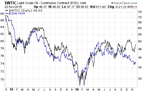
The US$ oil price and the Canadian Dollar (C$) have tracked each other closely over the past 2 years. When divergences have happened they have always been eliminated within a couple of months, usually by the oil market falling into line with the currency market.

In a 25th May blog post I wrote that an interesting divergence had developed over the preceding few weeks between these markets, with the C$ having turned downward at the beginning of May and the oil price having continued to rise. This suggested that either the currency market was wrong or the oil market was wrong. As I stated at the time, my money was on the oil market being wrong. In other words, I expected the divergence to be eliminated via a decline in the oil price.

The oil price was $49 at the time. Over the ensuing two weeks it moved a little higher (to $51) and then dropped by 20% within the space of two months. The result was that by early-August the gap between the oil price and the C$ had been fully closed.

The oil price and the C$ then traded in line with each other for about 6 weeks before another divergence began to develop. Again it was the oil market showing more strength than was justified by the currency market, and by early-October it was again likely that there would be a gap-closing decline in the oil price.

As expected, there was a significant decline in the oil price from mid-October through to early-November. However, the following chart shows that the gap was only partially eliminated and that a rebound in the oil price over the past 1-2 weeks has potentially set the stage for another significant gap-closing move.

I won’t be surprised if the oil price trades a bit higher within the coming two weeks, but my guess is that it will drop to the $30s within the coming three months.

oil_C$_221116

Print This Post Print This Post
Where did all the money go?

November 21, 2016

The prices of US government debt securities have been falling since early-July and plunged over the past two weeks. This prompts the question: Where did all the money that came out of the bond market go?

It’s a trick question, because not a single dollar has left the bond market. The reason is that for every sale there has been an exactly offsetting purchase. For example, if Bill sells $100M of T-Bonds, then $100M of cash gets transferred from the account of the buyer (let’s call him Fred) to Bill’s account. After the transaction, Bill has $100M more cash and $100M less bonds while Fred has $100M less cash and $100M more bonds. There has been no net flow of money out of or into the bond market.

In general terms, no money ever goes into or out of any market. A market, after all, is just a place where people go to trade. A market can grow or shrink, but it is not an entity that receives or disgorges money. Furthermore, every transaction in a market involves an increase in demand and an exactly offsetting decrease in demand. For example, in the case of the hypothetical bond traders mentioned above, the transaction involved an increase in the demand for bonds on the part of Fred and an exactly offsetting decrease in the demand for bonds on the part of Bill. Or, looking at it from a different angle, it involved an increase in the demand for money on the part of Bill and an exactly offsetting decrease in the demand for money on the part of Fred.

Related to the fact that no money ever goes into or out of any market is the fact that apart from a relatively small physical float, all of the money in the economy is always in the banking system*. It just gets shuffled around between the accounts of buyers and sellers. This, by the way, is why the “cash on the sidelines” argument that is regularly made to support a bullish stock market forecast is nonsense. In effect, all of the money in the economy is always on the sidelines.

Why, then, do market prices rise and fall?

Market prices rise and fall because one side (the buyers or the sellers) become more eager than the other side. If buyers are generally more eager than sellers then the price will rise by the amount required to encourage enough new sellers and/or discourage enough buyers so that a balance is established, whereas if sellers are generally more eager than buyers then the price will fall by the amount required to encourage enough new buyers and/or discourage enough sellers to establish a balance.

That’s why it sometimes happens that the prices of ‘everything’ (equities, bonds, gold, commodities) trend upward or downward together. One price doesn’t have to go down in order for another price to go up, and prices in one market going down will never be the direct cause of prices in another market going up. Although it is certainly the case that rising/falling prices in one market can alter the motivations of buyers and sellers in another market. The price of gold, for example, is determined mostly by what’s happening to prices in the bond, currency and stock markets.

Clearly, then, US government bond prices have fallen simply because, on average, bond sellers over the past few months have been more eager/motivated than bond buyers, not because any money has come out of the bond market. The reason for the change in motivation is a good topic for a separate post.

*If governments and banks get their way, at some point in the not-too-distant future there will be no physical float and 100% of the money supply will be in the banking system.

Print This Post Print This Post
Gold and the Real Interest Rate

November 16, 2016

The real interest rate is one of gold’s true fundamentals, with a rising real interest rate exerting downward pressure on the gold price and a falling real interest rate exerting upward pressure on the gold price. However, it is important to keep in mind that the real interest rate is just one of several fundamental drivers of the gold price.

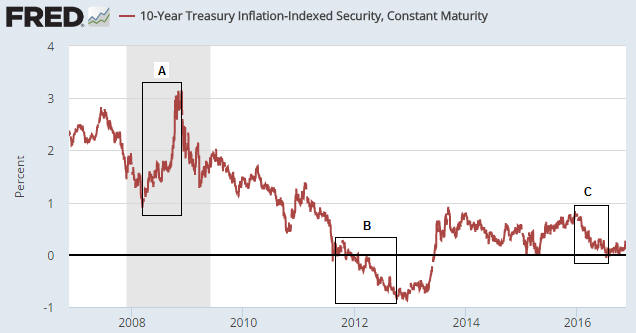
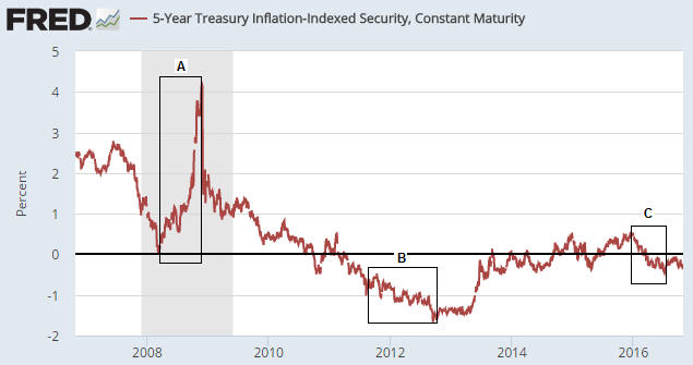
Due to the relationship between gold and the real interest rate, the gold price will often trend in the opposite direction to the 10-year TIPS yield. This is because the TIPS yield is a practical, albeit not theoretically correct, proxy for the real interest rate. For example, the sharp rise in the TIPS yield between March and November of 2008 (Period A on the following chart) coincided with a substantial downward correction in the gold price, and the multi-year decline in the TIPS yield from its November-2008 peak coincided with a powerful upward trend in the gold price.

Note, though, that the downward trend in the TIPS yield continued until September of 2012 whereas the gold price peaked in September of 2011. The period of divergence is labeled “B” on the following chart.

That the gold price stopped trending with the real interest rate for 12 months beginning in September of 2011 is related to the real interest rate being only one of several (six, to be specific) fundamental drivers of the gold price*. Other fundamental price drivers turned bearish during the second half of 2011 or the first half of 2012, thus counteracting the bullish influence of the declining real interest rate. That being said, substantial weakness in the gold price didn’t show up until after the real interest rate began to trend upward.

The real interest rate reached its post-2011 peak in December of 2015 — at around the same time that the Fed made its initial rate hike. The December-2015 downward reversal in the real interest rate marked the start of an intermediate-term rally in the gold price.

The most recent low in the real interest rate occurred in early-July (the end of Period C on the following chart) and coincided almost to the day with gold’s price top.

TIPSyield_LT_151116

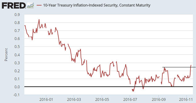
Prior to the Trump election victory there was no way of knowing whether the choppy sideways move in the real interest rate since early-July was a ‘pause for breath’ within a continuing downward trend or the start of a new upward trend. Prior to last week I therefore viewed this particular gold-market fundamental as neutral. It had stopped being a tailwind, but it hadn’t become a headwind.

The next chart shows that one consequence of last week’s post-election volatility was an upside breakout by the 10-year TIPS yield from its 4-month range. This means that the ‘real interest rate’ has temporarily become a headwind for gold.

TIPSyield_ST_151116

The TIPS yield is just one of six true fundamental drivers of the US$ gold price, but the post-election shift in this one indicator tipped (no pun intended) the overall fundamental balance from neutral to slightly-bearish for gold. This won’t prevent a multi-week rebound in the gold price, but the next major rally won’t begin until the fundamental backdrop has become more supportive.

*The other fundamental drivers of the gold price are the US yield curve (as indicated by the 10yr-2yr yield spread), credit spreads (as indicated by the IEF/HYG ratio), the relative strength of the banking sector (as indicated by the BKX/SPX ratio), the US dollar’s exchange rate and the overall trend for commodity prices.

Print This Post Print This Post
Update on the Comex fear-mongering

November 7, 2016

Over the past few years there has been a lot of irrational fear-mongering within the gold commentariat regarding the potential for the Comex to default due to having insufficient physical gold in its coffers. I most recently addressed this topic in a post on 6th May.

I’m not going to repeat all the information contained in earlier posts such as the one linked above. However, here’s a very brief recap:

1) The ratio of Comex Open Interest (OI) to “Registered” gold inventory that Zero Hedge et al employed to create the impression of high default risk was not, in any way, shape or form, a valid indicator of such risk.

2) The amount of gold available for delivery at any time is the TOTAL amount of gold in the “Registered” and “Eligible” categories, not just the amount of “Registered” gold, since it is a quick and easy process to convert between “Eligible” and “Registered”.

3) The maximum amount of gold that can be demanded for delivery is the amount of OI in the nearest futures contract, not the total OI across all futures contracts.

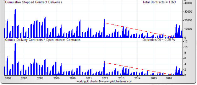
In the above-linked post I included a chart showing that the amount of gold delivered to futures ‘longs’ over the preceding two years was much less in both absolute and relative terms than at any other time over the past decade. The chart made it clear that as the gold price fell, the desire of futures traders to ‘stop’ a contract and take delivery of physical gold also fell.

This meant that the unusually-small amount of gold in the “Registered” category was almost certainly related to an unusually-low desire on the part of futures ‘longs’ to take delivery. To put it another way, the unusually-small amount of gold in the “Registered” category was nothing more than a natural consequence of bearish sentiment.

Here was my conclusion at that time:

It’s a good bet that if a multi-year gold rally began last December (I think it did) then the desire to take delivery will increase over the next couple of years, prompting a larger amount of gold to be held in the Registered category.

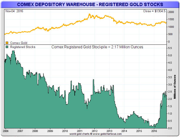
Finally, here are charts from goldchartsrus.com showing that this year’s strength in the gold price led to 1) an increase in the desire of futures ‘longs’ to take delivery and 2) a related and substantial increase in the amount of “Registered” gold.

Exactly as expected.

gold_COMEXdeliv_071116

RegisteredGoldStock_071116

Print This Post Print This Post
How should the real interest rate be measured?

November 4, 2016

Here is an excerpt from a recent TSI commentary.

Despite the popularity of doing so, subtracting the percentage change in the CPI or some other price index from the current nominal interest rate will not result in a realistic or reasonable estimate of the current ‘real’ interest rate.

The method of real interest rate calculation summarised above is wrong in two different ways, each of which is sufficient to render the result invalid. The first and most obvious way it is wrong is that the CPI does not reflect the change in the purchasing power of money. This is not just because it has been re-jigged over the decades as part of an effort to minimise its value, but also because the entire concept of a “general price level” is nonsense. There is no such thing as a general price level because disparate items cannot be averaged. To explain by way of a simple example, averaging the prices of a car, a potato and a visit to the dentist makes no more sense than averaging the goods/services themselves. Clearly, a car, a potato and a visit to the dentist cannot be averaged.

However, even if, for the sake of argument, we assume that the CPI makes sense at a conceptual level and is a satisfactory estimate of the change in the purchasing power of money, we still couldn’t use it to determine the current real interest rate. The reason is that the real rate of return obtained from an interest-producing investment has nothing to do with the historical change in the purchasing power of money and everything to do with the amount by which the purchasing power of money will change in the future. For example, if you buy a 1-year bond today your real return will be determined by how much the purchasing power of money changes over the next 12 months; not by how much it changed over the previous 12 months.

So, when you see a chart showing the nominal interest rate minus the 12-month percentage change in the CPI, what you are looking at is NOT a chart of the real interest rate.

How, then, should the real interest rate be calculated and charted?

The hard reality is that there are some things worth measuring that simply can’t be measured. The real interest rate falls into this category. By taking into account money-supply growth and population growth and by making a guess regarding productivity growth it is possible to come up with a realistic, albeit very rough, estimate of how the purchasing power of money shifted over a long historical period, but it will never be possible to calculate the current real interest rate.

The best we can do is use the financial market’s average forecast regarding the future CPI in our calculations. In other words, the best we can do is use the TIPS (Treasury Inflation Protected Security) yield as a proxy for the real interest rate, since the TIPS yield is effectively the nominal yield minus the expected CPI. A chart of the 5-year TIPS yield is displayed below and discussed in the next section (in relation to gold).

The TIPS yield is not an accurate reflection of the real interest rate because it is based on the CPI and because the market’s expectations are sometimes wrong, but for practical speculation purposes it seems to be good enough.

Print This Post Print This Post
Interesting aspects of the current financial situation

November 1, 2016

Here are a few aspects of the current financial situation that I find interesting:

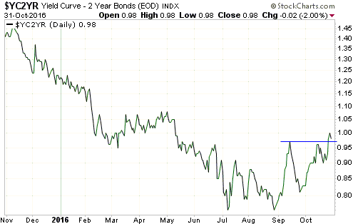
1) The spread between the 10-year T-Note yield and the 2-year T-Note yield is a proxy for the US yield curve. When this yield-spread is widening it implies that the yield curve is steepening and when this yield-spread is narrowing it implies that the yield curve is flattening.

The following chart shows that the 10yr-2yr yield-spread broke above its September high late last week. This is evidence that the US yield curve has shifted from a flattening to a steepening trend, which is a recession warning and a bearish omen for the US stock market. It is also bullish for gold, although the overall fundamental backdrop is no better than neutral for gold.

yieldcurve_311016

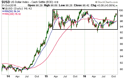
2) As illustrated below, the Dollar Index has been oscillating within a horizontal range for about 20 months. It has worked its way upwards since May of this year, but is roughly unchanged since the beginning of the year and is about 2 points below the top of its 20-month range.

The fact that the Dollar Index is roughly unchanged since the start of this year is interesting because the dominant fundamental driver of intermediate-term trends in the US dollar’s exchange rate (the relative strength of the US stock market) has been US$-bullish throughout this year. By rights, the Dollar Index should be well above its current level.

There are two reasons that the Dollar Index is still trapped within its horizontal range. One is that there was a huge sentiment-driven overshoot to the upside during the first quarter of 2015. The other is mentioned below.

US$_311016

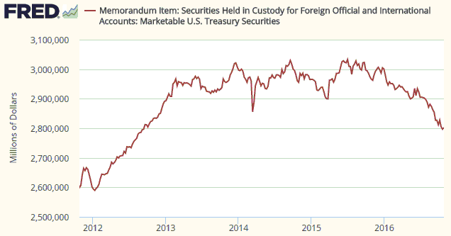
3) The following chart shows the Treasury securities held in custody at the Fed for foreign central banks (FCBs). Not all US government debt securities owned by FCBs are held at the Fed, but more than half of them are and trends in the Fed’s custody holdings should reflect trends in overall holdings.

The chart shows that FCBs stopped being net buyers of US government debt in December-2013 and have been relentless net-sellers since December of last year. This tells us that FCBs have made a concerted attempt over the past 10 months to weaken the US$. This, I suspect, is a reason that the Dollar Index has remained range-bound this year to date despite the upward pressure exerted by US$-bullish fundamentals.

FCBTreasuries_311016

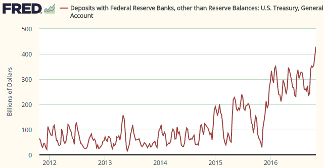
4) The following chart shows the amount of money held in the US federal government’s account at the Fed. Prior to the past year or so the amount of money in the Treasury’s deposit at the Fed was usually below $100B and had never been more than $200B, but something changed in November of 2015.

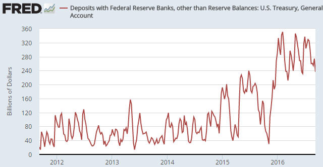
Since early-November of 2015 there has been a net addition of about $400B to the Treasury’s account at the Fed. This means that the Treasury has temporarily withdrawn about $400B from the US economy over the past 12 months, an action that is, in effect, a monetary tightening. This action would undoubtedly have slowed the pace of US economic activity.

The Treasury is obviously not trying to reduce the pace of economic activity. Why would it, especially in the lead-up to an election? It is, instead, trying to build-up a larger cash buffer for risk management purposes, possibly in expectation of more inter-party haggling over the debt ceiling.

TreasuryGeneral_311016

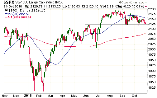
5) The final chart shows that the S&P500 Index is precariously poised near a technical precipice. A downside breakout will probably soon happen, but until support at 2120 is decisively breached there will be an outside chance of a rise to new highs prior to a tradable decline.

SPX_311016

Print This Post Print This Post
Chanting “it’s a bull market” won’t make it so

October 28, 2016

I’ve seen a lot of commentary in which the author assumes that this year’s rally in the gold price is the first rally in a new cyclical bull market. It probably is, but at this stage — as the saying goes — the jury is still out. At this stage it’s best to reserve judgment, because blindly assuming something that might not be true can lead to large losses.

There are two main reasons that ‘the jury is still out’. First and foremost, at no time over the past 12 months have gold’s true fundamentals* been definitively bullish. Instead, they have oscillated around neutral. There have been periods, such as February-April of this year, during which the fundamentals had a bullish skew, but after tipping in the bullish direction for at most 3 months they have always tipped in the other direction for a while.

Considering what central banks have been doing to the official forms of money my statement that the fundamental backdrop is not definitively gold-bullish could seem strange. After all, the ECB is firmly committed to asset monetisation and negative interest rates based on the belief that these counter-productive policies are working, and the Federal Reserve is seemingly afraid to take even a small step towards “policy normalisation” despite its targets for employment and “inflation” having been reached more than three years ago. However, gold’s fundamentals are determined by confidence, not by sound principles of economics. To put it another way, whether the fundamental backdrop is bullish or bearish for gold is determined by the general perception of what’s happening on the economic and monetary fronts rather than what’s actually happening. Perception will eventually move into line with reality, but in the meantime years can go by.

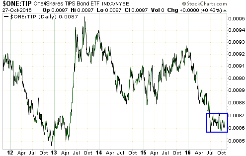
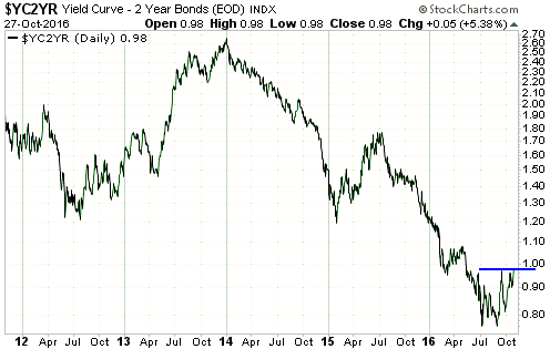
Since early-July the true fundamentals have been neutral at best and over the past month they have, on balance, been slightly bearish. However, they are constantly in flux and it currently wouldn’t take much to shift them to bullish or make them definitively bearish. In particular, two of the most important fundamental drivers of the gold price are neutral and positioned in a way that they could soon shift decisively in one direction or the other. I’m referring to the real interest rate, as indicated on the first of the following charts by the reciprocal of the TIPS bond ETF (1/TIP), and the US yield curve, as indicated on the second of the following charts by the 10yr-2yr yield spread.

The real interest rate would turn decisively gold-bullish if 1/TIP were to break downward from its recent 4-month range and decisively gold-bearish if 1/TIP were to break upward from its recent 4-month range. The yield curve, which has been gold-bearish for the bulk of the past three years, would turn decisively gold-bullish if the 10yr-2yr yield spread were to break solidly above its September high. Note that it is very close to doing exactly that. As an aside, a break by the 10yr-2yr yield spread above its September high would also be a recession warning and a bearish omen for the stock market.

Realint_271016

yieldcurve_271016

The price action is the other reason for the uncertainty as to whether this year’s rally marked the start of a cyclical bull market. I’m referring to the fact that of all the rallies in gold and the gold-mining indices from multi-year lows, this year’s rally is most similar to the bear-market rebound of 1982-1983.

The gold rally that began in December of 2015 will differentiate itself from the 1982-1983 bear-market rebound if the gold price closes above its July-2016 peak AND the HUI closes above its August-2016 peak.

Fortunately, you don’t need to be a fervent believer in the ‘new gold bull market’ story to make money from the rallies in gold and gold stocks. You will just tend to be more cautious than the bulls with blind faith.

*Five of the six “true fundamentals” were mentioned in the September-2015 TSI blog post linked HERE. The sixth is the general trend in commodity prices as indicated by a broad-based commodity index such as GNX.

Print This Post Print This Post
“Price inflation” is not the biggest problem

October 18, 2016

All else remaining equal, an increase in the supply of money will lead to a decrease in the purchasing-power (price) of money. Furthermore, this is the only effect of monetary inflation that the average economist or central banker cares about. Increases in the money supply are therefore generally considered to be harmless or even beneficial as long as the purchasing-power of money is perceived to be fairly stable*. However, reduced purchasing-power for money is not the most important adverse effect of monetary inflation.

If an increase in the supply of money led to a proportional shift in prices throughout the economy then its consequences would be both easy to see and not particularly troublesome. Unfortunately, that’s not the way it happens. What actually happens is that monetary inflation causes changes in relative prices, with the spending of the first recipients of the newly-created money determining the prices that rise the first and the most.

Changes in relative prices generate signals that direct investment. The further these signals are from reality, that is, the more these signals are distorted by the creation of new money, the more investing errors there will be and the less productive the economy will become.

Also, although adding to the money supply cannot possibly increase the economy-wide level of savings, monetary inflation temporarily creates the impression that there are more savings than is actually the case. This reduces interest rates, which prompts investments in ventures that are predicated on unrealistic forecasts of future consumer spending. Again, the eventual result will be a less productive economy.

During any given year it usually won’t be possible to separate-out the pernicious effects of monetary inflation and the distortion of interest rates that goes hand-in-hand with it from all the other forces affecting the economy. There will simply be too many things going on in the world that could be influencing the data. However, by taking a wide-angle (that is, long term) view it will often be possible to see the effects on the economy of shifts in monetary inflation.

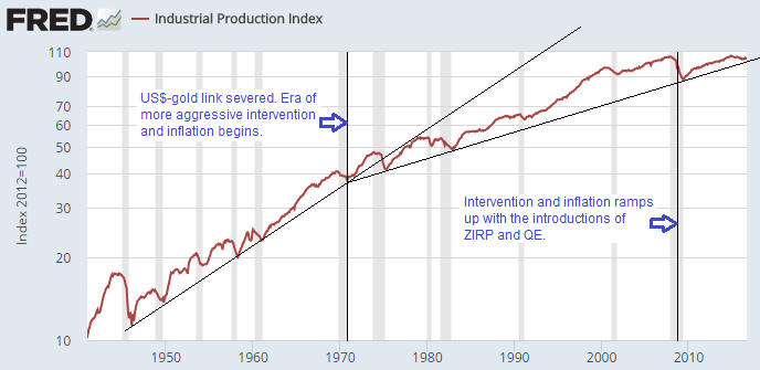
As an example of how long-term shifts in monetary inflation/intervention can be linked to long-term shifts in economic progress I present the following chart of the US Industrial Production Index. The chart shows that the industrial-production growth trend flattened at around the time that the ‘golden shackles’ were removed, that is, at around the time that the Fed was essentially empowered to do a lot more. This is not a fluke. The chart also shows that the ramping-up of the Fed’s monetary interventions in 2008-2009 has been followed by the weakest post-recession recovery in at least 70 years. Again, this is not a fluke.

IndustProd_181016

In economics, to have a chance of correctly interpreting cause and effect in the data you first have to know the right theory. That’s why Keynesian economists will not link the US industrial production slowdown with the Fed’s increasingly aggressive monetary interventions. From their perspective, the only negative effect that monetary inflation can possibly have is to make the cost of living rise at a faster pace than they believe it should be rising.

*Stable, here, means rising at around 2% per year. Note that it is not possible to come up with a single number that represents the economy-wide purchasing power of money, but this doesn’t stop the government (and some private organisations and individuals) from doing exactly that.

Print This Post Print This Post
The gold manipulation silliness continues

October 14, 2016

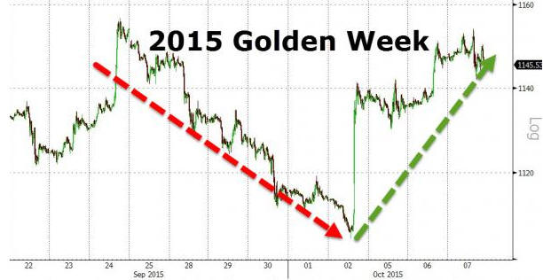
Not surprisingly, one of the silliest explanations for last week’s sharp decline in the gold price appeared in an article posted at the Zero Hedge web site. According to this article, the only plausible explanation for the decline is rampant manipulation while China’s markets were closed for the “Golden Week” public holidays*.

In an effort to prove that manipulators in the West routinely take advantage of China’s markets being closed to suppress the gold price, the article includes charts covering the 2015 and 2014 “Golden Week” holiday periods. These charts suggest that, as was the case this year, the gold price tanked during each of the preceding two years when China was closed for business. However, the charts are very misleading. Deliberately so, in my opinion.

For example, the following chart from the article suggests that the gold price plunged from the $1140s to around $1105 during the 2015 “Golden Week” holidays and then quickly recouped its losses after China’s markets re-opened, but that’s not the case. The “Golden Week” is from 1st to 7th October every year, so what actually happened was that the gold price fell from the $1140′s down to around $1115 during the days leading up to the 2015 “Golden Week” (while China was open for business) and then rebounded to the $1140s while China was on holiday.

gold_2015_141016

During the 2014 “Golden Week” holiday period there was no net change in the gold price.

The belief that manipulation is the be-all-and-end-all of the gold market is based on two false premises. The first is that the fundamentals are always gold-bullish. The second is that when financial markets are free from manipulation they always move in concert with the fundamentals. If you hold these two totally-wrong beliefs then every time there is a significant decline in the gold price you will naturally conclude that manipulation was the cause.

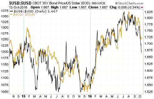
The reality is that gold’s true fundamentals have been deteriorating since July and that the pace of deterioration picked up over the past three weeks. At the same time, speculators in gold futures were adding to the risk of a steep downward price adjustment by stubbornly maintaining an extremely high net-long position.

The following chart compares the gold price with the bond/dollar ratio. The fundamental deterioration and the delayed response of the gold market can clearly be seen on this chart.

Gold market participants and observers who were looking at the right indicators will not have been surprised by last week’s price decline.

*China is apparently the bastion of honest price discovery in the gold market and corrupt Western bankers apparently wait for the Chinese to go on vacation before launching their bear raids.

Print This Post Print This Post
Most people want price controls

October 11, 2016

Anyone with rudimentary knowledge of good economic theory can explain why government price controls are a bad idea. It boils down to the fact that the optimum price is the price that naturally balances supply and demand, and to the related fact that forcing the price to be above or below the level at which supply and demand would naturally be in balance will lead to either a glut or a shortage. However, even though most people are capable of understanding why price controls are counter-productive, they still want them.

To be clear, most people living in semi-free countries are undoubtedly against the general concept of price controls, but they will be in favour of specific price controls. In a remarkable display of cognitive dissonance, they will simultaneously understand why price controls must cause economic problems and advocate for price controls in certain situations.

They will be in favour of certain price controls due to political leanings or due to being direct beneficiaries of the controls. Here are some examples:

1) Anyone who understands how supply and demand inter-relate should understand that minimum wage laws are not only counter-productive on an economy-wide basis but also cause the most problems for the group of workers they have supposedly been put in place to protect. In particular, it is axiomatic that if government intervention forces the price of labour to be higher than it would otherwise be then the demand for labour will be lower, that is, more people will be unemployed, with the additional unemployment occurring mostly within the ranks of the lowest-skilled workers. For example, if the official minimum wage is $15/hour and someone, due to their lack of experience or skills, is only worth $12/hour, then that person will be out of work. He might be eager to work for $12/hour to gain the experience/training he needs to increase the value of his labour, but the government says: “No; you will either get paid $15/hour or you will be unemployed”.

There are countless people who understand all this and yet strongly support minimum wage laws, either because the laws mesh with their political beliefs or because they personally benefit from the laws.

2) Anyone who understands basic economics should be capable of figuring out that it makes no sense for one of the most important prices in the economy to be set by a banking committee or government agency, and yet most people involved in economics and finance believe that there should be a central bank.

3) It is obvious that “rent control” legislation will lead to a shortage of rental properties and lower average standards of maintenance for existing rental properties, but the current/direct beneficiaries of the legislation (the people who live in rent-controlled housing) will often be in favour of this form of price control.

4) Price caps on utility charges will generally seem like a good idea to the people who currently benefit due to having lower electricity or water bills. That will typically be so even if these people have given the matter enough thought to understand that the artificially-low current prices will lead to less investment in future supply and less maintenance on current plant, leading, in turn, to much higher prices and/or a lower level of service in the future.

5) So-called “anti-price-gouging” laws are invariably popular during disasters, but laws that prevent prices from fully responding to a sudden shortage also reduce the incentive to speedily address the shortage. They therefore prolong the supply problem.

6) Here’s an example that I wasn’t aware of until a couple of weeks ago when I read the article posted HERE. The article discusses a dispute between companies that drill for natural gas in the US and landowners who receive royalty payments in exchange for letting the companies drill on their land. The dispute is about whether the drilling companies are entitled to deduct certain expenses from the royalty payments, but what really caught my attention was the reference to a Pennsylvania state law mandating that a landowner must receive a royalty of at least 12.5 percent of the value of the gas produced on his property.

This law was undoubtedly put in place for the benefit of landowners and most landowners are probably in favour of it, but what it means is that if the price of natural gas isn’t high enough to enable the drilling companies to afford a 12.5% royalty then production will stop and the landowners will get nothing. There’s no scope for the royalty payments to be influenced by natural market forces, although it’s possible that the drilling companies are using deductions to get around the law and reduce the effective royalty rate to a level that is economic at the current gas price.

In summary, very few people are consistently opposed to government price controls. Even people who have enough economics knowledge to understand why price controls never work as advertised find reasons to believe in particular price controls. As a consequence, most of the price controls that are now in place have a lot of supporters among the voting public and are therefore likely to remain in place.

Print This Post Print This Post

Wearing blinders when analysing China

October 5, 2016

Some analysts who are usually astute and show a good understanding of economics seem to put on blinders before looking at China. It’s as if, when considering China’s prospects, they forget everything they know about economics and refuse to see beyond the superficial. A recent example is Doug Casey’s article titled “Chung Kuo“.

Here’s an excerpt from the Casey article:

I can give you a dozen credible scenarios describing what might happen in China over the next couple of decades. But the trend that seems certain to continue is the rapid rate of wealth increase there. I don’t credit official figures with any great accuracy, but if we take them as being approximately right, then the U.S. economy is growing at 2%, and China’s at about 7% — but with a base of about four times the population. What this means is that the largest economy on the planet will soon no longer be America’s — but China’s.

There are two big problems with the above paragraph. First, after saying that he doesn’t credit official figures with any great accuracy he takes these figures as being approximately right. The reality, however, is that China’s reported growth figures are completed fabricated. It’s not that China’s government reports growth of 7.0% when the actual rate of growth is 6.5%; it’s that China’s government reports growth in the 6.5%-7.5% range every year regardless of what’s happening. If the economy were shrinking rapidly the government would still report growth in the 6.5%-7.5% range. Based on other measures of economic activity there have almost certainly been 12-month periods over the past 10 years when China’s economy shrank in real terms, but during these periods China’s government still reported growth of around 7%.

The second problem is that the monetary size of an economy is irrelevant to the people living in it. What matters is per-capita wealth, not aggregate wealth and certainly not aggregate spending (which is what GDP attempts to measure). For example, it’s quite possible that in size terms Nigeria’s economy will overtake Switzerland’s economy within the next few years, but so what? Nobody in their right mind is saying that if this happens then the average Swiss will be worse off than the average Nigerian, because it obviously must be taken into account that there are 175M people in Nigeria and only 8M in Switzerland.

The Casey article then goes on to list some of the things that China has going for it, but most of these things were just as applicable 100 years ago as they are today. Therefore, they aren’t critical ingredients for strong, broad-based economic progress.

Surprisingly, given that Doug Casey’s big-picture analysis is usually on the mark, the Casey article fails to address any of the most important issues. There’s no mention, for example, that China has a command economy with only token gestures towards free markets.

The true colours of China’s economic commanders were shown in 2015 following the bursting of the stock market bubble that they had purposefully created. I’m referring to how they became increasingly draconian in their efforts to stop the price decline. When words of support didn’t work, they made short-selling illegal and began to aggressively buy stocks. When that didn’t work, they forbade corporations and investment funds from selling at all and made it clear that bearish public comments about the stock market would not be tolerated. And when the market still didn’t cooperate, they started apprehending or ‘disappearing’ people suspected of placing bearish bets.

Related to the “command economy” issue is the fact that China has always had an emperor. This means that there is no history of freedom or a culture of individual-rights to fall back on. Furthermore, Xi Jinping, the current emperor (who doesn’t call himself an emperor), has shown admiration for Mao Tse Tung, the most brutal emperor (who also didn’t call himself an emperor) in China’s history.

There’s also no mention in the Casey article that over the past 10 years China has experienced the greatest mal-investment in centuries. You would have to go back to the pyramids of ancient Egypt or the building of the Terracotta Army by China’s first emperor more than 2000 years ago to find comparable examples of resource wastage on such a grand scale.

All the ghost cities, spectacular-but-mostly-vacant shopping malls, barely-used airports and bridges to nowhere have boosted the Keynesian measures of growth — such as GDP — that don’t distinguish between productive and unproductive spending. Consequently, even if the GDP growth figures reported by China’s government bore some resemblance to reality (they don’t), the reported growth wouldn’t be a reason to be optimistic because so much of it is associated with wasteful spending. Moreover, the bulk of the spending is debt-funded by State-controlled banks that would make Deutsche Bank look financially ‘rock solid’ if given a proper accounting treatment.

Next, there’s the legacy of the “one-child policy” to consider. Thanks to decades of the national birth rate being restricted by the giant boot of government, China is now facing a major demographic problem. Specifically, for at least the next couple of decades the number of prime-age workers is going to shrink relative to the elderly.

Finally, it is worth mentioning China’s mind-boggling wealth disparity. A few hundred million people are doing OK and a few million have become extremely wealthy while at least a billion people are living in abject poverty.

As to why some people who produce well-reasoned analysis of what’s happening in the Western world seem incapable of applying the same principles and logic when analysing China, I can only guess. My guess is that they are too focused on trying to show the US in a negative light to see what’s going on in China. It is, however, possible to be concerned about the direction in which the US is heading without being bullish on China.

Print This Post Print This Post
Inflation has always been about theft

October 3, 2016

In 262 AD, plans were being put in place to celebrate the “decennalia” (10 years on the throne) of Roman emperor Gallienus. The following excerpt from the fourth book in Harry Sidebottom’s “Warrior of Rome” series is part of a discussion between Gallienus and his senior advisors regarding how an appropriately-grandiose “decennalia” would be funded:

“The a Rationibus, in charge of the finances of the imperium, did not hesitate. “Celebrating your maiestas is without price and, as you know, Dominus, plans are in place to debase the precious metal in the coinage again. It will be a few months before the merchants catch up.””

In the end Gallienus decides to pay for the celebrations using direct theft (by confiscating and then selling the estates of his enemies and those of their families), but the final sentence of the above excerpt from a work of historical fiction reveals more knowledge of how monetary inflation works than is found in the writings of most Keynesian economists.

Regardless of whether it is implemented via an emperor surreptitiously reducing the precious-metal content of the coinage or by the banking system (the central bank and the commercial banks) creating new currency deposits out of nothing, monetary inflation is a method of forcibly transferring wealth from the rest of the economy to the first users of the new or debased money. In other words, it is a form of theft.

It has always been popular and it has nearly always been effective in the short term because it takes time — potentially a long time — for the people who are having their wealth siphoned away by the inflation to figure out what’s going on. For example, in ancient Rome it took the merchants a few months to catch up following a round of coinage debasement, meaning that it took a few months for prices to adjust to the reduced value of the money. These days it takes much longer, because there is no observable difference between the currency units that are being issued today and the ones that were issued in the past. In fact, these days most people never figure out why they are finding it increasingly difficult to make ends meet.

Just to be clear, if monetary inflation caused a nearly-immediate and uniform increase in prices throughout the economy then it would never have been popular. From the perspective of the ‘inflators’ it would serve no purpose, because it would not enable a small minority to benefit at the expense of the majority. It is only popular because it boosts some prices relative to other prices, thus temporarily benefiting some parts of the economy at the expense of other parts, and because the early users of the new money get to do the bulk of their spending/investing before prices rise.

As mentioned above, these days it is not possible to directly observe the debasement of money. Also, the populace is regularly told that “inflation” is not only not a problem, there isn’t enough of it! As a consequence, knowledge of good economic theory is required to understand what’s happening to money and why slower economic progress, or even a prolonged economic contraction, will be an inevitable result.

Unfortunately, hardly anyone has this knowledge, so most people’s minds are open to the propaganda that central banks are providing genuine support to the economy and that a more interventionist government could help make things better.

Print This Post Print This Post
A strange sentiment conflict

October 1, 2016

This blog post is a excerpt from a recent TSI commentary.

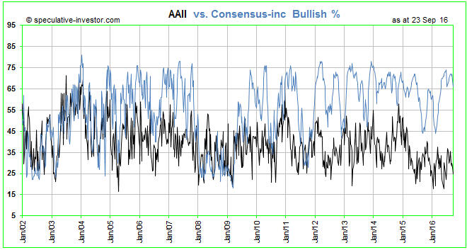
As the name suggests, the weekly American Association of Individual Investors (AAII) sentiment survey is an attempt to measure the sentiment of individual investors. The AAII members who respond to the survey indicate whether they are bullish, neutral or bearish with regard to the US stock market’s performance over the coming 6 months. The AAII then publishes the results as percentages (the percentages that are bullish, neutral and bearish). The Consensus-inc. survey is a little different in that a) it is based on the published views of brokerage analysts and independent advisory services and b) the result is a single number indicating the bullish percentage. However, the results of both surveys should be contrary indicators because in both cases the surveyed population comes under the broad category affectionately known as “dumb money”.

In other words, in both cases it would be normal for high bullish percentages to occur near market tops (when the next big move is to the downside) and for low bullish percentages to occur near market bottoms (when the next big move is to the upside). That’s why the current situation is strange.

With the S&P500 Index (SPX) having made an all-time high as recently as last month and still being within two percent of its high it would be normal for sentiment to be near an optimistic extreme. As evidenced by the blue line on the following chart, that’s exactly what the Consensus-inc survey is indicating. However, the black line on the following chart shows that the AAII survey is indicating something very different. Whereas the Consensus-inc bullish percentage is currently near the top of its 15-year range, as would be expected given the price action, the AAII bullish percentage is currently near the BOTTOM of its 15-year range. According to the AAII sentiment survey, individual investors are only slightly more bullish now than they were at the crescendo of the Global Financial Crisis in November-2008.

The conflict between the AAII survey results and both the price action and the results of other sentiment surveys (the AAII survey is definitely the ‘odd man out’) suggests that small-scale retail investors have, as a group, given up on the stock market and are generally ignoring the bullish opinions of mainstream analysts and advisors. We are pretty sure that a similar set of circumstances has not arisen at any time over the past 40 years, although it may well have arisen during an earlier period.

The lack of interest in the stock market on the part of small-scale individual investors could be construed as bullish, but we don’t see it that way. To us, the fact that the market has come this far and reached such a high valuation without much participation by the “little guy” suggests that the cyclical bull market will run its course without such participation. It also suggests to us that the cyclical bull market is more likely to end via a gradual rolling-over than an upside blow-off, because upside blow-offs in major financial markets require exuberance from the general public.

Print This Post Print This Post
Will the Fed be able to fight the next recession?

September 27, 2016

If you are asking the above question then your understanding of economics is sadly lacking or you are trying to mislead.

The Fed will never be completely out of monetary ammunition, because there is no limit to how much new money the central bank can create. The Fed will therefore always be capable of implementing some form of what Keynesians call stimulus. However, the so-called stimulus cannot possibly help the economy.

To believe that the central-bank monetisation of assets can help the economy you have to believe that an economy can benefit from counterfeiting. And to believe that the economy can be helped by lowering interest rates to below where they would otherwise be you have to believe that fake prices can be economically beneficial. In other words, you have to believe the impossible.

The reality is that the Fed never fights recession or helps the economy recover from recession, but it does cause recessions and gets in the way of genuine recovery after a recession occurs. For example, the monetary stimulus put in place by the Fed in response to the 2001 recession caused mal-investments — primarily associated with real estate — that were the seeds of the 2007-2009 recession. The price distortions caused by the Fed’s efforts to support the US economy from 2008 onward then firstly prevented a full liquidation of the mal-investments of 2002-2007 and then promoted a range of new mal-investments*. It’s therefore not a fluke that the most aggressive ‘monetary accommodation’ of the past 60 years occurred alongside the weakest post-recession recovery of the past 60 years. Moreover, the cause of the next recession will be the mal-investments stemming from the Fed’s earlier attempts to stimulate.

Unfortunately, if you have unswerving faith in a theoretical model that shows stronger real growth as the output following interest-rate cutting and/or money-pumping, then in response to economic weakness your conclusion will always be that interest-rate cutting and/or money-pumping is the appropriate course of action. And if the economy is still weak after such a course of action then your conclusion will naturally be that the same remedy must be applied with greater force.

For example, if cutting the interest rate to 1% isn’t followed by the expected strength then you will assume that the correct next step is to cut the interest rate to zero. If the expected growth still doesn’t appear then you will conclude that a negative interest rate is required, and if the economy stubbornly refuses to show sufficient vigor in response to a negative interest rate then your conclusion will be that the rate simply isn’t negative enough. And so on.

Whatever happens, the validity of the model that shows the economy being given a sustainable boost by central-bank-initiated monetary stimulus must never be questioned. After all, if doubts regarding the validity of the model were allowed to enter mainstream consciousness then people might start to ask: Should there be a central bank?

Circling back to the question posed at the top of this blog post, the question, itself, is a form of propaganda in that it presupposes the validity of the stimulus model (it presumes that the Fed is genuinely capable of fighting a recession, which it patently isn’t). Anyone who asks the question is therefore either a deliberate promoter of dangerous propaganda or a victim of it.

*Examples of the mal-investments promoted by the Fed’s money-pumping and interest-rate suppression during the past several years include the favouring by corporate America of stock buybacks over capital investment, the debt-funding of an unsustainable shale-oil boom, a generally greater amount of risk-taking by bond investors as part of a desperate effort to obtain a real yield above zero, the large-scale extension of credit to ‘subprime’ borrowers to artificially boost the sales of new cars, and the debt-funded investing in college degrees for which there is insufficient demand in the marketplace (a.k.a. the student loan scam).

Print This Post Print This Post
Corporate America has been in recession since 2014

September 23, 2016

This blog post is an excerpt from a recent TSI commentary.

The following three charts tell an interesting story.

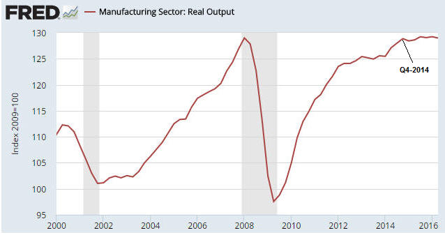
The first chart shows that the real output of the US manufacturing sector has essentially flat-lined since Q4-2014.

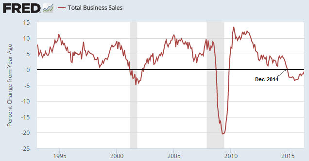
The next chart shows that Total US Business Sales has been down on a year-over-year basis during every month subsequent to December-2014.

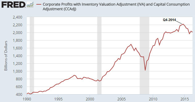
The third chart shows that US corporate profits peaked in Q4-2014 and in the latest completed quarter (Q2-2016) were almost 10% below their peak.

The story is that there has been a business recession in the US since the end of 2014. The business recession hasn’t yet transformed into a full-blown economic recession, but it will possibly do so within the next three months and it will probably do so by mid-2017.

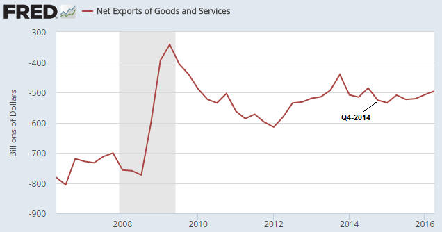
The US business recession hasn’t been caused by the relatively strong US$. We know this firstly because a strong currency logically cannot be the cause of persistent economic weakness and secondly because the following chart shows that Net US Exports have improved slightly since the end of 2014.

Economic weakness outside the US has almost certainly played a part in the US slowdown, but the biggest part has been played by the Fed. Monetary policy has simultaneously caused stock prices to remain high and underlying businesses to languish, with the most obvious evidence being the favouring of debt-funded stock buybacks over capital investment.

Print This Post Print This Post
Using statistics to distort reality

September 19, 2016

Two months ago I posted a short article in which I discussed an example of how the change in an economic statistic was greatly exaggerated — in order to paint a misleading picture — by showing the percentage change of a percentage. I’ll now discuss another example of using the same trick to make the change in an economic number seem far more dramatic than was actually the case.

Before getting to the specific example, the general point is that when analysing economic data — or any other data for that matter — it won’t make sense to consider the percentage of a percentage unless it’s the second derivative that you are primarily interested in. When you take the percentage change of a percentage you cause a change in the underlying number from 0.5 to 1.0 to become the same as a change in the underlying number from 5 to 10 or 100 to 200, but in the real world the change in an economic number from 5 to 10 will usually have vastly different implications to the change in the same number from 0.5 to 1.0. For example, there is a huge difference between a change in the rate of GDP growth from 0.5% to 1.0% and a change in the rate of GDP growth from 5% to 10%, but both constitute a 100% increase in the rate of growth.

On a related matter, it can also be problematic to look at percentage changes of economic numbers when the numbers are fluctuating near zero. This is because a move from one miniscule value to another can be large in percentage terms. For example, a move from 0.01 to 0.03 is a 200% increase.

The specific example that prompted this post appeared in John Mauldin’s recent article titled “Negative Rates Nail Savers“. The gist of the Mauldin piece is completely correct, but during the course of the long article some mistakes were made. I’m zooming-in on the mistake contained in the following excerpt:

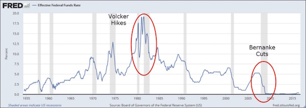
Here is a long-term chart of the federal funds rate, the Fed’s main policy tool:

The gray vertical bars represent recessions. You can see how the Fed has historically dropped rates in response to recessions and then tightened again when those recessions ended. I red-circled the particularly drastic loosening and retightening under Paul Volcker in the early 1980s and Ben Bernanke’s cuts to near-zero in 2008.

To this day, the Volcker rate hikes are legendary. No Fed chair has ever done anything like that, before or since. You hear it all the time. Problem: it’s not true.

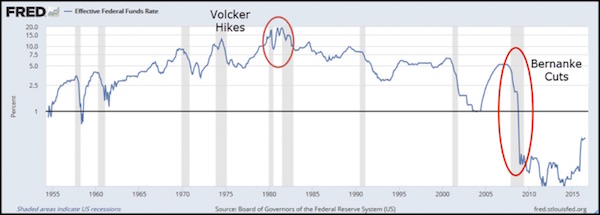
Here is the same chart again, this time with a log scale on the vertical axis. This adjusts the rate changes to be proportionate with percentage rises and falls. The percentage change between 5% and 10% is the same as between 10% and 20%, since both represent a doubling of the lower number.

Looking at it this way, the Volcker hikes are tame, almost unnoticeable. Meanwhile the Bernanke cuts dwarf all other interest rate changes since 1955. Nothing else is even close. Bernanke’s rate cuts were far, far more aggressive than Volcker’s rate hikes.

The fact that looking at it this way “the Volcker hikes are tame, almost unnoticeable” should have told Mr. Mauldin that it was the wrong way to look at it. Moreover, looking at it Mr. Mauldin’s preferred way, even the tiny up-tick in the Fed Funds Rate last December makes Volcker’s hikes seem tame. After all, when the Fed nudged the target Fed Funds Rate up from 0.125% to 0.375% last December it could be described as a 200% rate increase (since 0.375 is three-times 0.125). This means that by taking the percentage change of a percentage, or in this case by charting percentages using a log scale, it can be shown that last December’s rate hike was the most aggressive monetary tightening in the Fed’s history!

I suspect that Mr. Mauldin’s mistake was innocent, but a sure way to reduce the credibility of an otherwise good argument is to use flawed statistical methods to support it.

Print This Post Print This Post
What is/isn’t a risk to the global economy

September 16, 2016

This post is an excerpt from a recent TSI commentary.

Quantitative Easing (QE) is a risk. Negative Interest Rate Policy (NIRP) is a big risk. Governments using the threat of terrorism as an excuse to dramatically increase their own powers and reduce individual freedom is a huge risk. X hundred trillion dollars of notional derivative value is meaningless.

The hundreds of trillions of dollars of notional derivative value and the associated counterparty risk is a potential life-threatening problem for some of the major banks, but if you believe that derivatives are like a sword of Damocles hanging over the global economy then you’ve swallowed the propaganda hook, line and sinker. The claim during 2008-2009 that the major banks had to be bailed out to prevent a broad-based economic collapse was a lie and it will be a lie when it re-emerges during the next financial crisis.

The global economy could easily handle JP Morgan, Goldman Sachs, Bank of America, Citigroup and Deutsche Bank all going out of business. The shareholders of these companies would suffer 100% losses on their investments, the bondholders of these companies would suffer substantial ‘haircuts’, most employees in the investment-banking and proprietary-trading parts of these companies would lose their jobs, but it’s unlikely that depositors would be adversely affected as the basic banking businesses would simply come under new management. Furthermore, while there would be short-term disruption, Apple would continue to sell loads of iPhones, Exxon-Mobil would continue to sell loads of oil, Toyota would continue to sell loads of cars, and both Walmart and Amazon would continue to sell loads of everything. Life would go on and in less than 12 months most people would not notice that some of history’s banking behemoths had departed the scene.

The real economic threat posed by derivatives is that when there is a blow-up the central banks and governments will swing into action in an effort to keep the major banks afloat. Rather than doing nothing other than ensuring that there is a smooth transfer of ownership for the basic banking (deposit-taking/loan-making) parts of the businesses, we will likely get a lot more of the policies that transfer wealth from the rest of the economy to the banks. That is, we will get a lot more price-distorting QE and programs similar to TARP.

The justification will be that saving the banks is key to saving the economy, but in reality the biggest threat to the economy will come from the policies put in place to save the banks.

Print This Post Print This Post
Is the Fed surreptitiously tightening?

September 14, 2016

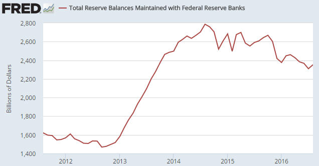
The following chart shows that on a monthly closing basis, bank reserves held at the Fed peaked in August of 2014 at $2.79T and by August-2016 had shrunk to $2.35T. This amounts to a $440B decline in bank reserves over the space of two years. Furthermore, $320B of this $440B decline happened since last October. Does this mean that while the financial world vigorously debates whether the Fed will/should take a ‘baby step’ along the rate-hiking path next week, behind the scenes the Fed has been tightening the monetary screws for 2 years and especially over the past 10 months?

BankReserves_130916

In a word, no. Up until now the Fed has done nothing to tighten monetary conditions.

I am, of course, aware that there was a tiny increase in the Fed’s targeted interest rate last December, but this rate hike was not implemented via a money-supply or reserve reduction and therefore did not constitute genuinely-tighter monetary policy. What, then, is the explanation for the significant reduction in bank reserves held at the Fed?

Before getting to the explanation I’ll reiterate that there are only three ways for US commercial bank reserves to decline. They can be converted to physical currency in circulation in response to increasing demand on the part of the public for notes and coins, they can be shifted to other accounts at the Fed, or they can be removed by the Fed. Only the last of these constitutes monetary tightening by the Fed.

Part of the explanation for the decline in bank reserves is the increasing demand on the part of the public for notes and coins. Due to “inflation”, this demand increases almost every year and is satisfied by the conversion of reserves into physical currency. This naturally has the effect of reducing bank reserves, but the process does not change the money supply because the physical currency replaces electronic currency. For example, when you withdraw $100 at an ATM, $100 is converted from electronic form to paper form while the total money supply is obviously unaffected. This $100 of ‘paper’ comes from the bank’s reserves.

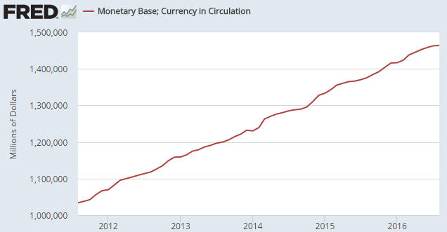
The following chart shows the steady increase in “Currency in Circulation” over the past 5 years. As noted above, this increase involves the siphoning of reserves (in physical form) out of the banking system to replace electronic money. An implication is that if the Fed does nothing and the public’s demand for physical notes/coins is rising, bank reserves will dissipate over time.

MonetaryBase_130916

Since last October, when the rate of decline in bank reserves accelerated, “Currency in Circulation” has risen from $1392B to $1464B, or by $72B. In other words, increasing demand for physical notes/coins only explains $72B of the $320B reduction in reserves since last October. If the remaining $248B reduction wasn’t due to the actions of the Fed, what caused it?

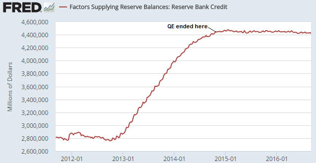
Before I answer the above question I’ll provide evidence that the reserve reduction wasn’t engineered by the Fed. The evidence is the following chart showing total Federal Reserve Credit. Notice that Total Fed Credit has flat-lined since the end of QE in October-2014. This indicates that since October-2014 the Fed has not made any sustained additions to or deletions from the quantity of money or the quantity of bank reserves.

FedCredit_130916

Getting back to the question asked above, the answer is the US Treasury. More specifically, about 90% of the remaining $248B reduction in bank reserves has been caused by the US Treasury hoarding a lot more cash than usual at the Fed.

As I mentioned earlier in this piece, bank reserves can’t leave the Fed unless they are removed by the Fed or get converted to physical currency in response to increasing public demand for notes/coins, but they can get shifted to other (non-reserve) accounts at the Fed. One of these accounts is called the US Treasury General Account, which, as the name suggests, is the US government’s account at the Fed.

As illustrated by the following chart, the Treasury General Account was about $50B at the end of October last year and was about $275B at the end of August this year. This means that over the 10-month period beginning in November of last year the US Treasury removed about $225B from the economy-wide money supply and removed the equivalent amount from bank reserves.

Just to be clear, the government removes trillions of dollars per year from the economy, but it normally recycles the money very quickly. Usually, money comes in one door via taxation or borrowing and immediately goes out another door. The difference this year is that the Federal Government has been maintaining a much higher ‘cash float’ than usual.

TreasuryAcct_130916

I don’t know why the US Federal government has suddenly started keeping a lot more cash in reserve. Perhaps the leadership wants to make sure that, come what may, there will always be plenty of ready cash to pay the salaries/benefits of politicians and senior bureaucrats.

Print This Post Print This Post