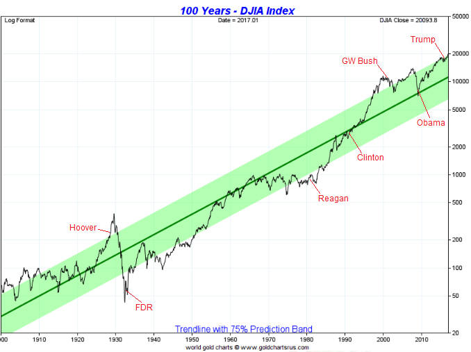
Update on the Comex fear-mongering

November 7, 2016

Over the past few years there has been a lot of irrational fear-mongering within the gold commentariat regarding the potential for the Comex to default due to having insufficient physical gold in its coffers. I most recently addressed this topic in a post on 6th May.

I’m not going to repeat all the information contained in earlier posts such as the one linked above. However, here’s a very brief recap:

1) The ratio of Comex Open Interest (OI) to “Registered” gold inventory that Zero Hedge et al employed to create the impression of high default risk was not, in any way, shape or form, a valid indicator of such risk.

2) The amount of gold available for delivery at any time is the TOTAL amount of gold in the “Registered” and “Eligible” categories, not just the amount of “Registered” gold, since it is a quick and easy process to convert between “Eligible” and “Registered”.

3) The maximum amount of gold that can be demanded for delivery is the amount of OI in the nearest futures contract, not the total OI across all futures contracts.

In the above-linked post I included a chart showing that the amount of gold delivered to futures ‘longs’ over the preceding two years was much less in both absolute and relative terms than at any other time over the past decade. The chart made it clear that as the gold price fell, the desire of futures traders to ‘stop’ a contract and take delivery of physical gold also fell.

This meant that the unusually-small amount of gold in the “Registered” category was almost certainly related to an unusually-low desire on the part of futures ‘longs’ to take delivery. To put it another way, the unusually-small amount of gold in the “Registered” category was nothing more than a natural consequence of bearish sentiment.

Here was my conclusion at that time:

It’s a good bet that if a multi-year gold rally began last December (I think it did) then the desire to take delivery will increase over the next couple of years, prompting a larger amount of gold to be held in the Registered category.

Finally, here are charts from goldchartsrus.com showing that this year’s strength in the gold price led to 1) an increase in the desire of futures ‘longs’ to take delivery and 2) a related and substantial increase in the amount of “Registered” gold.

Exactly as expected.

gold_COMEXdeliv_071116

RegisteredGoldStock_071116

Print This Post Print This Post

How should the real interest rate be measured?

November 4, 2016

Here is an excerpt from a recent TSI commentary.

Despite the popularity of doing so, subtracting the percentage change in the CPI or some other price index from the current nominal interest rate will not result in a realistic or reasonable estimate of the current ‘real’ interest rate.

The method of real interest rate calculation summarised above is wrong in two different ways, each of which is sufficient to render the result invalid. The first and most obvious way it is wrong is that the CPI does not reflect the change in the purchasing power of money. This is not just because it has been re-jigged over the decades as part of an effort to minimise its value, but also because the entire concept of a “general price level” is nonsense. There is no such thing as a general price level because disparate items cannot be averaged. To explain by way of a simple example, averaging the prices of a car, a potato and a visit to the dentist makes no more sense than averaging the goods/services themselves. Clearly, a car, a potato and a visit to the dentist cannot be averaged.

However, even if, for the sake of argument, we assume that the CPI makes sense at a conceptual level and is a satisfactory estimate of the change in the purchasing power of money, we still couldn’t use it to determine the current real interest rate. The reason is that the real rate of return obtained from an interest-producing investment has nothing to do with the historical change in the purchasing power of money and everything to do with the amount by which the purchasing power of money will change in the future. For example, if you buy a 1-year bond today your real return will be determined by how much the purchasing power of money changes over the next 12 months; not by how much it changed over the previous 12 months.

So, when you see a chart showing the nominal interest rate minus the 12-month percentage change in the CPI, what you are looking at is NOT a chart of the real interest rate.

How, then, should the real interest rate be calculated and charted?

The hard reality is that there are some things worth measuring that simply can’t be measured. The real interest rate falls into this category. By taking into account money-supply growth and population growth and by making a guess regarding productivity growth it is possible to come up with a realistic, albeit very rough, estimate of how the purchasing power of money shifted over a long historical period, but it will never be possible to calculate the current real interest rate.

The best we can do is use the financial market’s average forecast regarding the future CPI in our calculations. In other words, the best we can do is use the TIPS (Treasury Inflation Protected Security) yield as a proxy for the real interest rate, since the TIPS yield is effectively the nominal yield minus the expected CPI. A chart of the 5-year TIPS yield is displayed below and discussed in the next section (in relation to gold).

The TIPS yield is not an accurate reflection of the real interest rate because it is based on the CPI and because the market’s expectations are sometimes wrong, but for practical speculation purposes it seems to be good enough.

Print This Post Print This Post

Interesting aspects of the current financial situation

November 1, 2016

Here are a few aspects of the current financial situation that I find interesting:

1) The spread between the 10-year T-Note yield and the 2-year T-Note yield is a proxy for the US yield curve. When this yield-spread is widening it implies that the yield curve is steepening and when this yield-spread is narrowing it implies that the yield curve is flattening.

The following chart shows that the 10yr-2yr yield-spread broke above its September high late last week. This is evidence that the US yield curve has shifted from a flattening to a steepening trend, which is a recession warning and a bearish omen for the US stock market. It is also bullish for gold, although the overall fundamental backdrop is no better than neutral for gold.

yieldcurve_311016

2) As illustrated below, the Dollar Index has been oscillating within a horizontal range for about 20 months. It has worked its way upwards since May of this year, but is roughly unchanged since the beginning of the year and is about 2 points below the top of its 20-month range.

The fact that the Dollar Index is roughly unchanged since the start of this year is interesting because the dominant fundamental driver of intermediate-term trends in the US dollar’s exchange rate (the relative strength of the US stock market) has been US$-bullish throughout this year. By rights, the Dollar Index should be well above its current level.

There are two reasons that the Dollar Index is still trapped within its horizontal range. One is that there was a huge sentiment-driven overshoot to the upside during the first quarter of 2015. The other is mentioned below.

US$_311016

3) The following chart shows the Treasury securities held in custody at the Fed for foreign central banks (FCBs). Not all US government debt securities owned by FCBs are held at the Fed, but more than half of them are and trends in the Fed’s custody holdings should reflect trends in overall holdings.

The chart shows that FCBs stopped being net buyers of US government debt in December-2013 and have been relentless net-sellers since December of last year. This tells us that FCBs have made a concerted attempt over the past 10 months to weaken the US$. This, I suspect, is a reason that the Dollar Index has remained range-bound this year to date despite the upward pressure exerted by US$-bullish fundamentals.

FCBTreasuries_311016

4) The following chart shows the amount of money held in the US federal government’s account at the Fed. Prior to the past year or so the amount of money in the Treasury’s deposit at the Fed was usually below $100B and had never been more than $200B, but something changed in November of 2015.

Since early-November of 2015 there has been a net addition of about $400B to the Treasury’s account at the Fed. This means that the Treasury has temporarily withdrawn about $400B from the US economy over the past 12 months, an action that is, in effect, a monetary tightening. This action would undoubtedly have slowed the pace of US economic activity.

The Treasury is obviously not trying to reduce the pace of economic activity. Why would it, especially in the lead-up to an election? It is, instead, trying to build-up a larger cash buffer for risk management purposes, possibly in expectation of more inter-party haggling over the debt ceiling.

TreasuryGeneral_311016

5) The final chart shows that the S&P500 Index is precariously poised near a technical precipice. A downside breakout will probably soon happen, but until support at 2120 is decisively breached there will be an outside chance of a rise to new highs prior to a tradable decline.

SPX_311016

Print This Post Print This Post

Chanting “it’s a bull market” won’t make it so

October 28, 2016

I’ve seen a lot of commentary in which the author assumes that this year’s rally in the gold price is the first rally in a new cyclical bull market. It probably is, but at this stage — as the saying goes — the jury is still out. At this stage it’s best to reserve judgment, because blindly assuming something that might not be true can lead to large losses.

There are two main reasons that ‘the jury is still out’. First and foremost, at no time over the past 12 months have gold’s true fundamentals* been definitively bullish. Instead, they have oscillated around neutral. There have been periods, such as February-April of this year, during which the fundamentals had a bullish skew, but after tipping in the bullish direction for at most 3 months they have always tipped in the other direction for a while.

Considering what central banks have been doing to the official forms of money my statement that the fundamental backdrop is not definitively gold-bullish could seem strange. After all, the ECB is firmly committed to asset monetisation and negative interest rates based on the belief that these counter-productive policies are working, and the Federal Reserve is seemingly afraid to take even a small step towards “policy normalisation” despite its targets for employment and “inflation” having been reached more than three years ago. However, gold’s fundamentals are determined by confidence, not by sound principles of economics. To put it another way, whether the fundamental backdrop is bullish or bearish for gold is determined by the general perception of what’s happening on the economic and monetary fronts rather than what’s actually happening. Perception will eventually move into line with reality, but in the meantime years can go by.

Since early-July the true fundamentals have been neutral at best and over the past month they have, on balance, been slightly bearish. However, they are constantly in flux and it currently wouldn’t take much to shift them to bullish or make them definitively bearish. In particular, two of the most important fundamental drivers of the gold price are neutral and positioned in a way that they could soon shift decisively in one direction or the other. I’m referring to the real interest rate, as indicated on the first of the following charts by the reciprocal of the TIPS bond ETF (1/TIP), and the US yield curve, as indicated on the second of the following charts by the 10yr-2yr yield spread.

The real interest rate would turn decisively gold-bullish if 1/TIP were to break downward from its recent 4-month range and decisively gold-bearish if 1/TIP were to break upward from its recent 4-month range. The yield curve, which has been gold-bearish for the bulk of the past three years, would turn decisively gold-bullish if the 10yr-2yr yield spread were to break solidly above its September high. Note that it is very close to doing exactly that. As an aside, a break by the 10yr-2yr yield spread above its September high would also be a recession warning and a bearish omen for the stock market.

Realint_271016

yieldcurve_271016

The price action is the other reason for the uncertainty as to whether this year’s rally marked the start of a cyclical bull market. I’m referring to the fact that of all the rallies in gold and the gold-mining indices from multi-year lows, this year’s rally is most similar to the bear-market rebound of 1982-1983.

The gold rally that began in December of 2015 will differentiate itself from the 1982-1983 bear-market rebound if the gold price closes above its July-2016 peak AND the HUI closes above its August-2016 peak.

Fortunately, you don’t need to be a fervent believer in the ‘new gold bull market’ story to make money from the rallies in gold and gold stocks. You will just tend to be more cautious than the bulls with blind faith.

*Five of the six “true fundamentals” were mentioned in the September-2015 TSI blog post linked HERE. The sixth is the general trend in commodity prices as indicated by a broad-based commodity index such as GNX.

Print This Post Print This Post